Improvements for images in XWiki

Hi devs,

Context

I’d like to discuss some possible improvements around images. To be transparent, we (XWiki SAS) have a company willing to sponsor some product improvements around images (yeah!) and I’m quite thrilled about it since it’s an important area of improvement for XWiki IMO. I’d like to make sure we all agree about the direction and ideas. In the sections below I’ve translated the requirements into the way I think they could be implemented and that would fit in the XWiki architecture (I guess I should probably have listed the requirements but I wanted to make it simpler by proposing solutions; if we don’t agree about them, we can go back to requirements).

Style sets

Right now it’s possible to do 2 things:

  • have a default style for all images (default CSS which can be overridden using a SSX for example)
  • override the style for a given image using the style parameter (as in [[image:my.png||style="..."]])

However this makes it hard to have a set of consistent styles used throughout your wiki. For example for xwiki.org we have introduced an {{image}} macro and also provided some best practices regarding allowed sizes.

The proposal is to introduce the ability to define several named preset styles and be able to use them simply when using the image syntax in XWiki Syntax 2.0+ (I don’t think it breaks backward compatibility or really slighty and it would cost too much to introduce a 2.2 syntax at this stage IMO).

Example usage: [[image:my.png||styleset="thumbnail"]]. This would select all the style defined for the thumbnail style set (e.g. a border, and a height - the width is auto sized to keep the ratio). Admin users would be able to define several style sets in configuration (they should be able to use all the features offered by CSS), and we would provide an Admin UI to administer them (add, modify, delete style sets).

The WYSIWYG editor’s image dialog would also be modified to allow the user to select a style set (or use custom styles). It would also be interesting to have a config option to decide if users are allowed to use custom styles in WYSIWYG or if they have to use one of the predefined style sets).

Captions

Right now it’s possible to add captions for images by using the Figure Macro.

However there’s one issue to fix: Ability to edit the caption in WYSIWYG

We may also question whether we’d like to support a caption parameter for the image syntax. I personally don’t like having several ways of doing the same thing and a parameter wouldn’t allow using any markup (like markup on several lines). Now, for usability reasons, maybe we should support single-line captions (and for multiline captions, use the {{figure}} macro). I’m really not sure about this though. I think I’d prefer that the WYSIWYG offer this feature if the figure macro is available.

Image Rendering in HTML

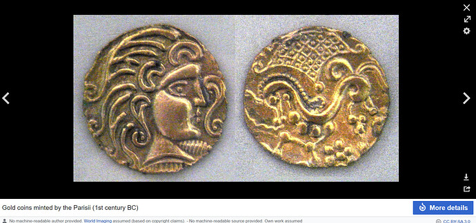
It would be nice to be able to always click on the image and it would open it in a light box, full size, with some meta information about the image (name, date of creation, etc), and the ability to cycle through the other images in the page (with arrows), similar to MediaWiki.

Image Grouping

For image grouping we already provide a {{gallery}} macro. That’s good. However we could offer a layout parameter to let the user decide how to lay out the images. The current default would be slideshow but we could add tiled and others, like in MediaWiki.

I see we have a class parameter but I tried to use it (as in the example on the doc page) but it didn’t do anything. Also I think it’s not user-friendly enough and I think the concept of layout would be simpler to understand for users.

Image Insertion

In addition to the proposed changes above for the WYSIWY editor, it would also be nice if the “insert image” dialog would allow searching for images, with the ability to search in the current wiki and in the current page, displaying matches from the current page with more relevancy (higher in the results). In addition the search result images should be displayed as thumbnails so that the user can clearly see what the image looks like before selecting it.

Also, it would be nice that the image be selected based on its name but also its caption if it has one.

WDYT?

Thanks
2 Likes

Inline styles are not recommended. What we recommend is to use a CSS class as in [[image:my.png||class="thumbnail"]] and this is already what you get from CKEditor if you use the Styles drop down, whose list of styles is already configurable, see application-ckeditor/application-ckeditor-webjar/src/main/resources/styles.js at master · xwiki-attic/application-ckeditor · GitHub and Styles Drop-down | CKEditor 4 Documentation .

Even if “styleset” may be easier to understand by simple users than “class” I still feel it’s bad to introduce a new parameter when we already have an existing one that does the same. So I’m more in favor of using just the existing “class” parameter.

Well, I think administrators only need to say which of the CSS classes defined in the XWiki Skin (including skin extensions) are to be used on images. This basically means keeping a list of:

{
  'name': 'Thumbnail',
  'description': '...',
  'class': 'img-thumbnail'
}

But the image CSS classes should be defined in the skin (using the features we already have). We shouln’t add a special UI for defining image CSS styles.

I’m not sure about custom styles. We don’t encourage users to use in-line styles. They are hard to maintain and create inconsistencies. So I wouldn’t spend time on this. Moreover, for custom styles you need to know a bit of CSS thus if you want to do this then you’re probably not a simple user so you can switch to Source and do everything from there using wiki syntax.

Like @mflorea, my first reflex when I saw the styleset proposal was “this is reinventing the existing class parameter”.

Sounds good.

Would that be the default (fine with me) ? We would need to make sure this is not reacting to images which are already part of some link label. Any idea already on how this should be implemented (a transformation, as part of the HTML renderer, …) ?

Indeed, I agree that the class parameter is the same as the stylset param I mentioned so that’s good and we don’t need to introduce anything new. That’s good news.

Sounds good. This is something we’ll need to implement then. However the best would to have the same name of both the class value to use in the image syntax and the name in CKEditor in the image dialog, for consistency (e.g. class="thumbnail"). It could be capitalized in the image dialog though.

Sounds good and enough for now, especially with SSX.

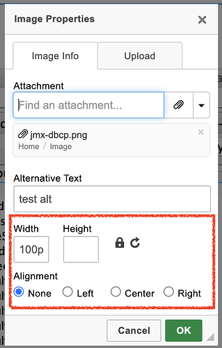
I didn’t express myself well-enough here. By image style, I mean also the size and alignment. Today they can be set in the image dialog:

The idea would be to modify this part to let the user:

  • either select from a drop down the image class to use (thumbnail, small, 'medium, large, extraLarge`)
  • or select a custom width/height and alignment.

with the ability for admins to:

  • configure the image dialog so that it’s possible that only predefined styles can be selected - this is a detail but an interesting one to ensure global consistency in wikis that need this).
  • configure the default image style to use

Yes I think I would make it the default.

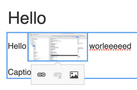
We could decide to only do this if the image is not in a link (ie the link would have precedence). Or do as Manuel did for the LD inline edit mode and display a popup with icons when you hover over the image. Something like:

Screenshot 2021-09-07 at 10.35.21

I was thinking about modifying the HTML Renderer for this.

@mflorea / @tmortagne thanks for the feedback so far. I’m eager to know your POV on the other items too! :slight_smile:

Note that it could an Admin UI config too, to enable/disable the feature (but I would make it the default).

We could make it a best practice but I don’t think we can enforce it to users (admins). One important reason is that we should be able to have:

{
  'name': 'Circle Thumbnail',
  'description': '...',
  'class': 'img-circle img-thumbnail'
}

i.e. we should be able to mix existing CSS classes (instead of forcing the user to create a new CSS class).

I don’t think they are exclusive, not all the time anyway. I don’t see anything wrong in wanting to set the alignment for a thumbnail image, or to set the width for a circle image. The alternative is to add a CSS class for each possible style combination (e.g. thumbnail-right, thumbnail-center) which is too much.

As for the other topics, if I didn’t comment on them then you can assume they’re fine for me :slight_smile:

Small note that the choice of having the features built in the XWiki Syntax 2.0+ has pros and cons:

  • Pros:
    • consistency (otherwise some users would choose to use the Image Macro while others would use the image syntax)
  • Cons:
    • It’ll work only for the XWiki Syntax 2.0+ and not for other syntaxes (whereas a macro would work for all syntaxes)

However, even with these considerations, I believe that consistency wins over support for all syntaxes and should the need arise, it would always be possible to either implement support for it if the syntax allows it or implement it as a macro for other syntaxes.

After discussion with Marius we said:

  • It’s good to extend the gallery macro.
  • The macro is currently using its own JS for the image display and with the introduction of different layouts, it would be better to explore existing JS libraries and to change the gallery macro implementation to use it.
  • An example of such a library is FancyBox (Note: a fancybox macro has been contributed).

Seems it’s not doing gallery layouts. We’ll need to research this more.

This one seems really nice: https://nanogallery2.nanostudio.org/

Hi guys,

This is a nice feature, but always is not appropriate, we need either an opt-in or an opt-out feature here, since there are numerous cases where this not appropriate, simply because the image is not used really as an image, but for other purposes. I am using MediaWiki and many times this feature is more annoying than useful to me. So, my advice is not to make the same mistake.

Just my 2c about this, and so great to see a client giving back !

Denis

Thanks @dgervalle for the feedback! Could you give an example?

The idea is to do this for ImageBlock only (i.e. real images in XWiki content coming from user-specified images), and not for other images such as LiveTable images for navigation, etc.

Thanks

From the top of my head, you may use images simply for presentational purpose, to make your content nice, for an equation, for a symbol, so not all images are equals. Just be careful about that, I don’t remember the exact case I had with mediawiki, but I remember getting frustrated about this automatic behavior.

ok but there’s no way to differentiate between images in the content for a given page. I guess one solution would be to introduce or reuse some block parameter to remove the behavior. Something similar to what we did for Loading... with data-xwiki-rendering-protected="true".

However ATM I think it’s overkill and I don’t think it’s a problem if, when clicking on a presentational image, that you get to see it in a lightbox.

I think we need some details for the pain cases you’re referring to. But even if they arise, we should be able to handle them.

All heading topics have been implemented except:

Where we said:

I’ve created Loading... for this.