Hi @amilica thank you very much for your considerations!
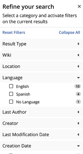
It hides and show it entirely. In this case I think it’s better to keep it hiding because when collapsing a significant interface element still is visible and takes a lot of horizontal space. This can lead to line breaking in small screens. But I agree that we could have the control directly on the panel, I would just use an X to close the panel, to get the panel back there would be a new control described below. What do you think?
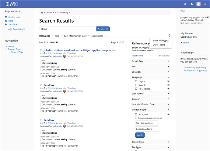
We could invert the logic and use the dropdown on secondary controls, like the visualization options (show filters and highlights). That way, we could have almost the entire line for sorting and a new “config” icon to choose what is available in the interface.
This is to keep up with XWiki philosophy of giving user content priority in space. That’s why I inserted a divider line between results, it keeps search results separated but still condensed. We can tweak it, but it will be a balancing act between screen space and content separation.
We could go all in and remove all borders altogether, use bold text like you said and keep just one shade of gray on panel titles. It would make the panel feels lighters and I think it still keeps content separation nicely.
Agreed, but IMO it requires a proposal on itself because it would change the pagination layout on the whole system. I will keep this in mind for a roadmap item.
That’s a very good idea, and we already have a precedent on this on the notifications. However, placing the avatar in the middle of the sentence fells weird to me because it is breaking my reading flow. This can be completely personal but how about we place it at the end, so the user can read the line “last modified by User Name” in its entirety, then comes the avatar and then at the end comes the supplementary info of date and time.

Here is an updated mockup with everything discussed in context:


