Hey everyone, I would like to propose some improvements to be made on the default tables and cards of Live Data.
Identified Problems
-
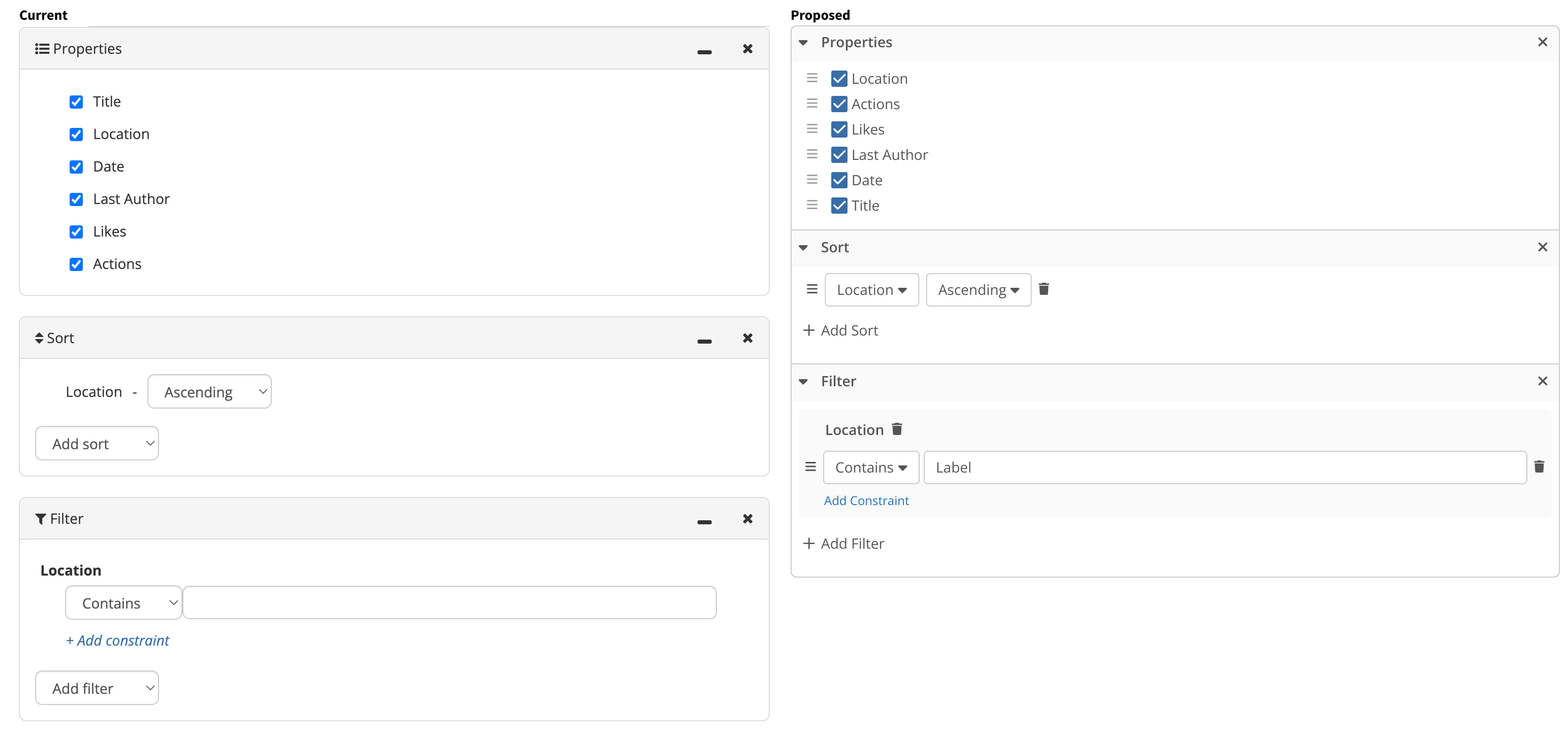
Columns and headers
- Waste of space in columns with column title and the filters;
- The filters are not properly indicated, they can be mistaken by content input fields;
-
Configuration Panels
- The distribution of info is not very optimized and lead to waste of horizontal space.
- The configuration panels remove the user from the context of the table, as it is necessary to scroll up and down depending on the screen size and resolution;
- Each needs to be opened and closed individually, via a menu that’s hidden by default. So the order of interactions is: open menu > open panel 1 > open menu > open panel 2 and so on. All of this while the LD menu keeps changing its position due to the fact that the panel was opened above the table.
-
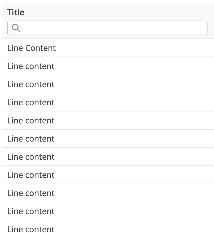
Cards
- The point in which useful information is shown inside cards, shifts with every field (the columns in table view). This hurts legibility as the eye need to have constant movement in two dimensions to find the relevant information.
- The information on card view is really packed and could get a little breathing room
Proposed Solutions
Column View
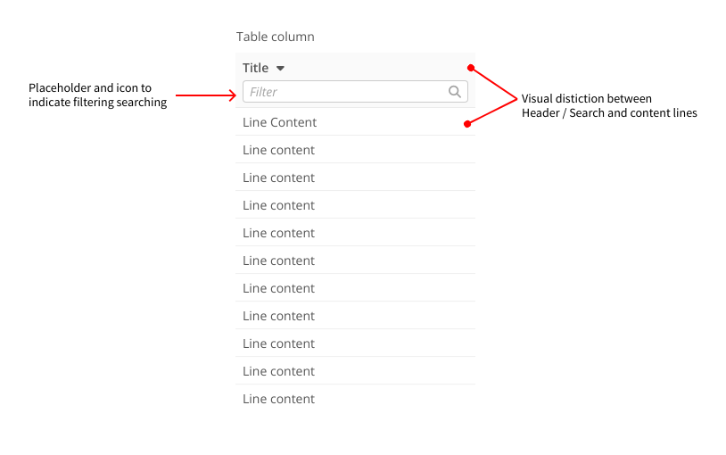
- The proposal for columns is to have its header and filter clearly differentiated from the line contents, creating a grouping via background color.
- Font sizes and input paddings were reduced a bit to make more space for content.
- Input filters have a placeholder and icon indicating its intended use to the user.
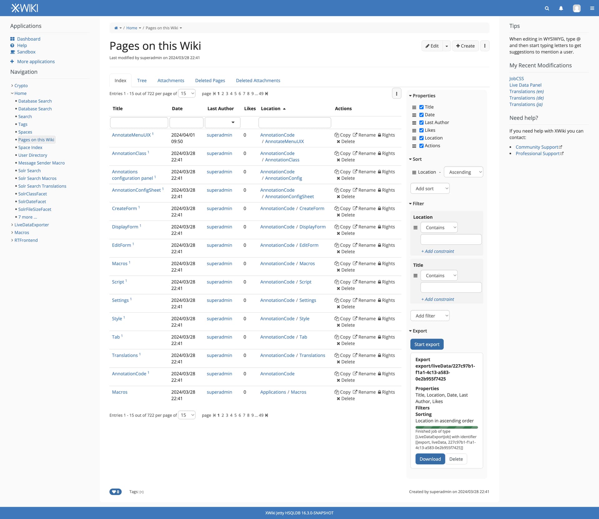
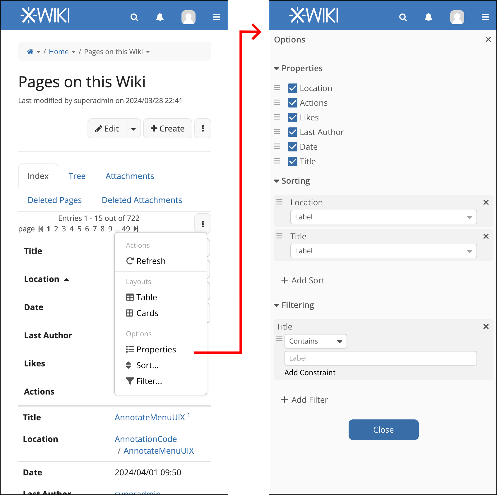
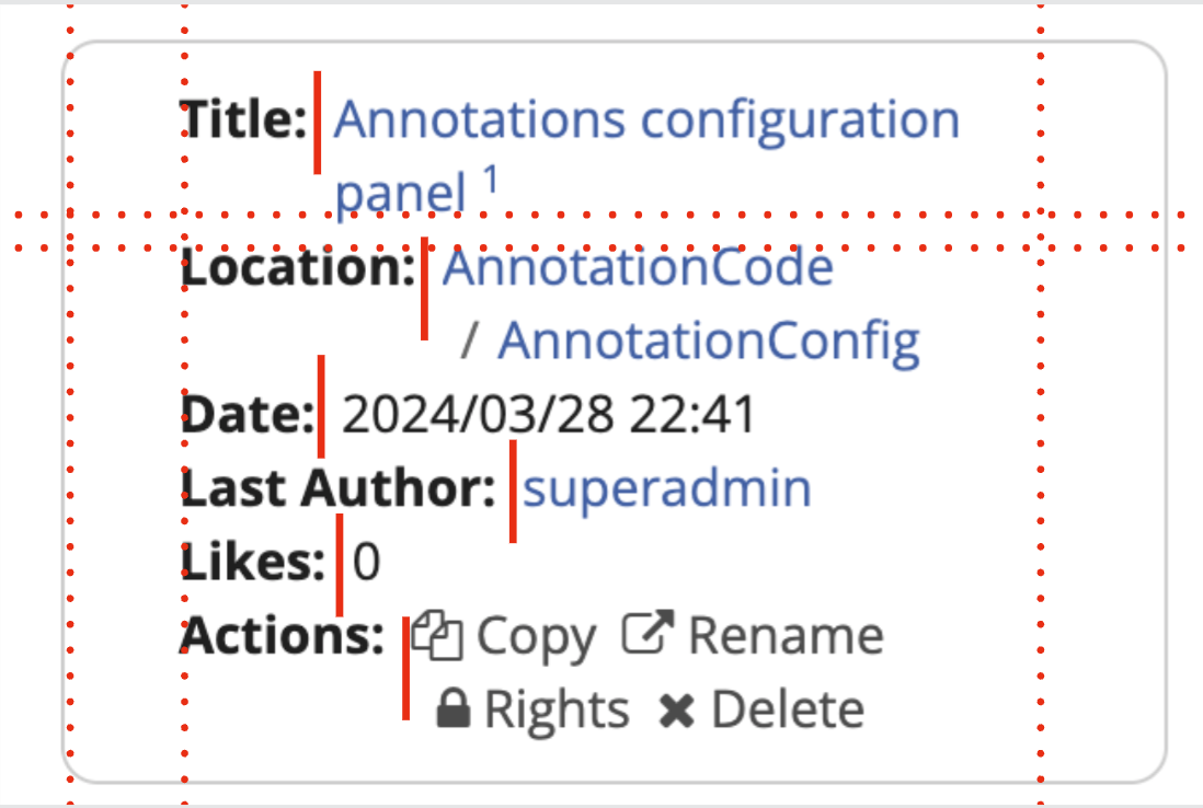
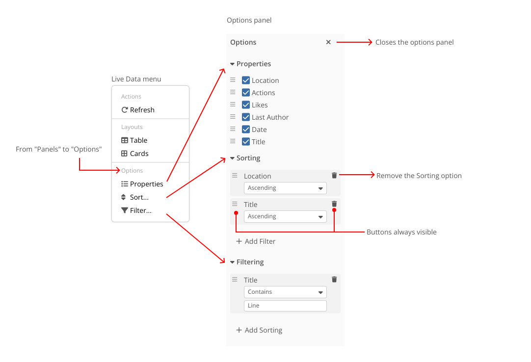
Options Panel
The different panels opened via the menu were condensed inside a single panel. This way the user have a single place for configurations and each one of them is collapsible. We can still maintain different buttons inside the menu, but they all will open the options panel and expand its intended option.
To optimize use of space and keep the user in context of changes, this panel opens on the right side of the table. This way, any change that is made here will reflect in view of the user.
The move handles and the remove icon are always visible so the user, in a glimpse, can discover these features.
Card view
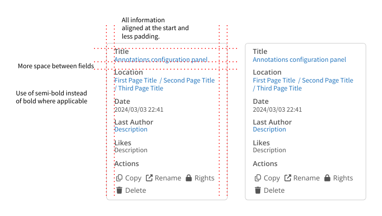
Here the changes were mostly visual to keep information organized. The biggest one being the change in disposition of the field title and its information. Before they were inline, the proposal changes them to two lines, one for field identification and the other one for the information itself. While this indeed takes more vertical space, it also frees horizontal space. It also provides a clear line of information in the vertical so the user spend less time looking where the relevant content begins.
To lighten up a bit, the strong bold style of field titles was changed to a lighter semi-bold.
Changes in context
Important: the pagination changes are being discussed in this topic: Pagination template of LiveData and LiveTable
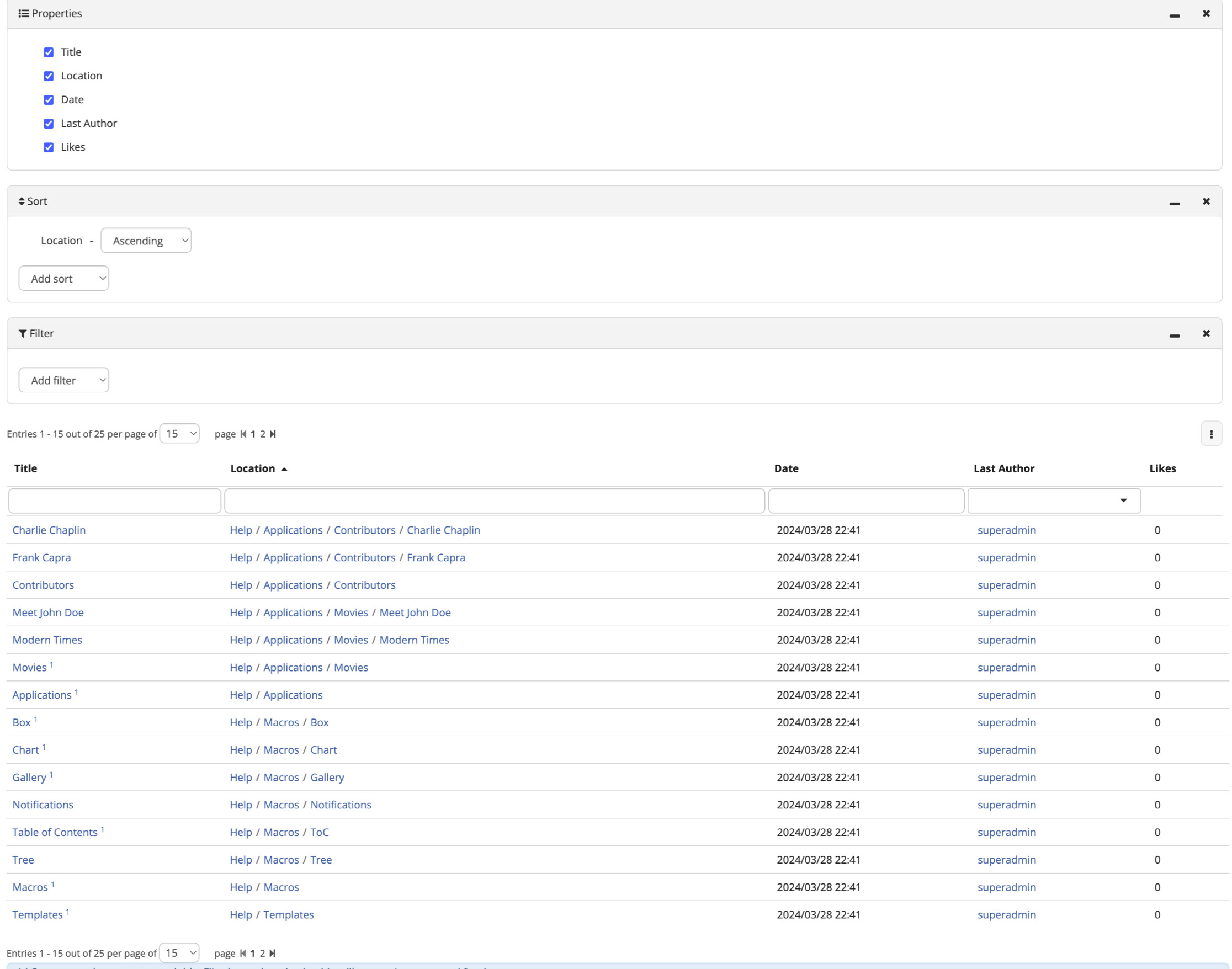
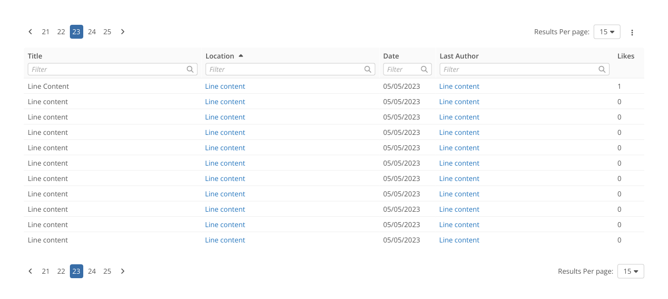
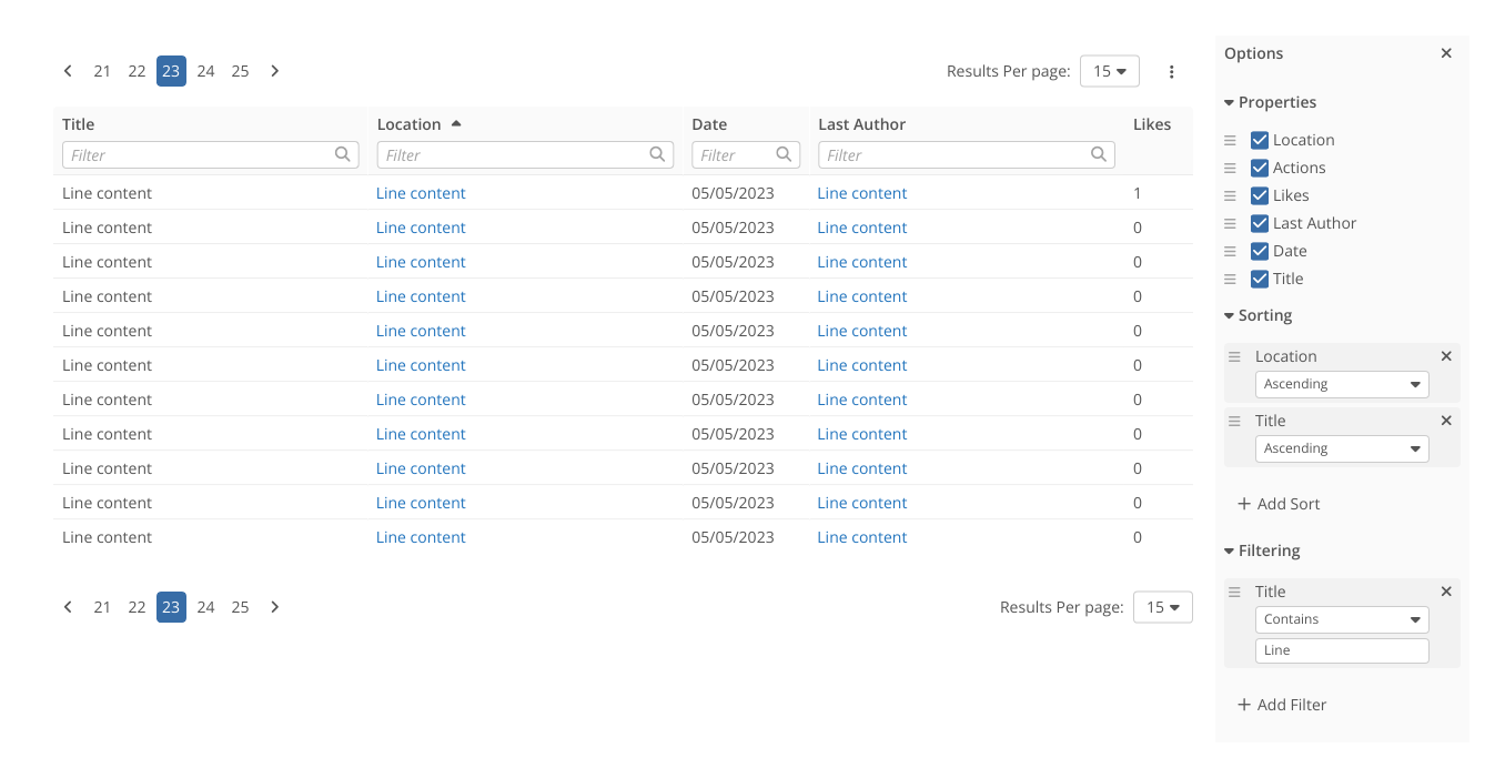
Here we have all the changes applied to the “Page Index” LD table.
Option panels closed (default)
Options panel opened.
So, all in all these are my proposed changes, I hope I made them clear enough but don’t hesitate to ask if some need more clarifications.
Thank you all for reading and please, let me know what do you think. See ya  .
.
 ).
). As a side note, it might be interesting to provide the font-weights we use often as variables. As of now, I see a lot of font-weights in our codebase that are hard coded.