Hey everyone, as part of a bigger proposal to improve the design of live data, I would also like to propose some changes to the pagination layout of both LD and LT, to keep them in sync.
Note: I know that Live Table is on its way out, however I feel it’s important to keep them both as similar as possible until we have migrated everything to LD.
Some problems identified and proposals to improve them:
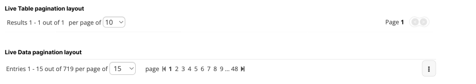
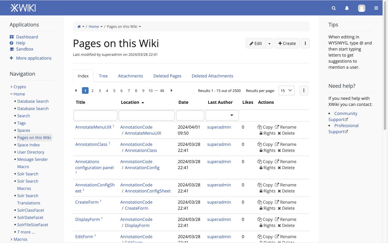
Inconsistent Layouts: Live Table (LT) and Live Data (LD) have different visual layouts for tables. Let’s aim for consistency between the two implementations.
Secondary Placement of Pages: The pages listing is currently secondary in the reading flow. Considering the navigation importance, let’s prioritize the pages within the results info. Of course this would need to be reversed for right-to-left reading flows.
Complex Results Info: The current format (“Results # - # out of # per page of #”) is hard to interpret. It requires the user to read the whole sentence to make sense of the numbers. Let’s split it into two groups for clarity: one for displayed results and another for results per page.
Subtle Selected Page: The selected page is indicated with subtle bold text. I suggest increasing contrast by using the primary action color as the background.
Small Interaction Area: The space for mouse interaction on each page is narrow. Let’s increase padding on page buttons for better spacing and accessibility. Also, enhance hover/focus styles.
@mleduc has been working on those upgrades, I think he might have a good idea on this question
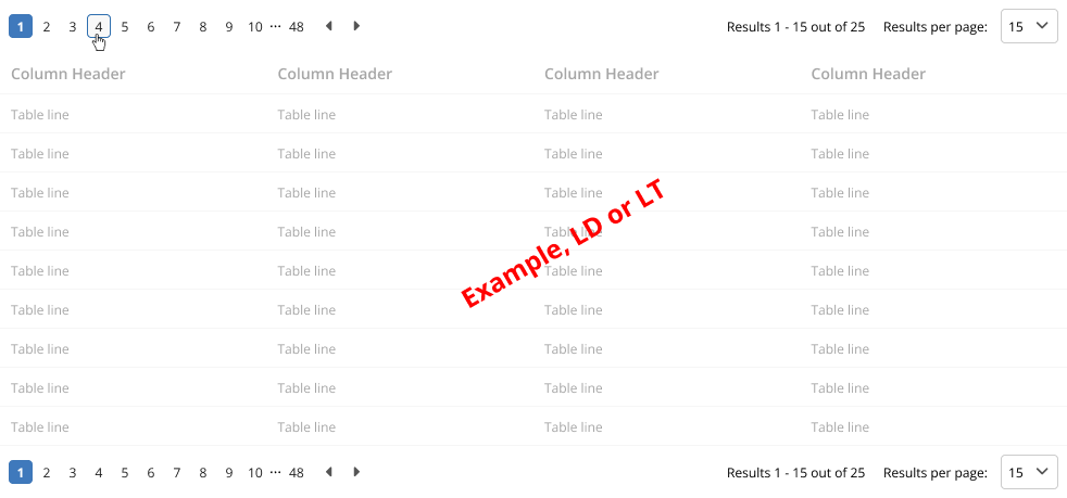
Do we really need 11 pages to move to in the primary info section? It’s quite heavy and I think most users could do with less: 1st page, current-2, current-1, current, current+1, current+2, last page. If need be, we can also probably add an input for the page number quite easily. I’m not sure what’s the best for UX but I think it should be considered for an improvement
Results # - # out of # is secondary info, but IMO it’s still too much and it clutters the UI. I don’t see a use case where the Results # - # would be useful. In the few cases where it’d be useful, this info is redundant and can be found without much trouble with basic arithmetics: I know I’m at page 12 with 15 entries per page. There are 11*15 = 165 entries before this one, so the first entry is the 166th. The last entry is the first between the last entry of the table or the last possible entry of the page. I knwo the table has 200 entries, which is higher than 166+15=181. So I can figure out that the last entry of the page is 181. Written down like that it doesn’t look that easy. Subjectively speaking those values are useless. It would be interesting to find a use case where they are needed.
Except for those two improvements on the content side, it looks good to me
My take is that we should close as “won’t fix” all jira issues that exists for LT and that don’t apply to LD + move all LT issues that exist for LD, as LD issues. Ie. focus our energy on migrating to LD (and improving LD) as fast as possible.
This is potentially a question that would merit its own thread (I was asking myself the same question today to decide if I should close some LT issues as won’t fix for today’s BFD ;)).
This is an interesting take, I haven’t thought about it yet, but I’ll try to have some mockups to test. I guess the only situation in which this approach would complicate things is when the user knows that his result will be in page number #, but also, I don’t know how common this situation would be. An input field would indeed mitigate this.
Makes sense. I can see some value on the total number of results for the table, if I am filtering for example. But not on the partial “Results 1 - 15”
Off-topic but I feel like pagination is becoming more and more something of the past and tabular UIs now mainly show the top X results based one the current pagination and filters, and an action to show more.
If an expected result is not found in the top X results, users either change the pagination and filters, or click on “show more”.
Note that this approach could solve the issue we have where we have to show N/A for results that a retrieved from the database but can’t be displayed to the current user because they do not have enough rights.
PS: This might not be a solution in all cases, but an alternative to consider.
I find this information quite important. In particular, the total number of results is not shown otherwise (or do you really suggest I should go to the last page and count the rows to know the number of results?).
Exactly, this basic math might be easy to do if you’re good at math, but it would still be useful if XWiki could do it for you as it as lot more effort to do it by hand.
Also, I find that the page selection is missing a label. I find these numbers not intuitive enough. I also think the idea of displaying a select input (or a text input) for selecting the page explicitly is good.
No one was against the updated visuals. I will create Jiras for this work and try to keep them as compact as possible. More discussions can happen on the future PR.
new icons
new selection color
updated spacing
The new order of fields has driven some discussions. I will keep these off from the proposal for now and try to progress on them a bit later.
Isn’t the “Next Page” button / link the most use one? I almost never click on the page links. The problems I see:
the icon for Next / Previous page feels too small
you have to move your eyes / mouse over all the page numbers to get to the Next Page button
the number of pages is variable (e.g. depending on the filters and new pages can be created while you look at the live data) => the position of the Next Page button can jump left - right while moving through pages; I’d rather have the Next Page button in a fixed position, that is not affected by the number of pages
@tkrieck you might have missed that comment, note that we even have a ticket to implement that: Loading...
It might be interesting to rethink the design of pagination in LD with that in mind, and maybe we’d realize that we can entirely drop the capability to go to a specific page result.
I did read it, I just didn’t know it was in line for development.
I don’t think we will drop pagination entirely, but perhaps not having it as a default. There are some situations in which having the ability to go to a specific page is beneficial. This article explains it: Infinite Scrolling: When to Use It, When to Avoid It