Issue: Loading...
Hey everyone, I’m back with some updates to the Cristal interface.
To keep things more organized, here I will remain on the topic of general UI only and branch out other discussions to different topics. So, there’ll be one for sidebars, one for information tabs, tags, etc. I will update the links to them here as I go.
Other discussions:
Document Information Tabs
Synchronization visibility on Cristal - #2 by vmassol
Flow - Moving documents on Cristal - #2 by vmassol
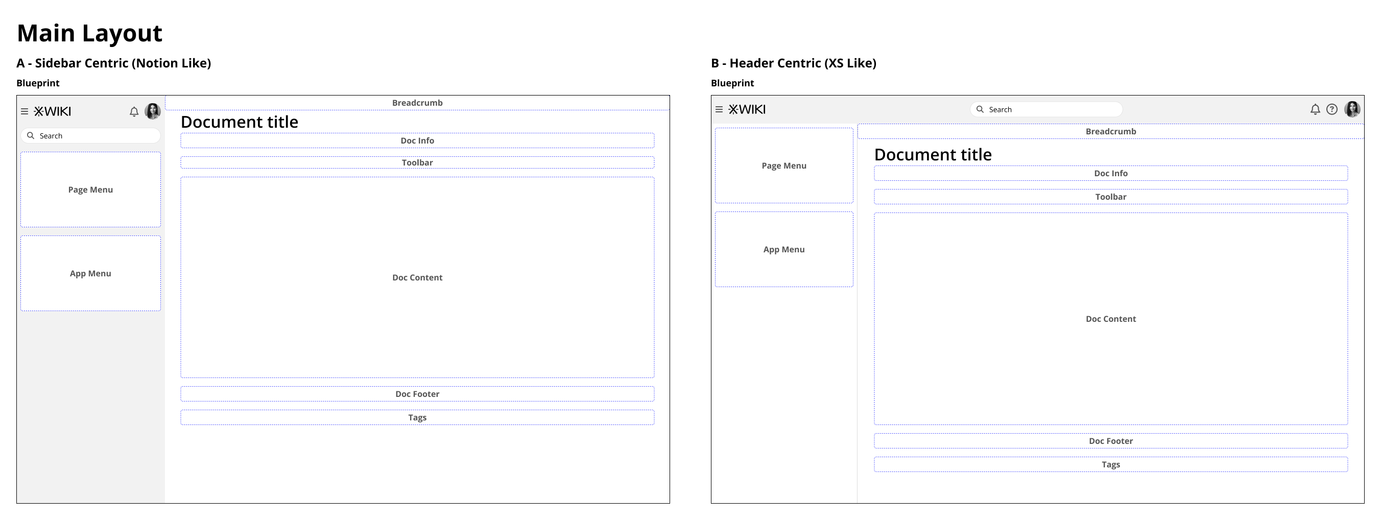
After your feedback I redid two versions of the main UI, one more focused on Notion like navigation and another one more traditional to XWiki Standard. Both have the same features, and I did all my layouts taking both into consideration. But ideally going forward I need to focus on one.
From now on, Version A is Notion like (sidebar focused) and version B is XWiki like (header focused). I say “focused” because there’s where the global interaction will be, things like user menu, help, search, custom menus, etc.
Pros and cons of each:
Version A:
- Pros
- The interaction is fairly focused, all things global are here. Main navigation, user profile, search.
- Being close to Notion layout, we gain points with someone who is used to that kind of app.
- We gain a little bit of vertical space for the content of the document, especially true on mobile.
- We can still allow customization of menu header and right sidebar
- Cons
- The sidebar can get convoluted, especially if someone wants to customize more panels there OR if we need to cram too many features on the same space.
- Is different from XS Standard, so someone that is used to work on XS will feel the differences
Version B
- Pros
- We have more horizontal space for features, current and future;
- Is close to XS and other sites, so there’s less adaptation on part of our users.
- The logo (branding) is always visible, even with the sidebar hidden
- More space is available for customization on the sidebar
- Cons
- Main interaction is more scattered, with navigation on the left side and global features on the top right
- We lose a little bit of vertical space
- Mobile requires more effort to reposition all the elements
With these reasons set, we can move on to the wireframes properly.
Notes:
- All screens are on a 1280x800 resolution;
- Different from XS the hamburger menu here open and close the left sidebar, not a floating drawer; We can still have the drawer it in the future if we deem necessary, but then the sidebar icon will need to be changed.
Blueprint of both versions.
Here we have a view of them without content, to better focus on the differences.
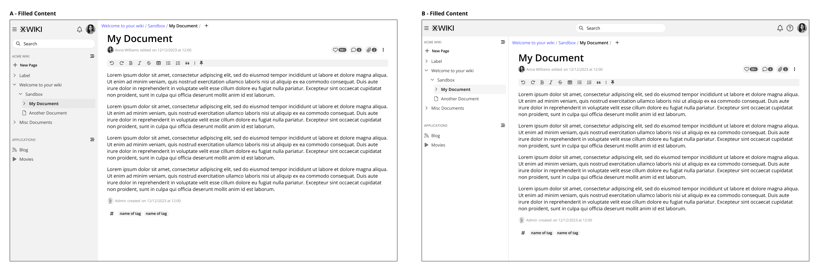
With content and detailing on other areas
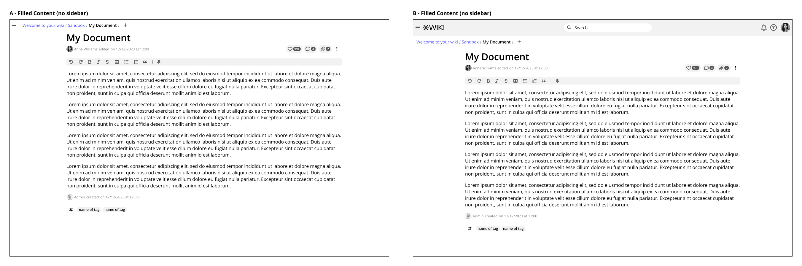
Left sidebar hidden
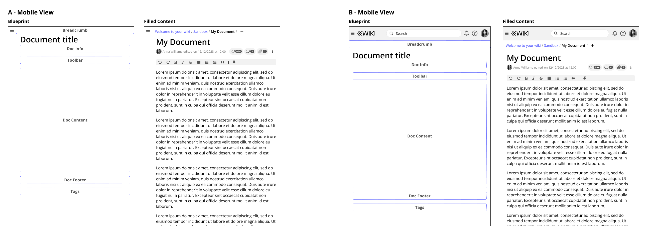
Mobile View
General Feature Set
Adding pages
After your feedback, I changed a little bit the buttons for adding a new page, so there’s less emphasis on them now. But I still maintained two buttons, this is because if the left sidebar is closed we can still have one on the breadcrumb.
For first time users, maybe some exploration of the interface will be necessary. But after the initial contact, the user will learn the standard ways of adding pages and the interaction becomes more fluid.
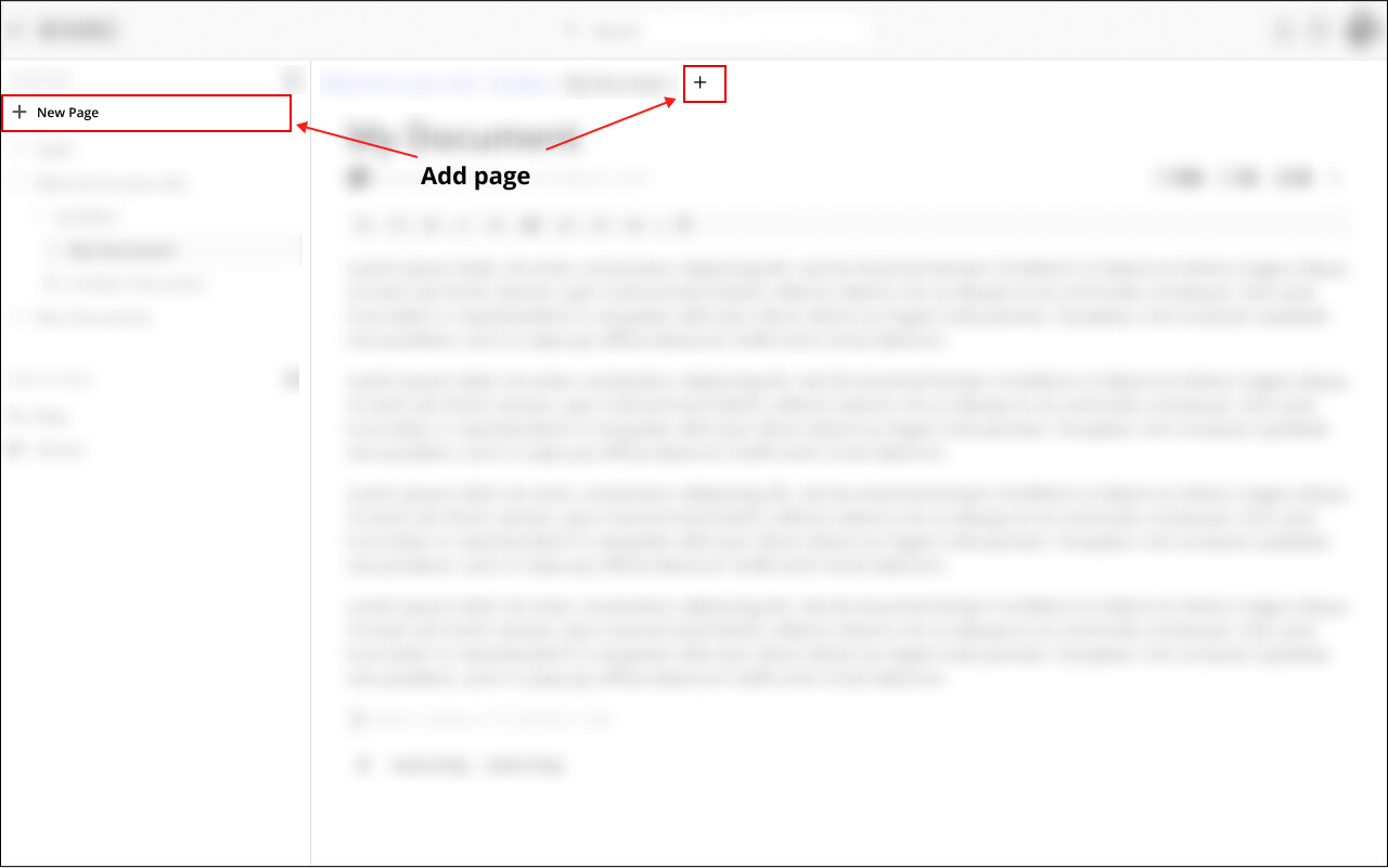
@amilica I did a version with the rounded add ( + ) on the breadcrumb, but I didn’t like too much the aesthetics of it, maybe I am biased  . But I agree, is a little more visible, I will post it below so others can have their opinion as well.
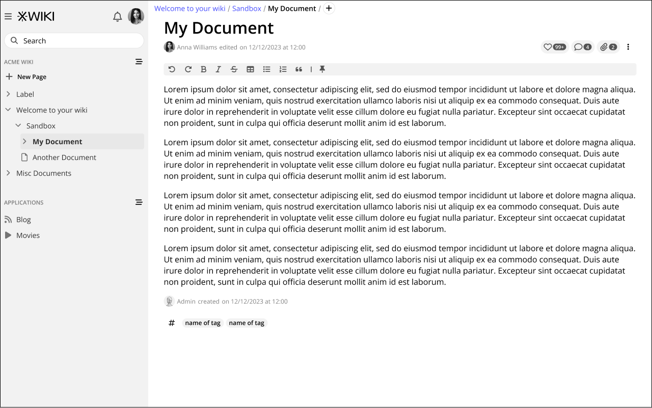
Also, as you can see, I still maintained the like, comments and attachment on the horizontal. I did because in large monitor, on your proposal, these icons could be situated very far away from the document. But I will explain a little bit better in the topic about the right sidebar.
Rounded Add button:
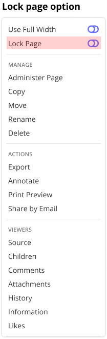
Editing pages
For now, the main focus of Cristal is to have an always editing, real-time collaboration aspect, so there’s no need for an “Edit” button. But a lock feature should be available via the page menu for sensitive pages.
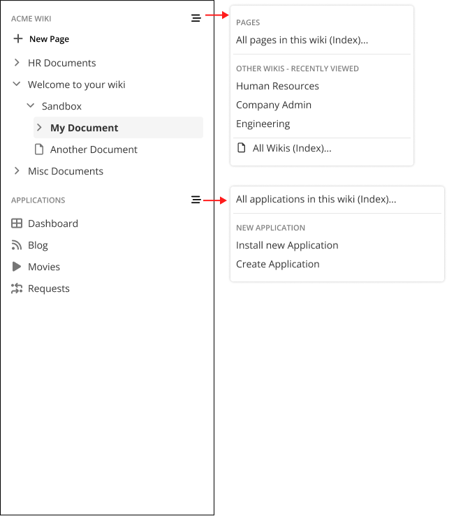
And lastly on the general UI scope, the main navigation.
Navigating to other wikis and indexes.
After the points mentioned by @surli and @mflorea I simplified the page and Wiki menu quite a bit. Now they are only accessed on the sections of the sidebar, not on the XWiki logo anymore. The same works for the application menu. Also, all buttons are always visible.
Thanks everyone for reading! See you next time