Initial Wireframing of Cristal

Hey everyone, here are some initial wireframes for the Cristal UX. Note that this is all still work in progress so if you have any suggestions, please feel free to share them with us. As you may know, Cristal is inspired heavily in personal note taking apps like Notion and Obsidian so you may see the similarities in interface design.

Also, these are wireframes only, so details on visual design are sparse, later we will take these wireframes and apply a design system on top of them to get to the final look and feel of the product.

Base layout explorations
Here we have two base layouts to study, the main difference between them is the header bar on the version A and the lack of one on version B. Version B can offer more space to the document, but will make the main sidebar more crowded.

In the final version, only of these will be available.

Version A
Version A

Version B
Version B

Speaking of header…

Header variations
You can see below some variations on the search bar placement for the header. Two to the sides and one center.
Interestingly, the side variations will allow us to place a custom menu at this header, so it can be good for customizations

Header 1
Header 2
Header 3

Selecting Datasources

One key aspect of Cristal is the selection of multiple data sources to work with. This can be the local file system, a XWiki instance, a GitHub account and so on. The user will be able to switch these data sources on the fly via a button provided right beside the main logo (that also may be customizable).

Screenshot 2024-01-23 at 09.01.00

Creating a new page

During research, we saw that a lot of apps have redundant buttons on the interface (like the new button). This allows the user to have more control on the placement of a new page right from the start.

Creating a page from inside a document will place it as a child of that document:

Create Page from doc - New page saved

While creating it from the sidebar will place it as a new sibling of the root page:

Create Page from sidebar - New page saved

During page creation we strive to give the most streamlined experience possible to create a simple page. With that in mind, templates will be featured as an option during page creation and the user must explicitly choose that route if desired, note the “Templates” button below.

Create Page from doc - New page created

You may also have noticed that the content is centered on the page, this is intended to be the default option to keep line lenght in check, however an option will be provided to make the page full width (both as a document options and user option).

page_menu

Also, from this menu you will be able to change the page location, if necessary.

Attachments, Comments and other info

Taking advantage of the extra space provided by the center page, it is possible to open comments, attachments and other relevant info on the document in a sidebar. The sidebar itself, it’s still a work in progress.

Sidebar opened

Document info will be presented right below the document’s title. There’s still work to be done on the presentation side of things, especially considering extensions and customizations.

Screenshot 2024-01-23 at 09.07.39

So this is it for now, I hope that I was able to provide a quick introduction to the work going on the interface side of things, and to leave with a small token of things to come, here is an exploration of the proposed interface using the Shoelace design system.

Version A - Shoelace

Please, tell us what do you think and see you next time

2 Likes

Hi,

thanks for working on this!

Being used to XWiki design it feels personally a bit weird to see the user info and notif bell being displayed at the bottom in version B. Also as you mentioned yourself advantage of the header bar is that it offers possibility to insert custom menu, so I’d be slightly more in favor of design A so far.

There’s something that I find a bit odd when looking at your screenshot it’s the location of the “Other wikis”, which is right now at the complete bottom of the sidebar. I’m wondering if it shouldn’t have at least the same importance than the data source switch, or at least to make more obvious in the hierarchy in which wiki you’re currently working.

Hi,

I think I prefer option A too, but:

  • my first impression was that there is something missing from the left of the header; the header and the breadcrumb line are unbalanced, with more items on the far right and close to none on the left side
  • the location of the “Created by” information at the end of the content is strange; I’m not convinced that the slight misalignment and the gray color are enough to separate it from the content; I’m wondering if we really need to show this information; I don’t think it’s that important, and could be “hidden” in a section with other page related information (a replacement of the document information tab we have in XWiki)
  • I’m not sure the number of versions and accessing the page history is a common action that needs to be 1 click away; I would hide it in a page menu / more actions
  • what about the last modification date? Are you planning to show it on hover or elsewhere?
  • what about page tags? Where would you display them?
  • I see exposed the apps, pages and wiki index on the left column. What about the user index? And how do you access the global configuration? (it doesn’t make sense to have it under the user menu and neither in the page menu)
  • I agree with Simon that the placement of the “other wikis” in the left column is a bit surprising, but my main worry is that you can have lots of wikis, in which case I suppose you only display the first N? How do you indicate that there are more? The same applies to the Pages section in the left column.
  • What does the (?) question icon / button on the bottom right? Open the tour?

Thanks for working on this,
Marius

Hellooo! Very happy about this forum post! :star_struck: Also, thanks a lot for working on this, it looks really good!

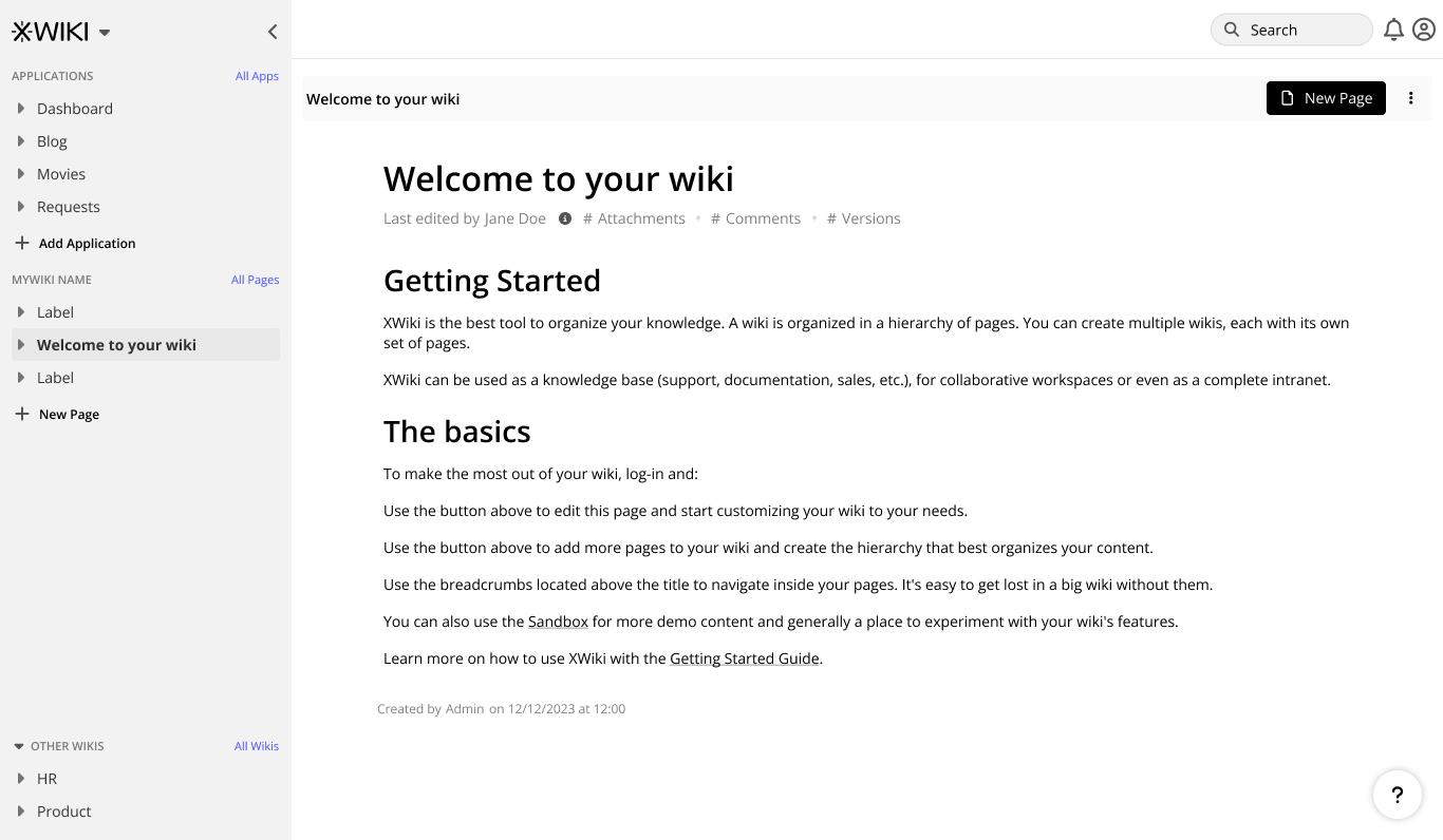
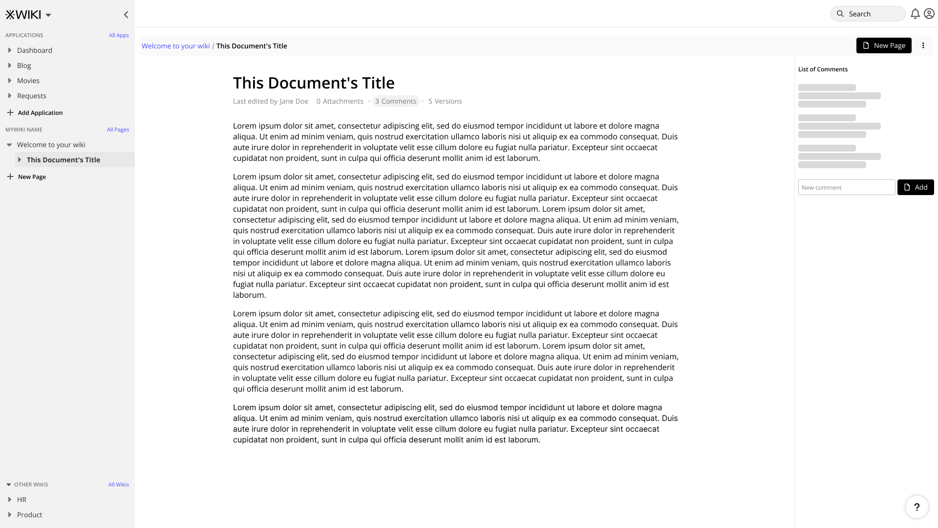
Top of the page - needs

Top of the page = header + next row (breadcrumb & co)

What I find necessary to have at the top of the page:

  • search bar clearly visible (not hidden under an icon) - I believe that the future of wikis is asking the wiki or a certain database for info, not actually searching it or navigating based on visual structure

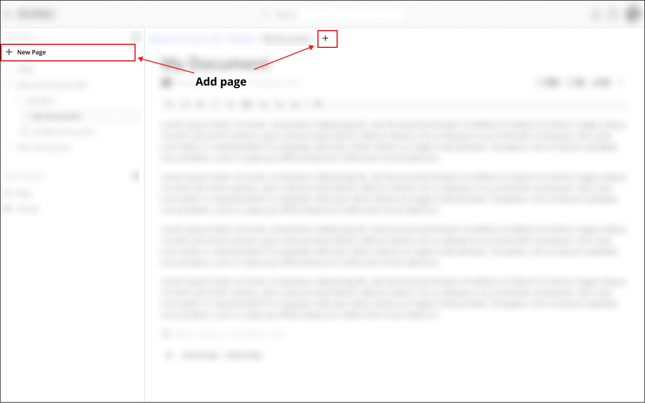
  • easy to find button for creating a page - one of the big things I don’t like about Notion is how hidden feels the action of creating a page

  • notifications - they are supposed to jump in the user attention

  • space for other spaces / subwikis / apps / important links - I can definetly imagine people would like to add an app like task manager at the top of the page or maybe an important app they use everyday (Collabora or maybe CryptPad or something)

What I don’t find necessary:

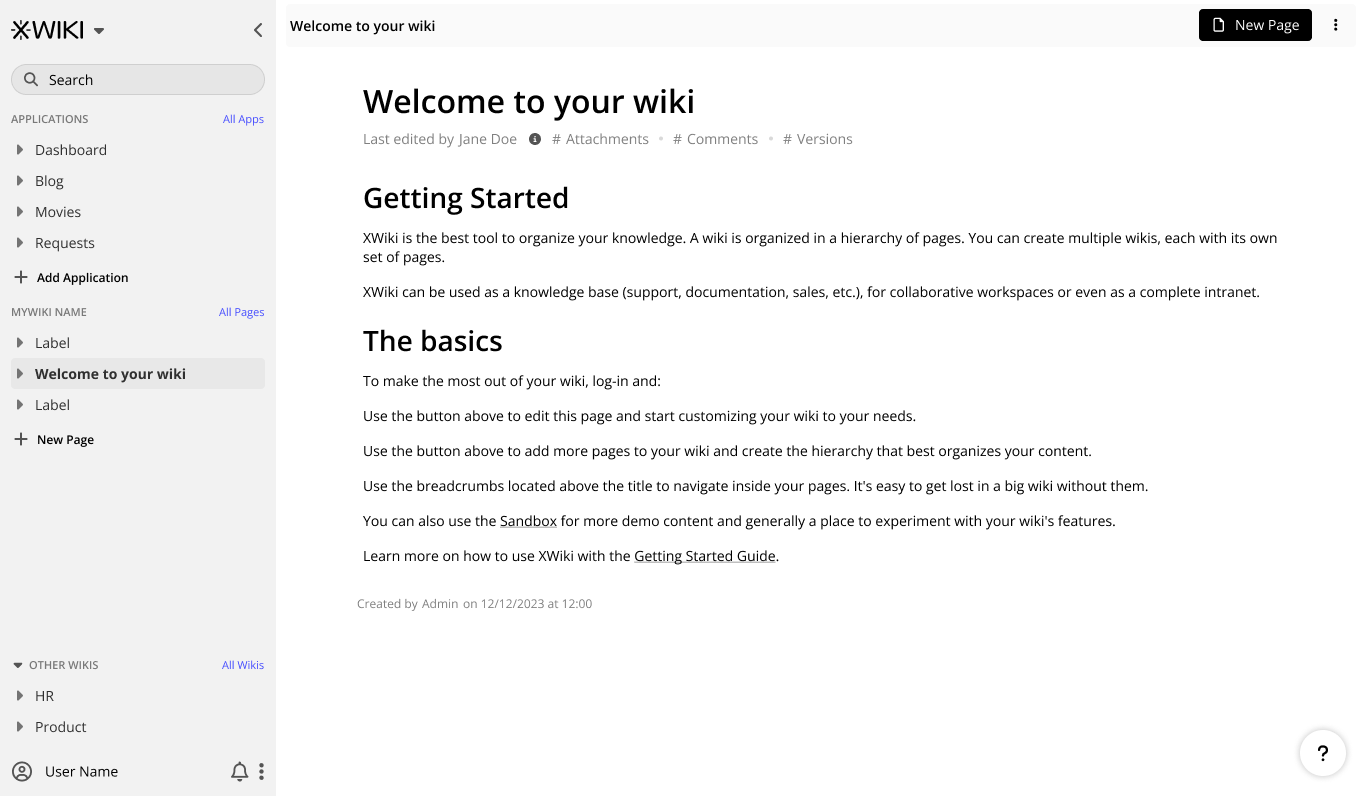
  • profile picture / settings - this is not oftenly accessed, it’s a secondary feature after the wiki set up process, I belive there is no need for it to be at the top

Vertical space

I’m a big believer that interfaces should try as much as possible to minimize the vertical space needed to view until you get to the important part.

100% we should keep the header, but I’m not 100% we should keep the next row as it is.

Ideally, the user could decide if he wants to keep the breadcrumb row on its own or merge it with the header. I can definetly imagine usecases in which the team doesn’t want to add anything else to the header and find it better to merge both to have more vertical space available.

Search bar

Looks good, I’d vote for it to be slightly longer to encourage bigger search inputs (I will assume we’ll have operators in search and probably AI).
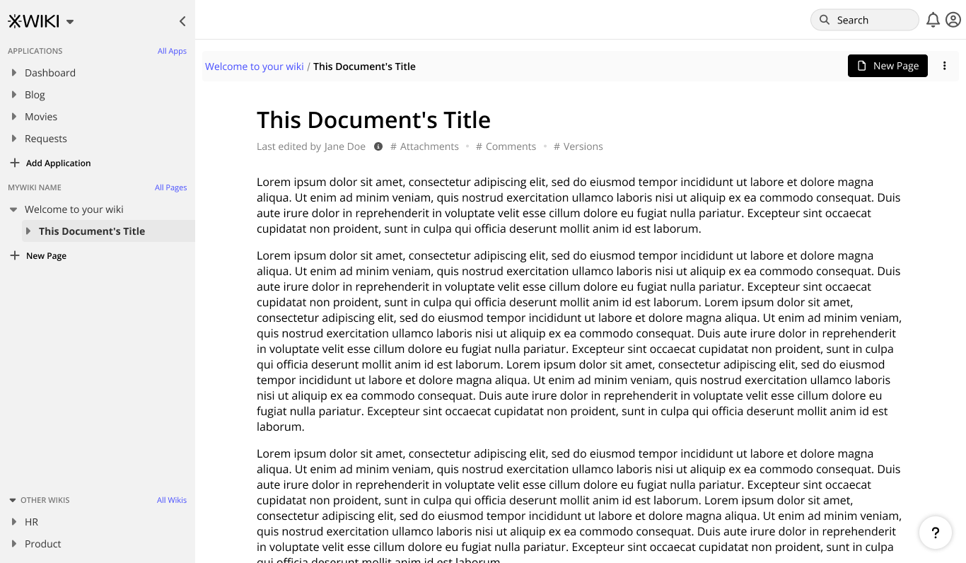
Breadcrumb & co

Some problems that I have with the breadcrumb row:

  • the breadcrumb is not alligned with the content - it feels off, unbalanced
  • the New page button has too much focus on it - it is the main thing I can observe on the whole page, it puts the content secondary. I believe that a good knowledge organization philosophy caters more to the nurturing of the knowledge rather than its continuous creation. It is not the color that is the problem, but the size and position in the interface.

I believe the New page button should be an icon button coming immediately after the breadcrumb with a " / " before it, so it’s extra clear where the new page will be created. The 3 dots can be next to it OR, maybe better, after the details below the title.

Line length

Not the main focus right now I imagine, but I think we should make the default line length smaller. Right now, it seems the line length is around 115 - 120 characters.

Studies show that the ideal line length for long content reading is around 50-75 characters.

While a wiki is not an article and it has the attention of the reader by default because of necessity, we can extend this to around 100. I think this is the strategy Notion had in mind too as they have a default line length around 100-105 characters (if I’m not missing any additional setting I’ve done on mine).

Also, maybe bigger font size? Not sure about this, though, it might just seem small. Just as general inspo, I love the formatting of Medium on content and anything close to that is great.
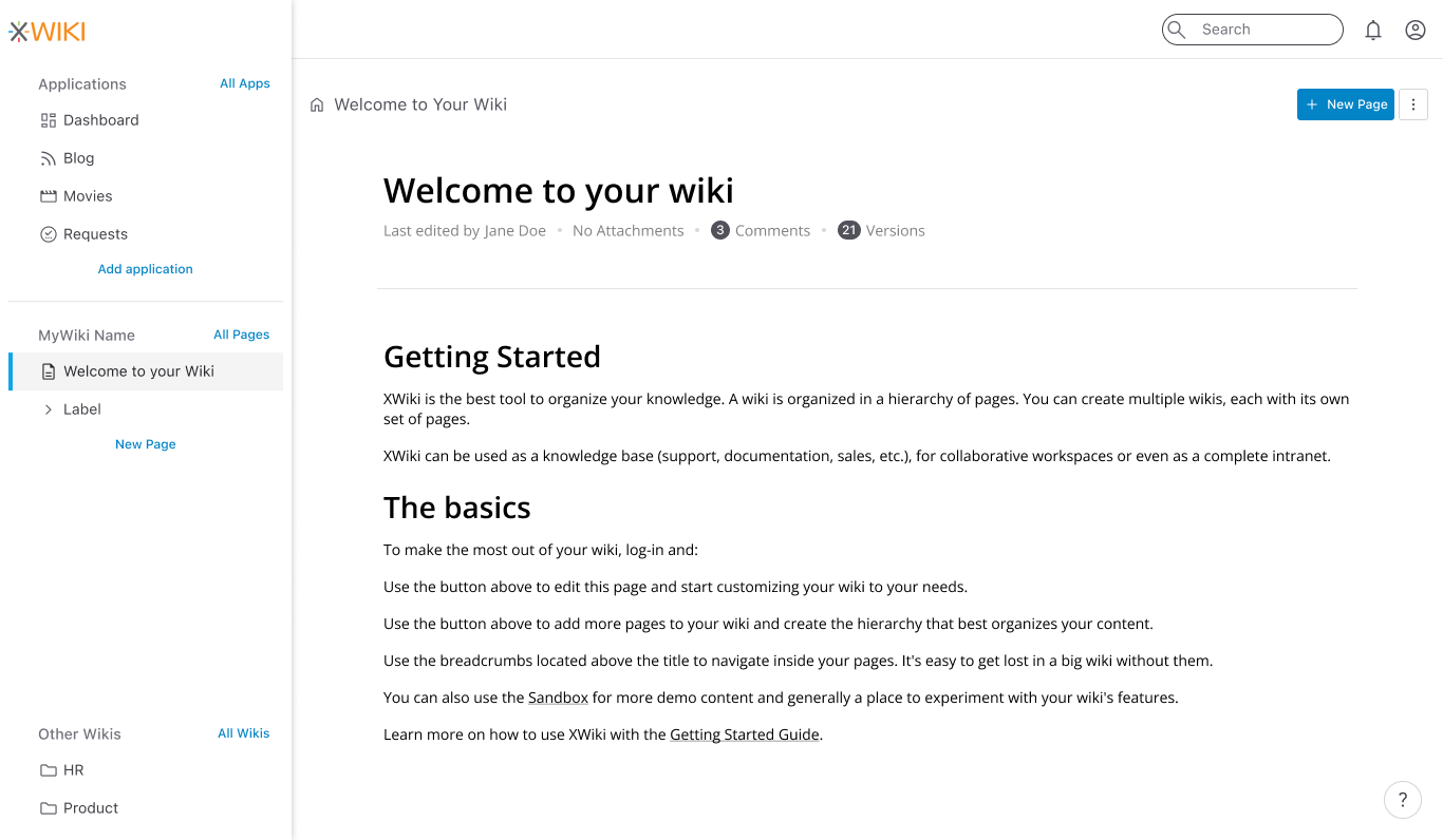
Data sources

I think the placement of data sources is very good, shouldn’t be changed as it makes the idea of all-in-one software much more clear.
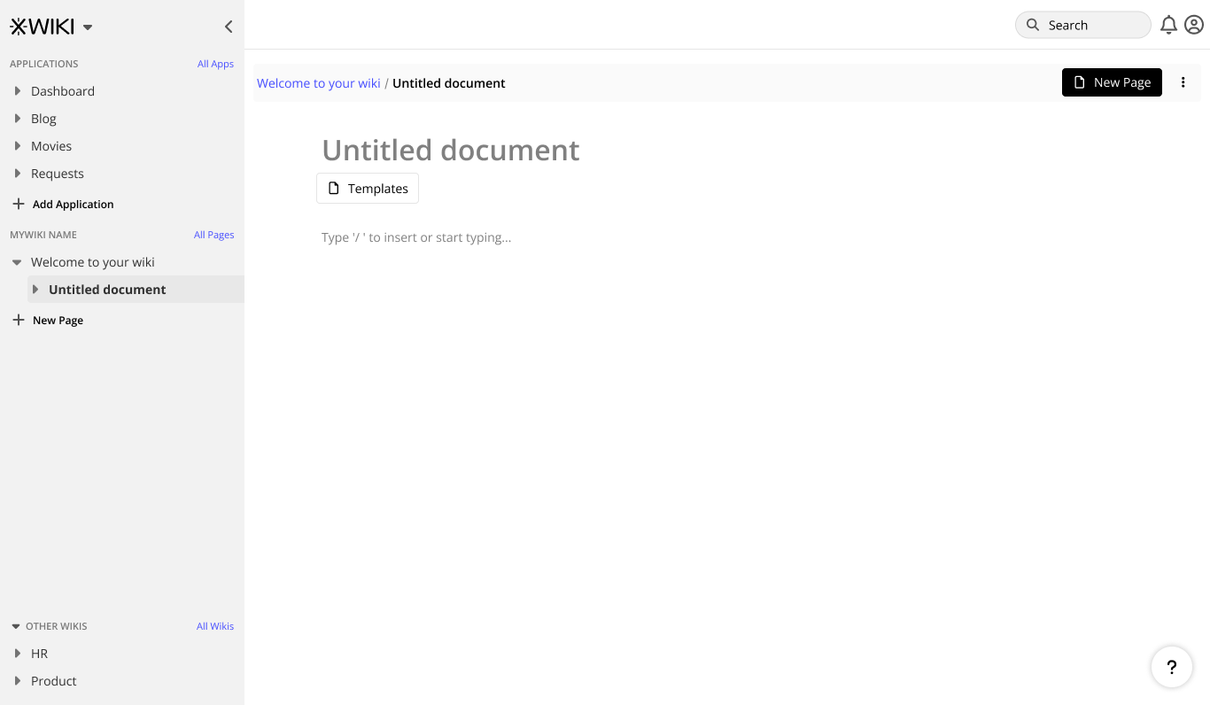
Applications

I’m not very sure there is a need for “All apps”.
I think it would be much better if Applications would be collapsable.

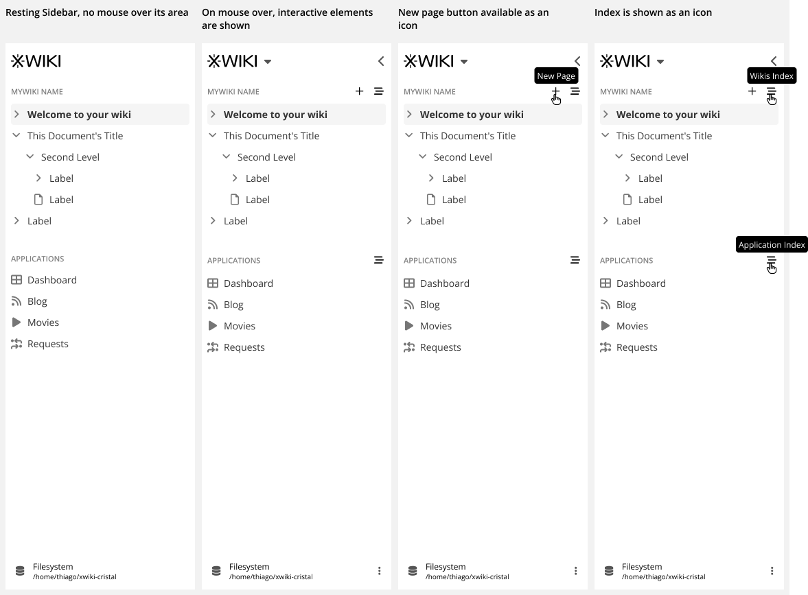
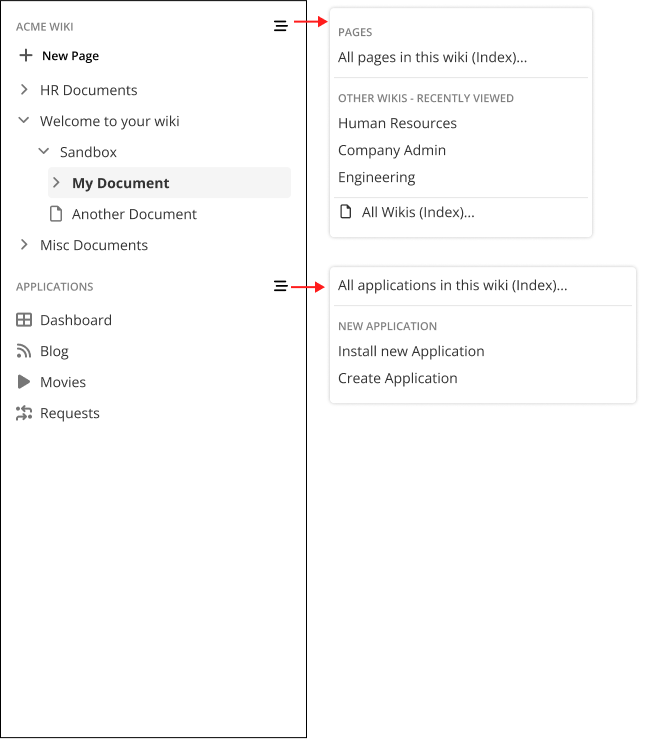
All pages section / Side navigation

I think the New page button should be an icon or/and should have the same styling as the other create page button.

I believe its position should be on the same line with “MyWiki name” and “All pages” should be at the end of the pages list (essentialy reverse them).

Also, maybe a search icon should be placed somewhere near the navigation in addition to the search bar because there is a big distance between the navigation and the search bar. Clicking on the search icon would make active the search bar.

Also, I’d be a fan of being able of collapsing the whole navigation to allow space for other things or to keep things from becoming overwhelming

We could include the feature of creating personal views of the wiki - a personal navigation, customized by each user individually with their main pages bookmarked/pinned. This is just an idea.
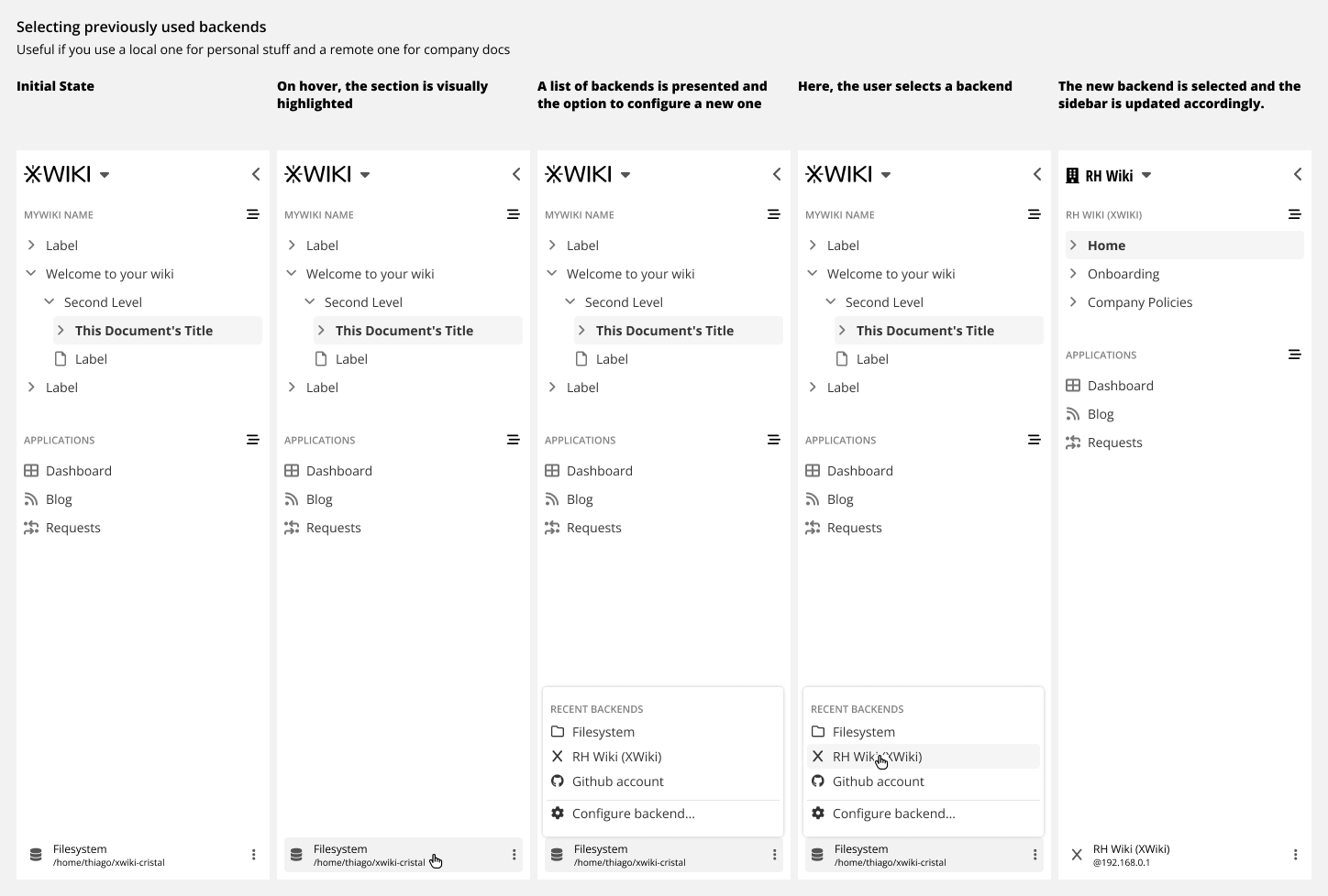
Other wikis

As most people stay most of the time in their team’s wiki, I think it’s okay if we place Other wikis somewhere not as central as other features.

The only problem intervenes when a team organizes knowledge based more on knowledge category and not on teams. This is the case in which most people in the company are from one team or the knoweldge base is used by only one team.

This translates into a lot of categories being used often so switching up from one wiki to another becomes a main necessity, unlike the case of switching from one team to another.

This implies the need of moving Other wikis from the bottom of the page to somewhere more easily accessible, maybe as collapsable megamenu that can be opened from the header.

There shouldn’t be a “All wikis”. Their number will be probably very small and people will want to see all of them or just collapse the menu.

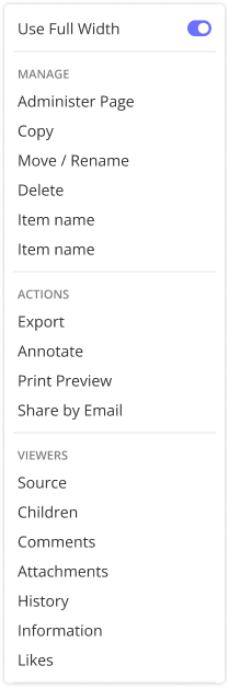
Attachements, Comments & others

I love that they get opened in the right side. I found it great when Nextcloud did it, I find it great now. Really good idea!

I think the details under the title (Attachements, Comments, Versions) could be summarized with icons, but accessibility wise, not sure if it’s ideal. They’d also need to be at least 24x24px so I think they’d be a bit distracting below the title. Maybe they could be on the side, verticaly arranged.

I also agree that versions are not as important to be seen right away, they could be hidden under the three dots.

I’m also curious about the placement of tags (if you’ll move them up or leave them at the bottom as they are now).

Some ideas

I’ve applied most of my points on two mockups:

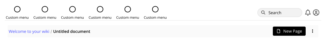
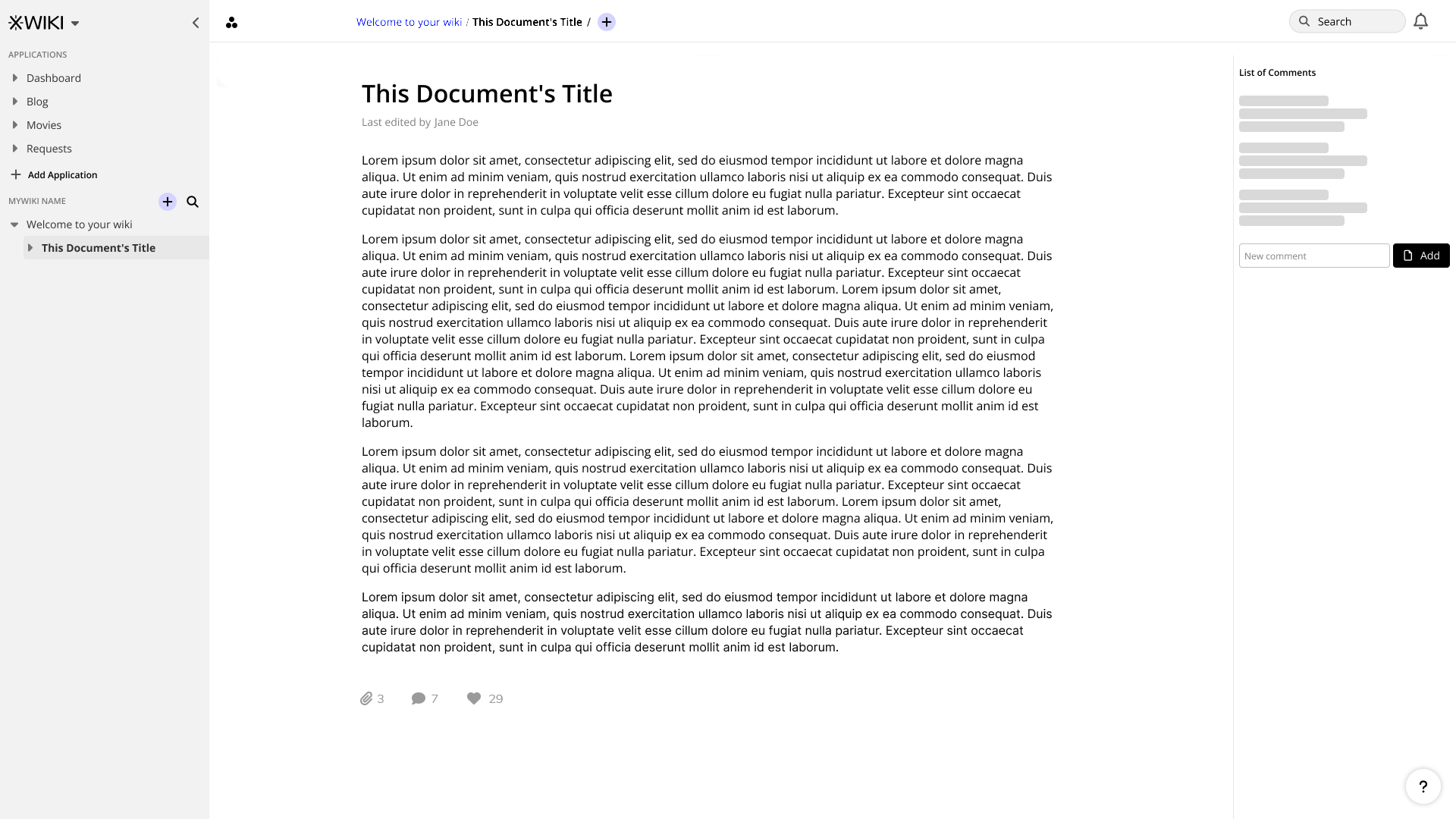
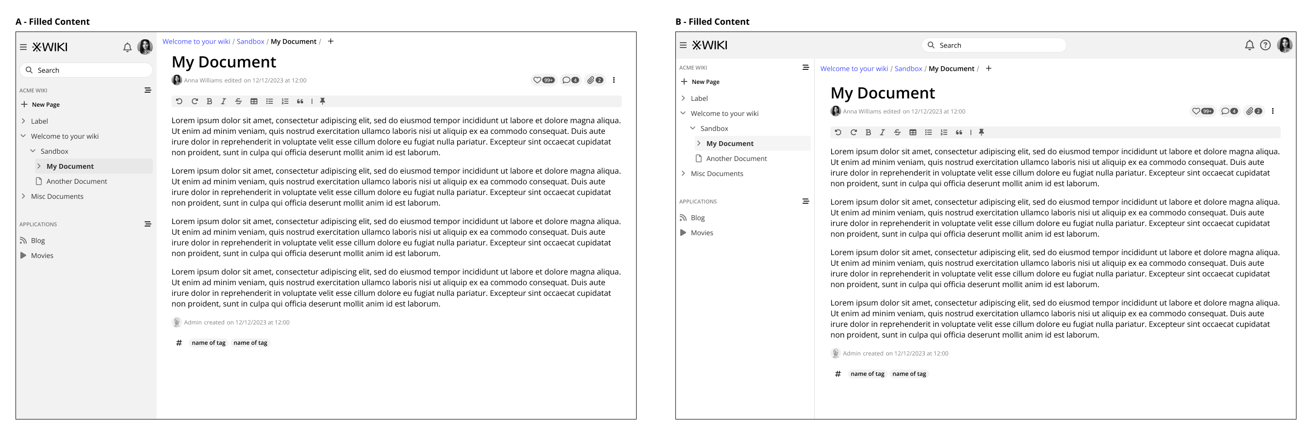
The following version is the case in which the user would choose to have the breadcrumb on the header and the comments, attachments and likes would go at the bottom. The 3 dots at the left of the breadcrumb would open the subwikis menu. There is a different placement for the New page button in the header and in the sidebar. There is a new search icon in the sidebar.

1

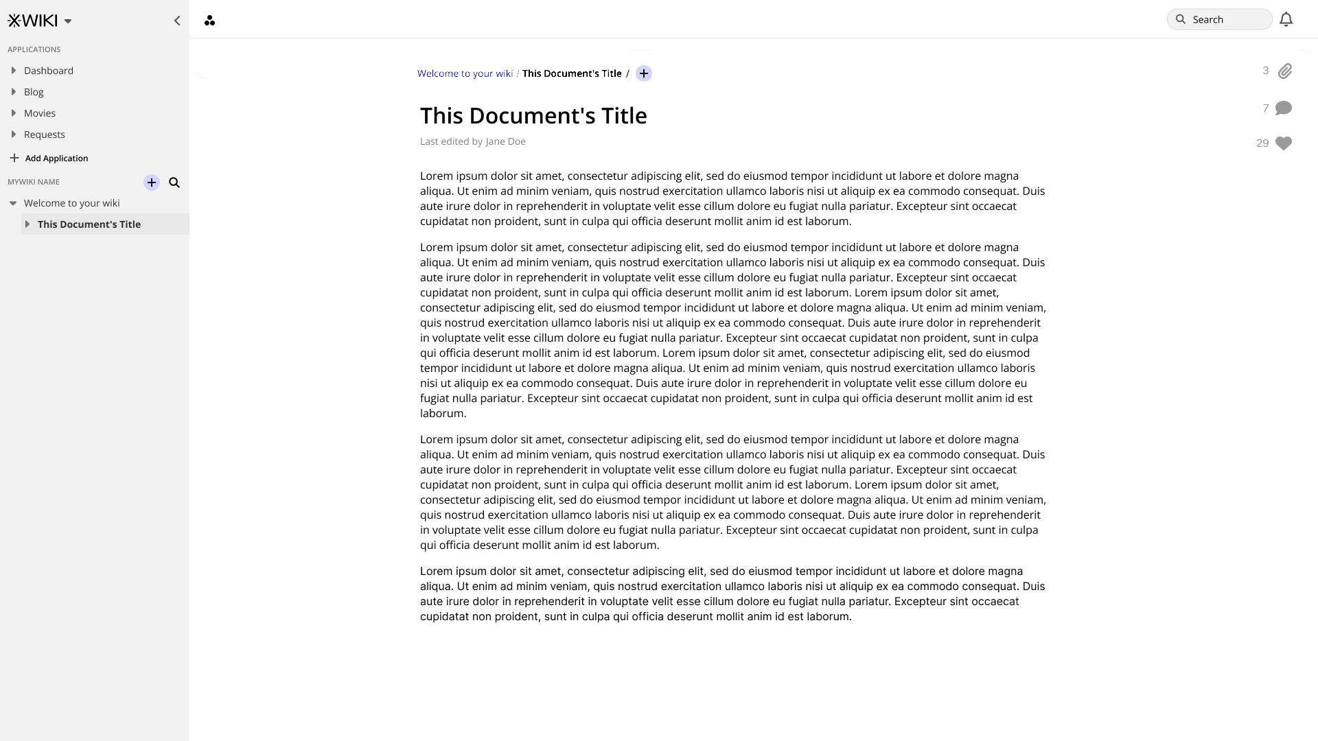
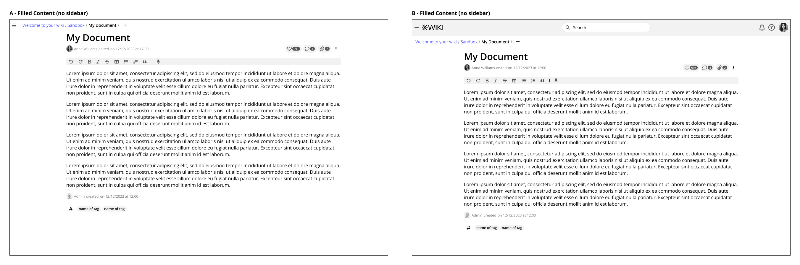
The following version is pretty close to the previous one, but I’ve placed the comments, attachements, likes on the right side and left the header with no breadcrumb.

2

Hope what I’ve wrote is helpful.
Very nice work, excited to see what you’ll do next! :star_struck:

Adina

1 Like

Thank you all who replied up to this point. I will update the wireframes here shortly based on feedback from you and also an internal meeting that we had.

Hi @tkrieck Thanks for this proposal and for the work done!

Some thoughts below.

I’d like to discuss the process of defining a UI and how it’s approached.

Since:

  • we’re designing a second system, we need to take into account the knowledge we’ve accumulated into building the first system.
  • we want that UI to become the XWiki UI in the future

I’m thus proposing that we list all features that we currently have in XWiki’s UI and make sure that we have a place to display them in Cristal’s UI in the future. I feel we need to plan for them now and not later since pushing that to later will result in having to redo portions of the UI (as I doubt that we’ll want to drop features).

For example:

  • Liking a page
  • Custom panels (right panels and panels layout?)
    • We wanted to allow right panels and this is why in XS we didn’t put info panels on the right side for ex
  • Editing a page (couldn’t see it in your screenshots, is it because the idea i
  • Changing the syntax of a page
  • etc.

Do we agree about this approach?

Do you have a full list somewhere to make sure you’re finding a UI location for each feature and not missing any?

Also, it’s important to start thinking about UIXP (ie extensible zones that can be contributed to by customizations). For example, a horizontal menu (as on xwiki.org)

I think we need to agree on terminology. For me these are not just data sources but back ends and they can come along with various services (not just a storage service - for example XWiki comes with a full-fledged Rendering service).

I was not aware that we wanted to allow for on-the-fly backend switch. Now I don’t think it’s different from any of the hundreds of other configuration options we will have (and that we have in XWiki), so we need an Admin UI for changing the configs in general, and not just for this.

I don’t consider changing the backend on the fly a key aspect of Cristal. It’s a feature that won’t be used much IMO and I don’t think it needs to be a special case.

Note that switching backend is the same as selecting a new wiki since the content will change. It also raises questions of sync if you have made local changes and before they’re synced, the user changes the backend used. We need to make sure that the local changes are not synced in this case. Not a UI issue per see but wanted to raise it.

I find it confusing for users to have 2 create buttons. We brainstormed a lot about the location of the create button of XWiki in the past (and moved it several times). Could be interesting to review these design decisions.

I think we need something more generic to allow setting various things: language, syntax, whether the page is hidden, apply a template, etc (even see xobjects, sheets, etc). Ofc these should be hidden for normal users but shown somewhere for advanced users.

BTW, in your UIs, you don’t differentiate simple users vs advanced users. It’s good if we dont’ have differences but alas I don’t believe it’s possible. I think you don’t have differences now simply because you’re still missing a lof of UI features (see above).

Thanks!

Hey @vmassol thanks for the feedback.

Agreed, that is something I am trying to do on the roadmap for this month, linking the wireframes to user stories already defined on Jiras. I just don’t think everything is mapped yet.

Absolutely. A lot of work is still needed, especially if we are going to have 100% feature parity with XS.

I am using the jiras here for features to work on initially.

About UIXP, is a concept I need to get acquainted on, it is a new thing for me.

The two buttons are proposed because is an interface paradigm used extensively on apps like Notion. But as @amilica said, now they are perhaps grabbing too much attention and could be de-emphasized a little bit OR maintain the approach from XS, with only one button.

Agreed, the interface can be generic, but calling the interface could be done with discriminate options, so the user can see that they are available but not needed right away, and it’s fast to access them. The important thing I tried to convey in the wireframes was to provide a way for a regular user to simply start typing information without the need to go through a dialog or separate page with lots of options and features. =)

Indeed, if possible I would like to avoid it, but let’s see how we progress.

Thanks!

Hello everyone, today I would like to bring you some updates regarding the sidebar and selection of backends on Cristal.

Note: My next steps will be on the more info, attachments, comments sections of the document. So here they all are unchanged from last version.

After your feedback, I did a new version with less emphasis on the backend, but still keeping it visible. Here we have much more emphasis on sub-wikis.

sidebar

Also, while the mouse is outside the sidebar area a lot of the controls will be hidden, only being shown when the mouse is over the sidebar. To keep the interface cleaner, the buttons for “New page” and “Indexes” are icons only and have tooltips on mouse over.

Sidebar icons

Selecting previously used backends.

I still think that selecting a backend should be easily done, without going to the admin section. My reasoning for this is that the user could use a local file storage for personal stuff, while using an XWiki instance for company work.

This element is still present on the sidebar but always at the bottom, so always visible, but with less emphasis. I don’t know an appropriate number of backends that could be shown initially, but maybe we can cap them at 7. If the user has more than that, then we could show them as a separate list, perhaps as a dedicated dialog.

Selecting backend

Below, you can see this new version in context of the whole interface. There are other changes here and there. Like the new button as an icon only besides the current page on the breadcrumb (always visible, in this case), thanks for the idea @amilica.

Sorry I forgot to answer you sooner. This was done this way because while the content of the page might be small, the breadcrumb can be a lot bigger and longer (and probably will). Also, you’ll have the ability to make the page 100% of the width, aligning both elements.

Indeed it is not the focus right now, but it will be soon enough. Thanks for the read, I will keep this in mind.

So that’s it for me for now. I hope to be back soon with more changes and new content.

Thank you for reading!

How will the user be able to discover these features without using the mouse. E.g.:

  • when navigating with the keyboard
  • or when using a touch screen?

Thanks,
Marius

Good points, on navigation with keyboard the :hover effects would be triggered by :focus. On touch devices, everything will be visible right from the start.

Thanks for the new proposal. Now honestly I’m a bit lost: the subwiki menu opens when you click on the arrow next to the XWiki logo? Or is it when you click on the “+” button next to “Mywiki name”?

Sorry, I tried to cram too much stuff into one screenshot. The subwiki navigation is accessed via the arrow next to the logo.

Ok, so I don’t really understand why it’s there then :slight_smile: 
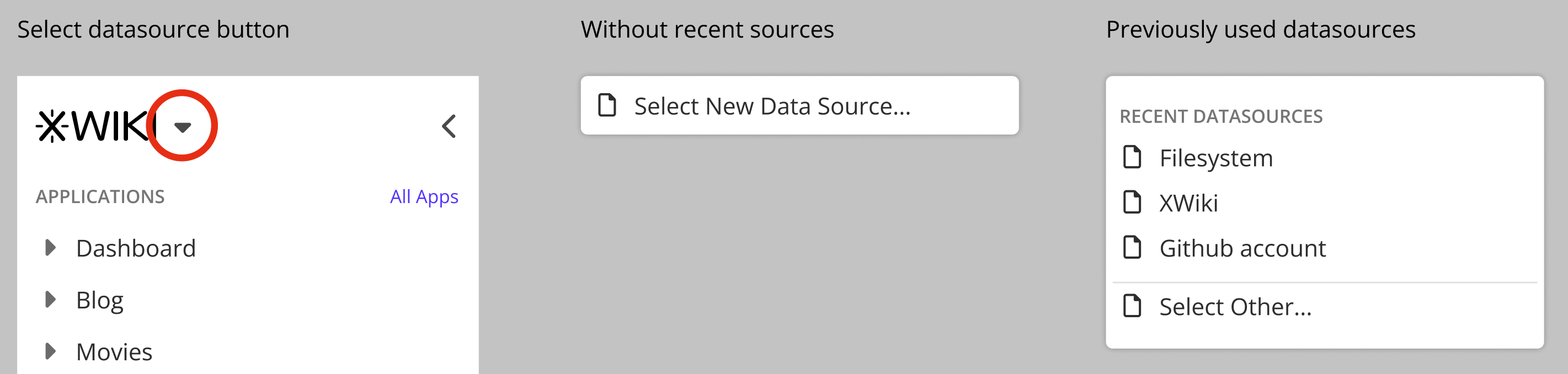
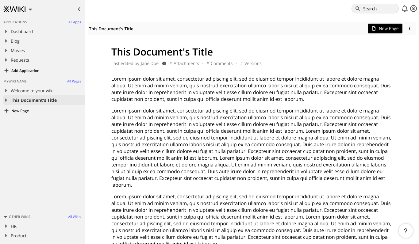
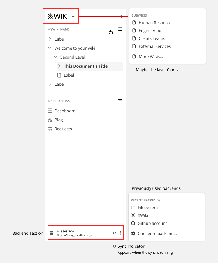
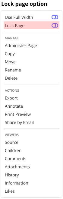
I mean: the XWiki logo doesn’t provide any info about the subwiki you’re currently in, so why a user would click on the arrow to switch the subwiki? I would have expected to see the subwiki name as the root hierarchy of pages and then to be able to switch from there.
So maybe it’s just the XWiki logo which is wrong in your screenshot?

Well, each subwiki can have its own logo, with the XWiki being the default one. That was my thought process positioning the menu there, but maybe we can have it next to the Wiki name, IDK.

Now that you mentioned it, with a bunch of subwikis and each without a logo defined, it could be a little odd to use this menu, the name below it would change but not the logo. I will do a couple of variants on this to explore a little more.

Hmmm note that there’s no logo explicitely attached to subwiki right now: a subwiki has only a name / description / owner and other technical stuff (see for example https://www.xwiki.org/xwiki/bin/view/WikiManager/), so technically speaking if we want to have a logo per wiki we’d need to add it in the descriptor.

Ah, thank you! This clears things up. I will redo this part then, no point keeping the menu up there.

Thanks for the insight!

Note that I talked to Thiago privately and mentioned that to me, the backend selection should not be immediately visible as 1) screen estate is expensive and we need a clean UI and only have the most important actions visible 2) changing the backend is not something that’s supposed to happen often at all (also, if you want to use another backend at the same time, you should use 2 browser tabs or 2 cristal electron apps, since that’s way more comfortable for not loosing your context). Thus the backend selection can be more hidden and shouldn’t be visible all the time.

2 Likes

Issue: Loading...

Hey everyone, I’m back with some updates to the Cristal interface.

To keep things more organized, here I will remain on the topic of general UI only and branch out other discussions to different topics. So, there’ll be one for sidebars, one for information tabs, tags, etc. I will update the links to them here as I go.

Other discussions:
Document Information Tabs
Synchronization visibility on Cristal
Flow - Moving documents on Cristal

After your feedback I redid two versions of the main UI, one more focused on Notion like navigation and another one more traditional to XWiki Standard. Both have the same features, and I did all my layouts taking both into consideration. But ideally going forward I need to focus on one.

From now on, Version A is Notion like (sidebar focused) and version B is XWiki like (header focused). I say “focused” because there’s where the global interaction will be, things like user menu, help, search, custom menus, etc.

Pros and cons of each:

Version A:

  • Pros
    • The interaction is fairly focused, all things global are here. Main navigation, user profile, search.
    • Being close to Notion layout, we gain points with someone who is used to that kind of app.
    • We gain a little bit of vertical space for the content of the document, especially true on mobile.
    • We can still allow customization of menu header and right sidebar
  • Cons
    • The sidebar can get convoluted, especially if someone wants to customize more panels there OR if we need to cram too many features on the same space.
    • Is different from XS Standard, so someone that is used to work on XS will feel the differences

Version B

  • Pros
    • We have more horizontal space for features, current and future;
    • Is close to XS and other sites, so there’s less adaptation on part of our users.
    • The logo (branding) is always visible, even with the sidebar hidden
    • More space is available for customization on the sidebar
  • Cons
    • Main interaction is more scattered, with navigation on the left side and global features on the top right
    • We lose a little bit of vertical space
    • Mobile requires more effort to reposition all the elements

With these reasons set, we can move on to the wireframes properly.

Notes:

  • All screens are on a 1280x800 resolution;
  • Different from XS the hamburger menu here open and close the left sidebar, not a floating drawer; We can still have the drawer it in the future if we deem necessary, but then the sidebar icon will need to be changed.

Blueprint of both versions.
Here we have a view of them without content, to better focus on the differences.

main-layout options

With content and detailing on other areas
filled-content

Left sidebar hidden
no sidebar

Mobile View
mobile

General Feature Set

Adding pages

After your feedback, I changed a little bit the buttons for adding a new page, so there’s less emphasis on them now. But I still maintained two buttons, this is because if the left sidebar is closed we can still have one on the breadcrumb.

For first time users, maybe some exploration of the interface will be necessary. But after the initial contact, the user will learn the standard ways of adding pages and the interaction becomes more fluid.

add page

@amilica I did a version with the rounded add ( + ) on the breadcrumb, but I didn’t like too much the aesthetics of it, maybe I am biased :sweat_smile:
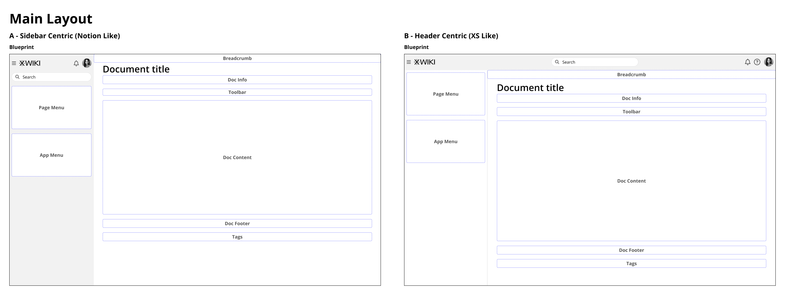
. But I agree, is a little more visible, I will post it below so others can have their opinion as well.
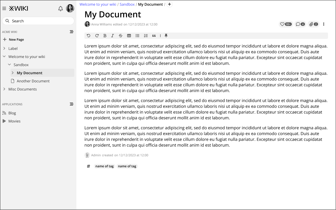
Also, as you can see, I still maintained the like, comments and attachment on the horizontal. I did because in large monitor, on your proposal, these icons could be situated very far away from the document. But I will explain a little bit better in the topic about the right sidebar.

Rounded Add button:
rounded add

Editing pages

For now, the main focus of Cristal is to have an always editing, real-time collaboration aspect, so there’s no need for an “Edit” button. But a lock feature should be available via the page menu for sensitive pages.

lock

And lastly on the general UI scope, the main navigation.

Navigating to other wikis and indexes.

After the points mentioned by @surli and @mflorea I simplified the page and Wiki menu quite a bit. Now they are only accessed on the sections of the sidebar, not on the XWiki logo anymore. The same works for the application menu. Also, all buttons are always visible.

sidebar menus

Thanks everyone for reading! See you next time

AFAICS the only difference is that in option A you’ve moved the search + top right menu inside the left sidebar.

One thing I don’t see on your blueprints for option A is that help icon that we see on option B. Where has it gone?

This raises a more general question: Right now in XS, the top right menu provides a UIXP and thus it’s possible to have more menu entries than the ones shown in your blueprint. The available space in option A is quite limited. Imagine that we have 5 icons to display, how would they display in option A?

This raises the question of the Login / Register icons/entries from the menu that are being discussed in some other forum post for XS. How would they be displayed in option A?

Second point, for the mobile view, you haven’t shown what happens when you click the hamburger icon. Does it display the sidebar before the content or after? Let me ask it another way: how easy is it to search for something in option A on mobile?

Globally, I think I have a small preference for option A. Vertical space is scarce and it’s good to have more content displayed.

There are not the same AFAICS. The one in the sidebar is a global one, that is when you click it, you’ll need to specify where to create the page, while the one in the breadcrumb is already situated.

I personally don’t like that much the global one in the sidebar as it’s a bit anti wiki (not being situated which may push users to put lots of stuff at the root) and I think I’d prefer the ability to have a + button inside the navigation tree, on each tree node. Is the planned?

hmm for me that’s part of the Rights to give to a page, and thus contained inside Administer Page.

sounds good to me!

Thanks @tkrieck I think the UI you’re proposing looks very nice and I like it.

I’m curious to know more about this :wink:

BTW, with version A, the search input becomes a Panel (and thus becomes customizable by the user).