Document Information Tabs

Hey everyone, like i mentioned on the topic Initial Wireframing of Cristal I am branching out some key concepts of the layout to keep discussion more focused and organized.

Issue: Loading...

This one will be about the document info tabs.

These guys on XS:
Screenshot 2024-02-22 at 14.30.04

Before starting properly, i would like to clarify some concepts:

  • Permanent sidebar: the one that an Admin sets for the wiki, can be customized like XS
  • Info tabs sidebar (or info panel): A transient sidebar that appear over the permanent one. It should close on user action (X button) or document navigation.
  • Info bar: the one below the document title, interaction here can make the info sidebar to appear. Clicking the comments button for example.

Now, on for the proposal itself

Note: All screens are on a res of 1280x800
Note 2: Here I am using version A of the general layout explained better here. But the same concepts works for both of them.


For Cristal I would like to propose them on a sidebar instead of tabs beneath the document, for the following reasons:

  • Easier to see if a long document have comments or attachments;
  • Easier to correlate pieces of info in the document with a comment or attachment;
  • Better use of space on desktops, as they are generally wider than taller. On mobile, we can still show them beneath the document if necessary with some CSS rules.

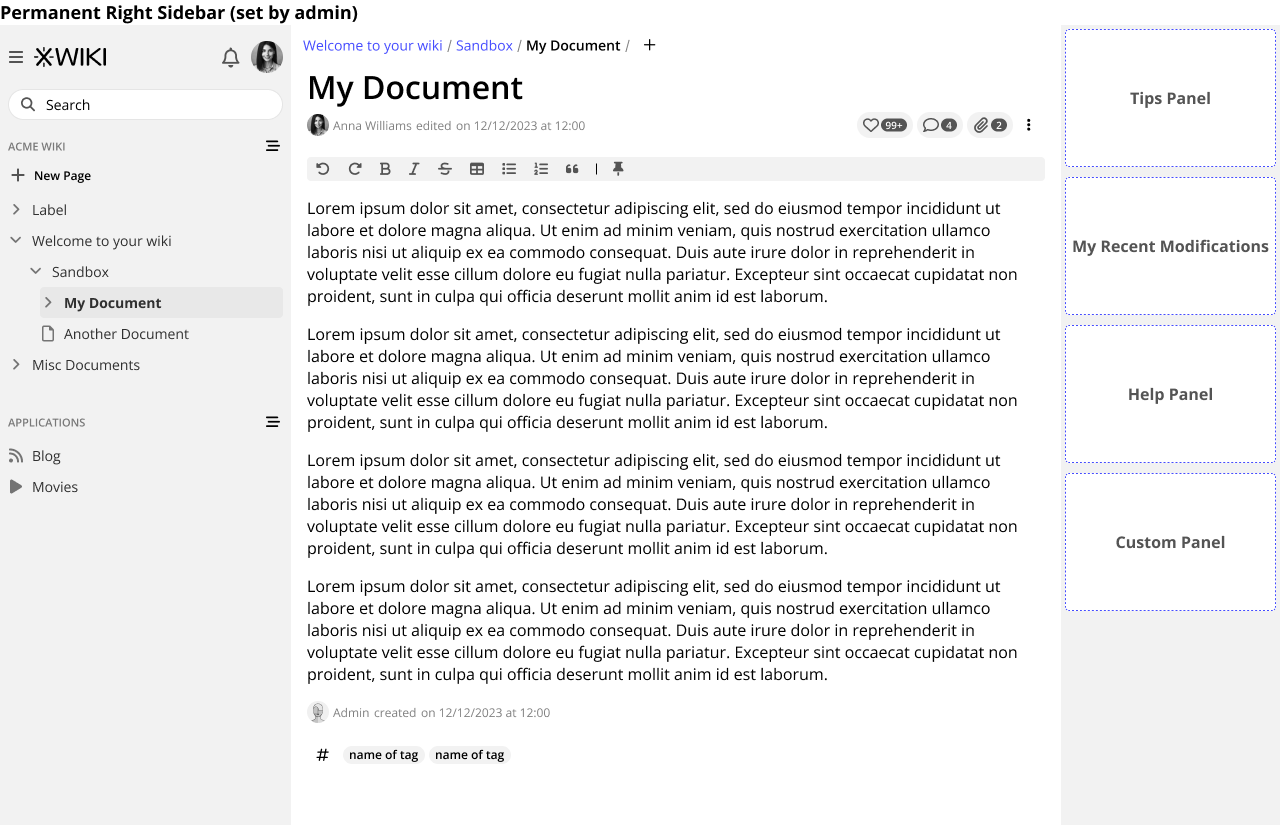
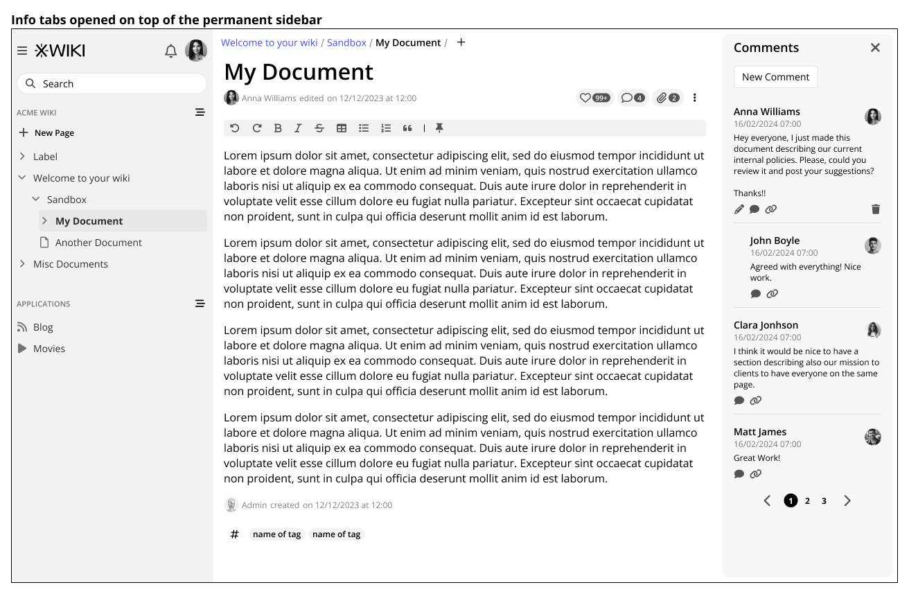
Having said that, I believe that this solution should not negate a general right sidebar should our users have them on, as you can see in the wireframe below:

Example of permanent sidebar

right-sidebar

Info bar
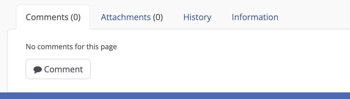
The info bar will reside beneath the document title this will make a general area for basic info about the document. Things like “editing status”, “likes”, “comments”, “attachments” and so on.

Screenshot 2024-02-22 at 14.50.07

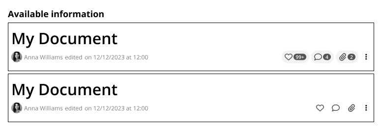
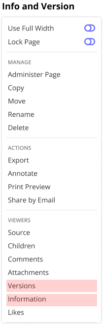
Here we can see visible at all times: Edit info (text + avatar), Likes (icon + counter), Comments (icon + counter) and attachments (icon + counter). Versions (history) and Info tabs are in the page menu, as they are less likely to be used on a day-to-day basis. Also, one more reason to hide them is that they would not have counters the same way we have with the other three buttons.

Below you can see how the buttons will behave when populated and when clean
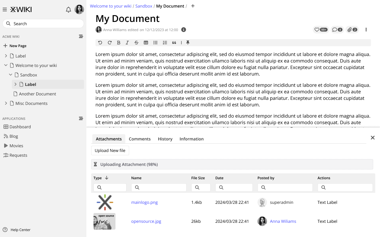
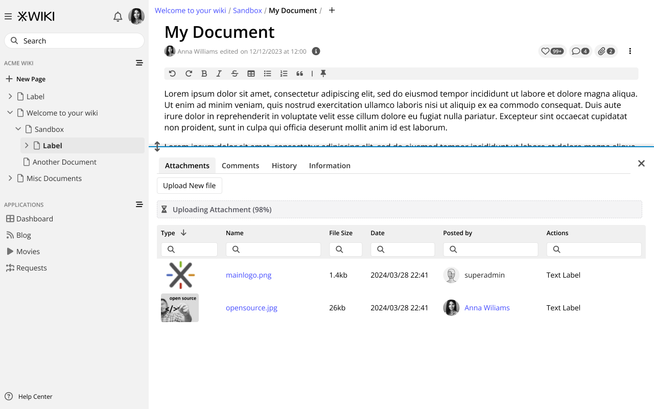
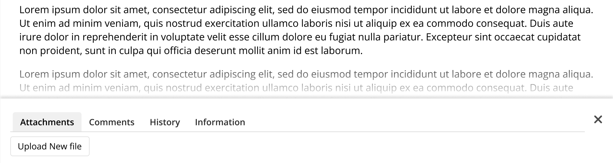
document tabs

The Info Panels

Clicking on the comments and attachment opens the sidebar. This sidebar will open on top of the permanent one. Closing the info tab sidebar is done with the X at the top, then the permanent sidebar should be visible again.

info tabs opened

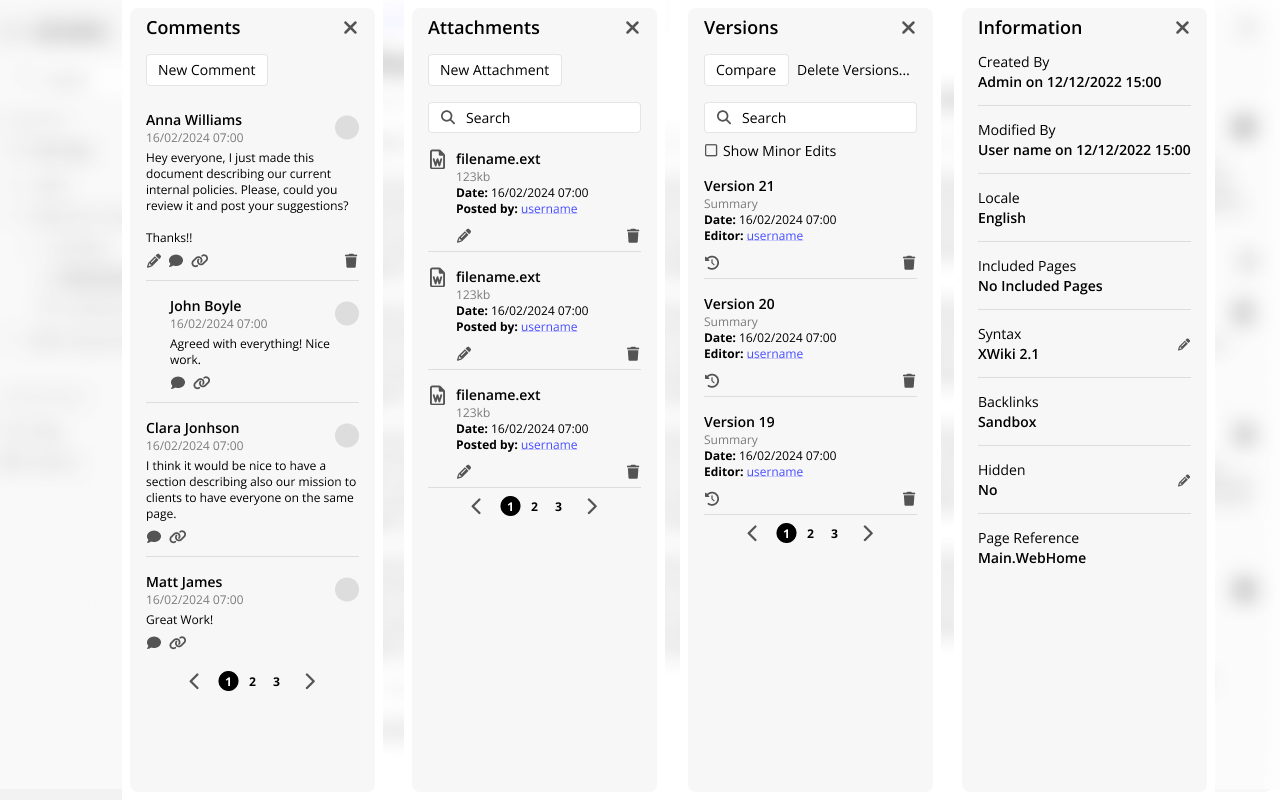
Below you can see different info panels opened, they act exactly like tabs, so only one of them is visible at a given time. Versions and Information are accessible only via the page menu.

different tabs

Page menu with Information and Versions highlighted
info-version

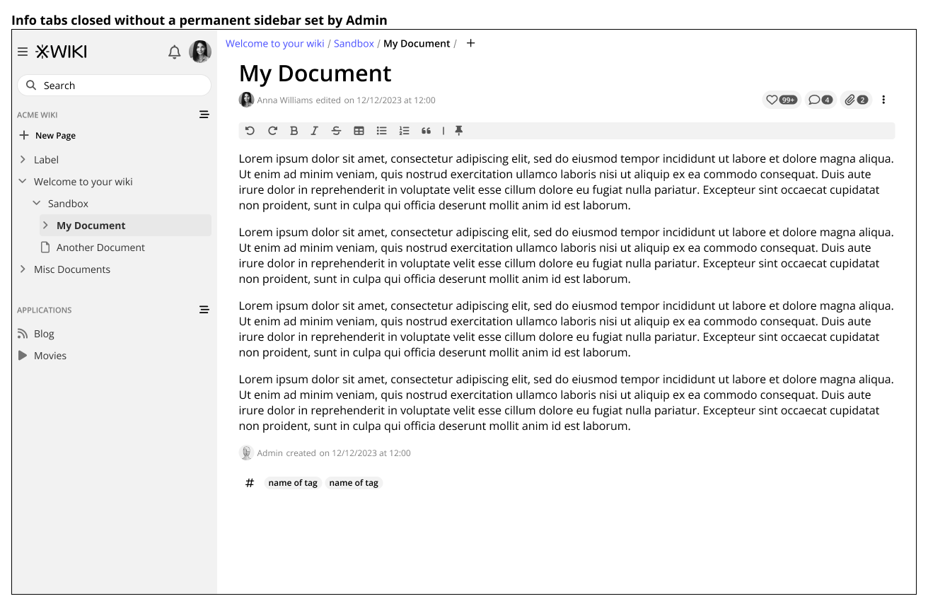
When the Admin has not set a permanent right bar the info panel will open and close pushing the contents of the document.

info tabs closed

Thank you all for reading, and please tell me, what do you think?

Hi,

thanks for working on this. This is quite a change compared to current XS UI! So my understanding is that, contrary to what we have currently in XS UI, the tabs wouldn’t be always visible but they would be displayed only if the related contextual information are clicked on (e.g. the number of comments icon) and when going to the 3 dots Page menu, is that right?

For comments it’s pretty clear to me what’s the direct access (without going to Page menu). For the history it’s a bit less clear: you display it when a user clicks on the dates of modification / creation of the page? And for information I just don’t understand when it’s displayed: only by going to the Page menu? I’ve the feeling that Information should be easily accessed without needing to go there, but maybe I’m wrong.

Now the big question is: how do you deal with extension point on that part? For example Change Request injects a new tab in XS for displaying a live data of all CR created for a dedicated page, it’s quite an important feature and it would be a pity to lose that in Cristal. Would that be only available from the Page menu? Or would that be possible to make those panels always appearing like we use to have tabs?

Hi @surli

Yeah, I know it’s a big change and that’s why I would like to have this discussions now rather than later. Of course, if the changes are not well received, we can always fall back to the default of XS.

My particular pet peeve with the way it is on XS today is that in long documents, this whole section is not so discoverable by the user. So if we go to the default and do it like it is in XS today I would at least like to see a summary at the top of the page like in my version, but instead of opening a sidebar the user would be sent to the bottom of the page via an anchor link. In my opinion, this would be a nice compromise between the two ways of work.

No, initially these options would only be accessed through the page menu. But now that you’ve mentioned, a link on the “modified by” line would be actually quite nice.

In my opinion, if the extension provides an icon, we can show it with the rest of the icons AND have a menu option as well.

CR 1

If it does not have an icon, we have a few paths:

A - Show the name of the extension along with the icons, but this would make the interface less clean probably breaking the line with a lot of extensions here. Not a nice option IMO.
CR 2

B - Show it only on the menu page, but this would make the extension less likely to be found.

C - Show exactly how it is on XS today, with a tab below the document. This ensures we have maximum compatibility with current extensions in this area. However, this would separate the interaction pattern of likes, attachments and comments from the extensions. I don’t see it as a big problem since these are not always related with each other.

I just checked, right now the UIX doesn’t ask for an icon (see the parameters in https://www.xwiki.org/xwiki/bin/view/Documentation/DevGuide/ExtensionPoint/Document%20Docextra/) so we need a fallback without the icon.

I agree, maybe there’s a middle ground to find, like only displaying it when an itemnumber is provided?

what about that?

Sorry, I missed that part. The info tab is important, but I think it’s mostly static information, meaning it’s not always changing (please correct me if I am wrong). Even in XS today it is a two step process as I have to:
1 - scroll to the bottom;
2 - click the info tab;

OR

1 - Click the page menu;
2 - Click the information menu option;

If needed, we can have a little “i” icon at the beginning as well. Like below:
info

Here I grouped the icon with the edit info as these two are related.

Yes it’s mostly static info.

ok, to be discussed, I’m not sure to be a big fan for having this icon. It could be ok to always have to use the Page menu to access it: honestly I’m mostly using the info tab to copy page references and when I need to check a specific information, so it’s not happening that often.

Now I’m thinking about something: do you think it could be possible to make the different panels “sticky” for users when they want it to be. e.g. I’m performing a specific task in the wiki where I need to consult often the Information panel of pages: so I’d like to display the information panel and to not have each time to go to Page menu and click on Information. Ideally I’d like to display it once and click on an icon so that it remains displayed if I browse to another page. wdyt?

Funnily enough, it was something that crossed my mind when I was replying to you previously, seeing how you need for your tasks. On principle, yes I believe it would be a nice feature, especially for comments (a user reviewing lots of pages for ex. or, like you said, checking the info).

Thinking out loud now, this would interfere a lot with the permanent sidebar, the one that could be customized by the Admin. But as the info tabs are user driven, meaning the user has to open them, it is a choice that someone is making not to see the default sidebar and see the info tab instead, and the user can always close it and return to the default state.

Interesting, I think this is something that I can at least do a proper mockup with a flow. I will try to have one next week!

1 Like

Hi @tkrieck,

I like the top icons. I will enjoy not going all the way down on long pages and I won’t miss attachments so regularly as I do now.

For my use, I prefer having a long list of versions on one line, this is easier to find scroll visually. As long as we still have the history viewer, it’s not a problem. Maybe a link to the viewer should be provided in the tab.

About the extension point, maybe it could be done the Firefox way with its extension button. This would still hide the extension, but it would be separated from the page menu.

It’s also used when changing the language and editing the content in another language, that’s a bigger use case.

I think we have a problem of horizontal space, making the content of the docextra tabs have a too small area. For example the LD for the History tabs is way too small to fix, and so is the CR tab.

We have several options:

  • Do as now, i.e. when using the Page menu to click on a viewer, it opens a full page for it.
  • Let the “tab” decide if it should open on the right side or as a full page
  • Open a lightbox on top of the current page
  • Something else?

Sounds a good idea to me too (in addition to the page menu entry).

We just an UIXP with a parameter to decide if the viewer is displayed as an icon or only inside the page menu. It’s then up to the UIX to decide. The icon would be passed as a parameter too.

Small note: we’ll need to make sure that the UI scales/displays well if there are lots of UIXs displayed as an icon.

Side note that Cristal will most likely not be 100% compatible with XS. We’ll need to define what gets broken and how extensions will need to be updated. For example, Cristal will most likely have its own Extension system/manager and any current extension that brings changes to the UI might need to be adapted to continue working.

That being said, we need to try to preserve the maximum of compatibility ofc. And here it’s possible.

Note that the info tab is used not only in view mode but also in edit mode in XS, i.e it’s possible to make changes when editing a document. We could drop that requirement but it’s something to think about.

The right panels could be important and need to be visible. Couldn’t we have 2 right sidebars open at the same time (right panels + viewers)? But we also need to solve the issue I mentioned above about not having enough horizontal space fo the viewers sidebar first.

Thanks

Hi,

I’m not fond of displaying the info tabs on the right sidebar, on top of the permanent sidebar. The main problem is the limited horizontal space, as @vmassol pointed out, but also the fact that there may be use cases where you need to view both the permanent sidebar and the info tabs, and toggling the info sidebar multiple times would be a pain.

Have you taken into account displaying the info tabs on demand at the bottom of the window (not page), in a sticky pane, that the user can close, resize vertically or maximize? It would be similar to the sticky pane you get at the bottom of the window when replying to a post on this forum.

If you decide to go with the right sidebar, then you’ll need to have a way to resize or “maximize” the info sidebar, but then the issue is that you may need different styling for the slim sidebar and the resized/maximized sidebar (responsiveness). You don’t have this problem with the sticky bottom pane, because it would be resizable only vertically, without affecting the layout.

Thanks,
Marius

Thank you all who replied, it’s always good to see different use cases and features for exploration.

In fact, I did not, but I do think it’s an idea worth exploring. I will do some work on this, thank you!

I will do some mockups using @mflorea idea of using the sticky panel on the bottom of the window. It could fix the issue of having the content too visually detached from the tabs while not introducing more problems like the horizontal space.