Hello everybody!  Let’s discuss the way users change or upload logos.
- Issue #1: Users find it hard to identify from where to change the logo.
- Proposal #1: Change the location of this UI to make it easier to reach.
- Issue #2: We do not have a global UI for changing skin logos and theme logos.
- Proposal #2: Have a single source of truth for logos (where you can upload, view, change, edit)
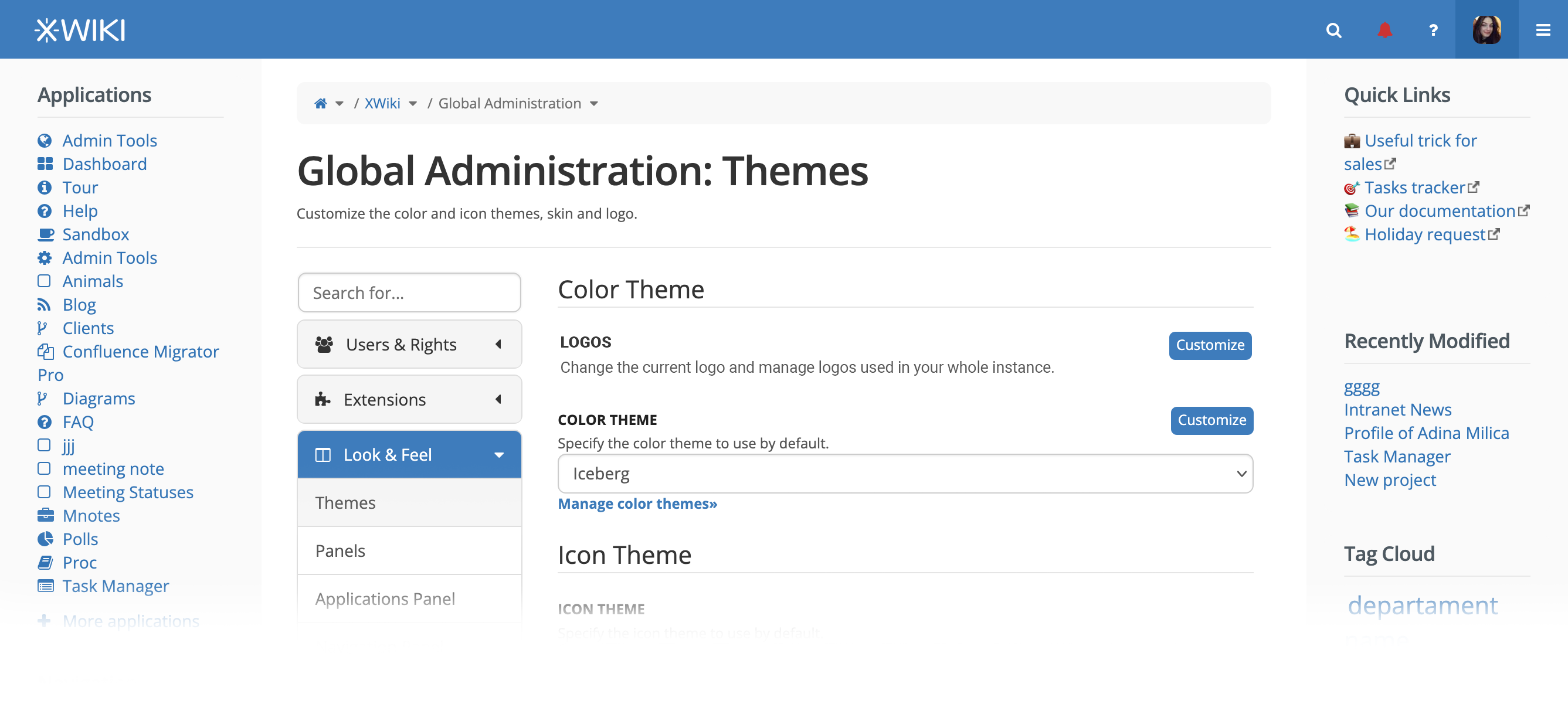
What we currently have
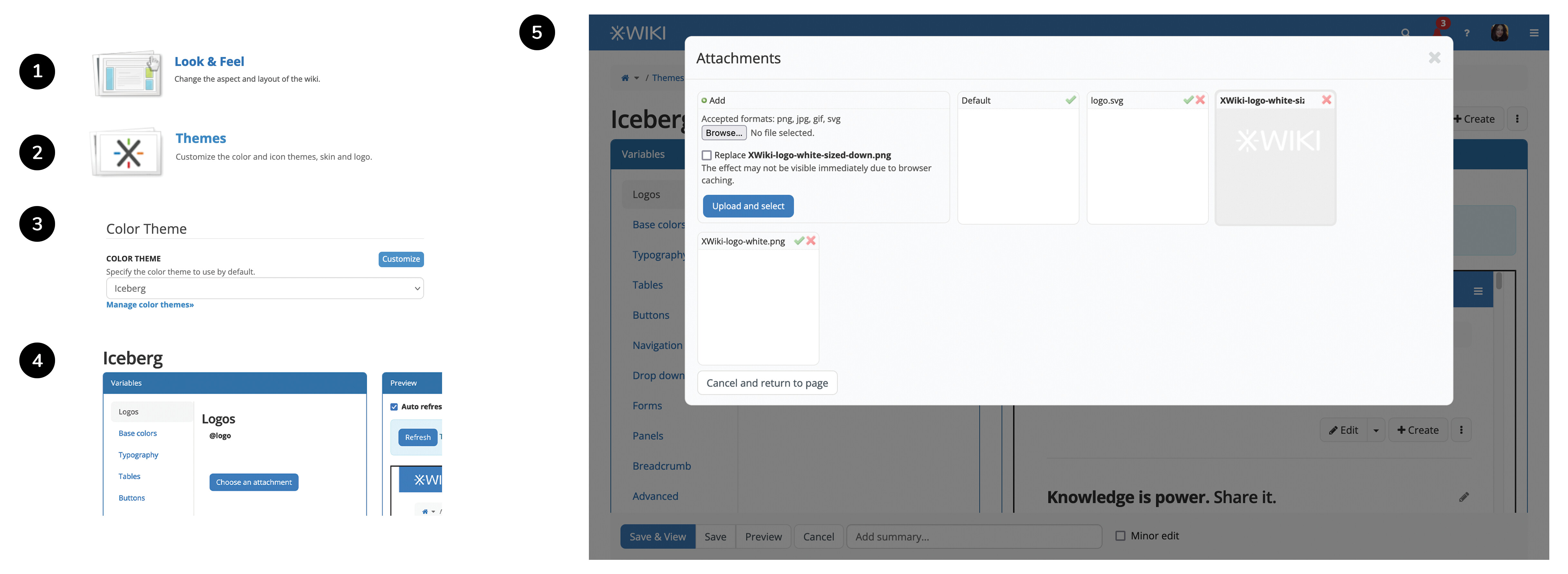
The user’s flow to get to change a logo in xwiki is:
Global Admin > 1) Look & Feel > 2) Themes > 3) Customize theme > 4) Choose an attachment > 5) Actions around logo (at least 6 clicks)
From our previous UI/UX designer Ecaterina’s usabilty session:
Average time for “Change Logo” task, for beginner users, during our Scenario #6 usability session was 7 minutes. This period is very high, especially for such a common task. This length causes abandonment and frustration.
What we should have
A logo space where each Logo added has different properties.
These properties reflect where the logo should be used (which skins, which themes, if it’s a default logo or not).
From where to enter the logo management page
The logo management UI could be entered from:
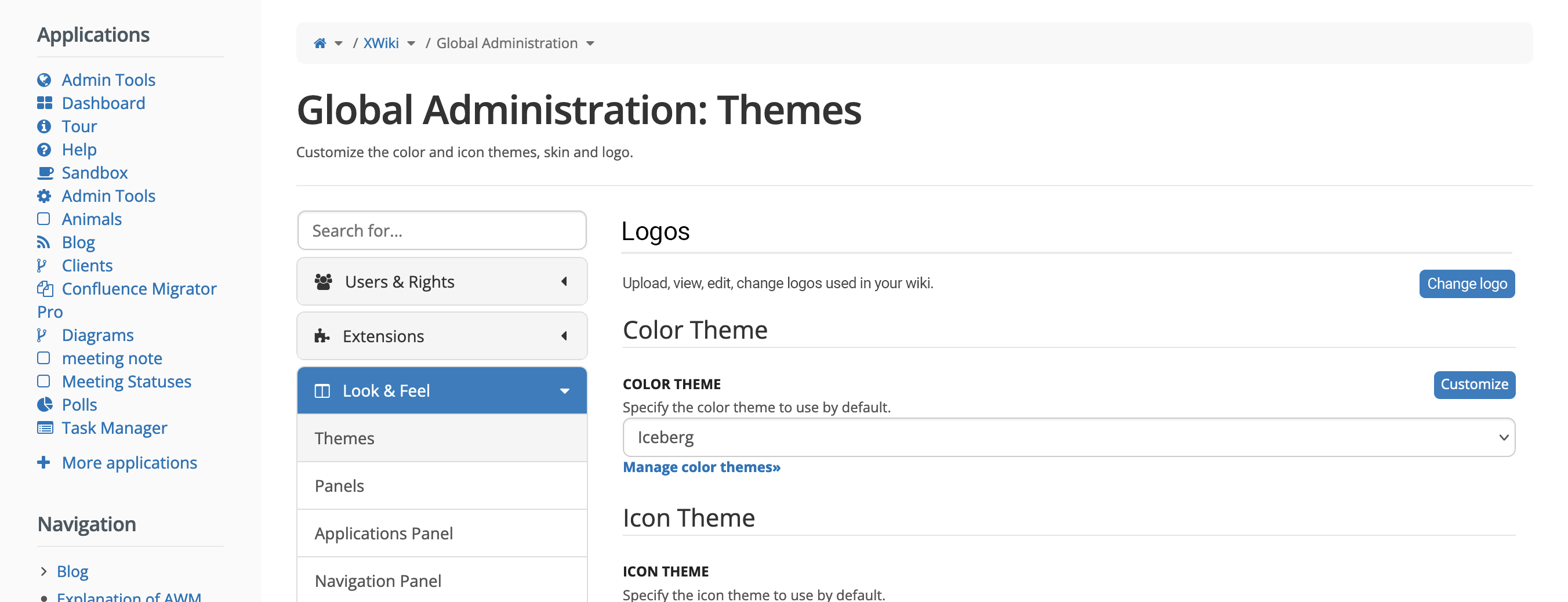
- the Themes section, right at the beginning before customizing themes.
- Pro: less changes to documentation
- Con: less improvement - this version’s journey has more steps than version 2 and its success depends on the user’s belief that in Themes he will find the functionality of changing the logo. (GA > Look & Feel > Themes> Change logo)
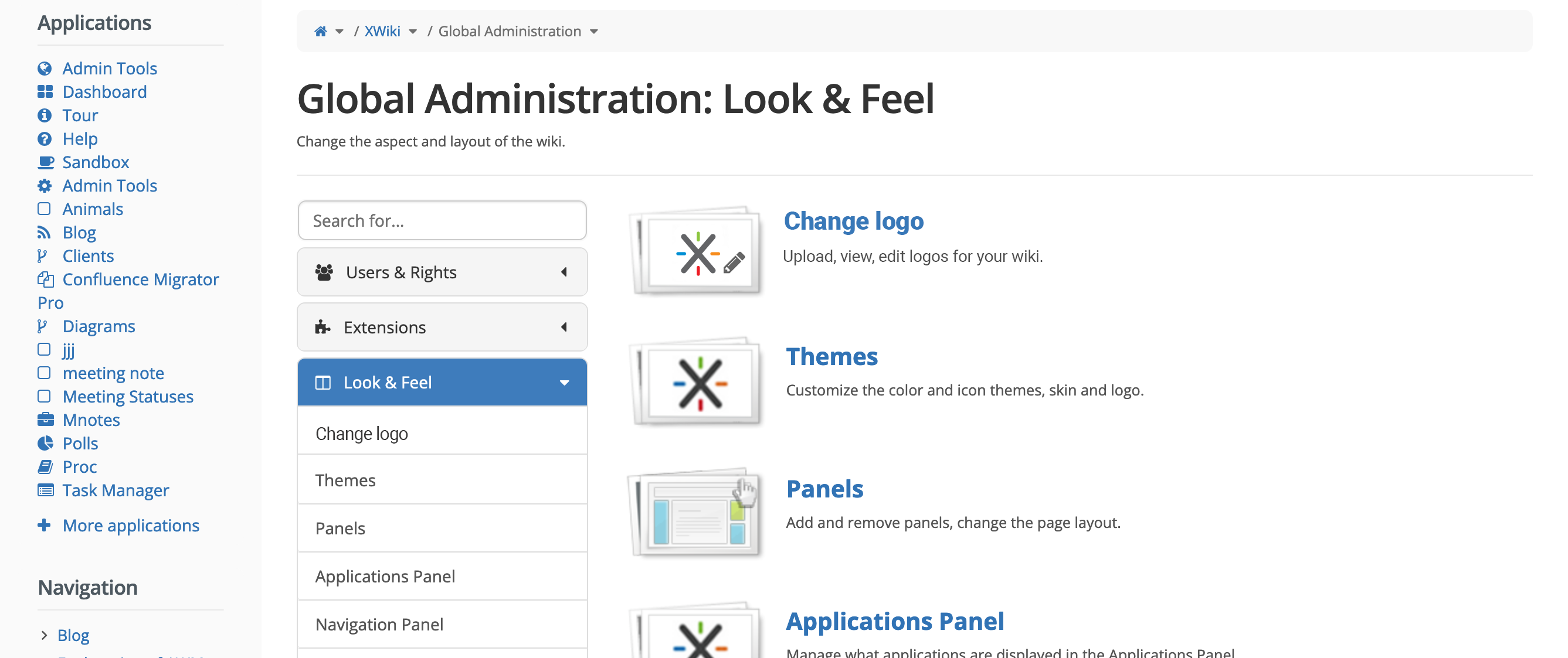
- a sub-section of Look and feel, before Themes
- Pro: simplifies the journey (3 clicks: GA > Look & Feel > Change logo)
- Con: more changes to documentation
Version 1
Version 2
In this version, we’d have a new section in Look & feel, named Change logo.
Clicking the Change logo link will lead to the logo management page presented in the next section.
In this version, the logo management page will be part of the Change logo section, NOT the Themes section.
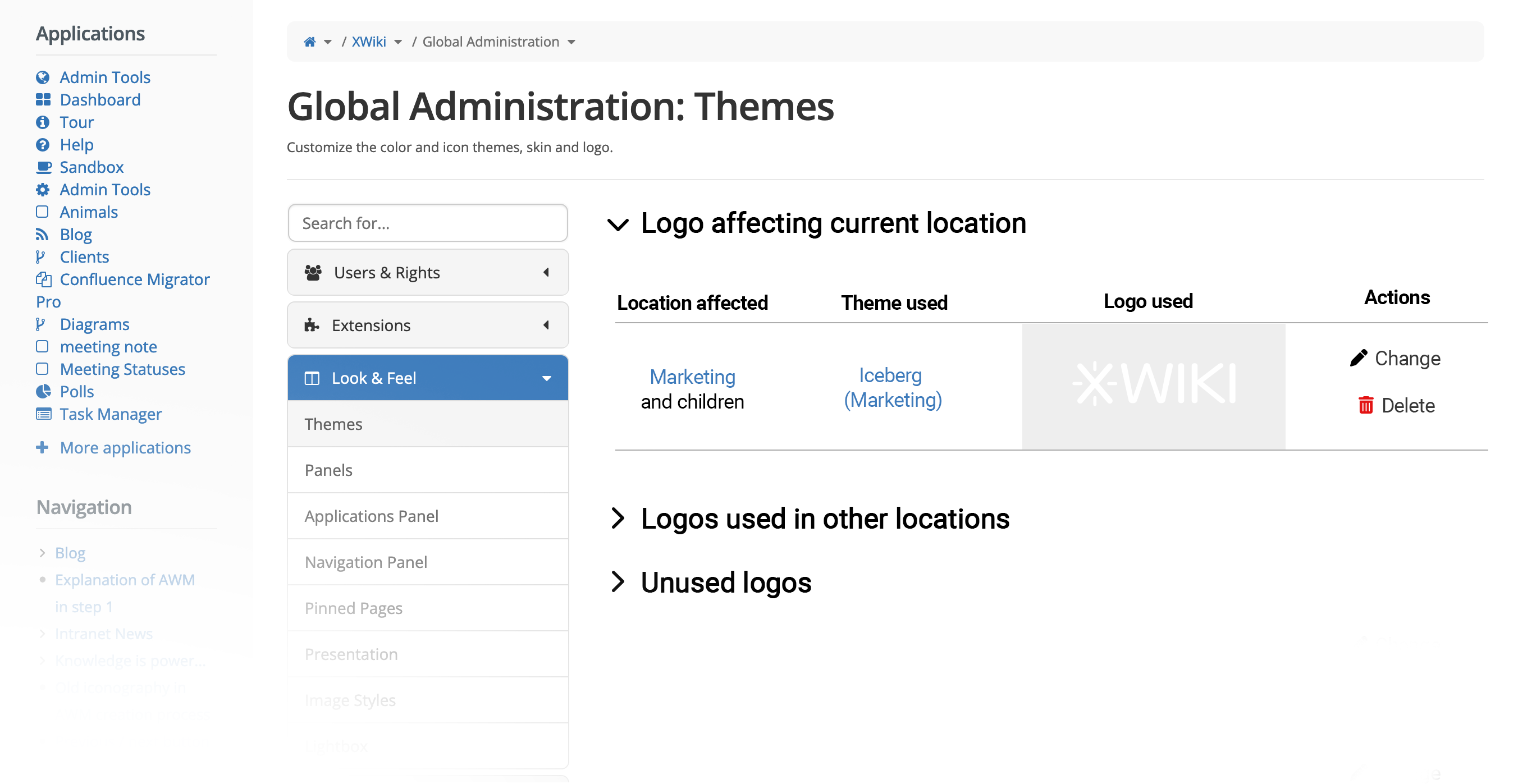
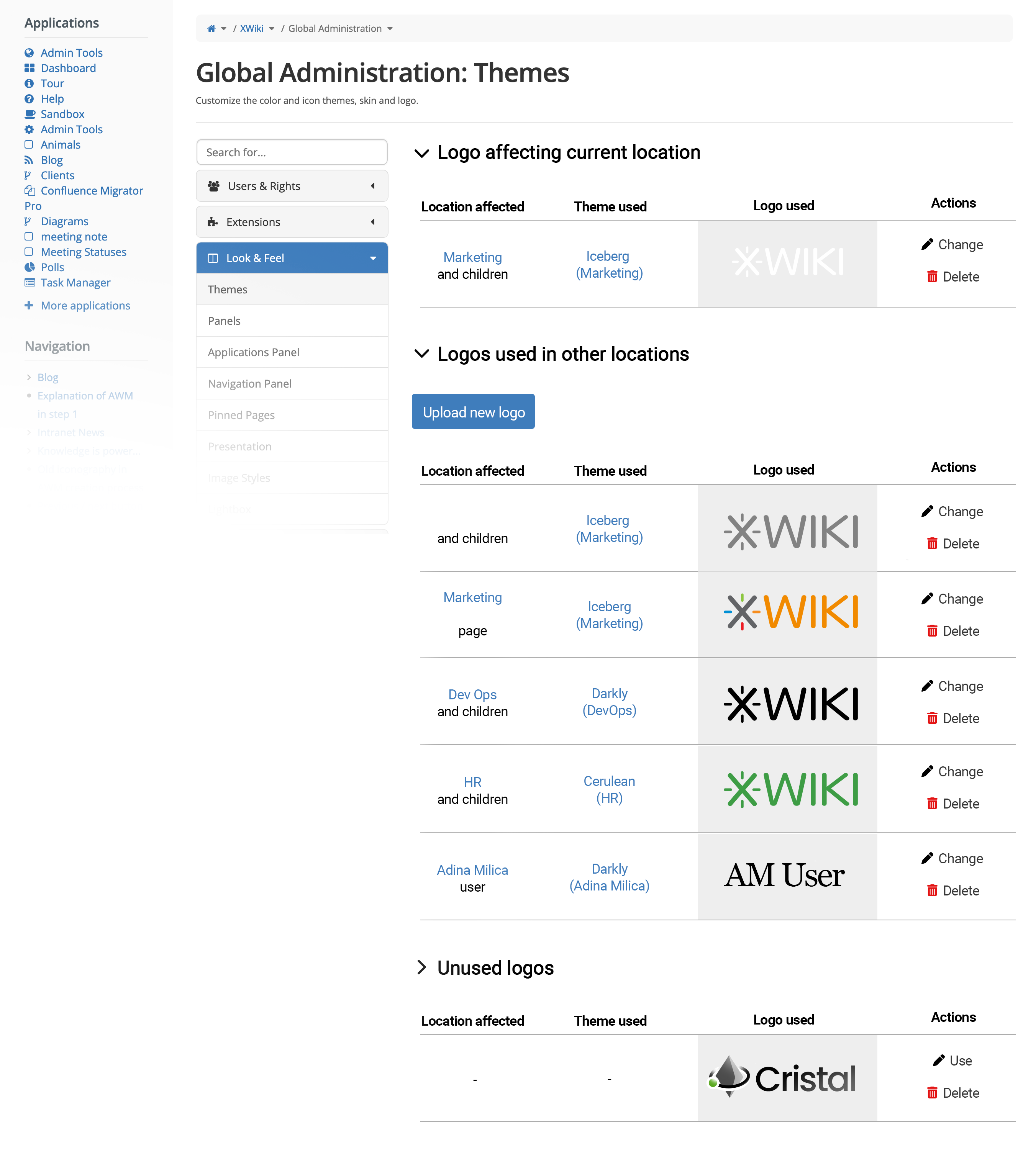
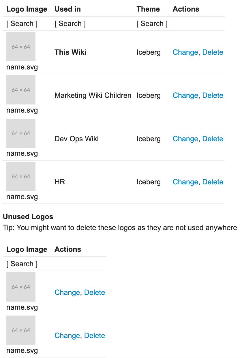
The logo management Page
Regardless of where and how we access it, the following management page will be shown:
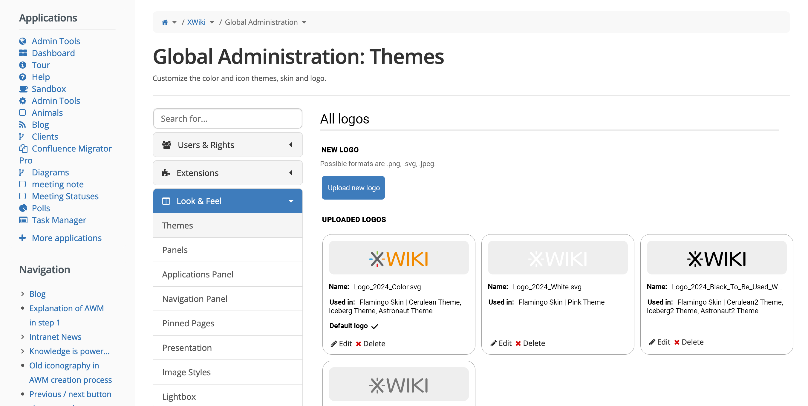
This page has:
- an upload button for a new logo
- this would open the file explorer, letting the user choose a logo from their computer
- a list of all uploaded logos with all their properties and actions
- If the logo is NOT enabled as a default logo, that checkbox and its label are NOT shown
Clicking the edit icon would open a configuration modal (see next section).
Settings for logo
Clicking the edit icon of a logo would open a modal with all the configurations made.
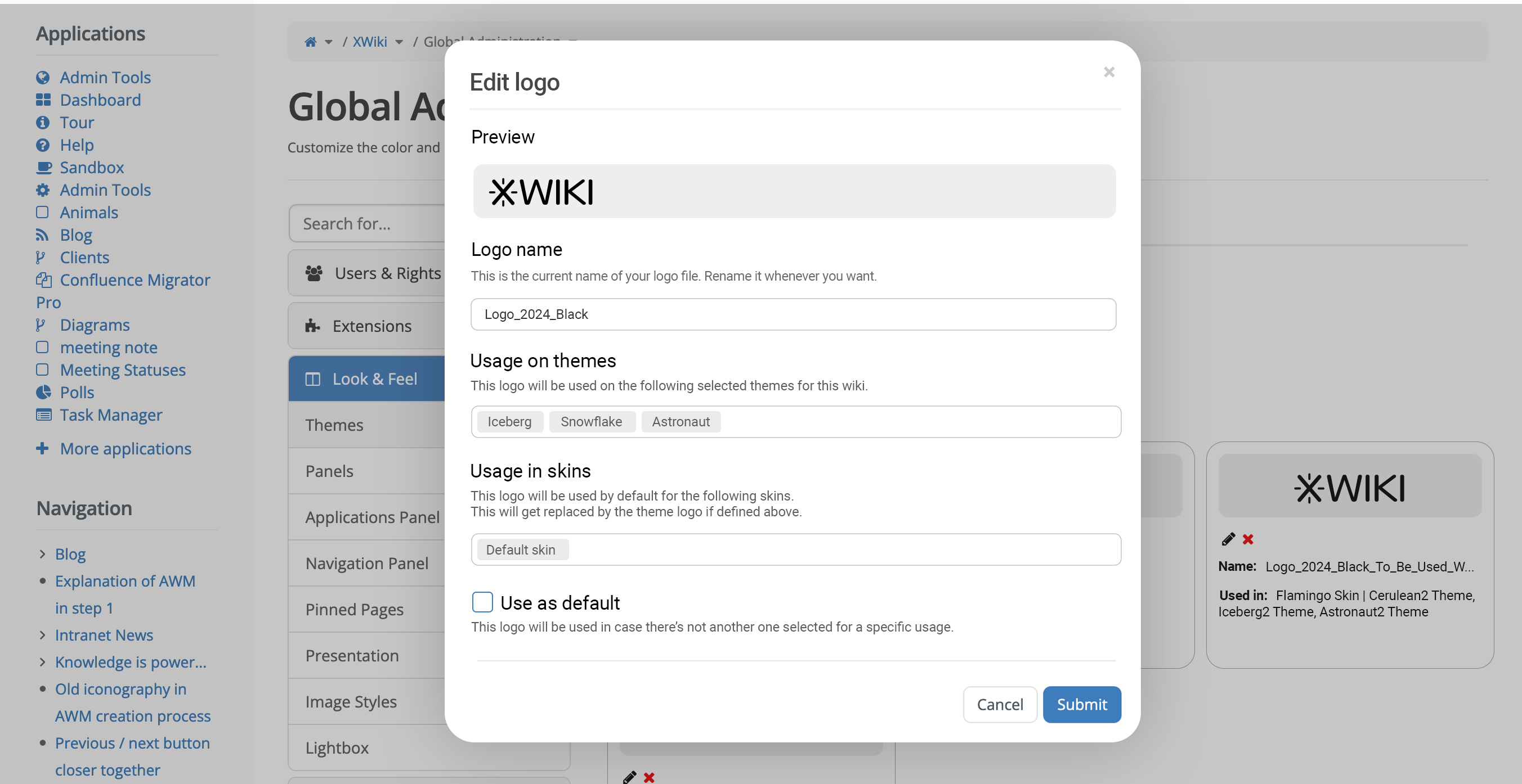
- The Usage on themes and Usage in skins field use the multi-select component (example of look somewhere else in XS: selecting multiple users in an AWM). The user can choose from a dropdown with all possible items, the themes/skins that he wants.
Logo priority
- Theme logo > Skin logo > Default logo
- If the theme logo is defined, it replaces the skin or default logo.
- If the skin logo is defined, it replaces the default logo.
What to do with the old UI?
I think that once we implement this new proposal, the old UI shouldn’t exist anymore, keeping one single “source of truth” for this functionality.