I recently had a more thorough look at the UI of the mentions notifications (in the popup under the notifications bell) and I would like to propose some changes to it.
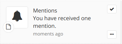
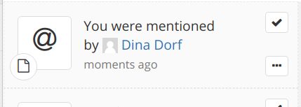
Currently it looks like this:
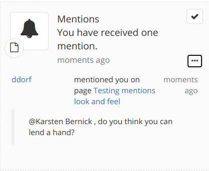
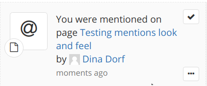
and expanded like this:
The issues I mainly have with it and I am trying to solve are:
the bell icon is good but not the most significant. I would find much more interesting the @ icon. Although here the problem may be the same as the one for the like UI, the availability of this icon in the Silk icon theme ( Like UI aligned with known conventions - #10 by lucaa ) but we could apply the same solution proposed there.
the “Mentions” word which appears as a title for each such notification is taking room on the UI and it’s not really transporting any important meaning. Also, it’s not very consistent with the other notifications which don’t state their type outfront (e.g. on a page modification notif there is no “title” saying “Page modification”, the information is provided directly as “this page was modified by this person”)
the text “You have received one mention” is a bizarre way of saying things in English. I would prefer “You were mentioned (once)” or something along those lines. The French translations are also rather odd, I don’t know about the other languages.
there is too little information that is provided in the notification itself, all is in the details (in the “expanded” version). I would prefer that at least the page name or the mentionner name are displayed in the notification itself. For example, the ideal amount of information would be “you were mentioned on page by ”. This would also be consistent with the page modification notifications, for example, which provide those informations. However, implementing this is, apparently, a bit more complex than it looks because notifications grouping, grouping criteria and the information we have for groups , @surli mentioned issue Loading... in a chat .
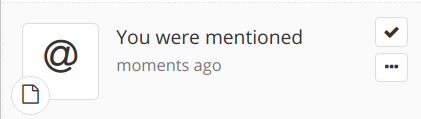
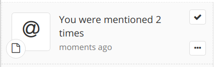
So, my proposal would look something like this:
Simple version (without improvements for 4):
Single notification:
Grouped notifications:
With improvements for 4:
A. (should also apply for groups of notifications with the current state)
B. (probably doesn’t apply as easy for groups)
C. (probably doesn’t apply as easy for groups)
What do you think about these 4 improvements? Do you have your own feedback about the UI of this feature that we could collect here in order to find the best way to present things?
From a pure look&feel I’m not a big fan of the @ as you displayed in your proposal, but I agree that it might be more accurate semantically: that’s the same icon used by discourse when you get mentioned, or by twitter on phone notif if I’m correct. So +1
+1 to remove it
+1 to change the wording
So we discussed that a bit on the chat with @mleduc . What we display on top of the notification will mostly depends on how we want to group those notifications. Right now AFAIU the notifications are grouped by page: so if you receive 3 mentions on page A, and 2 mentions on page B, you will receive 2 grouped notifications.
In my opinion that makes sense to keep that grouping and to specify the title of the page where you’ve been mentioned and the number of people who mentioned you. The name of the people who mentioned you will probably stay in the detailed view, even when there’s only one people: for a consistency reason first, but maybe also for technical reason (not sure we have two templates for singular and plural).
For a sake of completeness, the other possibility of grouping could be:
by receiver of the mention: that doesn’t bring much value for the user who checks their notifications since they will always all be grouped together. It’s a bit useful when checking the dashboard since the events will be grouped by people who receive mentions, but for me it’s more a edge case.
by emitter of the mention: that might bring a bit more value, but I think in general you better want to know where you’ve been mentioned than by whom. Now note that when you access a page, if the mention has been made in the content it’s not easy to know who has mentioned you, so maybe focusing on the emitter in notification could be useful to avoid having to search or having to open the details of the notifications. Also note that this grouping is technically not easy because of Loading...
by two criteria (e.g. emitter + page location): IMO it means essentially not grouping anymore the mentions
Also note that if we group the mentions by page location, it means we’ll group mentions related to a page but attached to different part of the page: it can be mentions on the content, comment, and mentions on objects on the same page. All will be grouped together.
I readily agree with your feeling on 1-3 and I vote for a “@ You were mentioned on PageX”. We can afford having to unfold the details in order to see both the mention text itself and the sender. The main info I want to have on the first look is where I have been mentioned from, since, if the event triggers my immediate interest, my next action will likely be heading there directly.
+1 to find a solution to display a ‘@’ even if the current icon theme does not provide one.
+1
+1
Taking the assumption that we keep the mentions grouped by document:
Displaying the document is easy
Displaying the list of mentionner is less trivial but we could opt for something like "You where mentioned 9 times on page A Cool Page by User1, and User2 and 5 others."
Also, I we take this path we need to discuss what to display once we expand a group.
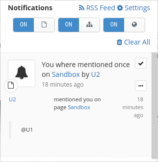
This is an screen I took on a dev instance where I modified the mention notifications velocity template.
Once expanded, the sentence “mentioned you one page …” is useless.
I don’t have a good solution in mind but we should aim for the most readable way to present:
the mentionner
the individual mention date (the one of the group is the one of the most recent mention on the page)
the sample of text surrounding the mention
the location of the mention (page, comment).
I’ll answer later when I’ve a good proposition for it. Feel free to suggest something I you have some inspiration
Displaying the list of mentionner is less trivial but we could opt for something like "You where mentioned 9 times on page A Cool Page by User1, and User2 and 5 others."
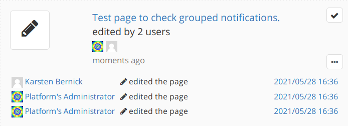
For the mentionner I would use the same strategy as we use today for page events notifications which mention the user when not grouped (or when all notifs in the group have the same user) and mention the number of users with avatars when the event is grouped:
It makes sense functionally and also creates coherence with the other notifs displays.
Once expanded, the sentence “mentioned you one page …” is useless.
actually, I discovered also with these tests that that sentence is referring the exact content where the mention is. When the mention is in a comment, that text says that it’s in a comment.
So I would say we can keep the same display in the details, with the detailed content where the mention is, and only put the document in the main text of the notification: “You were mentioned on Sandbox” even if the mention is actually in a comment of the Sandbox.