Minimalist Skin / Theme Design

Hi everyone! :slight_smile:

A couple of weeks ago, at an internal XWiki SAS meeting, several persons have expressed an interest for a minimalist revamp of how XS looks. Thus, I’d now like to bring this idea to the XWiki community.

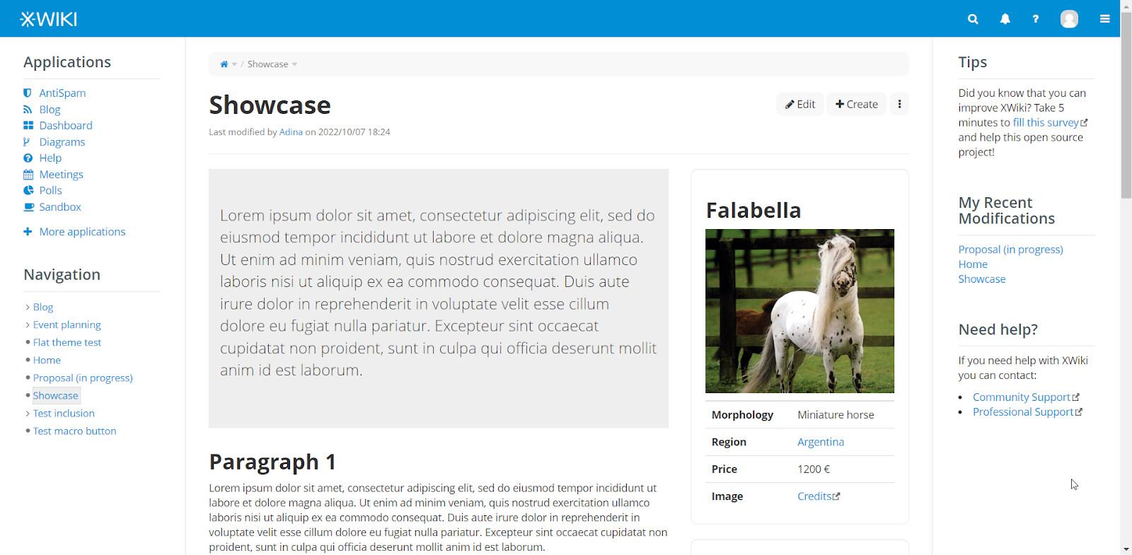
The ideas for this revamp have been documented in this proposal and you can see them in action here.

The main idea would be to create the clean slate look that is so, so beneficial to organizing knowledge.

As the proposal describes, the revamp is looking to:

  • flatten every existent element in the current main theme,
  • eliminate unnecessary borders (literally and figuratively!),
  • get rid of too many rectangles in too many shades of gray,
  • bold out the elements that matter the most in structuring knowledge,
  • increase the space between elements to make the overall design breathe more.

XWiki has always had its main focus on functionality and that’s truly amazing. The team has created a remarkable & complex beast of knowledge organization. This said, I think it’s time to make a big and long-lasting change on the UI of the product to make the functionality shine even brighter.

Motivation for a big design change: 1. we’ve all seen comments or, at the very least, thought about how XWiki looks a bit outdated 2. the design will continue to become more outdated as time goes by, especially when 3. our competition and new XWiki users put an increasing value on esthetics. Notion literally put a big banner with “Software should be beautiful” on a central building.

Ideally, every XWiki theme would follow the same rules that the proposal describes, so… we would be talking about a skin creation / modification.

Alternatively, if we consider that the effort of creating / modifying a skin is too big at the moment, a new main theme based on the proposal would certainly still bring a lot of value. We could use this theme when showcasing the product in videos or graphics.

Motivation for CREATING a new skin: 1. outdated 2. the current skin is hard to update 3. if there are users that want to keep the old skin, they should be able to

Motivation for MODIFYING the current skin: 1. outdated 2. less effort than creating one.
Observation: In this case, we are losing the current one. There might be people that like the older skin more for the nostalgic feeling.

This new skin / theme could benefit a lot from these two other proposals:

  • Minimize Panels Buttons documented here
  • Font Awesome New Icons documented here

What do you think it’s the best way to go about this: theme, new skin, updated skin?

What should be the next steps for implementation after a final agreement?

How much time do you think this would take to implement?

Any suggestions, questions or feedback are appreciated. :slight_smile:

3 Likes

Interesting.

Can you share more screenshots? The one in the post is not clickable (if it was meant to be).

1 Like

@watery The link works for me: Showcase - XWiki

You can also see screenshots at Minimalist Skin Design (Proposal.MinimalistSkinDesign) - XWiki

2 Likes

Yep, sorry, must have missed those in the OP :blush:

It will probably be a short answer, which will raise some questions after a while. Everyone can use the default skin or modify it for personal needs, not even by providing the CSS style.

The current Flamingo skin needs fresh breath and the newest look-up. And from what I see, the best option might be to develop a new modern skin which will be optional to select during the fresh installation of XWiki.

To conclude, what can be done for now is to apply the specified rules after adjusting them (there are some duplicates). But better to create a new skin.

1 Like

Well, we would need someone to develop a skin :slight_smile: Actually anyone can do that and publish a skin as an extension on extensions.xwiki.org. However, you should know that developing a new skin from scratch takes about a year.

Maybe by “new skin” you meant forking the flamingo skin and just making the proposed adaptations on that new skin? That’s possible, but it would mean dropping support for the flamingo skin since maintaining 2 skins is too much work (we tried in the past). So, very quickly the flamingo skin will stop working and user who haven’t upgraded won’t have a good experience.

My opinion is that the proposed changes look very minimal (I don’t have the full list of changes in my head but visually it looks minimal) and I wouldn’t do a new skin for that. I’d simply improve Flamingo as we’ve done for the past N years already.

Thanks

1 Like

We may have some reasons to consider switching to a new skin (that I won’t develop here), but I agree that the changes proposed here are not worth doing that and can be applied on flamingo.

1 Like

Wow, that is a lot of time!

I agree that the changes, although important and with great positive effect, still respect the main lines of the current skin and it seems to me that we should just update the Flamingo skin to not take time from other areas of developing.

Agree with it.

Then we need more custom changes, not only single CSS :slightly_smiling_face: and decide what can be apply as an update for Flamingo. In addition, the current CSS style if I apply it to the whole wiki, makes not user-friendly look for the Administration section.

Or publish these recommended changes, so that everyone can use them on their needs, instead of directly put them in Flamingo as update.

If you are referring to the CSS code from the proposal, that code is not supposed to be final code (I think there is a disclaimer on this in that section). Thus, changes are necessary for it to work perfectly.

Hi Adina,

Thank you for your proposal but more importantly for your desire to improve XWiki’s UI. We certainly need lots of help in this area. I agree with Vincent and Manuel that this feels more like an iteration of the current Flamingo skin than a new skin so I think the best way to proceed is to:

  • split your proposal into smaller actionable items (e.g. make buttons flat, remove unnecessary borders, etc.), detail them and specify why we should make those changes
  • ask for a vote on each of these items
  • for the items that pass the vote create separate PRs with proposed changes

Now, some remarks about your current proposal.

Would be good to list the UI differences, or at least the most important ones, so that we can agree on them. It’s also very important for me to justify each design / UI change.

I see you made the buttons flat. I like that and seems to be consistent with what the rest of the UI frameworks are doing. But you also removed the shadow from the drop down menus, popovers and modals. I don’t like that. I know that Bootstrap 5 has done this also but I see that most of the other UI component frameworks are still using the shadow for elements that float on top of the content. Notion’s slash context menu has shadows also. I think the shadow is useful in these cases as it separates better the floating element from the content on top of which it floats. So I don’t agree with “every” part from your goal. I think there are some exceptions.

Regarding the buttons, their styles are not that good in your live demo. For instance, if you check the Export modal, the buttons look bad on hover. At the same time, if you check the History tab at the bottom of the page the “Show minor edits” doesn’t look like a button at all, until you hover it, so there’s some work left in this area.

Also, if you check the Information tab, you’ll see that even if buttons can leave without a border when used alone, they need a border when inside a button group otherwise it looks bad. This makes me think that in general it’s best to stay close to the default styles of the used UI framework (e.g. Bootstrap), otherwise, whatever change you make you need to ensure it doesn’t break the rest of the UI components and how they can be grouped together.

I think we all agree to remove unnecessary stuff. The part we often don’t agree is what’s necessary and what’s not :slight_smile: . Regarding borders, I see you made the border between the panel columns and the content column thicker which seems to go against your goal. I like better the current subtle border. I’d be fine to make it consistent with the line that separates the panel title from the panel content or the page title from the page content, or why not, remove it completely. But I’m not sure it’s a good idea to make it thicker? What’s the rationale?

On the same topic, do we need a border between the panel title and the panel content? Same, do we need the border between the page title and the page content? I’d be fine to remove both.

I see you more than doubled the border radius in various places (4px → 9px). I find it too much. I like rounded corners, but there’s a limit, for my taste :slight_smile: . What’s the rationale behind this change?

Also, the border at the bottom of the page content looks strange.

Can you give some examples of such rectangles that you removed?

I see that you literally applied the bold style to the panel titles and to other headings, while I guess you mean to emphasize the elements that matter the most, which can be done in other ways. Personally I don’t like the bold panel titles because they stand out too much, while the user should focus on the page content (the center area). I find the bold content headings a bit too much but I can leave with that :slight_smile:

It’s not clear to me where you added more spacing. Can you give some examples?

Thanks again,
Marius

Thanks @amilica for this proposal! As discussed together, I agree with Marius that it would be best if you could if you could split this into small proposals (don’t forget the proposal label when you post). Thanks a lot.

In the end there probably will be a new theme + improvements of the existing skin in order to achieve the changes.

There is also a technical criteria for choosing here: some things cannot be done as part of the color theme, or they can be done in CSS / color theme but more like a hack. In order to decide what’s what, we probably need to analyse each change individually, as others have proposed.

Actually, this is a decision of maintenance and comitment of support: if we want to keep the old one and make it part of what the product proposes to install, this means that, as part of the product, both skins (old and new) will need to be maintained functional. So, to me, it’s probably a good idea to lose it as we cannot maintain both (or there is no good reason to do so).
If the proposal here is to “keep it but not maintain it”, then nothing would stop a user from copying the old one as it was and use it on their instance if they like it, or make themselves a custom skin in which they revert the changes that we’ve done. Custom skin maintained by the user is already a feature of XWiki. So we can make our changes in the flamingo skin and then if someone wants the old one back (or any other change to our skin because they don’t like it), they can make and maintain their own skin, with whatever changes they need in it.

I have some feedback about this proposal, is there a dedicated forum topic open for it? Should I put it as a comment of the design page?

Otherwise the new clean look looks good overall, I didn’t check the details, though.

Thanks,
Anca

I think before we move forward with implementing design changes we should make sure we all agree on the general direction. I see two directions here:

  1. We intentionally diverge more and more from Bootstrap 3 and we don’t intend to adopt another UI design framework in the future but establish our own UI design.
  2. We intend to adopt either a new version of Bootstrap or another UI design framework.

If we decide for the second option, I think we should adopt at least the button styles but maybe also other styles from whatever UI framework we choose and not create our own button styles that might not fit with the UI framework we choose. Instead of doing our own button (or whatever) style changes in the meantime, I think we should adopt the styles of the framework we intend to adopt even if we don’t move right now. This will avoid changing the design twice and ensures we have a consistent design after adopting the new UI framework. Also, this should make it much easier to agree on which changes to implement and how to implement them as there will always be the straightforward option to just take the design and CSS code from the UI framework we choose.

The 3rd option that I see would be adopt most stuff from a newer UI framework (like Bootstrap 5) and stay open to the idea of changing certain stuff from it. I don’t see this as another formulation of your first idea, because we wouldn’t stray very far away from an existing framework to call it a new design system.

A new design system would be nice and all (my ideas on it are pretty different than the minimal changes that we’re proposing at the moment, tbh), but it would imply too much change that needs a lot of debating & maybe user testing, making all of this process so much longer than it is.

From a design perspective, staying in the proximity of a heavily used framework gives us the advantage of analyzing the UI/UX effects of the framework on many other products, without feeling the need to get EVERYTHING from it.

As me & @Jsd documented in the proposal, there are lots of similarities between Bootstrap 5 and our proposed changes. We could consider it a good option because of many compatibilities.

Some design issues around Bootstrap 5:

  • while it is renowned, it doesn’t mean its accessibility is perfect (contrast issues, lack of shadows in many places where those shadows could’ve proven to enhance the idea of something being closer to the user)
  • its UI is very simplistic, it doesn’t say anything special about XWiki, BUT this may be what we want if we want to underline the idea that XWiki is extremely customizable, serving anyone as a blank canvas

Yes, though I think this is basically a variation of both options. My point here is about deciding if we want to just do our own thing which can be inspired by Bootstrap 5 but also other UI designs or if we want to intentionally stay close to Bootstrap 5 because we want to adopt Bootstrap 5 (fully, or in parts) in the future. In the latter case, we can of course also still deviate in certain aspects from Bootstrap 5 but in this case the idea would be to take what Bootstrap 5 offers as “default” option and to then decide where we want to intentionally deviate.

I’m not saying that we need to adopt Boostrap 5 now as this is indeed quite complex also from a technical point of view. My point is that we should have some vision where our journey with UI design in XWiki goes to make sure that every change we do goes in that direction and we don’t perform any changes now that make the adoption of Bootstrap 5 more difficult if that’s where we want to go.

If we’re doing similar things, why don’t we just do exactly what Bootstrap 5 does with the advantage that a) it’s less work as somebody else solved the problems with how exactly to implement the styles to get them consistent and accessible and b) it’s less work when we adopt Bootstrap 5 as it just means removing the extra styles we used for getting Bootstrap 5 design with Bootstrap 3. We could still say we want to have some differences, but basically the idea would be to then primarily talk about the difference to Bootstrap 5 in the proposals and not the differences to what we currently have.

Bootstrap 5 talks a lot about accessibility and color contrast in its documentation so I’m surprised you’re saying that they have contrast issues. Do you have any examples? I found this remark in the documentation, but that only concerns some combinations of colors they say so I would assume the main colors are accessible. In general, I think Bootstrap 5 should offer much better accessibility than what we have now.

Where do you see the difference between the simplistic UI of Bootstrap 5 and the minimalism you’re proposing here?

What I said was meant as : “Okay, if we choose to adapt to another framework and we have the time for that, maybe we should choose something that has a bit more personality, still being minimalistic.”

There are not many differences between Bootstrap 5 and our proposal because we had in mind small changes, quick changes that could be agreed on as soon as possible.

The proposal wasn’t meant to be the utopic/ideal/perfect choice, but the most practical one, which could make the product move forward as a more modern product, still allowing everyone to focus on the development of functionality.

The quoted remark is the one I was referring to, but yes, you are right, it only regards some combos.

My point of view on this is that:

  • we should definitely use an existing UI design framework and not implement our own
  • whatever UI framework we chose we’ll have to do some (small) customizations in terms of styling in order to distinguish ourselves (colors, margins, fonts, etc.)
  • ideally users / extensions should be decoupled from the UI framework we use (e.g. if we implement macros for buttons, modals and all UI components) but in practice this is very hard if not impossible to do, and we will always have at least some CSS classes leaked in user / extension code which means upgrading / changing the UI framework we use is never going to be easy / without breakages

Thanks,
Marius

@adina, you know my opinion here, as we’ve discussed it when we discussed about splitting the proposal in individual tasks in order to make sure it gets implemented.

All: my opinion here is that we’re aiming a design framework (bootstrap or other, probably a newer version of bootstrap), but, as we did for bootstrap 3 and the current skin, we could choose to not follow the proposal/default of that framework. However for now, this proposal is not about implementing Bootstrap 5 but about making rather low-cost changes with rather large benefits.

The idea of looking at what that framework does would be mainly for bringing another input in the conversation about for the choices we make, to try to make some choices faster and to make sure we don’t try to re-solve a problem from scratch when other people have already solved it (for example, the conversation about heading sizes is a good example for this) - which is why I proposed to add the Bootstrap 5 column in the table here Minimalist Skin Design (Proposal.MinimalistSkinDesign) - XWiki . If we don’t like the way they solved the problem or have other good reasons to try to make another decision, I have no problem in making another decision, it’s just gonna be (more) costly.

Thanks,
Anca