Continuing the discussion from this post, I wanted to get your opinions on the first issue of the minimalist skin design proposal detailed here. I’m planning on discussing with you most of the issues in the proposal throughout this month.
This first issue is tackling the gradients on buttons.
The current XS has gradients on most buttons. From my point of view, this is one of the elements that makes the whole design feel outdated, a bit old. While it was a nice touch in the early days of web design, the trend of flat design and the need of minimalism in complex tools took over.
For these reasons, I believe that removing the gradients from all buttons is the right call.
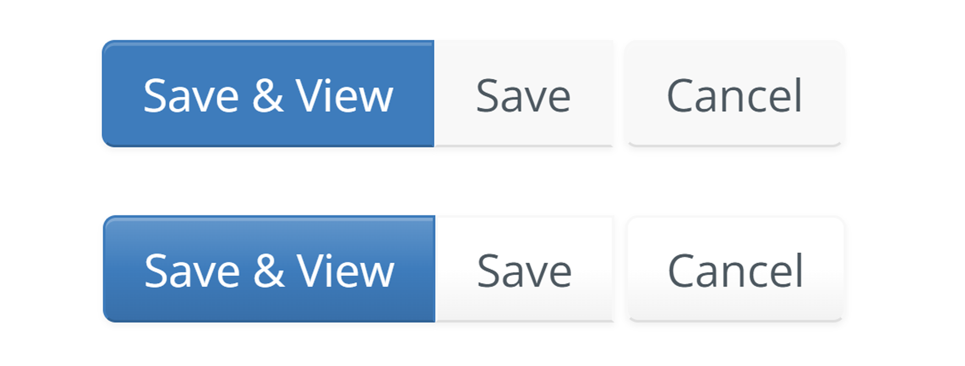
Below you can see an example of buttons with & without gradients. The other elements of the buttons (shadows & bevel effect, borders existence, border radius) will be discussed separately.
+1
From the WCAG standpoint, there were some contrast issues with the old buttons, and it wasn’t easy to find a new color that would have good enough contrast with all the gradient. An example of where the extra constraints brought by the gradient forced a noticeable UI change.
Having flat colors will reduce constraints on colors and increase the range of colors that would ‘look good’ (as in “has enough contrast with the text”).
Do you have a reference for this claim? I’d be interested to read more about this question.
Do you have a reference for this claim? I’d be interested to read more about this question.
Yep, yep. There are many articles explaining how web design turned from skeuomorphism to flat design, but one that explains this pretty well and quickly is this one.
Long story short, in the early days of web design and mobile design we used skeumorphism (gradients, bevels, shadows) to emulate the real world, thus making user interfaces seem more familiar to users.
People got more and more used to digital interfaces and so it was considered that design can afford minimalism without having much or any impact on usability, but still improving esthetics and decluterring the screen. This movement towards minimalist UI/UX design is mainly attributed to Apple.
This proposal doesn’t include any change to the border radius and border in general. It’s only about removing gradients, isn’t it? I don’t understand why you’re requesting a screen shot with no border and increased radius.
+1 for removing gradients on buttons, but I feel that we also need to improve the contrast between the button background / border and the page (white), for the secondary buttons.
Simply because we’re talking about the topic of buttons and to avoid having to do 6 different screenshots (3!) of buttons with all variations. Seeing directly what Adina is proposing seemed the nicest to me. But sure, if you think that gradients and increased radius is not going to make it, we could also have separate screenshots.
BTW I’d have merged the 3 proposals about buttons together into a single proposal containing the 3 sub-topics: borders, gradients and shape/radius. They’re related and in the end we need to choose a global new L&F for buttons. But let’s keep them separate now that they have been proposed separately!
Note that @CharpentierLucas could tell us if that passes WCAG or not.
Currently the PR description contains screenshot of the comment and page edit button, in default, hover and active states.
Let me know if you’d like screenshot of others screens or states.
It has a lot of exceptions and it’s not that demanding. In the Boundaries section, we can read:
This success criterion does not require that controls have a visual boundary indicating the hit area, but if the visual indicator of the control is the only way to identify the control, then that indicator must have sufficient contrast. If text (or an icon) within a button or placeholder text inside a text input is visible and there is no visual indication of the hit area then the Success Criterion is passed. If a button with text also has a colored border, since the border does not provide the only indication there is no contrast requirement beyond the text contrast (1.4.3 Contrast (Minimum)). Note that for people with cognitive disabilities it is recommended to delineate the boundary of controls to aid in the recognition of controls and therefore the completion of activities.
Which means in our case that the button element color contrast is just a recommendation since there’s already text, or an icon, in every button. This is not required by WCAG, but can improve usability and accessibility. Note that the contrast between the text and the button background is important though (that’s why I changed some button colors earlier this year).
The changes needed in the background color for those default buttons would be quite radical so I considered it as not an issue until now.
