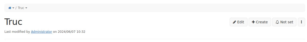
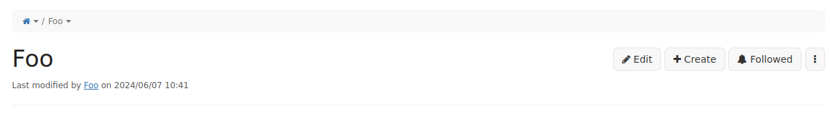
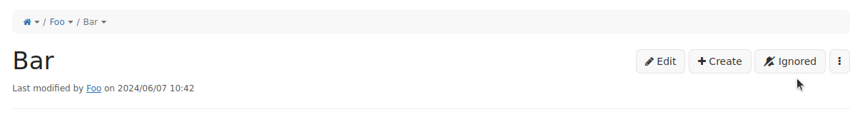
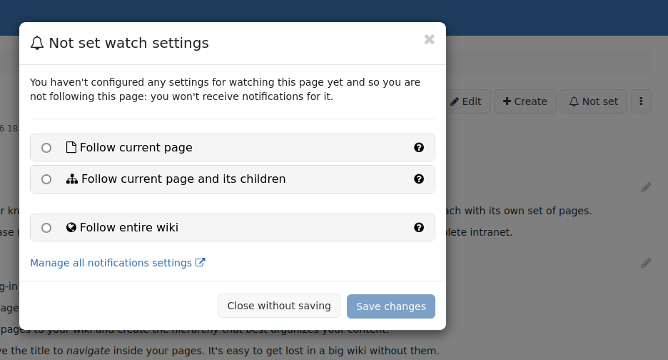
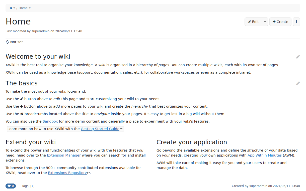
so I took quite some time to work on the Watch page buttons following what we initially put in the dedicated design page with @lucaa. I have a PR ready to be merged which contains lots of API changes and improvments but also a new UI for handling the watch settings.
You can see it in action in the following screenshots:
I’d like a lot to merge my PR right away, but the discussion about that UI has never been entirely closed. I read again the topic dedicated to it, where various ideas was provided.
In particular I noticed that:
Vincent was preferring to have the button either in the bell menu in the top of the page (where we display notifications) or in the more action menu (the … menu)
Marius seemed to agree with moving the button inside the page area, and ok with having it in the more action menu too
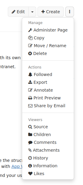
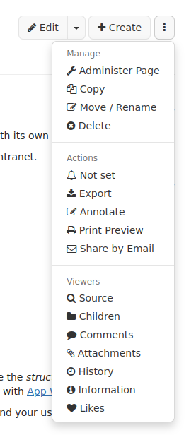
on my side I’d prefer to have it where it’s currently located in the screenshot, as I find it easier to discover but I’m +0 to move it to more action menu
So please vote for your favorite option:
A. Put the button next to edit like in the screenshot
B. Put the button inside the more action menu of the page
C. Put back the button in the notification area under the bell menu
I’m opening this vote for 2 week days until tuesday 11th at 6PM, so that I have enough time to rework the UI before the RC release.
For me:
-0 for A (I don’t think that users need to see that action all the time, nor the status for it)
+1 for B
-0 for C
I also think we need to decide if we use the “follow” terminology or the “watch” one. Your screenshots are mixing the 2 vocabularies and I believe we need to have some consistency.
Thx
PS: I haven’t fully re-read the design proposal (which is elaborate with lots of use cases).
I’m worried about the backwards compatibility implications of option B: Users that have used XWiki before will notice that the notification buttons are missing and if they don’t immediately see where they are now, they won’t find them. But maybe we could add a tour to inform users about the change after the upgrade?
-0 for A as I think the space there at the top is precious, and we should avoid cluttering it. I would have been +1 if it was just an icon.
+0 for B as while this makes most sense, I fear that having an item that is a status and not an action doesn’t fit there.
+0 for C as it is where existing users look for the feature.
If we go for B, I wonder if we shouldn’t introduce another place like in the footer of the document that shows the notification status.
-0 for option 1, +0 for option C
+1 for option B.
Couldn’t we put an explanation at the “legacy” location, explaining where to find it now?
Something we could remove later, e.g., after one cycle. Also, we could make it possible to hide it by configuration.
+1 for A: a status like this should be easely seen, but I would prefer an icon only; this button should have an aria label describing the status too and a title, so you can have an explanation for the status very fast with hovering the mouse; normally I would say that buttons should always have a label, but in this case I think an icon should be enough, as this is a combination of a button to change and a status to show
+0 for B: it’s more related to the article then option C, but the status must be actively checked on every visit
-1 for C: this part is more a global one; normally I wouldn’t search here for notifications based on the shown article
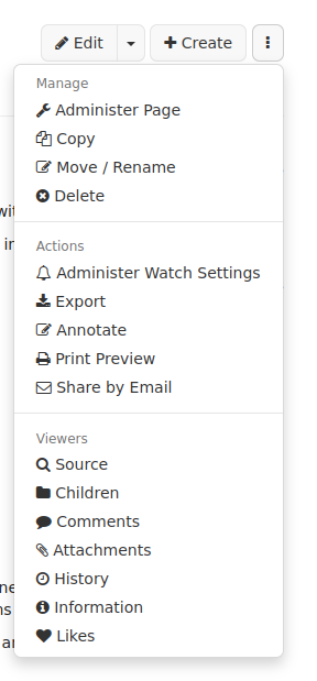
So, I started to look at implementing option B as I thought it would be the result of the vote but it’s not good. @MichaelHamann pointed out a consistency problem with using a noon in the button next to create/edit but it’s even worst in the “More options” menu since we put the possible item under “Action” submenu, and it really doesn’t look good IMO:
With “Followed” status:
I personally feel it’s even less understandable, so I’d be -1 for this option: I’m ok for having a menu entry there to open the modal for watch settings, but not for displaying a status, so like this (with a better label probably):
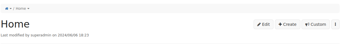
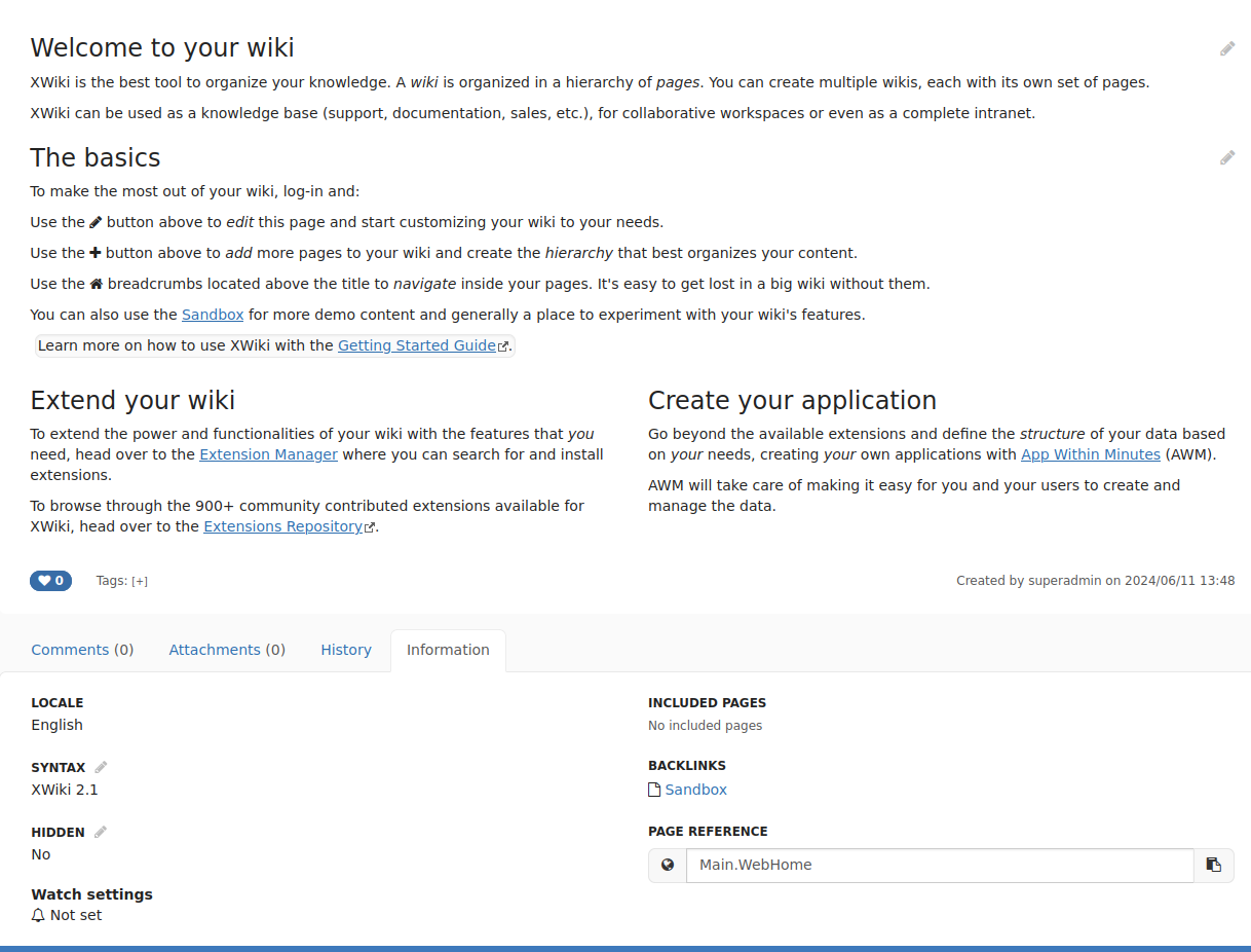
I experimented a bit the options we have with current existing UIXP, and so far the only options not too bad are next to like button on the bottom of the content, or directly in the information tab:
Displayed after content header:
Personally I feel like the information tab is the right solution on the long run: it’s easy to reach and we can be a bit more verbose without cluttering the UI.
Now @tkrieck did make some proposal to put the info next to the author, which was possibly a nice solution but we don’t have a UIXP for this, so if we go there we’d need first to introduce the UIXP.
So I’m reopening this vote for 2 days, what solution do you prefer between:
A. Put the button next to edit (A from original proposal)
B. First screenshot in this message: button with status in more action menu (also B from original proposal)
C. Put back the button in the notification area under the bell menu (C from original proposal)
D. Put a generic button in more action menu + a status next to Like button
E. Put a generic button in more action menu + a status in information tab
F. Put a generic button in more action menu + a status next to the author with a new UIXP
G. Only put a status + a link in information tab (same link as for editing properties of a page)
Here’s my vote:
-0 for A
-1 for B
-1 for C
-0 for D
+1 for E
+0 for F
+1 for G
This vote is opened until thursday 13th at 6PM CET.
For the status, we need to decide if we put it in the menu too (for example with a different icon + some text after the action, like “Watch (Followed)”) or it we want to display it elsewhere in the UI, in a non-obstrusive place.
D or E sound ok to me. Now, if we put a status outside of the more action menu, then we should probably also make it clickable, and then I’m not sure we need the action to be in the more action menu (we could, for consistency reasons - Note that we don’t have a Like action in the more action menu ATM for example).
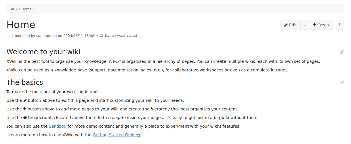
I’m fine with option E. And I would also add a small temporary text in the current position at the top of the page to where those options were moved, nothing fancy. As @MichaelHamann said, current XWiki users are used to find that option there and this was evidenced in my our usability study (I still need to post the results btw).
Example:
Further down the road, it would be nice to also see it as a clickable status besides the author, after the UIXP introduction. This would show new users that this kind of feature is available.
Also, I am not worried if this is something that’s accessible from multiple entry points (menu, status, info tab). Redundancy in some cases can be beneficial, in this case allowing different users, with different ‘paths’ inside the system, to discover a secondary feature.
While it may be nice to see it once, it’s painful to see it every time you click since you already know about it. The Tour idea is better IMO for this reason.
Some users will not have upgraded and this message is not necessary (and more confusing than anything else for them).
I don’t think we should point to some external URL. First, some instances of XWiki don’t have internet access and that URL could be broken/moved/etc. The message will also require maintenance since it’ll need to be removed in the future.
As others have noted end users have difficulty with the dropdown menu.
I think the choice here comes down to risking ui clutter vs the importance of the watch status; which links to how well the notification system itself is handled (Might be my implementation/workplace but I’m trying hard to get colleagues out of their outlook inboxes)
so my vote comes down to uh:
+1 for A
-1 for B
-1 for C
+1 for D
+1 for E
+1 for F
-0 for G
Thanks either way for working on this, I like many of the options given as improvements over the current situation.
I’m again extending this vote: it’s too late for changing current implementation before the RC release, I will do changes for the final release though so I’m extending vote until next monday so don’t hesitate to provide more feedbacks here.
I think that splitting the display of the status from the button that allows to make an action (which is proposed for D, E and F) has 2 problems:
it scatters even more the elements related to this feature on the UI: we already have the bell with global notifications, in this proposal we were discussing about creating a second place where we talk about watching (which was already not approved by everyone) and now these 3 proposals talk about a 3rd place that will contain information related to that, I think it’s too much
the whole UX of the feature would need to be re-validated if the button to act on the follow state is no longer next to the display of the state. The UX we proposed assumes that the action (button) will be used as a reaction to the current state and the actions proposed on the button are thought as the most probable next steps given the current state. If the current state is no longer displayed along with the action button, the action button has less chances of being used as a reaction to the current state, and we’d need to validate again that everything makes sense. Note that if the 2 are split, you will not know whether the user has seen the state before they clicked the button, nor whether they know where the button is when they see the state.
Thus, I’m -1 for D, E, F with the current implementation. I like A, but I understand that it creates a space problem. A status + actionable button in the footer would work too, but it was not proposed.
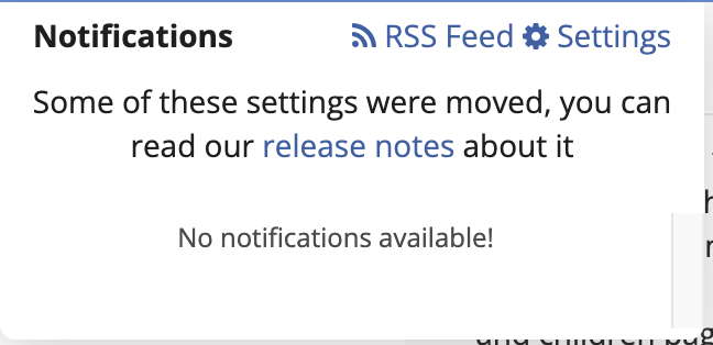
As @vmassol, I think having the warning about the move in the notifications doesn’t look right, looks more like clutter than anything else.
Also, I think it would be the first time when we move something and worry about telling people in the UI that it has moved (not only in the release notes). I think release notes are fine, and people will just discover its new location, it’s something that happens with a lot of software all the time…
Thanks for this proposal. Honestly, I’d prefer a modified version of option A - above the actions button. Since there is no commonality with page creation or editing. Moreover, it will be the best place that is easy to find and manage (unfollow or follow).
Altogether, option A - is the best location, so +1 for that. And -1 for all others.
I can’t wait to try it on my XWiki. Thanks in advance for that functionality.
I still believe that A is not the right place as we’re crowding even more our UI when our goal is to make it lighter/simpler. We’d be adding a new button and not removing any existing button since the alert menu at the top would remain.
If you want to wait for more feedback, your best option is to go with C which is basically what is there today and find a way to decide better on what to do.
Right now the summary is:
A:
-0 from Vincent, Thomas, Michael, Simon, Manuel
+1 from Manuel, Simon, Simpel, Wardenburg, Nikita
+0 from Anca
B:
+0 from Simon, Michael, Simpel
+1 from Vincent, Thomas, Manuel</delW
-1 from Simon, Wardenburg, Manuel
C:
-1 from Simon, Simpel, Wardenburg
-0 from Vincent, Thomas
+0 from Michael, Manuel
+1 from Manuel
D
-0 from Simon
+0 from Vincent
+1 from Wardenburg
-1 from Anca, Manuel
E
+1 from Simon, Thiago, Wardenburg
+0 from Vincent
-1 from Anca, Manuel
F
+0 from Simon
+1 from Wardenburg
-1 from Anca, Manuel
G
+1 from Simon
-0 from Wardenburg
-1 from Manuel
H (new menu entry in top level menu next to avatar)
+1 from Adina
I (action+status somewhere in the footer)
+1 from Anca
Totals:
A
Positives: 5
Negatives: 4
B
Positives: 4
Negatives: 3
C
Positives: 2
Negatives: 5
D
Positives: 2
Negatives: 2
E
Positives: 4
Negatives: 2
F
Positives: 2
Negatives: 2
G
Positives: 1
Negatives: 2
So far, the most positives are A, B and E with A being a bit in front but also having the most negatives votes… no clear winner…
Notes:
H and I were not officially proposed
The votes above include binding (committers) and non-binding (contributors)
Thanks everyone for the feedbacks so far. We already released XWiki 16.5.0RC1 with solution A and 16.5.0 final is planned for next monday.
Even if I’m not entirely convinced that it’s the right solution so far it appears to me it’s the less bad option: it gets the most positive votes so far, and if it gets a lots of negatives one it doesn’t get any -1 which are veto on the votes.
Also keeping that choice implies to not perform any change for the next release, which is always safer at this point.
I’m going to close that vote here, which doesn’t mean the subject is closed: I hope that we could get feedbacks in the few coming weeks about that feature to know quickly if we need to change it for the next LTS of 16.x.