I would like to add a new boolean property to the page information both in view and edit mode (where it is a panel) to enable/disable heading numbering for numbered headings in the new numbered content contrib extension. This needs a new UIXP.
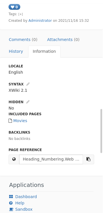
At the moment, we have two views of page information:
They display similar content, though the latter displays less and uses different HTML as the data is saved together with the content and this is also for new pages. We could try to unify these views as some differences seem strange (e.g., having a yes/no-select vs. a checkbox for the hidden property) but this might be a lot of effort and I’m not sure it is possible. Therefore, I think the best would be to have two new UIXPs so it is easy to target just one or the other view and to display different content for both of them.
Both use definition lists for display, so I think it makes most sense to make each item a UIX.
Concerning the UIXPs:
Should each UIX just contribute a part of the HTML code that is inside the definition list or should there, e.g., be a parameter for the content of the dt such that the actual content is just the content of the dd? For informationinline.vm, we need the possibility to set attributes of both the dt and the dd element so this would mean that we need a lot of parameters. Or is there a better solution?
Should the existing content be moved to new UIXs (or one, if we go for the "just a part of the HTML code)?
I suggest to add a column=left/right parameter to target the respective columns in the informationinline.vm template and a priority for ordering.
Names:
org.xwiki.platform.panels.ui.documentInformation (named according my understanding of the naming convention) for the panel - or remove the “.ui” part?
org.xwiki.platform.web.templates.information for the information tab?
The existing org.xwiki.plaftorm.template.docextra has “template” in singular and no “web” - should we do the same? Note: we should probably not adopt the spelling error of plaftorm even though this would be more consistent.
Not sure about this one. Ideally the UIXP should be as independent as possible from the UI so that it works in various skins. we could imagine a skin where all the information tab UIXs would be displayed one under another. So I think the left/right disposition should be generated by the template using the UIXP.
EDIT: same type of consideration will apply for small screens too, where each UIX should be displayed one under another.
EDIT2: I guess we could consider that left/right is a “preference” but still, I’m not that comfortable with something that depends on the UI/layout. Curious to hear what others think.
I agree with the ugliness of the left/right naming. I’ve suggested this as currently there are two div-containers named informationleft and informationright with separate dl-elements in the template (that is in xwiki-platform-web-templates) and with the column parameter, the UIXs would basically select in which container they are rendered. The two columns are already displayed under each other on small screens, except that the spacing is off (the space between the two columns is smaller than the space between items within a column), see screenshot below:
I don’t see how we could automatically group items into columns using Bootstrap, all I could find involves explicitly putting items into a certain number of columns that can be displayed next to each other, or, if there is not enough space, below each other. This is what we are using already with two columns as far as I can see. There is the CSS columns property that allows, e.g., to automatically have as many columns as possible of a defined width or we could set the number of columns based on some media query. However, this has one problem: There is no way to avoid that the content breaks between a dt and a dd, i.e., between the label and the value, which is quite ugly, see here. As mentioned there, there is the possibility to use div-containers inside dl in WHATWG HTML to fix this (and then forbid column breaks within the div-container). I don’t know if this is considered valid by XWiki’s standards, though.
Note that all of this is quite separate from the new UIXPs, though, as we already have this explicit layout in two columns already and I’m not proposing to change that. I have a proposal to keep this is as flexible as possible for future layout changes: We simply define the priorities of the existing UIXs such that all items of the left column are, e.g., below 1000, and all items of the right column are between 1000 and 2000 (with the first existing item of the right column at 1100 such that new items can be added before that). That way, there is no explicit encoding of the columns but there is still the possibility to add new items to each of the two columns. The template can then be changed at any time to simply put all items into a single container if this is desired or define new split points for more columns.
Hi, I’m not sure I see the relation between a configuration option that controls the way the headings are displayed. and the Document Information tab or panel. How is this configuration a document information? For me this is page configuration so it should be on the (missing) Page Administration, see Loading... . Note that it makes a lot of sense to have this configuration property inheritable by sub-pages.
Since simple users are using mostly nested pages (non-terminal) which have the “Administer Page” entry in the More Actions menu, I think the best option is for your extension to provide a “space” (nested page) level administration section using ConfigurableClass. I really don’t think adding this configuration to the Document Information tab / panel is the right choice.
I think this is similar to the hidden status and the syntax which are also configuration options in the document information tab/panel and in fact configuration options. However, we can also implement this in the space/page administration section.
I agree in principle, but one important aspect to keep in mind in my opinion is the ease of use and discoverability of the numbered headings feature.
If the checkbox is hidden in a sub-menu, I’m afraid users will never discover it and it will never be used.
For this reason, I think the the numbered headings checkbox must be visible from the editor without having to switch page, both in WYSIWYG edition and in-place editing.
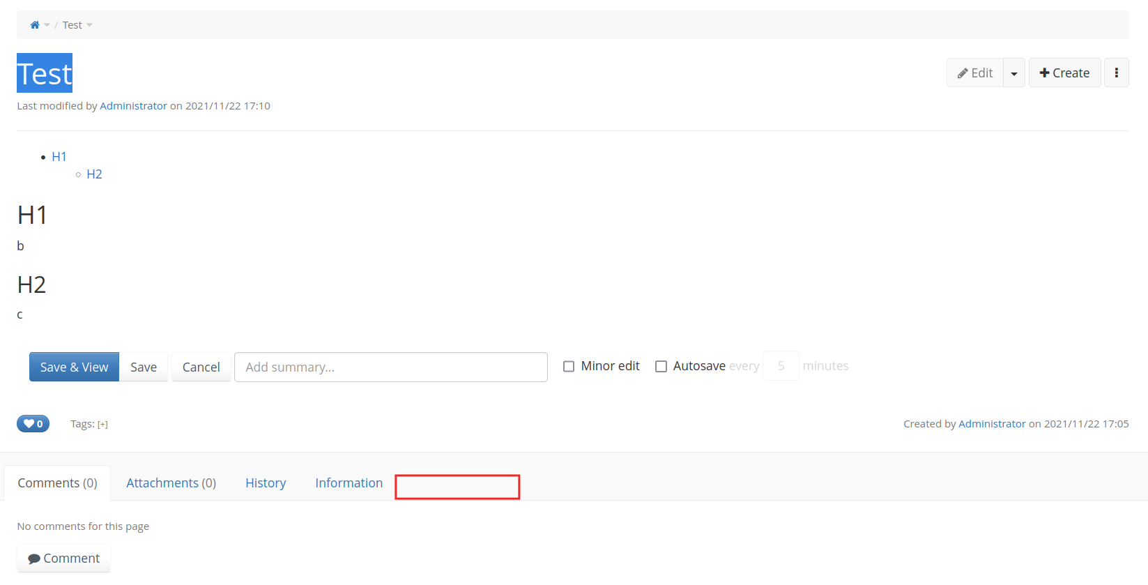
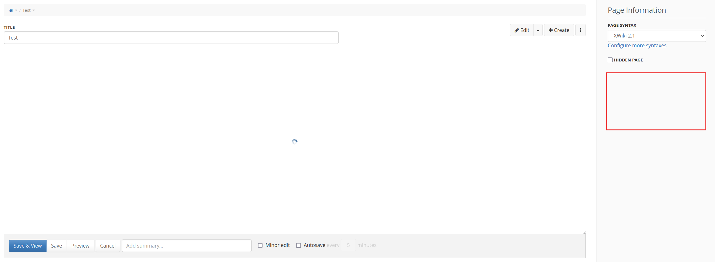
Then, maybe the Information panel are not the best place, but it this case it might be interesting to add another panel below Information in WYSIWYG editing. For instance, in the location of the red rectangles in the screenshots below.
Another problem is that that regular users cannot access the page/space administration UI for enabling/disabling heading numbering even though they are able to change the XObject on the current page itself which seems very wrong.
Note that the selection of panels for the WYSIWYG/Wiki editor is currently configured in editpanelsvars.vm in xwiki-web-platform-templates and thus cannot be changed from an extension as far as I can see.
This is why we don’t want to do that (we discussed it already in a call). This is why I suggested to use the Information tab, i.e. something that it part of the content and for which you need edit rights.
I don’t think this changes anything (one tab or another). For me there’s no reason that enabling/disabling HN should be different from enabling/disabling hidden page or setting the page syntax. They’re all about page config for editors.