Hello everyone!  I’m here to discuss the theme editing UI and how we can improve it.
To check out
I’ve added 2 polls at the end of the post that will help us get more structured global feedback in the long run. If you make it until there, thanks a lot in advance!! 
Some definitions
-
theme element = the menu items (Logos, Base colors, Typography)
-
theme property = Table background, table row on hover, etc.
-
theme variable = @table-bg , @table-hover-bg
Current situation
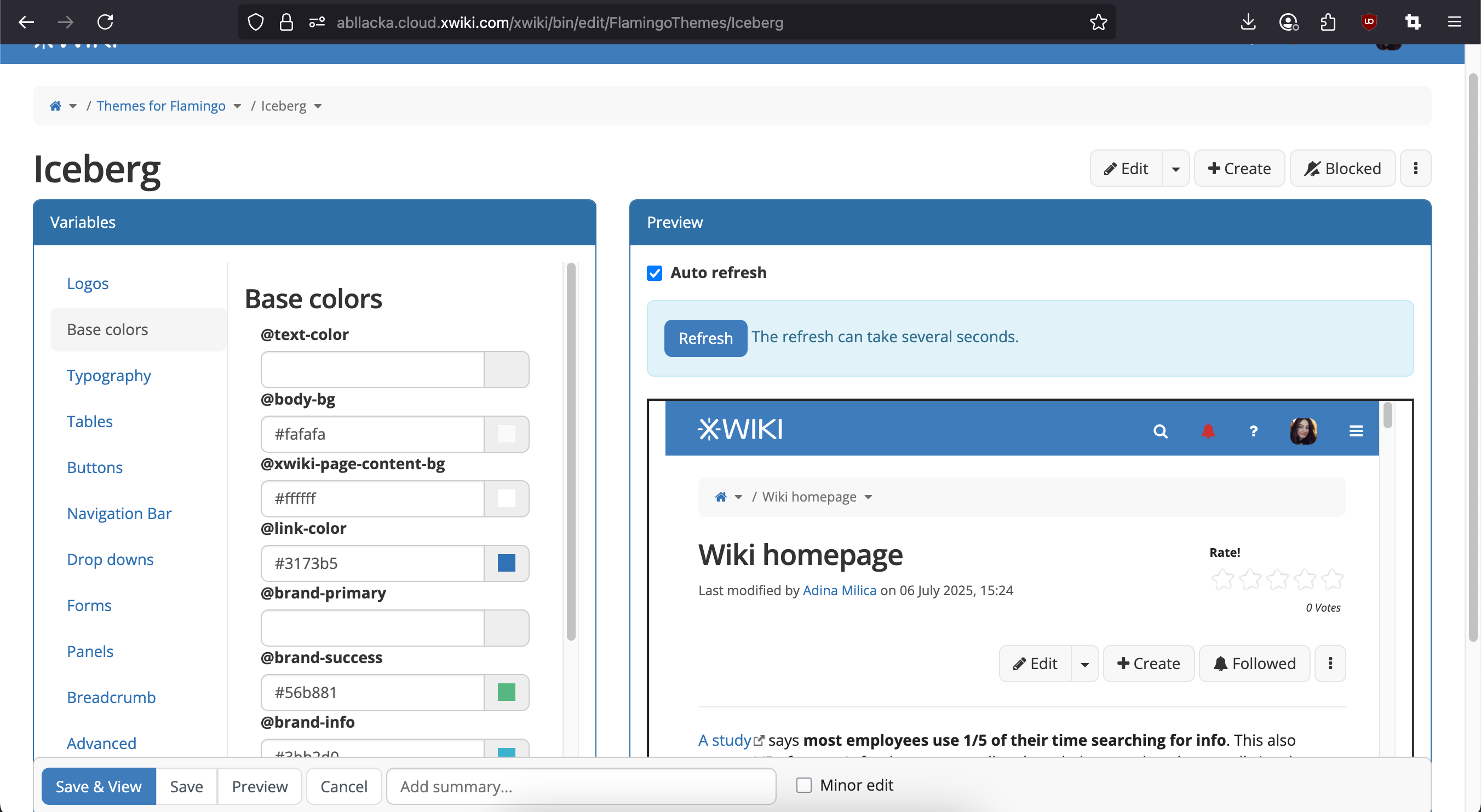
Issues
#1 Not all theme properties have their color code present in the input.
- I assume this is because they have the values from the Bootstrap theme, but a new user to XWiki (technical or non-technical) doesn’t know our stack and, even if he knows, maybe is not even used to Bootstrap variables.
#2 Theme properties don’t have an actual name, they just have the theme variable shown.
#3 No explanation or context is given for each theme property. The user can’t understand only from the variable what UI element is affected by the color he chose
#4 The variables sometimes affect UI elements that are not present on the pages that are user-created. Thus, the user can’t quickly observe the changes he makes in the theme
#5 The preview of the wiki makes the interface scale down to its tablet view. To see the panels too, one has to zoom out the entire page, possibly affecting accessibility.
#6 After modifying a color, there’s no way for the user to know the initial value or the default value.
Effects of these problems
They decrease the perceived value and quality of the product for new users. Theme customization is a very basic thing in most software and users expect it to be very simple, straightforward.
They decrease the chance of non-technical open-source contributions to our themes as the current UI relies on technical knowledge or XWiki-specific knowledge.
New design 
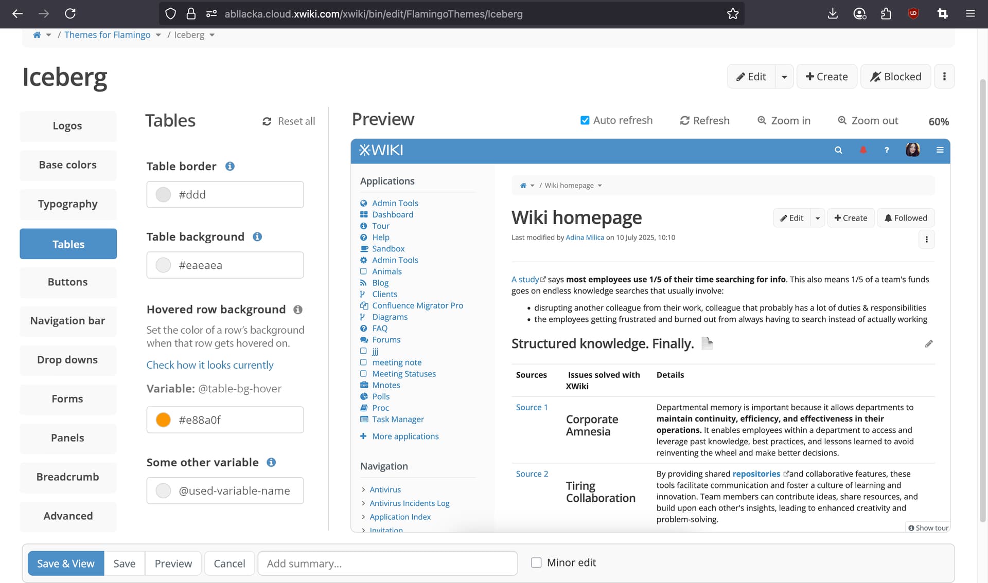
Changes made
#1 We stop organizing things into clearly bordered panels (Variables, Preview) to reduce used space (space-saving)
#2 We reduce the amount of strong borders to make the UI less overwhelming and more breathable. (breathability)
#3 The menu in the left is more cohesive with the one proposed both for Global Admin and the one for Profile Page. (cohesion)
#4 We make the variables’ menu slightly narrower to allow for more width on the preview (space-saving)
#5 We keep all actions related to the preview on one single line together with the “Preview” title (space-saving)
#6 We introduce Zoom in, Zoom out buttons that scale only the preview of the wiki to let the user see how the wiki looks like on multiple screen sizes with the new changes done (on the largest screen size they will be able to see their side panels)
#7 Each theme property has a name present instead of just its variable.
#8 Each theme property is expandable. Clicking on the info icon, expands info about the theme property:
-
which UI element is affected - this is done just by naming the UI and, if it’s the case, its specific state (hover/focused/…)
-
where to find an example of this UI element - this is done by an anchor link to a section of the Sandbox page (which should be updated, see #9)
-
the theme variable - for technical users that may still want to reference it somewhere else
After clicking on it, the info icon gets the color gray. Clicking on it again, we collapse the details and make the info icon blue again.
#9 We modify the “Sandbox” page to have UI elements relevant for each theme property. This is the page that will be shown first in the preview for the wiki theme configurations. The user can navigate from this page to any other of his liking. For page theme configurations, this page will NOT be used.
- For example, in the Sandbox page, a heading named “Tables” will introduce a hover table populated with some random data, so the user can see how his color choices look like for all states of the table.
#10 We change the way we display the color and the code. The color swatch comes first in a circle, followed by the HEX code. This order is similar to popular design tools and no-code tools (Figma, Webflow).
#11 For any theme property, the color code and swatch will be present, regardless if their value is the same with the ones from Bootstrap.
12 The gray line that separates the menu from the overview transforms into a scroll bar when it is necessary to do so.
#13 When deleting the value in the input of each theme property color, the color resets to the Bootstrap theme value.
#14 We add a Reset all button on the same line with the title of the theme element. Clicking it will open a modal for confirmation. Confirming will reset all the values of the theme properties (example: Hovered Row Color) associated with the current theme element (example: Tables)
Scroll bar view

Polls
#1 What do you think of these changes?
- I agree with most or all points
- More work is needed
- The current UI is good enough, I don’t think we should change it
- I’d advocate for a more extreme revamp, the whole process of theme editing should be changed
#2 How’d you evaluate the effort needed to implement this proposal?
- Reasonable, shouldn’t take too long
- Quite intensive, but worth it
- Quite intensive and NOT worth it
#3 How big of a priority do you see the implementation?
- High priority (tell us why in the comments)
- Medium priority (tell us why in the comments)
- Low priority (tell us why in the comments)
- Jira issue: Loading...
- XWiki Design Page: https://design.xwiki.org/xwiki/bin/view/Proposal/UIThemeImprovements