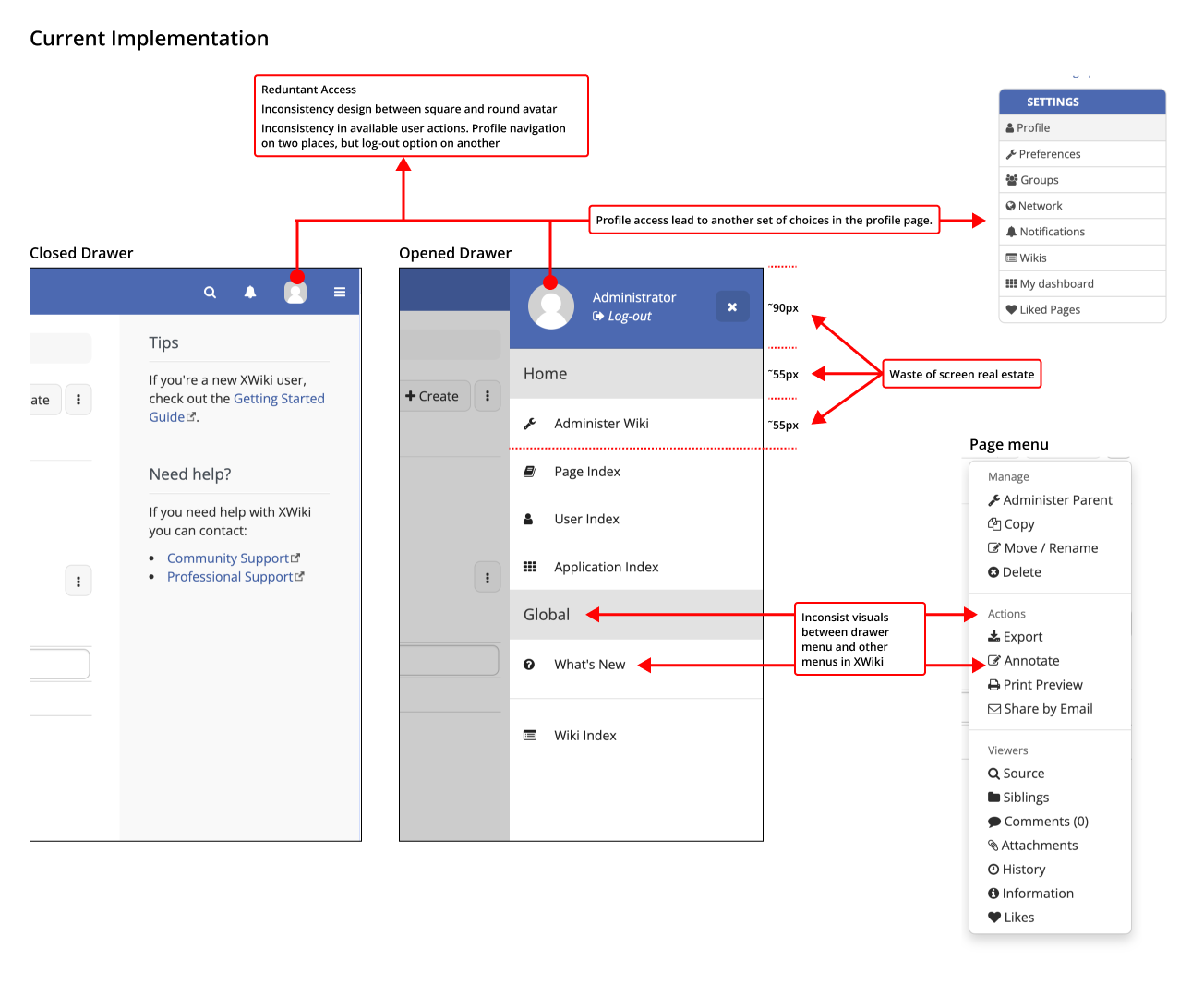
Hey everyone, while dealing with the aforementioned proposals that focused on the header area, I also noticed that we have some inconsistencies and redundancies regarding the user profile access.
General theme of the issues that I noticed:
Inconsistent visual design
Duplicated access to user profile, but only one of them allows me to log-out
Waste of space
Not an issue per se, but an improvement could be made to provide quicker access to user sub-pages
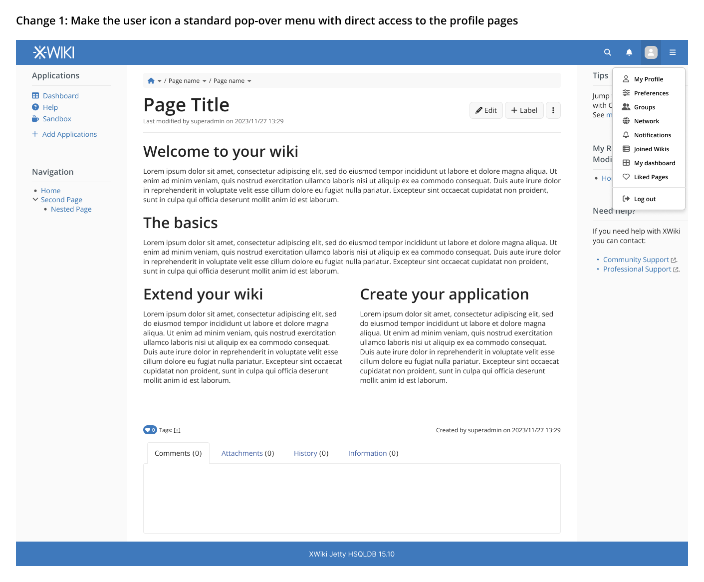
We could use a standard pop-over menu to provide quick access to sub-pages in the profile and add the log-out option here. This menu would appear on click, not on hover. With these changes, we would have the user profile section contained on a single item on the header.
Important: the current menu on the user profile page would continue to exist, I am not proposing the removal of the menu there.
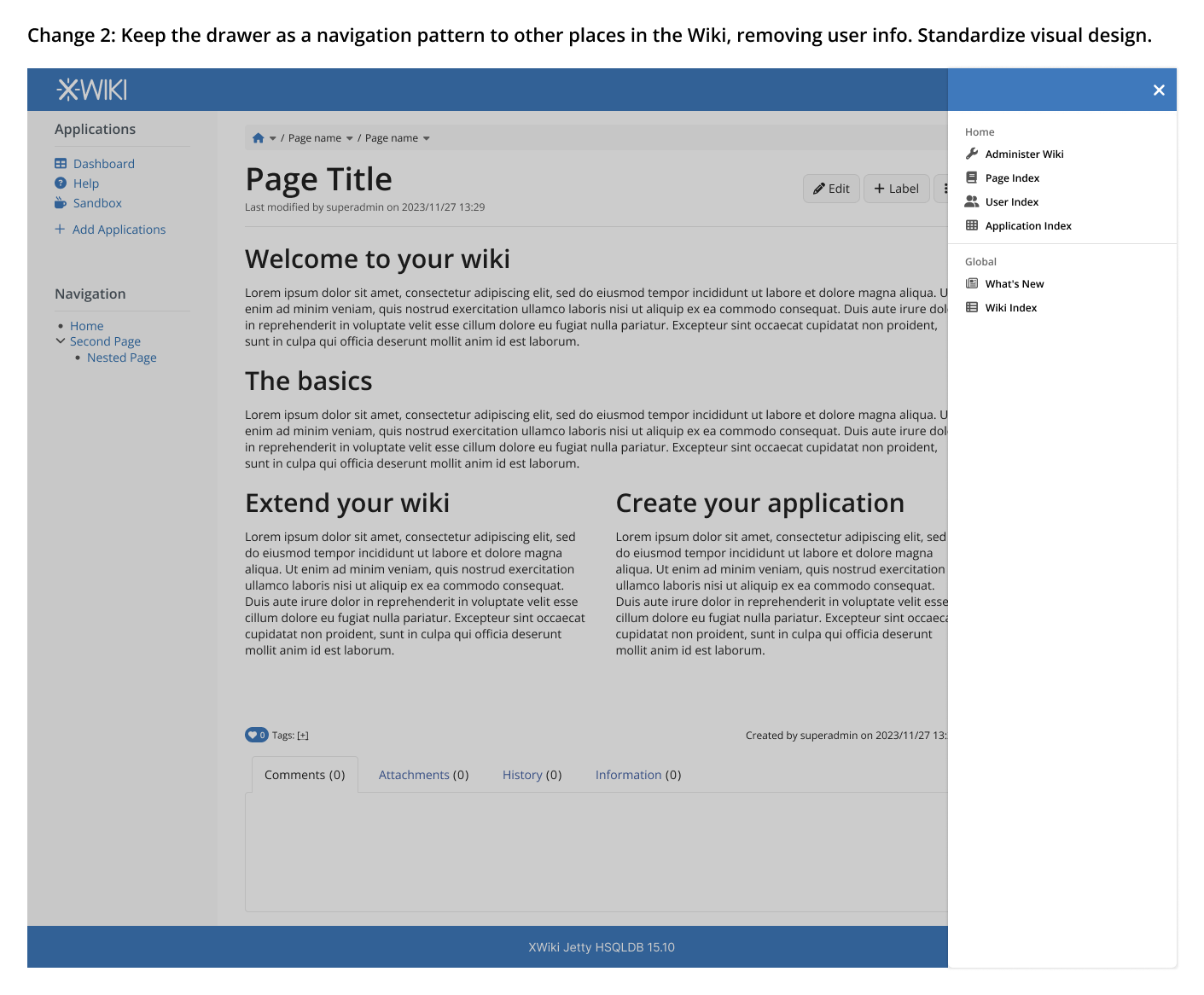
Here the changes are mostly visual to keep it inline with the design of the rest of the wiki. The user section is removed so we don’t have issues with duplication and inconsistent design anymore. The blue bar at the top of the drawer remains there (albeit, smaller) to contain the close icon and also to keep an UIXP that is available there.
Definitely, we even have open issues about the difficult to find log out AFAIR.
I like your proposal, so I’d be +1 to apply it.
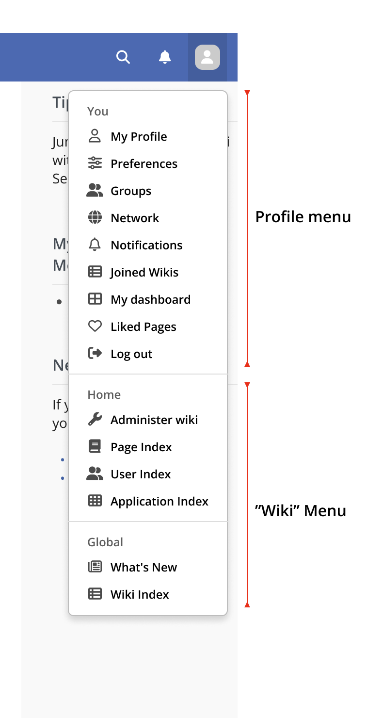
I’m starting to wonder if we shouldn’t check how to get rid of the drawer: if we go to your changes it’ll basically only contains admin link and the indexes.
Admin link could be put somewhere else (could even be just an icon), indexes could be a specific panel on the right, or another drop down menu. Remains what’s new which could be integrated in the dashboard maybe.
What about using a dropdown menu for the admin entries too?
That would leave the drawer unused, and then we could use it for giving access to new things (e.g., what’s new).
I would get rid of the drawer. As far as i remember a drawer isn’t used anywhere else in the wiki. And in 13.10.x it has some a11y issues in navigation with keyboard. (Iirc I made a/some jira ticket/s for that issue/s.)
I like what you propose for the user icon/menu. So my +1 too.
I personally don’t see any problem with the drawer, and I think it makes sense under the hamburger icon. The issues you mentioned have been fixed already. We also improved it recently to support multiple drawers opened at once.
Note: We also want to use a drawer for the “what’s new” feature (Loading...).
Hey everyone, thank you all who participated in this discussion.
As it’s been some time from the last post, and it seems that everyone agrees with most of the changes proposed, I will mark this thread as solved for now. If you have any issues or new ideas to improve the proposal, please get in touch.