At upgrade, this new user setting changes the default underlining option for users who didn’t have the extra accessibility setting enabled, and non registered users. After the upgrade, it requires that each user changes his own setting to have something close to the old behaviour.
(close, as the old behaviour was underlining at mouse hover, which now requires a theme customization, but it may be another topic )
As it has been decided that by default inline links should be underlined, it would be great to:
if possible keep something close to the old behaviour, per user, when upgrading from an older version
Ideally have a global setting for the administrators to configure this behaviour for all users in a row.
-0, if the user upgrades to a new version, by default they should get the actual improvements. If we start doing this for everything, then the upgrade step would be meaningless. This is nowhere near the scale of a change in skin, but it’d be interesting to know how we handled upgrades from colibri and if we want to do something similar. The problem is a bit the same: some users expect the old interface, we update it. “Upgrading” would be easy, but for the users to actually upgrade their wiki and use new features, they would need to toggle everything on.
+0, there’s definitely some need for it. I wonder if a snippet and better documentation would be enough and avoid needing to provide yet another setting.
I think there’s a bug on the search page and the breacrumb items shouldn’t be highlighted (since the breadcrumb parts at the top of pages are not highlighted) since they’re not “inline link”. WDYT @CharpentierLucas ?
The reason we put it by default is because we discussed it and agreed that it’s an improvement for everyone (which is why it was removed from extra accessibility). Either this statement was wrong and we need to change the default value or if it’s correct, then we should keep it, and in this case it’s users who need to change their settings if they don’t want to see it.
Hi! I think we needed the 3rd configuration that you’ve shared. That works well for our use cases.
Finding the information in the documentation is as hard as finding the configuration in the object. Most users including admins don’t look in objects to make changes but expect that option to be available in the UI of XWiki Administration.
The breadcrumb here is used inline, there’s Located in. I’d understand removing the underlining here since the format makes it clear that it’s a breadcrumb. If we agree on it, we can open a ticket. It looked alright to me and noone mentionned it when reviewing recent changes for Loading...
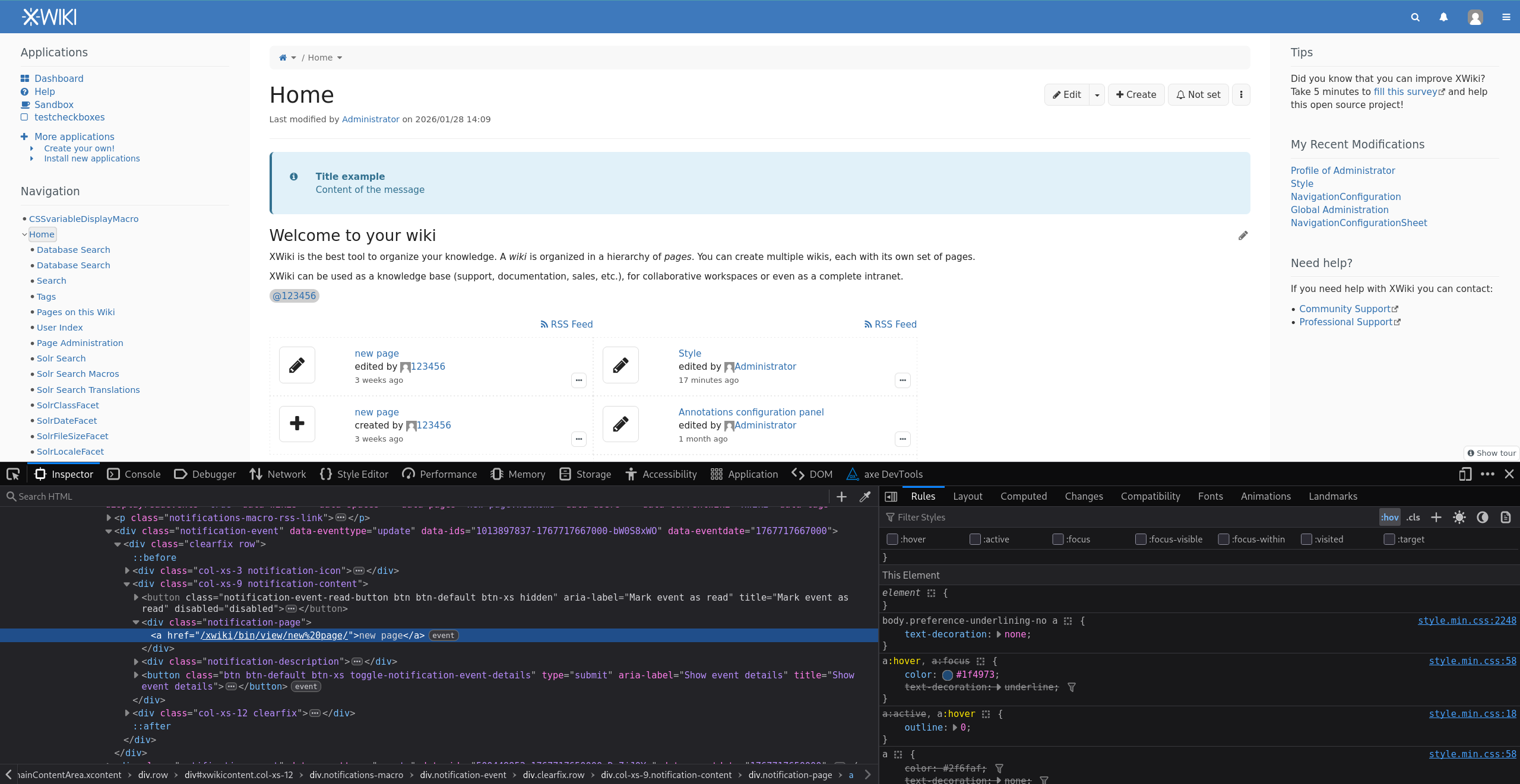
The bug here is actually on the user link on the line below : Loading...
BTW @CharpentierLucas the fact that user is underlined when creating a subwiki feels wrongish too (especially since clicking it doesn’t navigate to the user but opens the suggest picker):
Could you create a jira and handle that if you agree? And I think it would be good to do a quick review of all screens of XWiki to notice if there are places where links are underlined wrongly (i.e. too much). Thx.
Thanks, indeed it can be considered as an improvement on a larger scale, but we are seeing users from several instances who don’t agree. All of them because they come from a previous version of XWiki and don’t find a fallback except at the user level.
I see then two options to ease the transition:
Publish a snippet to allow existing users to get back to a behaviour that was close to the previous one (while keeping the default behaviour for new users)
Improve access to the default behaviour setting for all users, ideally in the administration space, or in the xwiki.properties file with the proper documentation
The option of restoring the previous behaviour with all links underlined at mouse hover would be nice aswell, still in the context of upgrades, to avoid customizations.
If lots of users don’t agree then it means they don’t see the value of the default config for underlines and we need to rethink our default value IMO. Also, as pointed out above, I think we still have some work to do to remove extra underlines (which is possibly also why users don’t agree with the current default value, in any case it probably shows we’re not ready yet to change the default).
cc @CharpentierLucas (if you agree you could send a proposal to change the default value).
I believe the “.preference-underlining-no” rule should be made lower priority than the hover rule so that picking “no underline” works like it used to.
This interference only happens on inline links.
I’d be interested to know what part of the users went along with the changes and if this is a feeling that’s representative of a significant portion of the user base. If changing back hurts even more users, then I’m not sure changing back would be better.
Unfortunately it’s rare that we get precise reports about the failing use cases from users. I’ll report/provide fixes for the ones you found tomorrow.
For one complaint on the forum, I’m sure there are hundreds of users who have the same issue but don’t take the time to report it.
Now, I thought this was introduced in 17.10.x but I’ve checked and I see it was in 16.3.0 (Loading...). So I agree with you that reverting it might not be the best option (which it could if it had been introduced in 17.10.x).
So, I guess we need to:
Finish the implementation. I’ve checked only for 5 minutes yesterday and found 3 places where links were underlined and they shouldn’t have been. I’m surprised that we didn’t go through all screens to remove unnecessary underlines. For me this is one reason that can push users to ask to remove that config. I agree with @Jsd that https://www.xwiki.org/xwiki/bin/view/Main/Search?text=links%20underlining&f_type=DOCUMENT&f_locale=en&f_locale=&r=1 is really too much (too heavy).
Make it easier to disable
Decide what we do for the old behavior we lost of underline on hover (cf above)
@Jsd Do you have any idea if point 1) would help in your case to make it acceptable to have “inline links” underlined by default or the users you have in mind, for some reason, don’t want to have underlines visible at all (and if so, why would they not want to be more accessible?). Thx
Thanks for the investigations about complaints here. I think this question is linked to the perception of WCAG topic, usually underestimated and here rejected when changes affects too much UI. All the complaints we have come from upgraded instances, maybe new users don’t feel the same way about 16.3+ UI.
It would certainly help to fix point 1), and keep inline links underlined by default (helpful for non registered users on public instances). I still think that we should provide a way to control more easily this setting at the wiki level.
+1 provide a way to control more easily this setting at the wiki level.
Another aspect is removing excessive underlined links. And there’s not only navigation and breadcrumbs, it’s also excessive in panels and diagrams that usually have more links than text. See also: Loading...
The jira issue shows custom UI/UX content (as opposed to page content) so right now, it’s up to the creator of that content to decide to disable underlining links. It’s hard or impossible to guess the intent in a generic manner.
@CharpentierLucas suggested to disable underlining links in content inside a <nav> tag. Sounds good to me if that’s legit (I’m not an expert). @CharpentierLucas please create a new jira if you think that should work and not cause accessibility issues.
Note that this would still require the user creating that custom content to use a <nav> HTML tag (which is potentially harder to use than a force-no-underline class which can be expressed as a parameter in XWiki Syntax, whereas the <nav> tag would require using the {{html}} macro). The reason we cannot use <nav> automatically around all panels is that not all panels are about navigation. For example the “Tips” Panel is not used to navigate and contains sentences of text and should have its inline links underlined by default.