Hey everyone, here’s a quick proposal for improvements on the filters and actions of LiveData. There’re other improvements more specific to the pagination, and overall LF of LiveData, so in this one I am focusing more on mobile improvements.
Current Context
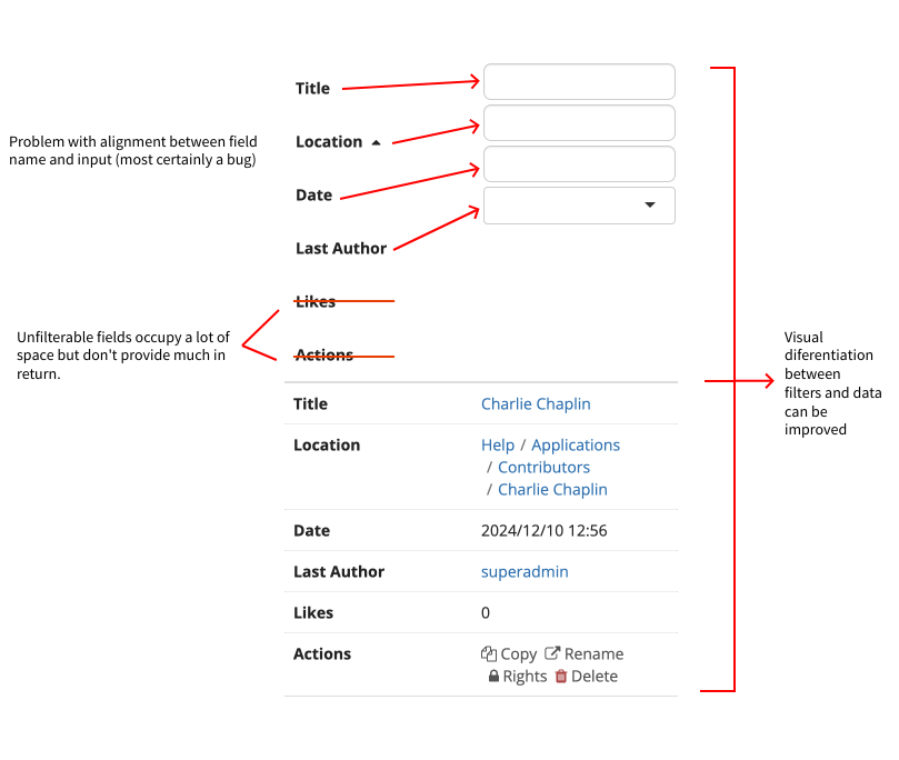
Currently LiveData filters have these problems, usability wise:
It occupies a lot of space initially, that can grow based on the size of the table
Fields that an not be filtered are being shown nonetheless, taking valuable space.
Not enough visual differentiation between the filter area and the body of the table
Field names and input are misaligned
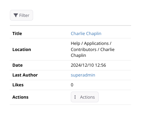
The actions on the card are very hard to use, with a small action area and piled up next to each other.
The actions on the card are very hard to use, with a small action area and piled up next to each other.
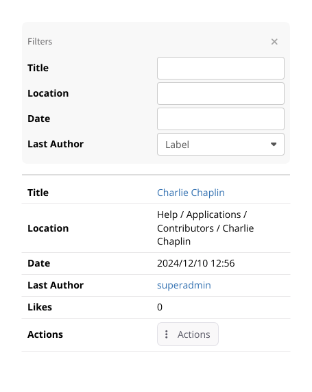
I don’t know the technical complexities on the opening and closing panel for the filters, probably the implementation need to be a bit different from what it is today. Currently, the filter row on desktop is just rearranged on mobile, but this is partly why we have some of the problems listed, namely showing filterless fields on mobile and the lack of open and close.
WDYT?
Any other ideas for showing liveData on mobile?
Thanks for the proposal @tkrieck !
Definitely an improvement.
The only limitation I can think of is that mobile users won’t be informed of the currently applied filters, unless they click on the filter button.
A few brainstorming options:
present a compact “read-only” view of the filters beside the filter button (i.e., a short text with filer id = filter value pairs)
make the filters panel expanded by default when filters are applied
2.1 an improvement, with more work, it to always display active filters, and to provide actions to add/remove filters. That way only relevant information is displayed to the user.
Keep the filters panel collapsed and don’t show the actual filter values, but style somehow the filter toggle button to indicate that some filters are applied.
We could mix a bit of option 2 from Manuel and 3 from Marius.
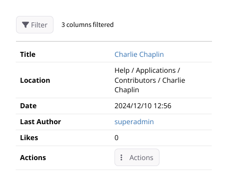
So, style the filter button to indicate that filters are applied and show a string beside it with “## column filters applied”, with “##” being the number of columns. Or something like that.
Ideally, the change in icon would be from “outlined” to “filled” when the filters are applied. But the outlined version is not on FontAwesome free, only in the paid version: Find the Perfect Icon for Your Project | Font Awesome
We could apply just as a color change, not ideal but close. Unfiltered: Filtered:
Sounds like a good tradeoff. Users are aware that something is filtered, and can easily click on the filter button to know more.
We could consider something like Filters applied on columns X, Y, and Z, but it’s more difficult to implement, and might require more vertical space for long column names, and that’s not desirable.
So +1 for your proposal.