Proposal for the View Attachment page

Hey everyone,

I wanted to share a quick update on the proposal for the Attachments View page.

Purpose

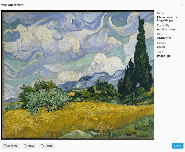
The purpose of this page is to provide a preview of the attachment, its metadata, and the actions that can be performed on the file.

Mockups

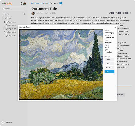
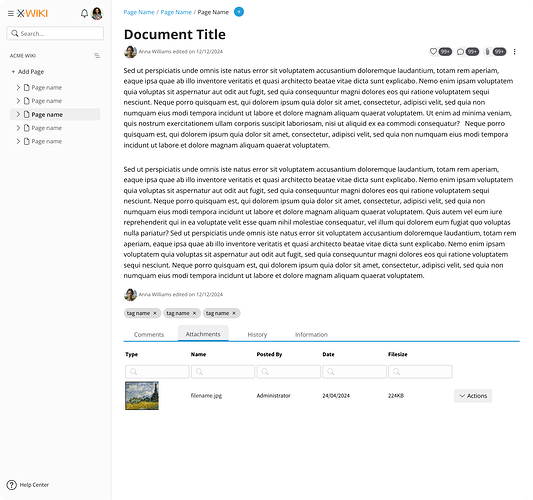
Here’s a mockup with the attachment tab selected at the bottom:

When the user interacts with any part of the attachment line, except the actions menu, the preview will open.

Desktop Experience

On desktop, the preview screen will open as a dialog to retain detailed context.

The default layout will be in landscape mode to optimize element distribution, with the preview occupying the larger portion of the screen. Metadata will be displayed in a vertical column, with actions for the file placed below it.

Mobile Experience

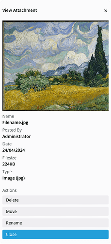
On mobile, the layout will be arranged vertically to accommodate the smaller screen size. The preview will be at the top, followed by metadata, and then actions at the bottom.

File Types and Previews

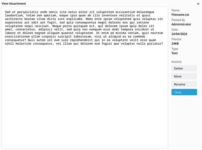
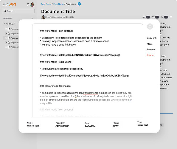
While the images above show an image preview, other file types like text can also be previewed:

No Preview

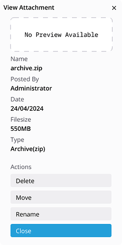
If a preview isn’t available, the interface will clearly indicate this. In such cases, there’s no need for a large preview window with “No preview available.” Instead, we’ll use the same condensed vertical layout for both desktop and mobile experiences.


This is a brief update, and I’d love to hear your thoughts. If there’s anything missing or any concerns, please let me know.

Thanks for taking the time to take a look at this!
Hi Thiago,

Thanks for working on this.

From the displayed metadata I think the file name and the author name have the risk of being large. Are you planning to limit the width of the metadata column? If so, then are you planning to use ellipsis (...) or wrapping the text on new lines?

I’m wondering if it’s not better, for consistency, to keep the landscape layout even when there’s no preview, for large screens (where usually there’s more width than height).

Thanks,
Marius

I’m wondering the same. Also having a thin vertical modal on a large landscape screen might feel weird.

How are you thinking of displaying the version+link to previous versions of the attachment? Would it be the same as now?

Some thoughts on the preview (it’s possible that some things have already been discussed and I’ve missed them - if so, please excuse me)

Should the preview process be kept simple?
Or is it conceivable or desirable to integrate additional functions into the preview process?

Examples, depending on the document type:

  • for graphics: Zooming and panning
  • for PDF files and Office documents: page-by-page view
  • for documents with a recognisable structure (e.g. XML, scripting language): Syntax highlighting

This has impact on the displayed meta information of the attachment.
(e.g. A graphic: “date” date of attaching, date of creation, date of modification …, video data: any id3 tags)

Basically:
Preview is now a pop-up window. Is it conceivable to split the current window into 2 iframes and display the output on the right-hand side of the screen, for example? The current document can then be scrolled and certain information about the attachment can be displayed at the same time.

Norbert

It depends on the amount of fields to be displayed here, but I think it’s important to show the complete information. This could potentially push the buttons outside the visible area and that’s not a good thing, maybe we should sticky them, put them before the metadata or make them collapsed inside a “Menu” button. I’ll need to give it some thought, but WDYT?

It’s a balancing act. Even when showing in landscape view we would waste space on something that’s not very useful. That’s why the “No Preview” element is very short. But I agree on the consistency issue, and it’s probably easier to implement too since we wouldn’t have one more case to code specific CSSs.

Good call, right now I don’t have it on my mockups, but I agree that it is an important feature.

Perhaps in the future we’ll have more features but for the initial versions it will be very simple, yes.

We could end up with an interface that’s very complex (main document + attachment preview). It’s an interesting take, and perhaps advanced users would like such complexity.

Something that’s comes to mind is that we had discussions in the past regarding a right sidebar. For now, we reserved this space for individual panels that the user might add there. Similar to XWiki Standard.

Heyyy everyone! Thanks a lot for the work, @tkrieck !

Sorry if I’m late to the convo, just wanted to drop by and propose an alternative to the layout. Ignore this if it’s too late.

More of an aesthetic concern than a UX one

While I like the column of details, I feel like it takes the focus from the actual content, especially for the image one. I was thinking we could go for something like this:

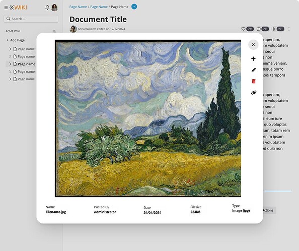
View mode (icon buttons)

  • Essentially, I like details being secondary to the content
  • this way, longer file names/ usernames have a bit more space
  • we also have a copy link button

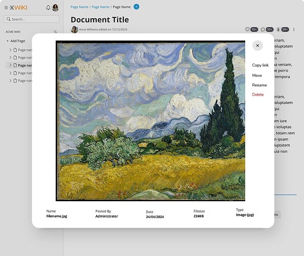
View mode (text buttons)

  • text buttons are better for accessibility

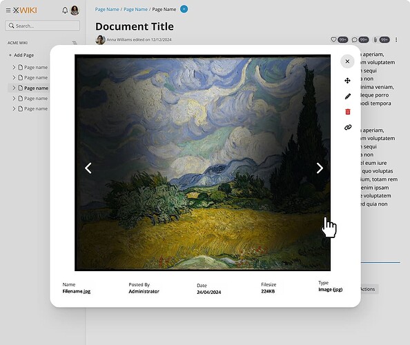
Hover mode for images

  • being able to slide through all images/attachements in a page in the order they are used or uploaded could be nice ( the shadow would slowly fade in on hover - it might be a bit strong but it would ensure the icons would be accessible while still having an unique UI)

Applicability

This proposed kind-of-horizontal layout works for other types of files too because we center the content.

1 Like

Thanks @amilica and @tkrieck

My POV:

  • We should merge ligthbox (when clicking on an image in some part of the content) and attachment view to use the same UI
  • I agree that we need to be able to see previous and next images

Thanks

1 Like

Definitely not too late =)

I liked your options in the way that the space is more evenly distributed, other than strictly vertical or horizontal like mine was.

May I propose a slight change? On your options, you used the bottom part for metadata and the right part for the buttons. We may face a problem if more metadata is to be added further down the development cycle. We probably would need to break the metadata line or add horizontal scrolling, none of these are ideal as they have their own challenges, UX wise.

But what if we change positions between metadata and action buttons? I say this because it’s less likely that we’ll have much more buttons than more metadata. It also has the benefit of reducing the visual impact of the buttons, relegating them to a secondary role, even with icons.

Speaking of icons, in this case, I would not go into icon only buttons as it can make them too concealed and, depending on the action, ambiguous. But we can definitely combine them with labels. Some reading that I am fond of on that subject are: The best icon is a text label — Thomas Byttebier and Yes, Icons Need Text Labels (Video)

Something like this: (here the icons are circle only just for spacing purposes, I still need to import them into Penpot)

What do you think?


Agreed, and another way to make sure these icons stay accessible is to provide hard edges to them. I very much like the Instagram (desktop) looks on this, as it still makes the background image more visible than inner shadows. We just need to make sure it passes WCAG contrast recommendations.

In our case, these arrows navigate between attachments, but some of them might not have previews or the previews are only in text form and these arrows could be hard to see. I’ll need to make some tests on this.

As a fallback we can make these arrow as discrete buttons, outside the preview, but this could also make them look a tad old school.

+1

1 Like

Sounds good to me. I’d not use a circle though as it feels like some sort of radio button :slight_smile: I assume they’re action buttons, aren’t they?

Yes, the circle is just a preview. The final icons will be something like we have in XS.