Hello everyone!  I come with a proposal for some rules for the UI/UX of the macro configuration modals. I tried to keep here the most general ones. Many fields are affected by these rules.
Goal of this standardization:
- improve UX of macros, make them easier to use even by new users
- keep everything consistent
- make current configurations adhere to this standards
- follow these standards in future development
1 Label naming
The label of a field should:
- try to be short
- try to make an additional description unnecessary
- try to not refer to the type of input, but to what the field represents for the configuration the user is doing
- try to not duplicate information: if something is understood by context, then it shouldn’t be specified in the name
2 Field description
The description of a field should mainly be reserved to:
- linking to a section of documentation
- providing concise instructions for how to use a new or custom UI.
- specifying accepted file formats
Also, for anything that would not be known to a new user, there should be added a link in the description of the field. See examples in full page
The documentation could be provided…
- externally - needing internet access
- locally - as an extension (to be confirmed if this is possible, I don’t know the technicalities of it)
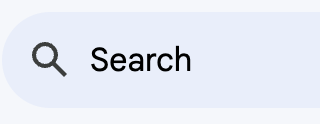
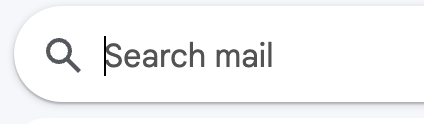
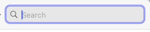
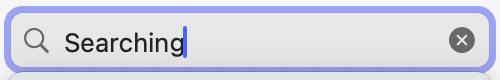
3 All fields should have a placeholder text
The placeholder should concisely say what the user should enter in a specific input box. Also, we should make sure it has enough color contrast, without making the normal text and the placeholder the same.
4 The length of the input box should indicate the length of the input needed.
We can have 3 general lengths (small input, medium input, big input) for large screens and the default length for small screens.
5 Selection method
Depending on the data that is contained in a list, selecting from that list can function differently.
The component that lists the options depends on the type of list we have:
-
a short limited list (with a maximum of 10 items at all times, is probably a static list)
- UI component: dropdown with all options, non-searchable
- example: the columns/properties that a livedata can have, layout types for a livedata
-
long limited list (dynamic list, with items that don’t need to be presented in a complex structure / hierarchy)
- UI component: searchable dropdown (non-filterable, default sorting)
- examples: the users an instance has, the tags of a wiki, the ids of usable livetables
-
unlimited list (dynamic list with a very high possible number of items that need to be presented / selected in a complex way)
- UI component example: for pages, attachments → link dialog UI inspired
- example: all pages in a wiki, attachments → they need trees, they can be refferenced or linked
6 Multi choice fields
= fields in which the user can enter multiple options
The user should NOT be required to input them without any help and only by delimiting the options with a column.
We should use a multi-option suggest input.
7 Singular choice field
= fields in which the user can choose only ONE option
If the choices are complicated in meaning, but can be explained in 1-2 lines of text…
- …those explanations should be included in the dropdown (as it was done for quick actions).
If they can’t be explained in only 1-2 lines…
- … a link must be provided concisely in the description of the field to let the user understand the differences between the choices
8 Checkbox field (true or false)
The label of a checkbox much be short but clear in its meaning, without it needing a description under the checkbox. The description is NOT forbidden; there are many cases in which the field label would be way too big if the field doesn’t rely on the description.
The label of a checkbox should specify…
- what is affected by the check (a feature, an object, etc.)
- and how does the check translate as an action upon the affected.
9 Measurement fields
Fields that specify width or height or time until something happens should have two inputs:
- one is the number,
- the other one is a dropdown for the accepted units (px, percentage, em, rem, seconds, hour, etc.).
10 Code fields
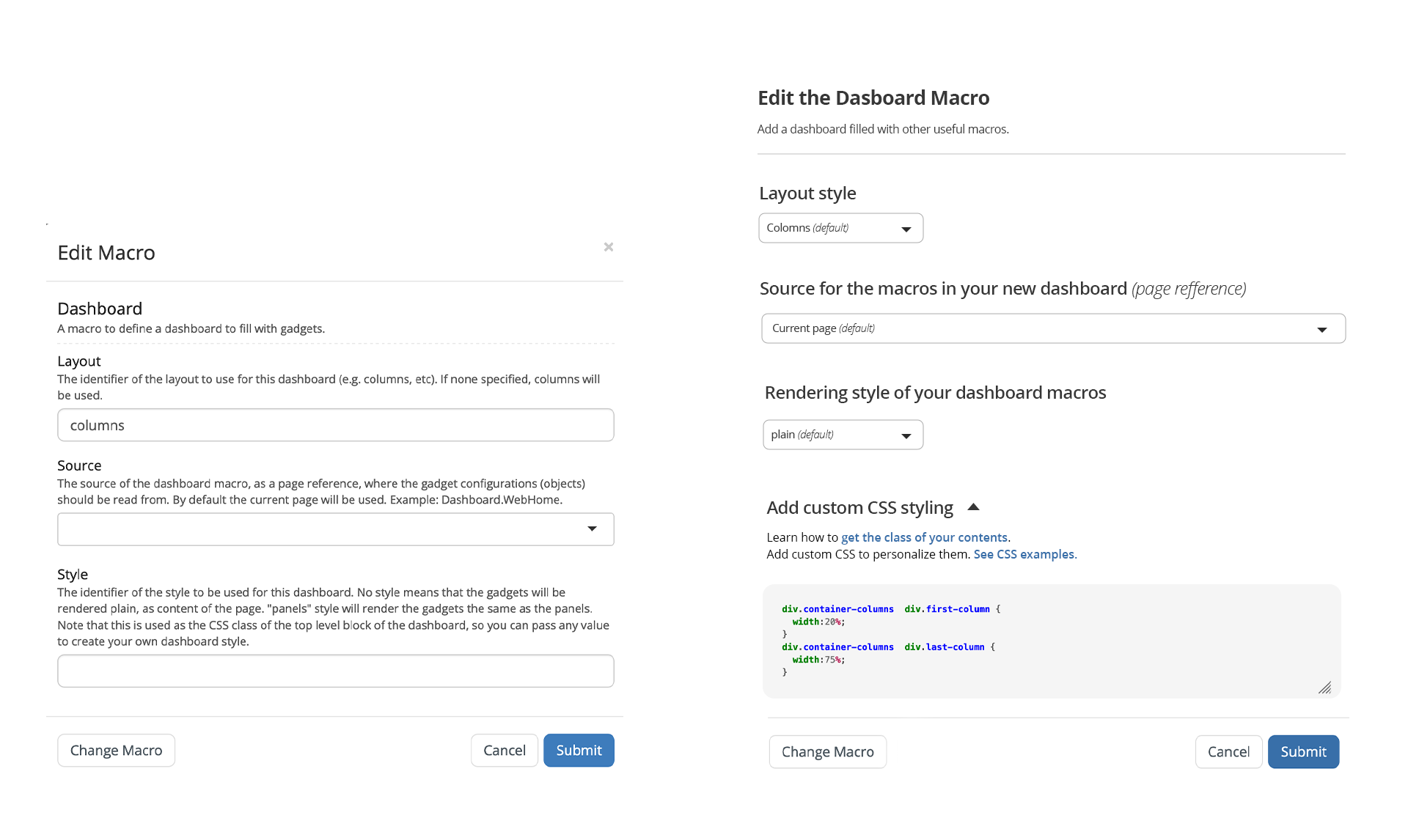
For fields that require the user to input code (of any language) or wiki syntax or markdown, the field should have a different look than other normal text input fields.
See special cases who fall in this category + exceptions + look proposal in full page
11 CSS fields
= fields that let the user add new CSS or a CSS class to a certain macro
#1 The input should be formatted like a code field (with the default language CSS).
#2 This input should contain commented CSS code that shows the user what classes he can use for that specific macro and how.
#3 The field’s description should link to how to use CSS classes in XWiki or how to find the CSS class of a macro.
#4 Also, a link to examples would be nice.
12 Wiki syntax fields
For fields that require the user to input wiki sintax:
- description should link to a guide on how to write wiki syntax correctly
- the input box should contain a commented / not-outputted example of wiki syntax for that specific macro. For some macros, we can decide if this example should not be commented and just be the default value for that macro’s content.
- they should be formatted like code fields
13 Page reference fields
For fields that require the user to reference a page/attachment/image/video we should use their dedicated selector component.
For fields that require multiple types, we can reuse the link dialog UI component.
For images & videos, we should add a functionality to only search through supported file types.
14 Alternative to referencing/selecting a file
Whenever the user can select/choose/reference/search a file, he should also be able to upload the file.
Conclusions
- Which rules do you agree with?
- Which should we edit?
- What do you think are the next steps after confirming the rules?