Proposal for view/edit page Permissions(Rights) UI

Hey everyone,

Here’s a proposal for the view and edit page permissions. The name scheme is something that I would like to start actually.

In XWiki these are called Rights, but the denomination Permission is more widely utilized on other apps and software. Changing this for XWiki would be a burden in documentation, source code and breaking user flows, but I think that for Cristal we could start realigning ourselves with other applications, for simplicity’s sake. What do you think?

Anyway, back to permissions in Cristal. To view and edit them, I would like to propose a page inside a modal. This modal would serve for all kinds of personalization options, but right now we will focus on permissions.

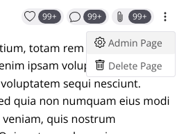
To open the modal there’s an option on the more button.
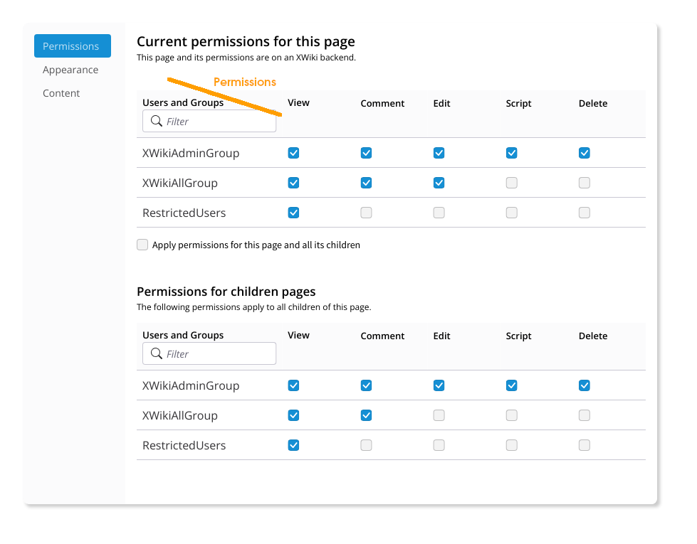
admin dialog open (1)

Modal opened

Permissions menu already selected (appearance and content are placeholder only for now)

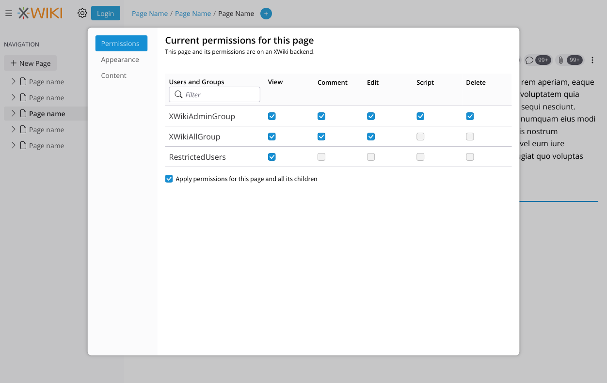
At the start of the modal, below the main title, there’s a hint that states the backend that this page belongs to and a short text explaining that these permissions comes from that backend.

Screenshot 2024-12-17 at 10.07.25

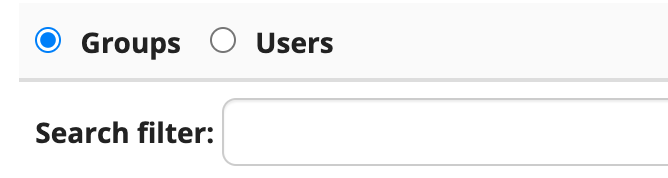
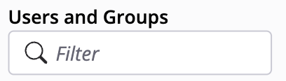
Filtering for users and groups can be done with the default LiveData filter:
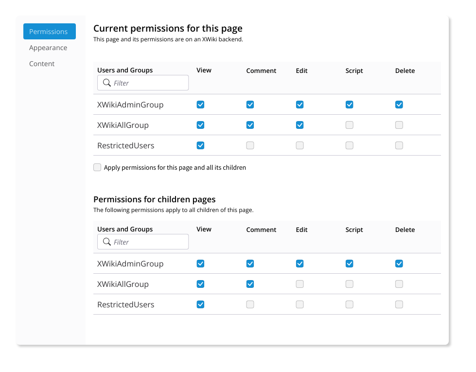
Screenshot 2024-12-17 at 10.08.14

Children pages
Different from XWiki, where we have separate pages, in Cristal I am proposing that the permission screen is the same for the page and its children. There’s a checkbox (default on) that controls who is the recipient of the permissions, if the permissions are the same for the page and its children then only one table will be shown.

If the users want to separate them, they check the box and a second table will appear, one that controls permissions for the children pages.

Scroll and pagination
This screen can grow very much depending on the amount of users and groups, that’s why it would be nice to have scrollbars individually for each table.

Pagination is also probably that will be needed, just not pictured here.
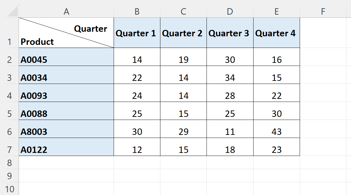
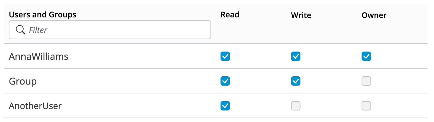
Different backends
With the support of vairous backends this screen will need to be adapted for each, so in case of the filesystem for example the table might look something like this:

Ending thoughts

As you can see, this screen is not that different from others like the ones from XWiki. The proposal is more focused on ways to access it and some details like the checkbox to see permissions from children and the different nomenclature. Some fields might be different, especially regarding the work being done with Required Rights, but I feel the same pattern shown here will be applicable in that case.

Thank you for reading and please tell me your thoughts on this.

Thx for the proposal Thiago!

I think that we should also propose what we want to do for XS, and that proposals should be made together for both Cristal and XWiki since we want to merge their UIs in the not-too-far future :slight_smile:

The downside is that there’s less space for admin UI options. Can you see this working for XS too? It’s easy to imagine it for Cristal because it’s quite empty ATM but if you check the XWiki Admin UI, you’ll see there are plenty of options, including one for the Panel which has a panel wizard taking lots of space for ex (maybe we don’t want to keep that, idk, it’s just an example of a screen requiring lots of space).

The Rights screen is actually a good example too since the number of rights is unbounded (there can be 30 right types for example). It seems to me that we’re doing the same mistake than what we did in XS, ie consider that the # of rights is small and fits on the screen or almost fits (I already don’t like in your screenshot that Admin or Programming Rights are not shown, I think that’s not good enough and will be misleading for users).

I think that’s why we had these proposals (we need to fix the macro):

This looks ok to me and we should have the same for XS IMO.

So globally it looks nice and I like it, but I have questions about UI scalability:

  • Scalability of the dialog itself
  • Scalability of the Rights UI specifically

Thx!

You’re right, actually I did consult the admin page on XS before making this proposal, so at least it is based on it.

I do for the page options at least. For the general Wiki Admin, there’s a specific proposal for it. Also, the dialog can be almost the size of the viewport so we can be generous on this aspect (on mobile the dialog should spans 100% of the width and height of the viewport).

Now, this brings an interesting discussion, if both should be the same screen as in XS or specialized screens (one for general admin and one for page admin).

There are pros for both approaches.

Discrete screens: we can specialize each for the needs of each use case. Page admin requirements are smaller in scope, so a dialog can work best as it does not completely remove context from the user (close the dialog and the users are back to where they were).

Same screen: there’s only one resource to maintain.

One question to be answered, is it technically feasible to have the same children pages but being opened by different parents? Like the same page that can be called by a discrete page OR by a dialog, depending on context?

I will make some mockups with more content to make more clear the behavior on each scenario. Hope that helps.

Thanks for the feedback!

As far as I understand, it should be doable with Vue :+1:

One thing that bothered me a bit (while trying to forget about my habits with the XWiki UI) is how asymetrical this permission table was.
There is a label for the Users/Groups column but none for the Permission row.
While reading this discussion, I wondered why we wouldn’t have a filter on Permissions too.
I don’t know how we could make all of this fit gracefully together though… :thinking:


Thanks!
Lucas C.

1 Like

I am not sure if understood this part. You mean the “Search filter” label that we have on XS?

Screenshot 2025-01-07 at 09.54.23

So if I mark the filter for that permission, only entries that have that permission would be shown? I think this would be useful. We can show this as a “yes / no” OR as a checkmark.

I would go for a “yes / no” label because it’s more consistent with the other filters and also provide more context to what the control does. What do you think?

I don’t think we understood each other. Here is an example of this kind of symmetry between columns and rows headers in a spreadsheet software.


And where it would end up at in our UI.

I was thinking about a filter for permission columns by permission name. E.g. I start typing E and it filters only Edit and Export right, hiding every permission column that doesn’t start with an E. It would be somewhat symmetrical to the User filter we have now in XWiki. It uses the user name to filter for users:

1 Like

Ah, got it now. But this isn’t a very common practice on the web. At least, I don’t recall a practical example. We could try to group them, somewhat like the image below.

I think I got it, I will try to have something mocked up, but I fear this would go against the live table filter standard where each column has its own filter. I’ll try to experiment a bit.

Thanks for the reply.

1 Like

I think there are a few important things missing here that are also problematic in XS:

  1. The UI is impossible to use if there are thousands of users and groups and just a few of them have rights set. It is impossible to find those that have rights set. Instead of listing all users and groups with an option to filter, I think the UI should only show those rights that have been set and offer an option to add additional users or groups. Additionally, we could decide to always show some users and groups like guest, the all users group, and the current user.
  2. The UI gives you no feedback which rights a user or group has (before or after setting a right).
  3. There is no support for performing several changes at once, at least I don’t see a save button, so I assume all changes are immediately applied. However, this makes it very hard to perform certain changes as you need to be very careful that a) you don’t lock yourself out and b) the intermediate states don’t cause issues for other users. At least to me, it would seem much better to have a UI where you can perform several changes, preview the effects (see how it affects the rights of some users you enter) and then apply everything at once when you’re satisfied.

I also agree with @vmassol that there is a problem when there are many rights. I think https://design.xwiki.org/xwiki/bin/view/Improvements/Rights4Wiki shows an interesting solution for this problem, but I’m also not entirely convinced as we’re losing the easy overview that the current table view provides. What’s not clear to me also is what happens if a right is explicitly denied, but the user still has it (for example, when an admin is explicitly denied edit right, it has no effect). It seems much simpler to show something like this in a tabular view.