Context
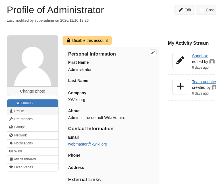
The left menu of the user profile is a flat list of 8 entries in XWiki Standard (Profile, Preferences, Groups, Network, Notifications, Wikis, Dashboard, Liked pages), and extensions keep adding more: there’s at least 9 outside xwiki-platform. There’s no obvious place for a new preference, and the list keeps growing (XWIKI-22065).
Proposal
Group the entries in collapsible sections, displayed as an accordion like the one of the Administration menu:
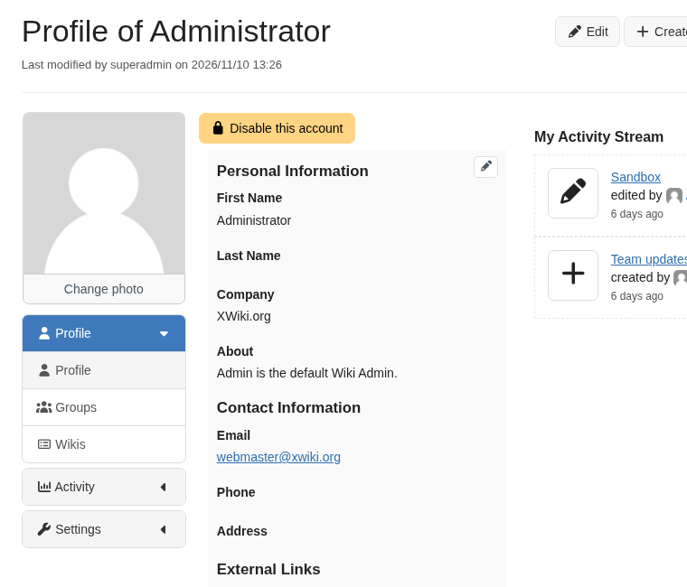
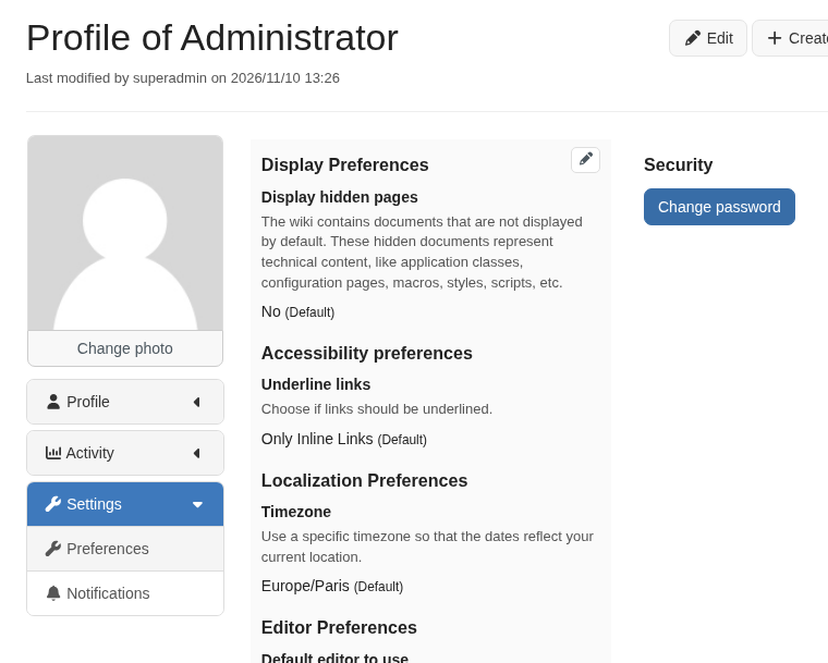
The default groups:
| Group | Entries |
|---|---|
| Profile | Profile, Groups, Wikis |
| Activity | Network, Dashboard, Liked pages |
| Settings | Preferences, Notifications |
| Other | entries without a group, e.g. those of extensions not updated yet |
The behaviour is the one of the Administration menu:
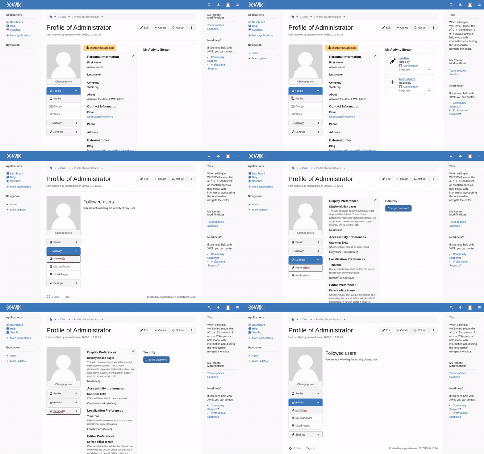
- Only one group is expanded at a time.
- The group of the displayed entry is expanded on load, and again when going back in the browser history.
- Clicking a group heading only expands or collapses it, groups have no page of their own.
- Empty groups are hidden.
Here it is in action: https://github.com/user-attachments/assets/6f5f214d-3d20-41c6-ae41-3f1d7f7a671c
On the technical side, in short:
- Groups are UI extensions of a new
org.xwiki.platform.user.profile.menuGroupextension point, so an extension can add its own group. - Menu entries get an optional
groupparameter. Existing extensions keep working unchanged and land inOther. - The accordion is a new generic
#verticalNavigationAccordionskin macro. The Administration menu is not migrated to it right now but it’s an improvement we could do later on. - The panes content themselves don’t change.,
The details, the rules and the dropped options are on this design page: https://design.xwiki.org/xwiki/bin/view/Proposal/UserProfileMenuSubsections/
The implementation is in draft PR XWIKI-22065: Add subsections to the preference menu by Sereza5 · Pull Request #7508 · xwiki/xwiki-platform · GitHub
Questions
- Do you agree with this accordion for the user profile menu? It takes more space than the previous menu but it matches better what we have in the Admin menu.
- Do you agree with the 4 default groups and the entries in each?
Here’s my +1 for both.