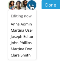
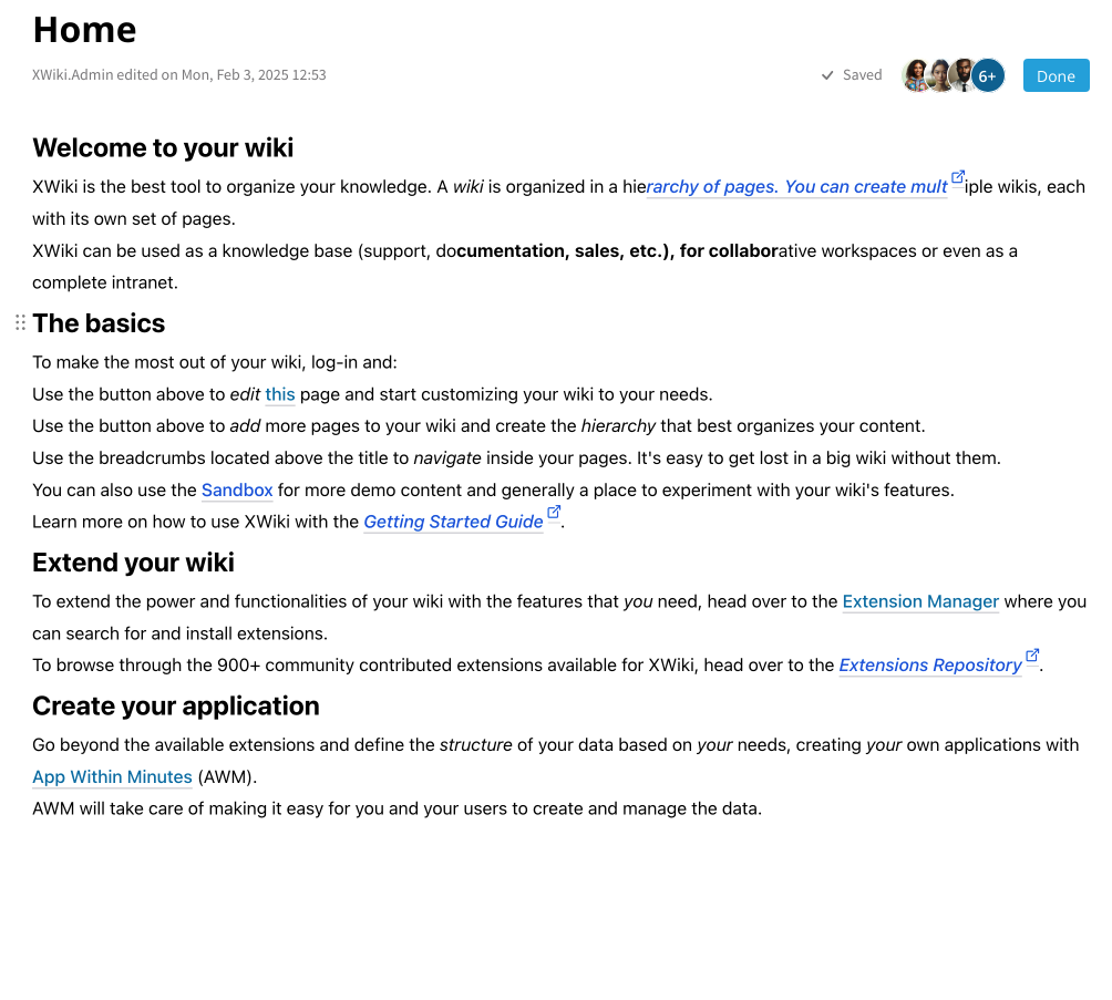
This proposal integrates session information into the same line as the Edit button, streamlining the experience:
Example
Editing Mode Adjustments:
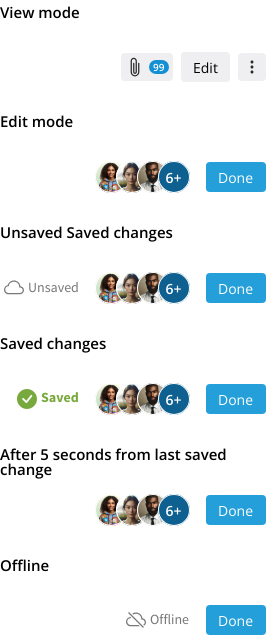
When editing, the buttons for attachments, comments, and “More” are hidden. The tabs for these, at the bottom of the document, should still be available
A “Done” button replaces the “Close” button to indicate workflow completion, reinforcing the concept of making changes and finalizing them.
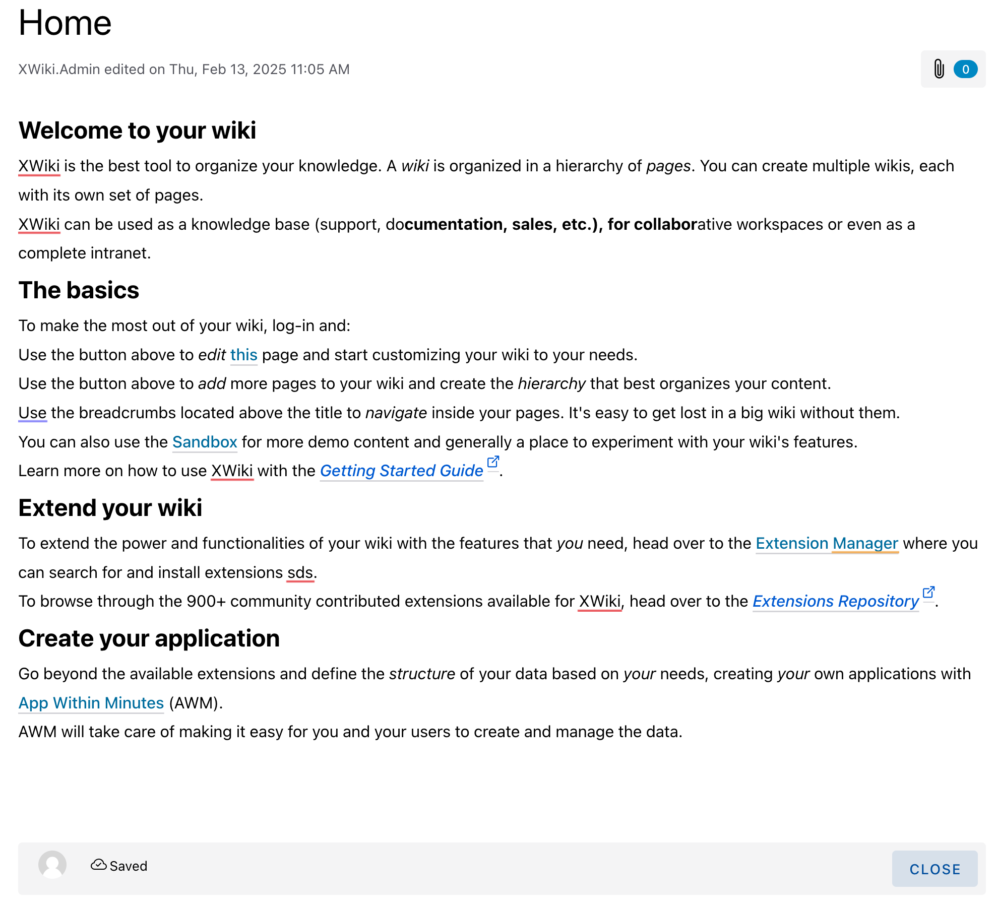
The list of editing users is moved to the top bar, making collaboration more visible.
This helps users quickly identify if others are working on the document, reducing conflicts.
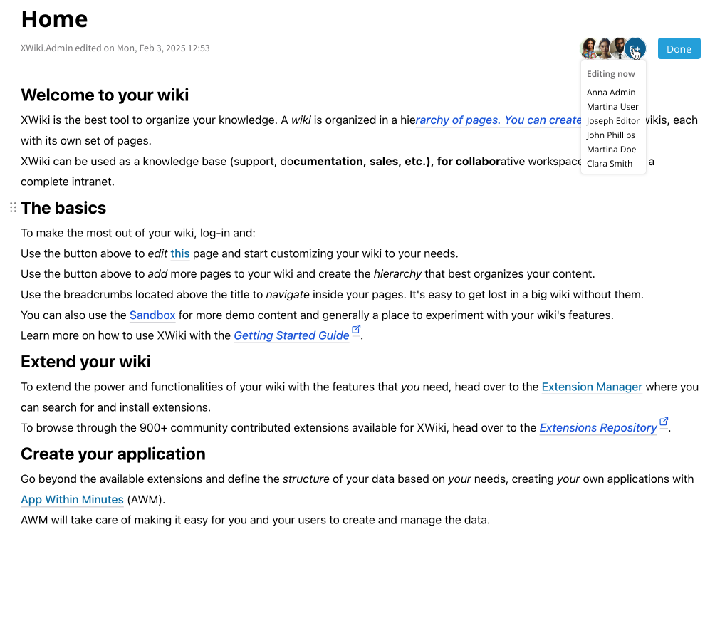
Hovering over or tapping a user’s avatar reveals their username via a tooltip.
If many users are editing, only a limited number of avatars are shown. A grouping button displays the count of extra users, and hovering over it reveals all usernames to ensure complete visibility.
The saving status is placed next to the user list.
All save-related statuses remain visible as needed, but the “Saved” status disappears after a few seconds (configurable by an Admin). This helps the UI to be cleaner in normal operations.
Hello! This looks really good! Thanks a lot for working on this!
My only question relates to what happens when scrolling in edit mode. Does the session status bar remain at the top (sticky)? Together with the who edited last information or without it?
Good point, that I didn’t address in the proposal, but it should always remain visible. It actually already works like this in the current implementation and should remain that way.
Thanks Thiago. We discussed also addressing XS at the same time when proposing new Cristal UI/UX improvements. I would be interested to discuss how this would apply to XS and make sure we agree about it at the same time. WDYT?
It’s probably not a big problem for attachments and comments (if they remain accessible at the bottom of the page), but by hiding the “More” menu it means the user has to leave the edit mode to perform those actions. Are all of them exclusively for view mode? This “More” menu is going to have an extension point in the future for sure, to allow extensions to provide menu entries. Even if the currently hard-coded entries make sense only for view mode, we don’t know if it will remain like this.
In XS we tried to keep the in-place edit mode as close as possible to the view mode. We wanted the user to be able to do from edit mode most of the actions that were available in view mode. For instance, I don’t see why the user wouldn’t be able to share the page by mail, export, check history, administer, etc. from edit mode. These can use a modal, or be opened in a new browser tab.
+1. I’m wondering about the button color though. It’s blue because it is the primary button?
+1, looks great.
+1. I suppose that in case of an error we can display more information about the error in a tooltip on hover (and show “Unsaved” with red).
Can you show us a screenshot with how it looks when the page is scrolled? I’d like to see what exactly remains visible at the top.
You are right, I forgot about it when proposing. I’ll update this proposal for XS too, it’s actually conveninent since the top voted feature for XS in 2025 is the replacement of CK4. Thanks for the reminder.
Thanks for your input. This is the way Cristal works right now, the more button is hidden when editing, so I thought it was a technical decision. I’ll update my proposal to include the More button.
Correct, its color comes from the Design System tough, so it might not actually be blue or exactly this shade of blue.
I’ll update the mock-ups with these two situations. Regarding the scrolling part, this section is already fixed in the implementation, the proposal just includes more items there (moving them up from the bottom of the screen).