Hi everyone,
Note:
- This discussion is also based on its Cristal counterpart, here.
- More details can be seen in the proposal page: https://design.xwiki.org/xwiki/bin/view/Proposal/RealtimeEditingSession
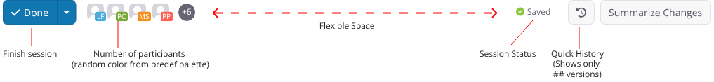
Currently, the action buttons bar, at the bottom of the document, loses a bit of sense on a Real-time editing context. After all, the document is always saving itself, so there’s no need for individual save buttons.
Also, the active users in the session is overlaping page title.
Discussing with @mflorea we got to the results below, which we believe will improve the experience when using the Realtime Editor.
Proposal
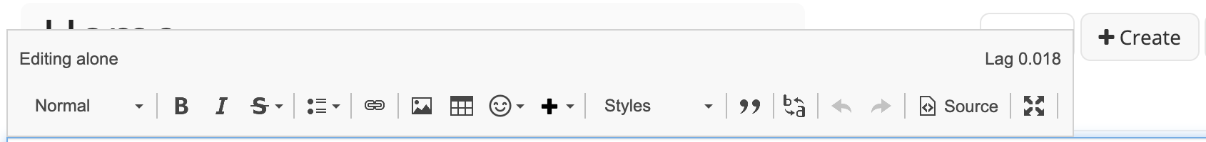
Editing Alone:
![]()
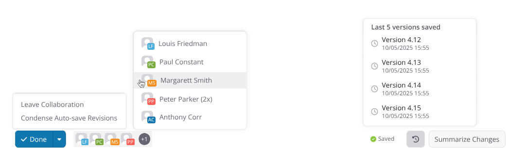
Editing with other users:
![]()
Sections
Offline
When offline, most of the buttons disappear, only the reconnect action is available. XWiki still tries to reconnect on the background, but there’s the option of a manual attempt. The “?” icon explains this behavior.

Pop overs
Here’s a list of buttons that expands to show different sections:
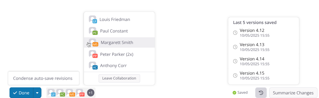
Done
Has an option to condense auto-save revisions, object of this discussion by @mflorea
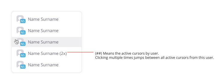
Participant list:
To save space, only some participants are shown. To see the full list, the user must click this space. Also in this pop over, there’s the option to leave the Realtime Session.
Clicking the avatar of a participant will take the cursor to where that user is editing. If a user is editing in more than one place in the document (in a different tab for example) after each click the cursor is cycled between these locations.
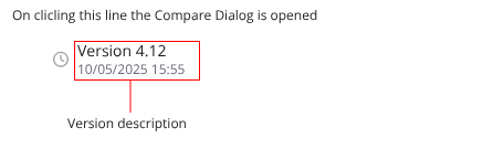
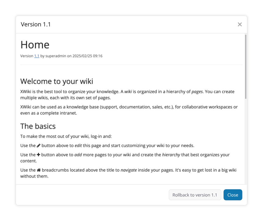
Quick History
Here we list the most recent revisions to allow the user to go back to a point in time and rollback unwanted editions. Clicking each revision opens a dialog showing the document at that point in time, in the same way as the history tab, with an option to rollback.
Thank you for reading, what do you think of the proposed changes?