The fact that it’s not easy to maintain. Its content is oldish now, been maintained by XWiki SAS (under the governance. It’s also hard to ask the community to translate it without the source being owned by the xwiki.org project. And translating a video is hard anyway.
This VOTE is thus about removing it.
Here’s my +1
Now, we should discuss if we want to replace it with something else or not.
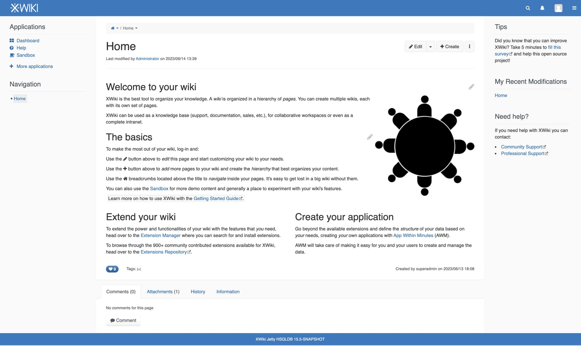
I think an image would make the home page looks nice (and also shows to our users how to view and edit images). I guess the harder part would be to decide what to use.
BTW, I think we shouldn’t have any video in XS since we don’t offer a way to display videos in XS. So we would first need to make the video macro a macro supported by the XS devs, and bundle it in XS.
In any case, this thread is about removing the video (not replacing it with a new video).
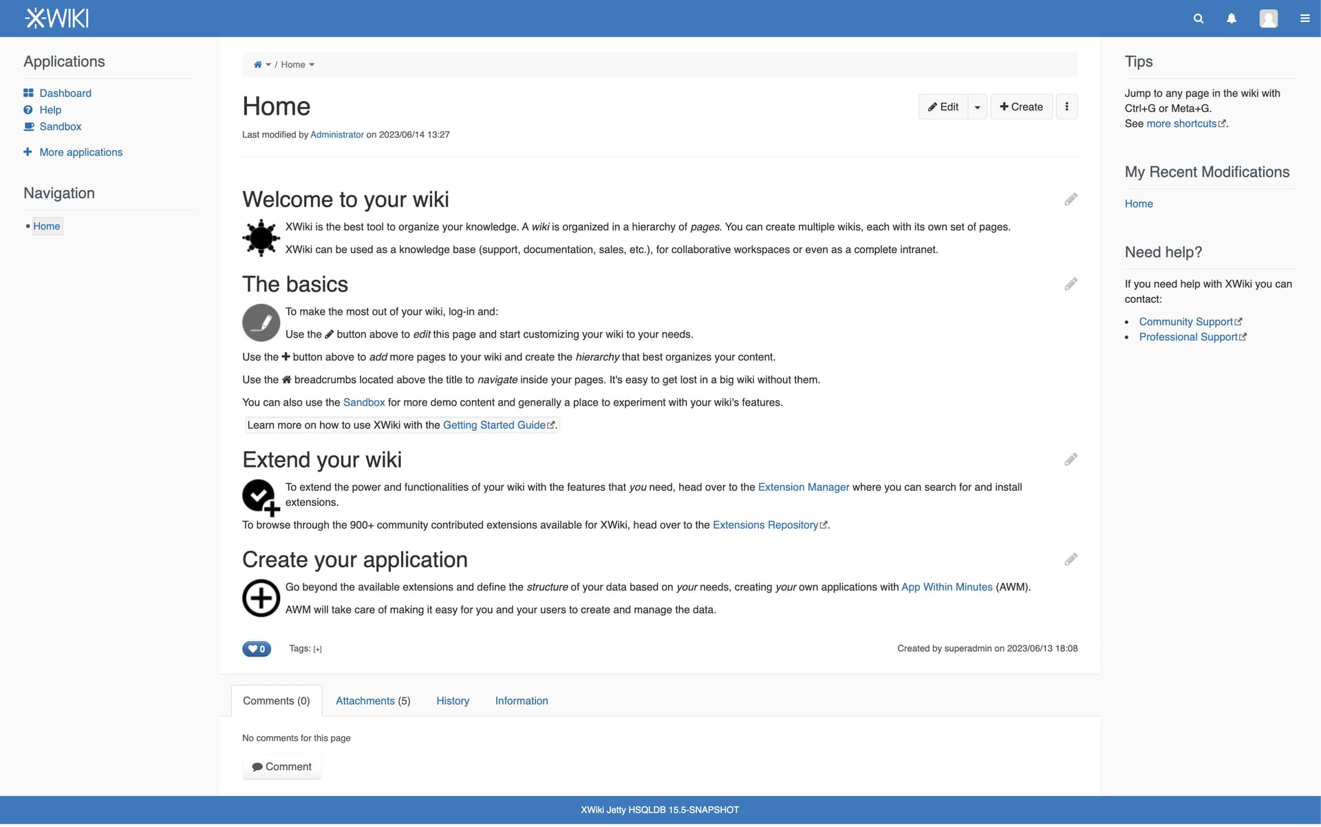
In case you aren’t aware, Help.Videos embeds 6 YouTube videos. Various other pages like Help.Applications also embed attached videos. Just search for videos in the list of all attachments in a fresh installation.
AFAICS it’s a lot of work and hacks to keep it up to date and running (see Vincent’s initial post). As of now the cons outweigh the pros by far and I don’t think changing the video host would solve much.
+1 for the logo
Subjectively, I’m not sure the caption would be needed though. It could create/increase cluttering and I’m assuming any user reaching this page would recognize it as the XWiki logo pretty easily anyways. @surli Is there a rationale to why we should include it?
I wonder if we could/should change the layout by moving “Extend your wiki” and “Create your application” in one column that is right of “The basics”. Alternatively/additionally, we could have an image for every section similar to the DokuWiki.org front page.
What’s sure is that we have some jiras open about the multi column layout. Removing that in favor of sections could be nice.
I remember 2 issues:
Issues in some export
The markup for the home page isn’t nice and too complex (looks hackish). We would need to use the container macro, but first we need to make it inline-editable
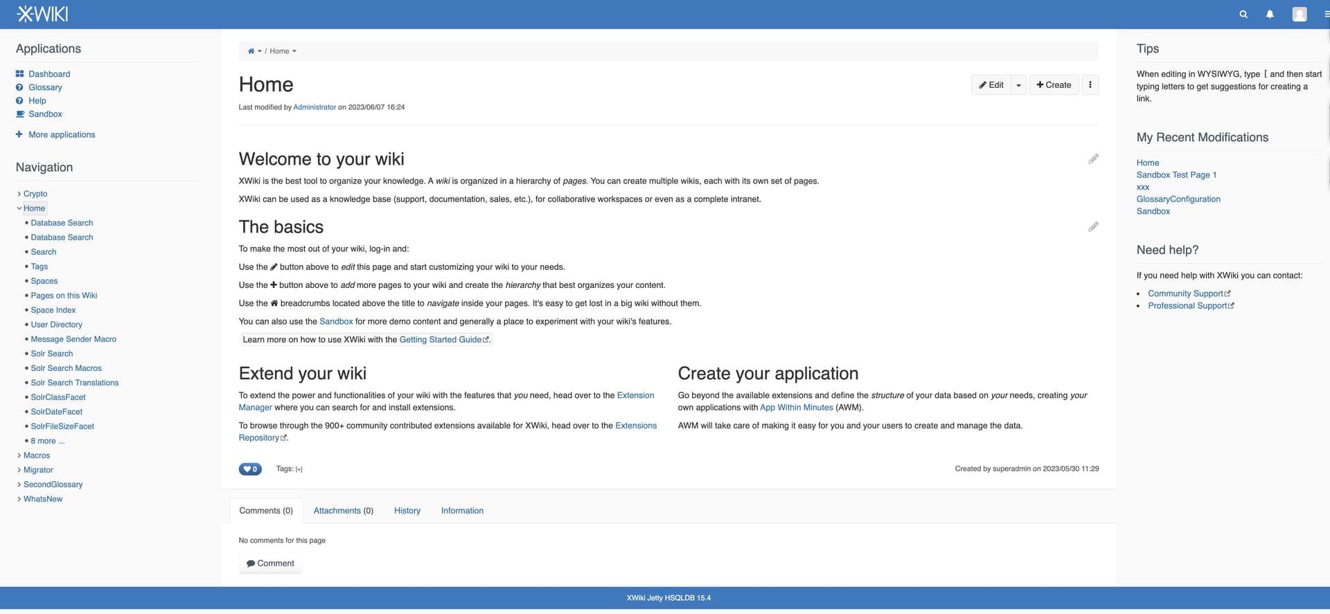
We have the Sandbox page for that, which already includes an image which is exactly the XWiki logo. I’m not convinced by the value of showing a big XWiki logo image on the home page (we have it on the top left corner already).
Most definitely the first image. I dislike two-column text in the original state and on the second image.
However, visually using small non-color pictures make XWiki empty on the web-scale 100% or lower. Also, I’d like to see an animation instead of example pictures, how the content looks during changes from 100% up to 150% zoom scale.
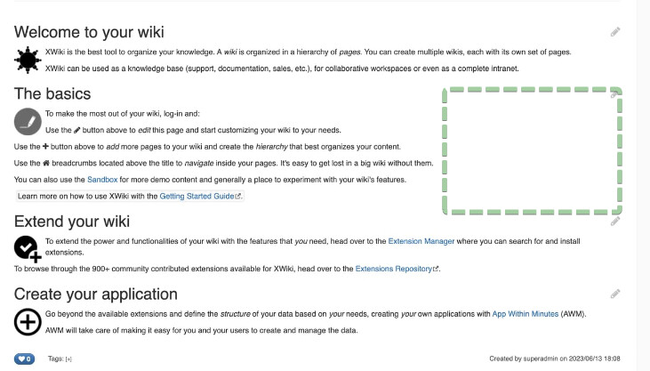
Why not to fill this area with some macro or table?
I think because the home page is not meant to be a sandbox, there’s the sandbox space for that. The images proposed above are mostly there to make the page less blend. There’s a fine threshold we should not cross I guess between blend and bloated.
Since I didn’t get much feedback about the idea of adding images, I’ll just remove the video for now. We can discuss adding images and refactoring the home page in another thread.
 (not replacing it with a new video).