Hey everyone, I would like to put for discussion a UI proposal for managing the users and groups in Cristal. Overall, it should function a lot like the one in XWiki Standard, but there are some differences.
Screen Layout
The layout of this screen follows the general structure used across other content pages, with a few key differences:
- Introduction Line: Instead of the usual info line (which includes author, likes, comments, etc.), this screen features a description line that provides a brief introduction to the page.
- Create Page Button: The create page button, commonly seen on other screens, should be hidden on these Admin screens.
Content Structure
As the name implies, this screen is designed as a standard interface for managing users and groups within a selected backend. It can serve as a foundational template for similar future screens. Key elements of the screen include:
-
User/Group Selection: Allows users to toggle between managing either users or groups.
-
Primary “New” Button: A button for creating new users or groups.
-
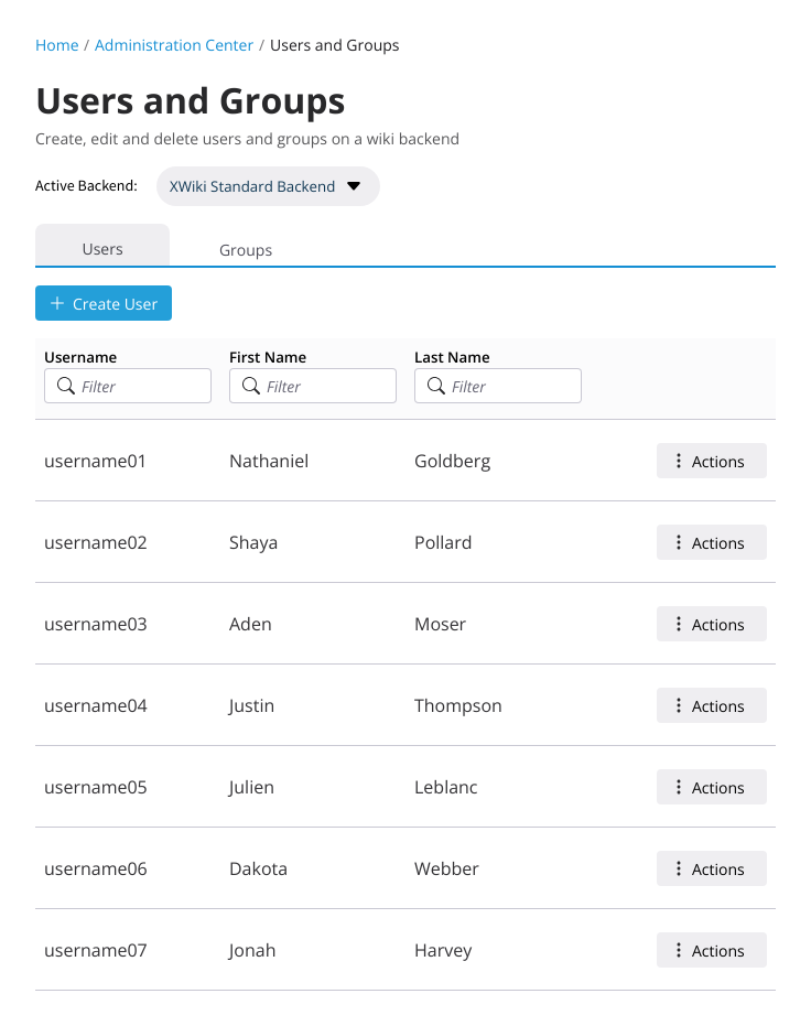
Backend Selection: Allows the user to select a backend. This may either be:
- A standard dialog or dropdown for backend selection,
OR - A Link to another admin screen enabling the switch backends
- A standard dialog or dropdown for backend selection,
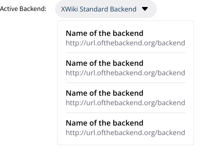
Honestly, from these two options, I am not sure which one is best for our use case. Analyzing the pros and cons I came up with:
- Enable editing users from other backends, via the selection proposed:
- PRO: Direct access to other users making the job of an Admin with multiple backends easier
- CON Potential point of confusion. Did it change my whole instance to a new backend? Or did it change only for this screen?
- Enable editing users only from the current selected backend. Changing backends will happen only on one place:
- PRO: Less points of confusion, backend changes happens only in one place in the UI
- CON: To manage users from different backends the Admin will need to constantly change pages
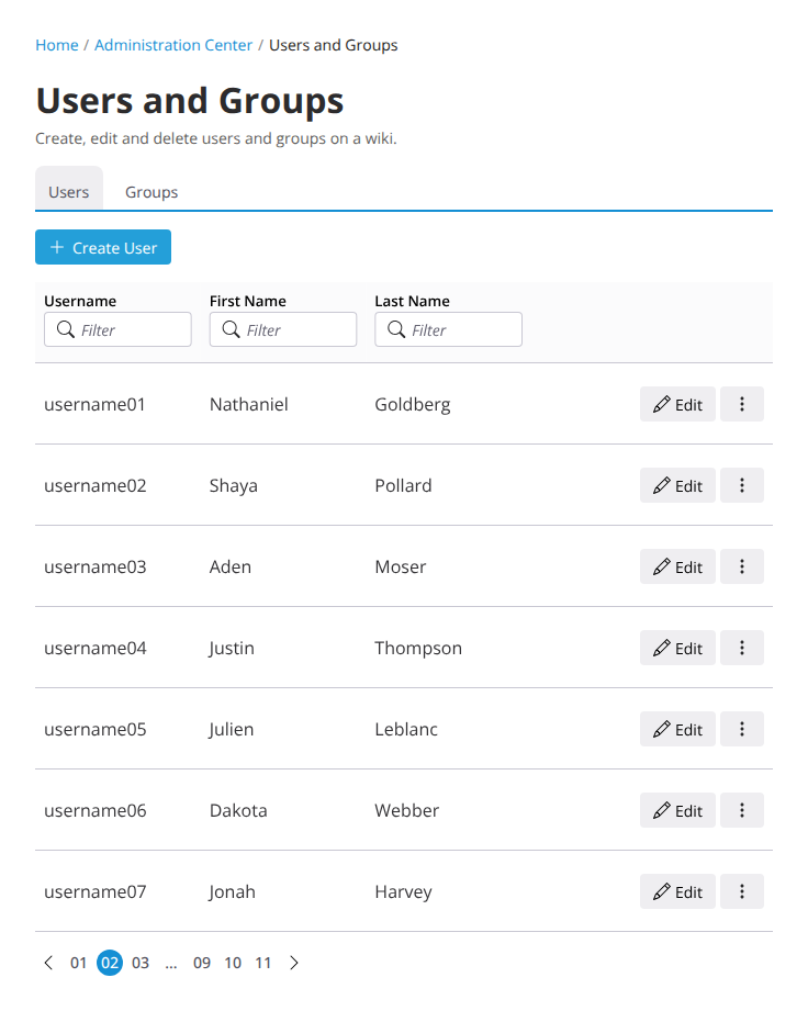
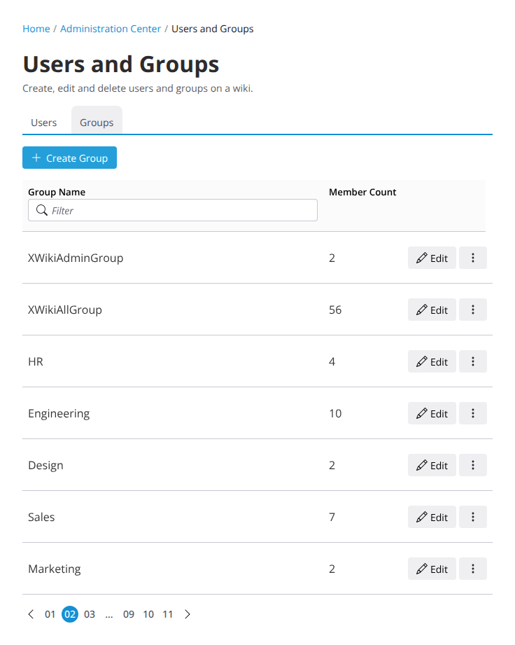
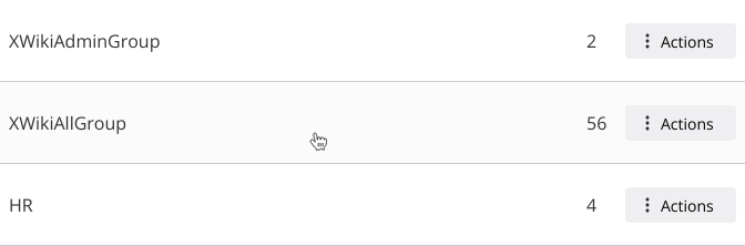
- LiveData Table: The main content area displays dynamic data and includes the following columns:
- For Users:
- Avatar
- Username (with a filter option)
- First Name (with a filter option)
- Last Name (with a filter option)
- Actions (e.g., edit, delete)
- For Groups:
- Group Name (with a filter option)
- Member Count
- Actions (e.g., edit, delete)
- For Users:
- Row Interaction: Clicking on any row within the table will open the edit screen for the selected user or group.
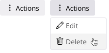
- Action Button: Each row contains an action button with the following options:
- Edit: Opens the edit screen (the same as clicking on the row).
- Delete: Prompts a confirmation dialog before deletion.
- Why a button and not all actions exposed?
- Easier to standardize. This list can be bigger on other areas
- Less clutter on the UI
- Easier to make mobile friendly
- Exception: If only one action is provided, then there’s no need for the action button and the action can be exposed directly.
Admin Layout
The admin layout for this screen is designed to help users focus on administrative tasks by providing a separate workspace. This is being proposed in another discussion, but I will post here the main idea behind it:
- Dedicated Space: When users access Global Administration, the screen opens in a separate space where the main wiki navigation is unavailable. This prevents distractions and maximizes screen space for managing tasks.
- Return to Main Navigation: To return to the main wiki navigation, users will need to click an easily accessible “Go back” button.
This layout and behavior helps to create a more focused experience in administrative tasks.
I think my main questions on this proposal is:
- Grouped actions on the Live Data, yes or no?
- Should we allow the backend selection on this screen?
- If positive, will it change the context of the whole app?
- If negative, perhaps we should give a quick switch UI for changing the backend globally
What do you all think?