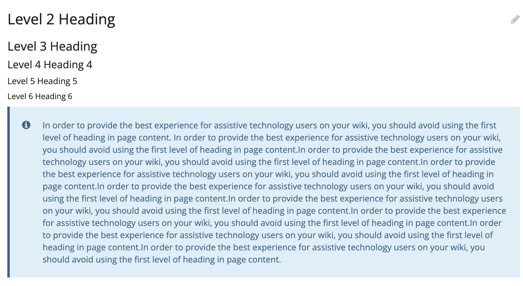
I think that most casual users would expect the title to at least be in bold.
IMO there are way more cases where the user wants the title in bold rather than looking similar to the block content, so I’m in favor of putting it in bold by default.
Note that with the HTML changes proposed in the PR, a block is introduced to contain the title (makes it trivial to apply whatever custom style on it from a style extension).
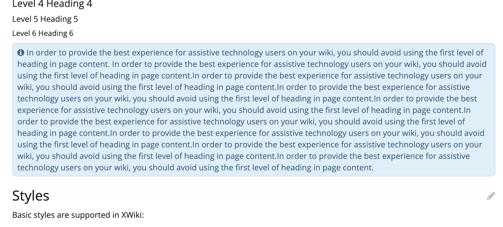
Thanks for working on this. There’s something about the indenting / padding on the left of the message, below the icon, that doesn’t look good to me. I don’t know why, maybe it’s the lack of symmetry or balance. It resembles a bullet list, but it’s not. For a bullet list it works because most of the time you have more than 1 item. While in this case I think most of the time you have a single “item”. You probably already tried without the indentation, and it didn’t look good either?
Let’s hope everyone will like icons (especially in inline mode where I feel it’s a bit too much). If we get complaints in the future we might need to have a configuration, or at least document a SSX to remove them.
I think we need to discuss the title and image parameters. I don’t see how they are useful since they can both be specified in the content of the macro. In addition the title accepts wiki markup which will cause problems (depending on how it was used) with the new bold of the title.
I’d personally be in favor of deprecating/legacifying them because:
they’re not needed. For example if you check how the info, warning, error, success macros are used, you’ll find that they almost never use these parameters and that instead if they need a title they specify it as part of the content, which is way more powerful.
The fact that the title contains markup is a pain (and as mentioned doesn’t play well with the boldification proposed)
This is a prototype I had at one point. Thiago afterwards highlighted that having a consistent line start would increase legibility. I think it looks cleaner to have all the text start at the same level whether or not there’s a title in the box.
Later on, I proposed another version with left-alignment, but less padding compared to the final one (ignore changes on the position of the icon itself):
The icon takes a bit less space but there’s also less unbalance between left and right paddings.
I think the final version (proposed in message 1 of this topic) looks the most appealing.
In my biased opinion, this indentation doesn’t look that odd, because the box itself is an item in the page content, and all the text inside it follows this indentation.
Ultimately, it depends on how we consider the icon:
If it’s a feature of the box, it doesn’t need to be inline and can be in a position that disregards text flow
If it’s a prefix to the text, it should be inline and we should avoid adding indentation to following lines.
Like others have said before, the indenting/padding looks a bit weird with the standalone version, and personally I think it’s because the overall padding is too small. Keeping the top/bottom padding as large as your first prototype, and putting a bit more on left/right as well, would probably work better.
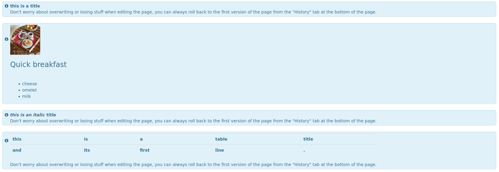
Those message boxes are used with a meaning. Users who can see all colors learn their meaning by color. But screen readers won’t see a difference. So we teach our users to start those boxes with a keyword like: note, error, warning etc. These keywords should be the title I think.
We really would like those titles prefilled/default, so they won’t be forgotten to use. (You can change or delete them if you don’t want them.) With a translation page those defaults then could be adapted to the needs of the wiki.
I personally don’t think that wiki syntax is needed for the title. But what could be interesting is a switch to separate the title (including icon) with new line from the message body or not. Short messages could be look weird with separate title and body.
If they are still relevant by the time we merge, I’ll add those snippets to the docs
Okay, I agree that those should be deprecated.
If that’s alright, I’ll revert the title changes from this PR (so that it can be merged soon), and open a new improvement ticket to:
deprecate title and image
Provide heading as a replacement, which does not accept markup and is always bold.
Thanks for the reminder!
I did forget to provide a systematic alternative for this icon for scren readers. I’m adding this ASAP to the proposal.
Those alternatives will rely on a translation and will be available to change for admins of a wiki.
Hey everyone, I did some explorations to provide some options for the standalone version. One of them is with larger paddings, like @pjeanjean mentioned, and another one with the same padding all around.
Bigger paddings and a left border to grab attention and give it a “card” look
Same padding all around with the icon applied inline (I am not a big fan of this version, but here it is)
This is interesting. I think it looks better, also thanks to the square corners, but I’m wondering if this is consistent with the rest of the UI that has rounded corners. If we go with this then we need to find some guiding rules for when we should use rounded vs. square corners.