Another reason for moving this button outside this notification menu is also the context: the notification menu is something placed outside of the page so it’s not easy for users to understand that it will contain a configuration specific to the current page. Putting the notification configuration settings inside the page makes that more clear.
There’s also a minor question of consistency: we took a bit of inspiration from the Export modal behaviour when proposing this originally since the same question occurred when Export was revamping about using a dropdown in the more action menu, or using a modal, and it was decided back then to use a modal (see: Export format selection)
It’s not exactly the same thing here, but it shows we have a precedent with using modal for this kind of complex actions.
OTOH it’s a place where it’s easy to discover the settings and having 2 buttons make it more complex to understand and makes the UI heavier. I’m not fully convinced that moving the button is the best choice even if I understand the logic. I’m not against it though (especially if the bell menu is inside the “…” menu).
In this type of situation what we would need is to do what we’ve done once in the history of XWiki, which is to recruit newbies to XWiki, record them, and ask them to perform tasks, and ask them to verbalize what they’re doing. Present one UI to one group and another UI to another group. It’s costly and time-consuming but very interesting. And you don’t do it for only 1 item but for the whole UI with lots of different questions. See https://design.xwiki.org/xwiki/bin/view/Improvements/UsabilityScenario & related links.
I think it makes sense to move the page watch setting from the top bar to the page area, because it’s a page level setting.
I don’t think it deserves to be visible directly on the page action buttons because it’s not used as often as Edit and Create.
My preference is to add an entry to the More Actions drop down menu that opens a modal, but I must admit I’m biased because I don’t use this feature that often (I’m expecting the watch to be turned on automatically when I edit a page or when I add a comment, which means I don’t expect to explicitly watch a page too often).
For the users that use this setting often, I’d be OK to have it exposed on the same line as the page Like button (I see these two features as related), where it would open a popover as in @tkrieck 's mockups.
Note that you’d still have a link to your notification preferences under the global bell, but not the subscription state of the current page.
The move is also related to the fact that the “subscription state” and the “wiki notifications” are 2 different things (even if related). For example, you could subscribe to a page and not have in-wiki notifications enabled (only mail ones). This is also why we decided to use the “follow” vocabulary for the state of a page, while leaving notifications be a different thing that will use the “follow” state.
Indeed, what I just said here hints towards also using a different icon for the follow state than for the notifications list (as we discussed previously on this thread). I’m fine with it, as long as it’s aligned with the vocabulary.
I guess clarification of the vocabulary used, concepts and illustration of those (icons) would be something that we should try to structure, maybe, before we actually decide on where exactly we should display things on the UI.
Instead of “follow” from https://design.xwiki.org/xwiki/bin/view/Proposal/Notificationwatchbuttons#HVocabulary , we could also decide to use “watch”, as we currently are, still, in some places (although we kinda banned it when we changed the notification system but not completely so it’s a bit of a mess). “watch” has the advantage of being easily translatable in an icon, more so than “follow”.
Yes, a full session of usability testing can be very costly and time-consuming. But we can try to use online tools to have smaller, cheaper, focused research. Tools like Maze and UX Tweaks have prototype testing capabilities and with proper mockups we could do these isolated tests (by isolated I mean a small scale UI change). I will look more into it, but it seems that both have free tiers available for small scale testing.
EDIT: Even better, an open source tool. I’ve made a quick usability test for evaluation purposes. The recordings are available inside the app with success rates, heatmaps, task drop off point. Really promising! Quant-UX - Prototype, Test and Learn - 5.0.0
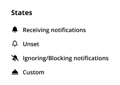
I forgot to add the image which have all the icons described. I am on the fence about the last one, “Custom”. On one side I think it is a good telling of something custom, like ordered or made just for me, but also at the same time I think the icon may feel too weird or alien in this context. Tell me what do you think.
If this feature works like that, then I agree that the Follow option could be hidden behind more actions
Note that, because it can be quite complex to compute the actual effect on notifications of the watch state of a page and to properly propose options based on their effect on notifications, what we initially proposed with @surli was that the button & the icon handle the watch state of a page, not the result of this on notifications (e.g. an “unset” watch state may also result in “receiving notifications”, if a parent is watched with all its children and there is no exclusive filter anywhere else on the hierarchy; so the full bell should not say “receiving notifications” but “followed”).
We’ll need to find a way to express consequence of the watch state on notifications, if we want to make such a bridge explicit and to decide when we present that consequence.
the icon should show the watch state of the page, which is “unset” - empty bell
however, the user may or may not receive notifications for the page, depending on the parent
only when they hover or click the button, we want to compute the actual result on notifications and show it to the user - we need to tell them the effect on notifications.
then, the actions proposed behind this button are still actions on the watch state, not on the notifications.
however, since there are many actions possible on the watch state (of the current page or parent), we propose the ones that may have an effect on notifications, without promising them, though.
This may be a bit too technically driven, I definitely understand that it would be simpler to design a user experience with simpler concepts. But basically this is the challenge here: how to choose what to show to the user and the actions they can do in order to drive towards a simple usage of all these technical capabilities.
Maybe indeed, from this angle, it can be clearer to:
use the eye icon instead of the bell one, to explicitly express that it’s about watch state not about notifications
use a single icon to access the modal / menu, which will then display the actual watch state & its effect on notifications (since the information in this modal is mixed between watch state & effect on notifications, it can be hard to try to resume that in a single icon).
I noticed last friday we don’t leverage 100% of font awesome capabilities. I opened Loading... so that someday we could use icon stacking, which would make finding correct variations here way easier IMO.
After reading some discussions about the Like button (Like UI aligned with known conventions - #10 by lucaa) and its effects, it seems to me that both actions “Follow” and “Like” are pretty similar. Perhaps I am missing some details about their differences, but all in all it seems to me that I “mark” some page as an interest of mine and start receiving notifications about it.
If that’s indeed the case, I think it is safe to hide the Follow option behind the three dotted button. Maybe naming it to something even more specific like: “Notification Settings” reminding the user that this option is different and more powerful than simply Liking or Following just one specific page.
In this scenario, if I want to follow a single page, I simply “Like” it. If I want more control over notifications of a page and its children, I can “Configure Notifications” (and in this case with the Bell icon or variant, to correlate them), opening a modal with all the options available and properly explained as previously discussed.
I am not aware that this happens like this today, so it’s possible that it was in a proposal but it was not implemented. The documentation of features is on extensions.xwiki.org, on design there are the proposals (the specification before implementation), so there may be differences between that and the reality.
I checked on a local 15.10-SNAPSHOT and watch does not happen on like.
To me, there is nuance here as in
the “Like” is more like a message for the others (I like this page to express my appreciation of the work that was done for other people to see what’s the best content on this wiki)
while notifications is more of a thing for oneself, like a bookmark (I watch this page because I want to know what happens on the page).
Also,
like is for the past, for what is already there (I read the content and I decided that what I see is good )
while watch is for the content that is not yet there (stuff may happen to this page in the future and I want to know when it does). I may not at all like what’s already there but want to keep an eye on it to see if it gets better in the future ;).