Font-weight of headings - Minimalist Skin 5

Hello everyone! Today I wanted to talk about headings and content structure. :blush:

There are 5 things that make headings stand out when compared to the body: scale, weight, font, color and iconography.
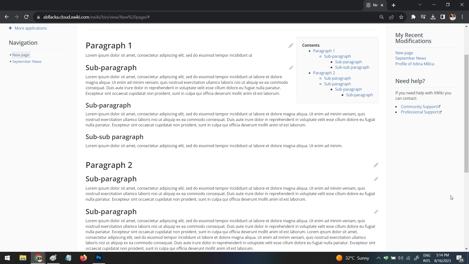
Current situation

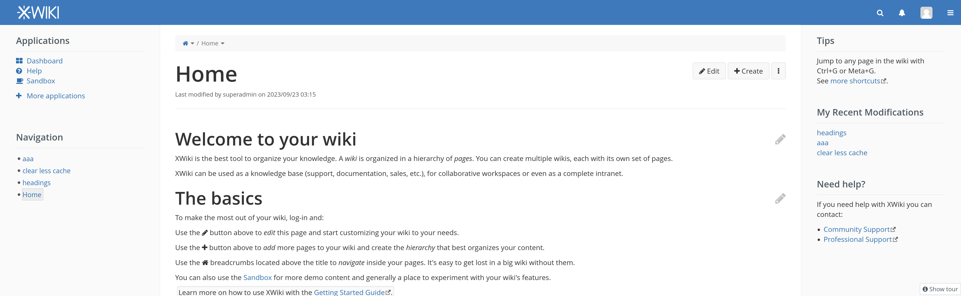
In XS, by default, headings have the same font and color as the body, no default iconography, so we only have to discuss weight and scale.

Currently, headings have the regular weight, same as the body text (font-weight: 400). The difference in terms of size between each heading is pretty minimal:

image

Why change it

One of the main reasons people organize knowledge is because they want to make it easy and fast to access it, either for themselves or the people they work with.

Users use knowledge management tools because they want easiness & speed in searching some particular knowledge. When people are searching for digital information, they donā€™t read everything that exists on a particular pageā€¦ they scan the page.

LTR users tend to scan content in an F pattern and RTL users tend to scan pages in a symmetric F pattern. As defined by the NN group:

the F-shaped scanning pattern is characterized by many fixations concentrated at the top and the left side of the page. Specifically:

  1. Users first read in a horizontal movement, usually across the upper part of the content area. This initial element forms the Fā€™s top bar.
  2. Next, users move down the page a bit and then read across in a second horizontal movement that typically covers a shorter area than the previous movement. This additional element forms the Fā€™s lower bar.
  3. Finally, users scan the contentā€™s left side in a vertical movement. Sometimes this is a slow and systematic scan that appears as a solid stripe on an eyetracking heatmap. Other times users move faster, creating a spottier heatmap. This last element forms the Fā€™s stem.

The implications of this pattern are:

  • First lines of text on a page receive more gazes than subsequent lines of text on the same page.
  • First few words on the left of each line of text receive more fixations than subsequent words on the same line.

This means we need to make it as easy as possible for users to scan the most important text elements on the left side of the main content.

Proposal

Itā€™s very hard to scan a page if everything mainly looks the same. Size is not enough to emphasize headers, especially when many Sans Serif fonts are pretty thin even at a big size (on the Regular weight).
headings comparison

To better serve the goal of knowledge organization, we should increase the font-weight of most headings to support the idea of easy to scan structure.

To keep and increase the idea of hierarchy, we should either :

  • VERSION 1 - ā€¦make the headings in a page have the font-weight based on their level ( example: h3 to have a smaller font-weight than h1)
    OR
  • VERSION 2 - ā€¦keep headings at the same font-weight of at least 600, but have big enough changes in font-size between each level using a scale/ratio (see proposal 5 from the main proposal)

I prefer much, much more option 2 because it makes sure that even low level headings get emphasized.
I will follow-up on this discussion with one about the size of the headings in which weā€™ll focus on the specific ratio between headings.
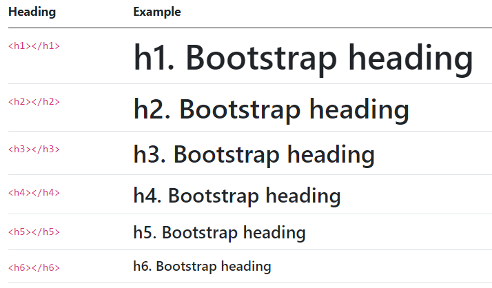
In Bootstrap 5

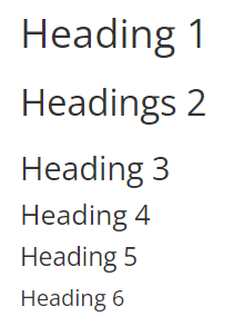
In Bootstrap 5, headings are bolded (font-weight:500 of their chosen font) and have a pretty big difference in font-size between each of them:

image

Look of bolded headings

You can see the comparison between the current and the bolded version above, but here is only the bolded version:

bolded headings

Note that the easiest implementation will affect all headings, not only those in the main content area.

What do you think about this? Which version of the proposal do you prefer? :thinking:

Option 2 looks good to me :+1:

Do you have a visual for proposition 1 too? I wonder how the variable font-weight would look.

Thank you! :slight_smile:

If we want to have as many levels of boldness, we have to start from the biggest font-weight OR to have multiple levels of the same boldness which would defeat a bit the purpose.

Going from font-weight 800 for H1 to font-weight 400 for H5:

image

800 is a bit too heavy by my esthetics, especially when used on the title:

image

1 Like

+1 for option 2

1 Like

Thanks a lot, Thomas! :blush:

+1 also for option 2, the progressive font weight looks a bit weird to me.

1 Like

+1 for option 2 as well

1 Like

+1 for option 2, thank you!

1 Like

Thanks for your feedback, everyone! Option 2 it is! :partying_face:

Additional question, should the font weight 600 applies to the whole UI (including panels heading), or just to the page content.

Option 1.1: just the content page (#mainContentArea)
image

  • The admin section is impacted

Option 1.2: the content page excluding the heading title (#xwikicontent)

image

  • The admin section stays with the same weight.

Option 2: the whole page
image

Iā€™m +1 for option 1.2, as I think the pages content is the place where having weight is important.
For instance, the administration headings (as well as the panel ones) are styled differently.

1 Like

Personally, I think option 1 and 2 are the best.

Now that we have all headings bold, itā€™s especially important that the title is bold too for cohesiveness. The title is, in a way, a heading of the document (H1, actually). So why shouldnā€™t it look like a heading?

I like that option 2 makes the panel titles bold too.

Making the panel titles bold will make the panel categories easier to spot a a glance. This can be easily verified by squinting your eyes at option 2 versus option 1 or 1.2. When squinting, you blur the details & youā€™ll see which are the most prominent elements and how prominent they are.

In the case of option 2, I feel like the bold panel titles donā€™t take away much from the main content because of the sizing of the headings in the main content.

ok, so iiuc you are suggesting an option ā€œ1.3ā€: just the content of pages + the page titles

Iā€™m also ok for that ok, might indeed be more coherent than 1.1 where the page titles are not of the same weight as the content.

+1 for option 2

Semantically, panel titles are <h1>, which makes them somewhat important parts of the interface. Making them bold too would increase their ā€˜viewedā€™ importance and improve consistency of the style <-> semantic relation.

Thank you!
Lucas

1 Like

yep, totally agree with this

@mleduc, I personally incline to option 2 more than the option 1.1 or 1.3, but option 1.1. or 1.3 are very good too.

If I made a top 3 of all of the options:

  1. option 2
  2. option 1.1 or 1.3
  3. option 1.2

Thanks for the answers, The PR XWIKI-21333: Update the weight and font size of headings by manuelleduc Ā· Pull Request #2360 Ā· xwiki/xwiki-platform Ā· GitHub is now using option 2.

looks very nice, thank you very much for this! :blush: :grin:

XWIKI-21333: Update the weight and font size of headings by manuelleduc Ā· Pull Request #2360 Ā· xwiki/xwiki-platform Ā· GitHub merged

1 Like

Following some recent discussion, Iā€™ve made some update so that:

  • the default weight for headings is 400
  • the headings weight in Iceberg is 600
  • Open Sans can now be downloaded from the wiki if not available in the userā€™s system

See XWIKI-21333: Update the weight and font size of headings Ā· xwiki/xwiki-platform@ec96057 Ā· GitHub

1 Like

nice!