I only read these threads from time to time, so sorry if I missed it: does this mean the Last modified row under the page title will go away? From this post it seems the information will be included in this footer.
From proposal page, I don’t understand the functionality of “Documented by”
Does it matter who the author and when specifically that page was created if multiple people review, edit, copy, update it?
Does that mean it will collect all the users who not only changed the page, but read it? To me, this is a bit misleading and resembles the collection of statistics of visits and changes to the page.
I think the idea is to list all the authors of the page from the history (so show all the contributors of the page instead of last version author).
It’s not a bad idea, now it might be a bit expensive since it’s not an information we have in the current document, it would definitely have too much impact on the page view unless it’s asynchronous.
As @tmortagne said, I was only referring to those who modified the page in some way. I can understand the term review have be a bit misleading, will take it out.
Just a note: from a collaboration point of view it doesn’t but knowing the creator of a page is a very useful information in XWiki when developing. But I opened recently an improvment ticket to have all current authors information of a document directly in the information tab: Loading... so the creator information wouldn’t be lost if this is implemented.
the global improvements actually involve several extensions that we could evolve separately (e.g., the like extension or the tag extension)
the “circle avatar” looks good, but it might be interesting to consider using it on all places where the avatar is displayed (either all at once or gradually)
the colored tags look nice but can be an accessibility challenge (e.g., text/background contrast) and would required some discussion (e.g., are the color automatically generated from a palette or based on user choice?)
In general, this looks nice. As noted by others, these are several improvements that should be considered separately.
Colored tags I think needs a proposal on its own and in particular a way how the colors should be defined. Further, we need to make sure that colors are consistently displayed across XWiki and not just in the footer.
For the tags UI, I would prefer to use a standard XWiki UI than to have something custom (the current one is custom, too) to make sure we have a consistent UI experience and design across XWiki - or why should adding a new tag be different from, say, adding a new movie genre in the movies AWM demo app? Therefore, I think we should use a standard suggest widget for editing tags and use standard display code for tags. Now I’m not against improving the suggest experience, but then it should be improved in general and not just for tags. Editing could use in-place editing which is again a standard UI pattern that we also use in many other places in XWiki and users are thus familiar with it.
For the authors, I think we need to clearly define who should be listed here in which order. Like, should people who just wrote a comment be listed? What should happen if a user doesn’t exist anymore? Also, I don’t like the “Documented by” prefix as it only applies to documentation but XWiki can be used for so much more than just documentation. Further, we currently don’t have this information easily available so once we know what we want to display we first need to discuss how to compute and at least cache this information if we don’t even want to store. Listing all contributions of a user or all users who contributed to a documented is a need that has been expressed in other contexts, too, so I’m not against it, I’m just saying that this is more than just a design change.
Circled avatars should also be something to propose in general, we shouldn’t use circle avatars in one place and square ones in all other.
Maybe I’m looking too much at this as a simple (non-advanced) user.
So here it is …
When I see the word Documented by, it first conveys to mind the work on the document. In other words, each user can commit any actions on the document based on the permissions granted.
Review refers not to a document but to actions on an article or a review. As far as I’m concerned, it overlaps with the Blog application (which I’ll mention here more than once).
There are no questions regarding visualization. The question is small in functionality and binding. For example, if the point is to display the last 5 unique authors, then this duplicates the History tab, which provides more information (ideally when a summary is also specified). Let’s assume a situation where this tab is disabled visually, and the URL processing file is configured to block access. Then, it will be nothing but a Blog where only the owner or a specific group will have all the information. Ordinary visitors/readers will see Documented by. This could be an improvement or a new feature to the existing Blog application.
The very last word Documented by is confusing because, at the сore level of the platform, users edit documents through Edit, and therefore the result is a document modified by.
OMV, the further introduction or discussion of this field has 3 ways:
This field is disabled by default (to prevent the display of such field for code documents that are hidden). And can be enabled from page display settings
Show by default and replace Last modified by, which is the removed field after title of document.
Only add as an improvement to an existing extension
Oki doki, makes sense. Does this mean the proposal would be better off splitted in 3 seperate ones (like, tags, creators/modifies in the doc footer)?
Totally agreed. I’ve said in the proposal that we should have all avatars revamped as circles. I’ll try identifying all places where we might need to change CSS classes. Places that I noted so far:
user-avatar (
.navbar-avatar > a > img (in the navigation bar)
.commentavatar img (in the Comments section)
img.xwiki-selectize-option-icon (in the User Avatar macro selector)
the image afftected by class: _avatar linkview typetext (in User Directory)
#avatar img (in the Profile section)
.notification-event-user>img (in Activity Stream, Notifications )
.drawer-nav .drawer-brand img (in the Drawer menu)
.user img.user-avatar, .group img.group-avatar (in LiveData)
I just took the colors for the info, warning, success and error boxes in Iceberg. I’m thinking these could be the colors that define the default suggested tags. They have a good contrast for text readability:
So, as I’ve said in the proposal and here as well, I was thinking of using the colors for the info, success, warning, error boxes as they have a pretty good symbolism in relation to the 4 default suggested tags that I was proposing ( done, in progress, to improve, to update)
I’ll have to give more thought to this.
Yep, this is a good idea. I’ll think of some ideas for ordering contributors.
Oki doki, fair enough. Other options would be:
Modified by
Contributions by
Knowledge organized by (pretty long version and a bit marketish)
Feel free to add more ^^
Yep, makes sense
Replied to this to @mleduc , totally agree with this, as said in the proposal. See the earlier reply for places I’ve identified so far that make use of the avatar image (and if you can remember any other places, feel free to add, I’ll search more anyway)
Now that we agreed on the general idea, I indeed think it would be beneficial to split into separate discussions.
Unless I missed something, there is no such thing as “default suggested tags”. Auto-suggestions are based on existing tags of the wiki.
Anyway, we can discuss this on a discussion dedicated to tags revamp. But I would consider the colors as an improvement on top of the tags UI revamp as this seems to be bringing some additional complexity.
I didn’t understand that you wanted to propose these tags specific tags, I thought they were just examples. Why do you think they are good tags to propose by default? Would this be configurable?
Ideally, they would be configurable, but, initially, I think it could be a good idea to see how people respond to a specific range of default tags for a period of time (until we get questions on it or feedback)
I did suggest these because they are pretty much the most used in project management and I’ve always seen knowledge management kind of motivated and elevated by project management.
As said in the proposal, the tags would mean:
done = no need to improve, edit, add to this, it can be even archived
to improve = see everything that needs improvements, related to tasks
in progress = helps in having an overview
to update = when info is old and not accurate, helps in keeping info true
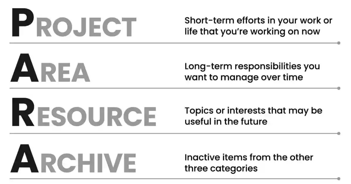
Of course, there could be others as well. If we want to support any popular knowledge management philosophies we could introduce the tags Project, Area, Resource, Archive ( in support of the PARA method developed by Tiago Forte). Not ideal as we would probably need to explain to a lot of people the concepts and it wouldn’t help the discoverability.
We could also try to organize a small research on this and see which statuses do people usually organize around.
XWiki is not a project management tool, even tough it can be used as one.
Therefore, I don’t think we should make any effort to support any specific methodology and instead focus on being generic and configurable.