Macro config UI

Hi everyone,

Macros are one of the main and most used features of XWiki. In conversations with @surli, we identified a number of pain points in the current macro configuration interface, and I’d like to take this opportunity to propose a potential solution.

Note:
This post serves as a companion to the following discussions:

Usability Issues with the Current Macro UI (Configuration Dialog)

  • Only a limited number of fields are shown by default
  • Inconsistent design patterns that diverge from XWiki’s UI/UX standards (labels, notably)
  • The “More” button is too small and easily overlooked
  • The ordering of fields is inconsistent—prioritized by recent usage but still capped at three visible fields
  • The macro name and description resemble input fields, which can be misleading
  • Some required fields are grouped in mutually exclusive sets, but this logic isn’t clearly conveyed to users

Principles to Guide the redesign

  • Required fields should be immediately visible
  • Field order should remain consistent, regardless of configuration
  • Mutually exclusive fields should be clearly marked, with user-driven toggles
  • The overall form should be as compact as possible
  • Modified fields should be visually distinguishable to the user

Proposed Solution

  • A new layout that distinctly separates introductory text from input fields
  • Required fields are at the top of the interface and never hidden.
  • Eliminate the “More” button entirely
  • Introduce a tabbed interface to separate optional fields and reduce vertical length

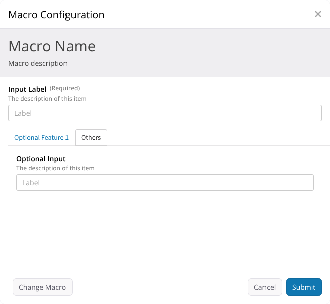
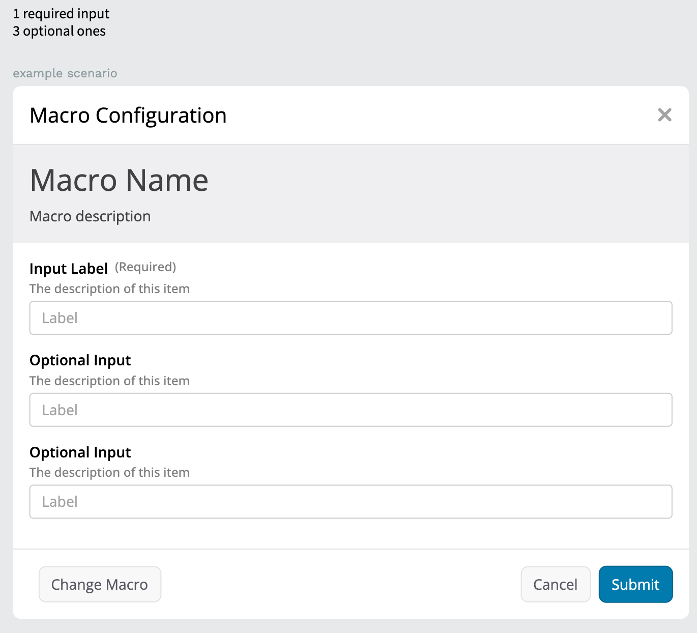
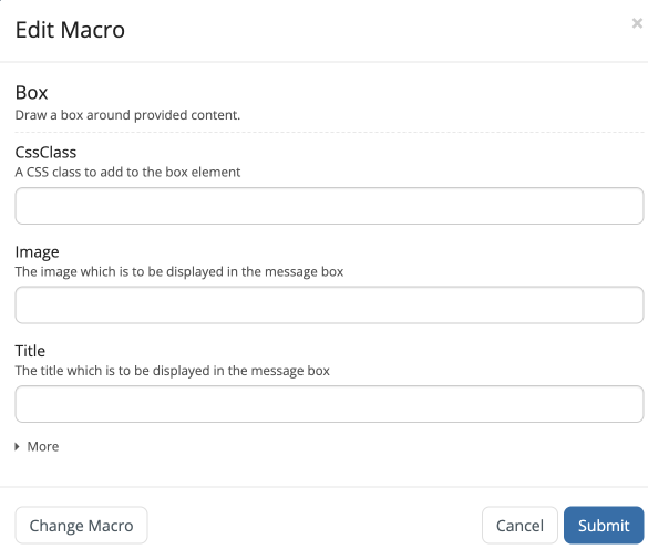
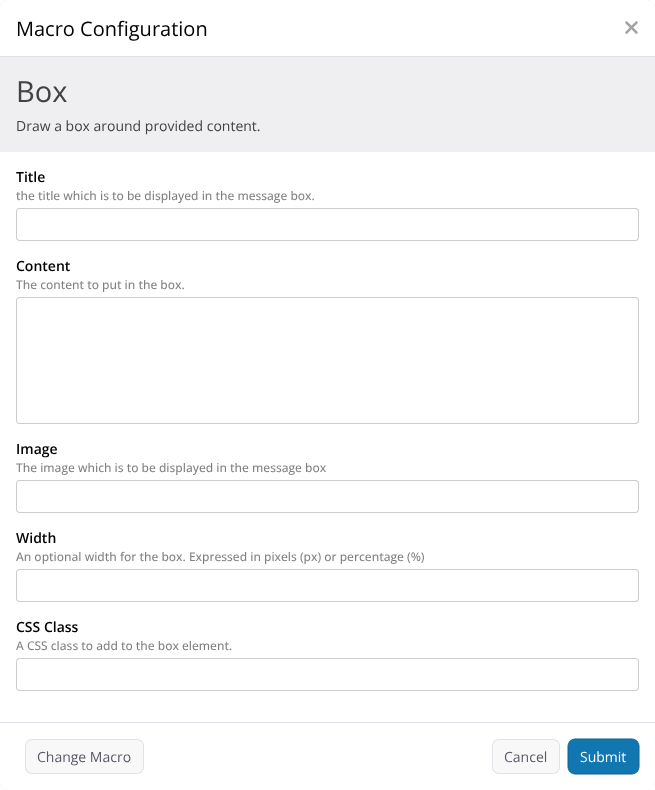
Simple Example: Box Macro

Current UI:
Board

Box Macro with the proposed layout

I reorganized the fields a bit to put the more used ones on top, but this work should be done in a case-by-case scenario.

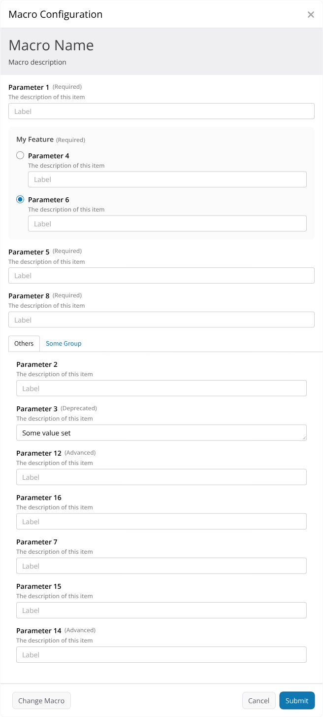
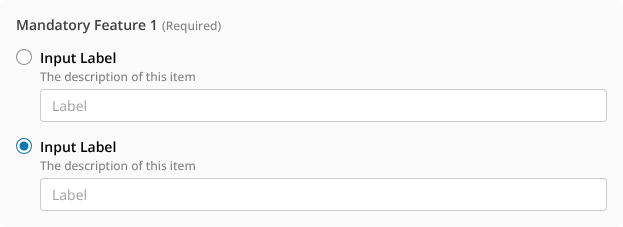
More Complex Scenario

Here’s a sample scenario drafted by @surli to illustrate more intricate configurations:

  • Parameter1 – Mandatory
  • Parameter2 – Mandatory
  • Parameter3 – Part of Mandatory Feature1
  • Parameter4 – Part of Mandatory Feature1
  • Parameter5 – Optional
  • Parameter6 – Optional, part of Group1
  • Parameter7 – Optional, part of Group1
  • Parameter8 – Part of Optional Feature2
  • Parameter9 – Part of Optional Feature2

Here’s how the modal configuration dialog might appear:

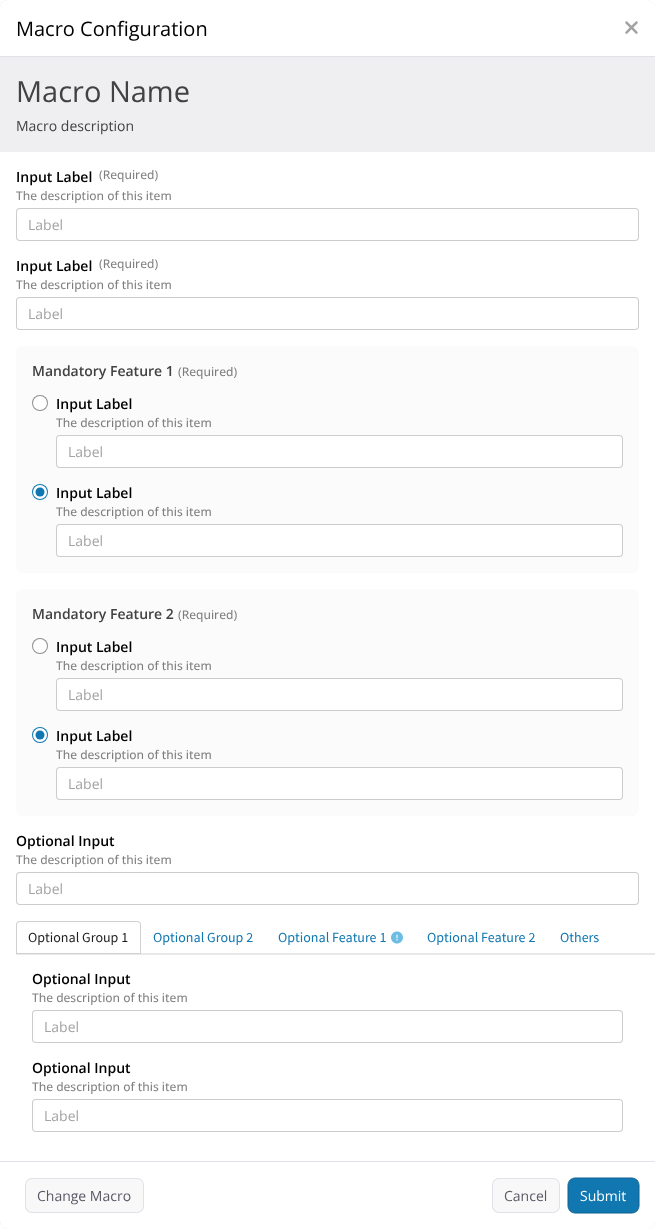
Yes—it’s complex, but still manageable. This represents a worst-case scenario, helping us evaluate the robustness of the UI rules. Some of the improvements:

Explicit Control for Mutually Exclusive Options

Board (1)

Tabbed Groups for Optional Fields and Features

Change Indicators on Modified Tabs

tabs _ single tab _ resting


This approach aims to bring clarity and consistency into the macro configuration experience, I’m looking forward to your thoughts and feedback. If needed, I can propose different scenarios based on these rules.

Thank you all for reading.

1 Like

Thanks for your work on this!

There’s something I don’t get: why the “Optional input” before the tabs is not in “Others” in this screenshot? AFAIR the idea was that when we have tabs we’d put everything which is not grouped in this “Others” tab no? else what’s its purpose?

Hi Thiago! Thanks for working on this!

I really like the new designs. My only feedback would be that, as Adina stated in point 5 of her proposal, I think there should be multiple types of fields depending on the expected data.

For example, in the case of CSS Class, it would be fine to keep using a text field.

However, for content where we already know the expected values, for example the Image field, where we already know the images available on the page, I think the field should become a dropdown with the available items.
Same for other config options where we already know the values.

e.g.: The livedata macro has the layouts option that only takes table and cards as values. At the moment you need to input the words manually in a text field. I think it would be better to present the user with a dropdown from which they can choose either of the 2 available options.

Agreed. I’d also add an indicator to let users know those fields are required. A simple * would suffice in my opinion.

I fear to have scenarios in which we have a tab bar (so, at a minimum one Feature or Group and then the Other tab) but only one field in there, so I put it outside. IMO, if doable technically ofc, grouping lone fields under the “Other” tab could be decided in a case-by-case scenario.

You’re right. In my mocks I just copied the fields and paid more attention to the order of the fields, but I agree with that each field should, as much as possible, have its corresponding input type.

I put the string “required” on each, as it’s the current default o other XWiki forms. The asterisk would be a cleaner option (and universally used) but it should be standard across all XWiki. I checked, and it uses a CSS class called xRequired so perhaps it’s easily doable if that class is also used here.

Example on the create user form

Thanks for the input.

1 Like

Do we actually have any use in XWiki Standard? I thought the UI for this kind of thing was not implemented yet because we wouldn’t use it.

Just to be sure, if there’s a lot of optional groups, the tabs wrap up on mutliple lines right?

+1 good idea. We need to make sure this icon has a proper tooltip and alternative text. At least for me, it wasn’t clear at first that this was a change indicator.

If we decide to go all in on asterisks, we need to make sure they come with their alternative text. I didn’t report it yet because I knew a redesign was coming, but currently the asterisks in the macro editor have no alternative text. Low vision users cannot differentiate Required fields from Mandatory ones.


Not much to add upon what you explained. Looks good to me :slight_smile:

Thanks for progressing on this design!
Lucas C.

2 Likes

Personally I think it’s more clear if we always follow same rule and make no exception based on an hardcoded number of fields. It also simplifies the implem.

in XS we already have the case with the include macro if I’m correct for which we started to use the feature annotation. But the other part of the feature is deprecated so it’s not obvious.
Now outside of XS we have the case with the JIRA macro.

1 Like

@tkrieck I just realized that you didn’t proposed to have tabbed groups also for mandatory fields and features, could you explain the rationale to keep displaying those vertically only?
In your example if we have tabs also for mandatory features it would help saving vertical space since we’d have feature1 and feature2 in tabs.

Ok, I’ll remove the single optional inputs. But with this decision, we could have situations with a single optional field behind the “Others” tab in the interface.

My reasoning is to not input any kind of noise in the interaction between required fields.

Fields behind tabs are less visible and might be missed, in this case we would need a badge in the tab itself to label it as required. And we already have a badge being proposed for communicating changed fields inside tabs.

There’s also the simplicity in focusing the first field, filling it and “tabing” your way through other required form fields without much effort.

So in this case, IMO it’s acceptable to have a longer form.

Thanks for providing the screenshot :slight_smile: Honestly I’m not sure what’s best, especially since it would be actually possibly rare (at least at first) to have tabs: right now we have very few macros currently with groups or features. Would be interesting to see what’s the proposal too when there’s only optional parameters outside without any group/feature: would they be always visible?

OK thanks for the clarification

If only one tab would be available (like the others, for example) ideally we would hide the tab bar, making the fields always visible (like below).

But this means introducing a switch in the code (if only one tab is available, hide the whole bar) I don’t know if this is feasible or not. If not, we could continue with the current behavior of showing the lone tab already opened.

I’m wondering if we shouldn’t have always the tab bar available even if it contains a unique tab, but makes the tab bar collapsable and collapsed by default. E.g. if you look at this example, and consider there’s no group, there’s a lot of info to grasp at first view and most of them are about optional parameters that shouldn’t necessarily be visible:

You have a point. I feel that here we might be trying to standardize something, but in certain scenarios, this standardization might bring usability problems. By always showing the tab collapsed, we might encounter a scenario in which there’s a single optional field collapsed under the single “Others” tab.

That’s why I would give the macro developer the option of grouping some fields under the “Other” tab or not. Alternatively, give the developer the options of always showing the first tab open or not. With proper defaults, of course (always open/closed or always group/not-group). Again, I’m not sure on the difficulty of implementing such solutions.

Well that’s the group property on the fields and that would create tabs.

I wouldn’t go there personally: I’m not sure how we would encode this information in the macro and we already have a lot of possible options we can put on the field IMO.

Hi Thiago,

Thanks for working on this proposal.

I’m fine with using the background color to separate the “header”, but you mentioned this in the usability issues:

Inconsistent design patterns that diverge from XWiki’s UI/UX standards

So I was wondering if using the background color to highlight / separate the “header” is a pattern we use elsewhere in XWiki? And is relying only on color accessibility proofed?

Wasn’t this the case before? The documentation says:

We always show Mandatory parameters and parameters that have a value set.

I don’t see how this will work or improve anything for macros like Document Tree that have 25 or so optional parameters.

I just want to mention that the order between the optional parameters (in this case) is not controlled by the macro configuration modal (the target of this proposal), but by the macro descriptor, which is extracted from the macro implementation. The order can definitely be improved for some macros, but this needs to be addressed separately IMO.

It’s not clear to me how this is supposed to work. You have 2 input fields (the radio button and the text input) and a single label. The label must be connected to the text input, meaning that if you click on it then the text input should be focused. So this leaves the radio button without a label? Is this accessible? Is clicking directly on the radio button the only way to “select” the corresponding text field?

It seems to me that your proposal is based on the fact that (optional) macro parameters are grouped, which is rarely the case. And there’s no best practice around this AFAIK. So does this mean that you are actually proposing we should always or as much as possible group optional parameters into smaller groups (sections / tabs)? This means applying this rule for new macros and starting to update existing macros.

This is not controlled by the macro configuration modal but by the macro implementation. Each macro can decide what kind of input field is used to edit its parameters. If the input field used for a specific macro parameter is not user-friendly then you should report an issue / improvement for that specific macro.

It’s already the case in the current implementation.

You mean between required and optional? And are you saying that low vision users don’t see the asterisk? Is it because of the color contrast or because it is too small? How large does the asterisk have to be to become “visible”? I’m asking because this is a fairly used pattern to indicate required fields. I’m not arguing about the consistency issue, we need to fix that for sure.

Thanks,
Marius

1 Like

@tkrieck proposal is mainly based on information I gave and the scenario example he mentioned. The idea was to explore how to indeed properly handle the display of groups of parameters, and I do think we should indeed use that more in the future to save the vertical space and have a more semantic way of seeing the parameters. I was actually planning to improve the actual document tree macro to create such groups once we have the new UI.

I wasn’t planning to propose that as a best practice though, I’m not sure how I would formalize it.

Hmmm we haven’t discussed the accessibility of this solution: the problem we’re trying to resolve here was how to express to the user that the fields are mutually exclusive, and the radio button seems like a good visual option. The other idea was to disable the other input when inserting value in one input, problem in such case is to allow switching…

By low vision users, I meant blind or almost blind users, those who need to rely on screen readers and assistive technologies (i.e. anything but the visual UI). Technically, the asterisk could be gigantic and it wouldn’t solve the accessibility problem. Those asterisks don’t have a proper text alternative here, and they should have one because they have an important meaning.

OK, so the problem is not the asterisk (it could be any icon) but the fact that it doesn’t have a text alternative, which can be fixed. So the asterisk with proper text alternative is as good as the explicit “Required” text, accessibility wise.

Thanks,
Marius

1 Like

We could provide more labels, I think it would cramp the UI a bit, but still usable.

alternative (1)

We could also have these labels visually hidden in the DOM but still readable by screen readers.

+1 for the radio button representation.

For the best accessibility, I’d have used a radio-button set, which contains inputs that are semantically-hidden as long as they are disabled. When the radio button choice changes, make sure the user is notified of the change in the page content (aria-live would probably work well somewhere in there).

Thinking notes on disabled inputs

A disabled control is always a bit difficult to explain. With a quick reflexion, here’s how I’d explain it:
A disabled input is an input. An input expects the user to interact with it to convey some information (here, a string of text). But it’s disabled, so actually we don’t expect the user of interacting in any way with it. Okay, then what is its purpose? We want to show that some kind of action might be asked of the user given they fulfill the right conditions to activate the field. What is the condition? In our example, it’s that all other fields are unselected. It’s exactly the kind of semantics the radio buttons can provide. Does the user need to know that there’s an input waiting to be activated? Not really, the input being completely hidden as long as the option is not selected would work about as good. So the semantics of the hidden input are not needed when the option is not selected and we can hide it from screen readers without creating a noticeable accessibility issue (technically it is a very minor one since the visuals and semantics are not perfectly aligned).

1 Like