Notification Center Redesign

Following the discussion on the relocation of the watch page buttons, I would like to propose a revamp of the Notifications Central itself.

You can see my reasoning and proposed solutions below. For more details (new features for example) there’s this design page. But the gist of the changes are replicated here.

Currently, we have some problems in this area that I would like to address here:

  • Outdated visual design
  • Visual hierarchy that’s difficult to follow (the big icon gets all the attention);
  • Iconography with recognizability problems;
  • Passive voice (not exactly a problem per se, but I would like to make a different proposal as well)

image

Visual Design revamp

image

Change from passive voice to active voice

image

Visualization on Home Page

image

So, please tell me what do you think.

1 Like

Thanks @tkrieck Looks good!

I understand that you’re proposing 2 options. Do you have a preference? By reading between the lines, it seems you’re proposing option 2 (ie “Change from passive voice to active voice”), is that correct?

Could you also show visually what happens when you click the icon to get details?

Thx!

Hi @vmassol,

Yes, all in all they are two proposals. I didn’t know about previous discussions about this subject (voice) so I proposed two variants. My personal preference is indeed for option two, but I wanted to do a more conservative version as a fallback, in case someone likes the visuals but don’t agree with the voice change.

By the details icon, you mean the down arrow? It will open the panel that is currently implemented, you can see an example on the last screenshot. I didn’t change much in this panel because, in my opinion, the current implementation is spot on for a detailed view.

I meant the details of an event.

Hi @tkrieck

thanks for working on this! I like very much the change from passive voice to active voice in notifications, it will force us to change all translations though: on one hand it’s good because we need to do it, we even have some tickets because it creates problem in some languages right now (e.g. in Japanese see: Loading...). Now we probably need a plan for backward compatibility: e.g. if your changes are done in XWiki 16.0 and you install an extension which doesn’t have implemented the active voice, what do we do? Would that be ok to mix active and passive voice ?

Now for the details, and even for the notifications, I’d be interested to see what’s happening if the text describing the action is long? Something like “John disclosed a new vulnerability related to your wiki in the page CVE-1589-445-6669” (that’s a completely made up notification text, but it gives an example of a possible long text).

Also what do you suggest if an event is not directly triggered by someone in particular, but by the system (e.g. through a scheduler)?

Hi!
+1 overall for the visual design revamp. I have a few nitpicks that I would like to mention:

  • The text for “Load more notifications” still feels heavy. Couldn’t we replace it with something shorter? E.g. on this forum’s notifications, there is no visible text, but just a ‘down-caret’ and a title that displays on hover.
  • Some of the carets to expand the notifications used in your demo are not in the right direction (‘up-caret’ instead of ‘down-caret’).
  • With the additional feature of notification grouping, I think we should avoid white margins around the group header. I think that an horizontal line or a full length background would be cleaner because it wouldn’t look like an additional box in the UI.

I don’t have anything to add about the changes you proposed related to voice :+1:

Thanks!
Lucas C.

Hi,

I really like the revamp as well!

Now, I have a hard time deciding between the two, and I wonder if it wouldn’t be possible to still highlight the action a bit more on the active voice version? I was thinking that action icons could still be present on the bottom right side of the avatar, but maybe it would end up too cluttered…
I also agree with Lucas that padding the background and headers looks a bit weird.
And finally, I’m not a fan of the circle around the “mark as viewed” icon, which sounds like the button has already been… clicked? But maybe that’s just me.

1 Like

Indeed I didn’t noticed it before, but I agree it’s not quite clear that this is an actionable button for me, especially since no other button in the UI is round right now AFAIK.

Hi,

Both options look good, but I’m leaning towards the first option because:

  • I find the second option too focused on the user activity, as if you are following / watching the users not the content of the wiki. It is more “social” for sure, but do we want to go that way?
  • the action is less visible, as @pjeanjean mentioned

Thanks,
Marius

1 Like

Heyy! Very, very nice proposals! :star_struck: Besides the ideas that I had on the initial mockup which we’ve discussed, some other points that occurred to me now would be:

  • the spacing on the sides is a bit big. I’d be okay with a very small border or none at all. The spacing on the sides limits the way the sections’ titles look (Home, Procedures), making them look like they are pushed into the left side.

  • if we go with the active voice version, something to try visually would be to have an action icon in the right corner of the profile image of the user, just to make the action clearer, as others suggested. It wouldn’t be clickable, but decorative, so from an accessibility point of view, it can be pretty small, maybe put into a circle. Of course, more space between the profile pic and the text would be needed.

  • while I like the philosophy behind the passive voice version (don’t follow the person, follow the knowledge), users may resonate more with the active voice version. This is not only because of the natural order of speaking, but also because we are humans and we interact with humans, not with knowledge. Ideally we could test this somehow, maybe even internally

1 Like

Edit: After talking on chat with @surli I realized there was a misunderstanding on my part regarding the grouping feature. I’ve edited my post to reflect corrections.


Hey everyone, thank you all for the suggestions and questions. I changed some things based on your feedback and also had other ideas while redesigning some features.

One thing that will make this proposal clearer, in my opinion, is the segregation between each proposed change, being in layout or voice.

So, from now on, I will refer to the changes as:

  • A and B for changes in layout
  • 1 and 2 for changes in voice

This post will be a bit long and I will quote your feedback as I go into the sections, this way I can be more objective when talking about changes.

So, let’s get started.

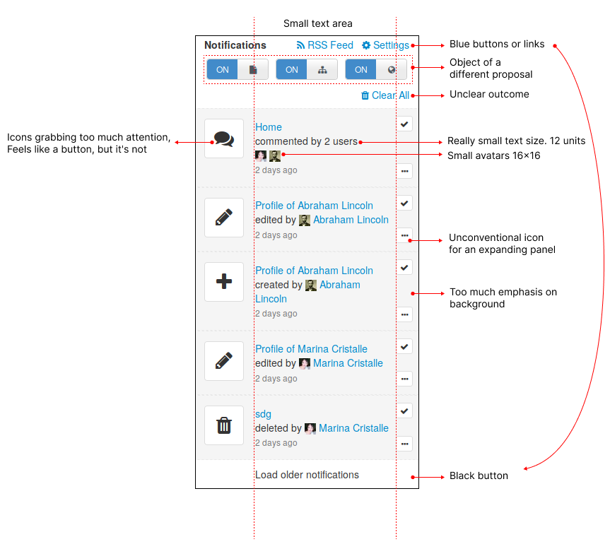
System notifications

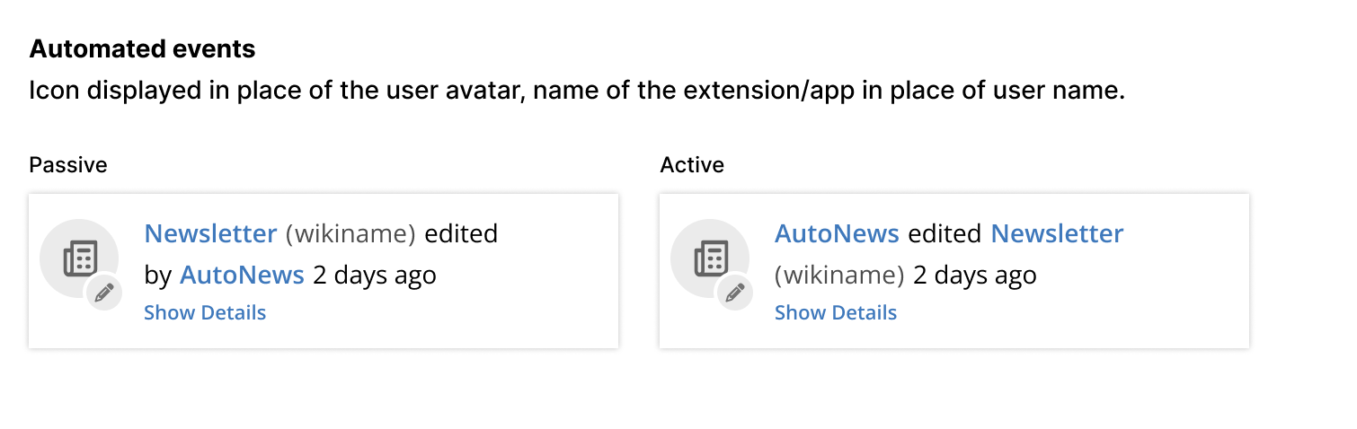
I would like to see an example to have a more concrete opinion. But maybe we can do a different category of notifications for automated ones, without avatar and name, kind of like the What’s New feature below. Or maybe we can retain the base layout but where the user would go, we print the name of the extension or a “system” tag, for example.

Base Layout changes

Below you can see the changes made from last version regarding tha base layout, What’s New (new feature), grouping (new feature), and actions.

The gray background is for this visualization only, it will not be in the notification.
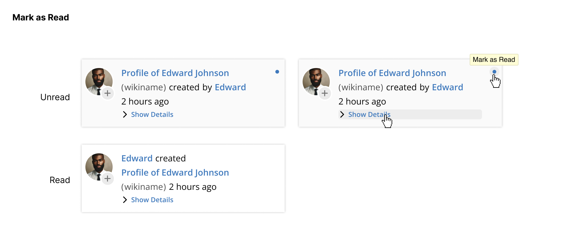
Base layout

Mark as Read

The button, while still remaining round, takes the primary color of actions of theme. I believe this will make the action clearer.

Also, as you can see, there’s no more of the yellowish background on the notification. I made it this way to avoid the situation in which all visible notifications would be yellow. This problem already happens in the current version, but with the gray background.

In this version, the only indication of a new notification is the blue button to mark as read.
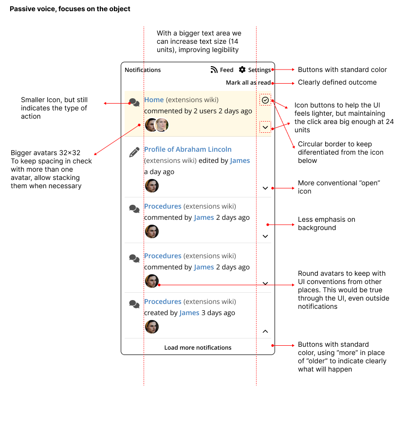
What’s New

The What’s New feature now has a fixed position at the top of notifications and can be dismissed by the X. It is also visually distinctive to help keep things separated.
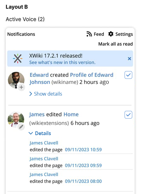
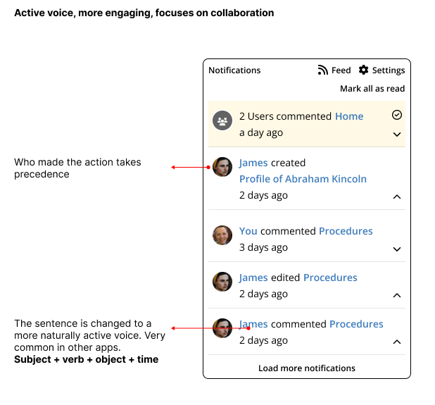
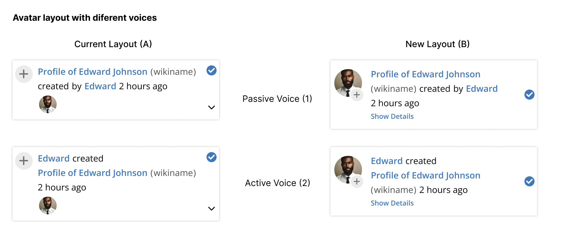
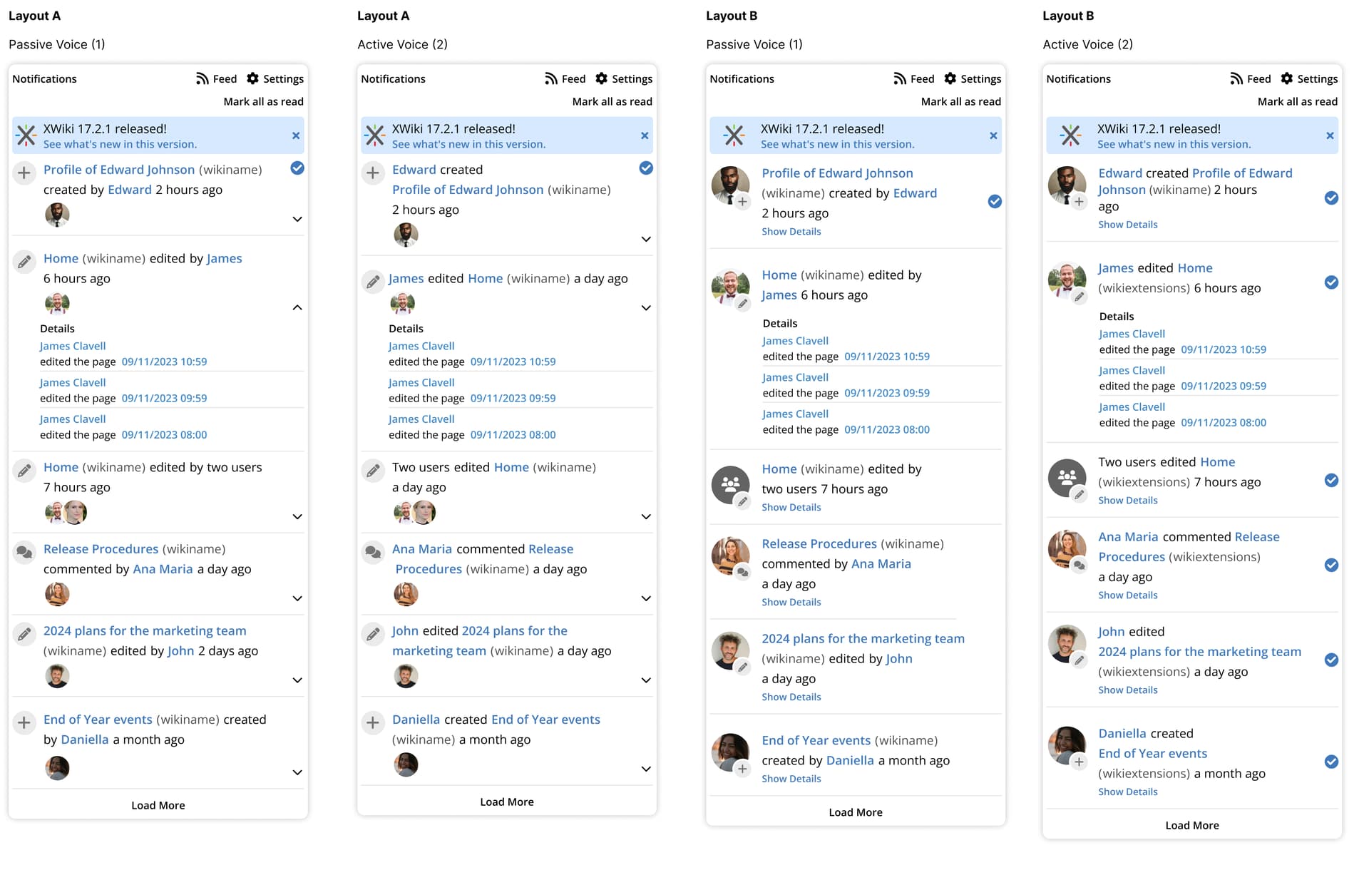
Avatar and Voice

Previously, I made two changes on the notification layout and called it as one. The change in layout (the avatar) and the change in voice. However, they are not mutually exclusive and can be interchangeable, like below. That’s why I am calling them Layout A and B and Voice 1 and 2.

New avatar, passive voice

Why two layouts?

When appropriate, I always like to propose two versions. One with fewer changes and easier to implement (A) and a more complex one (B). My reasoning for this comes from a prioritization perspective so we can have options when discussing.
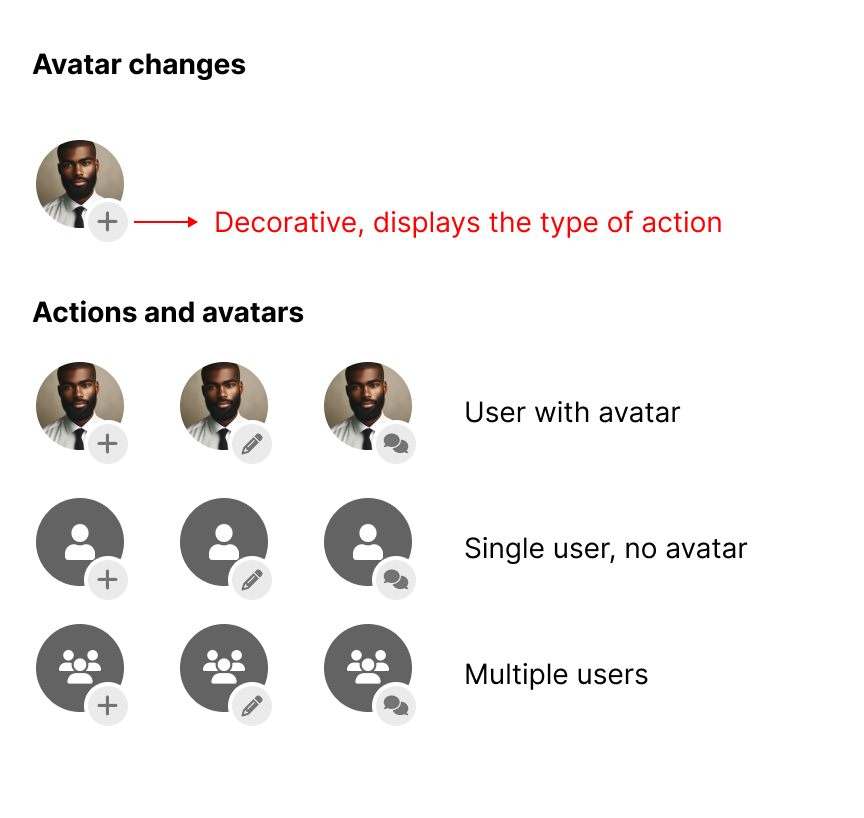
Speaking of Avatar

I changed the avatar on layout B a little bit. Now the activity type icon is placed in conjunction with the avatar as a reinforcement of the notification text. As you can see in the image we can have different signatures from the notification based on activity, number of users and the presence or not of a photo.

Actions and avatar

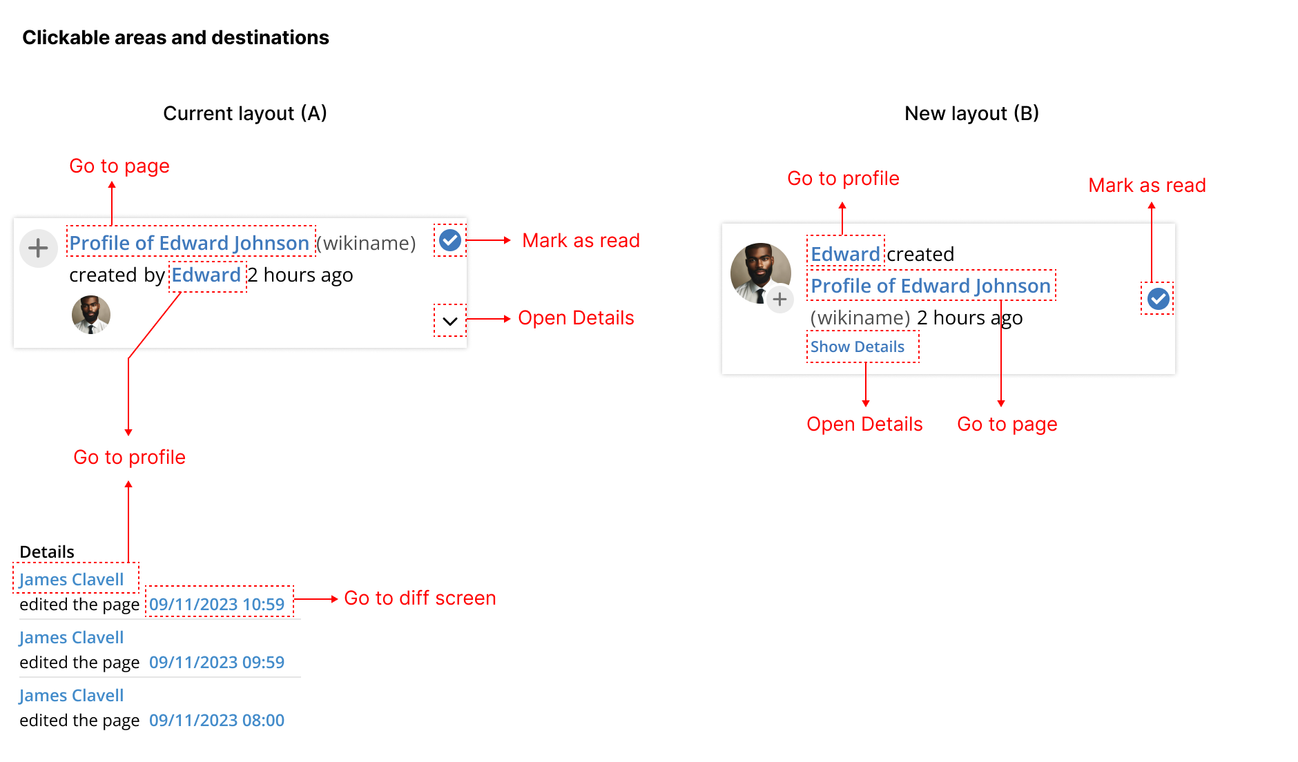
Actions areas and destinations

Check the image below to see what are actionable elements in the notification. This is unchanged from the current version in which there’s no default action on the notification itself, only on its sub elements.
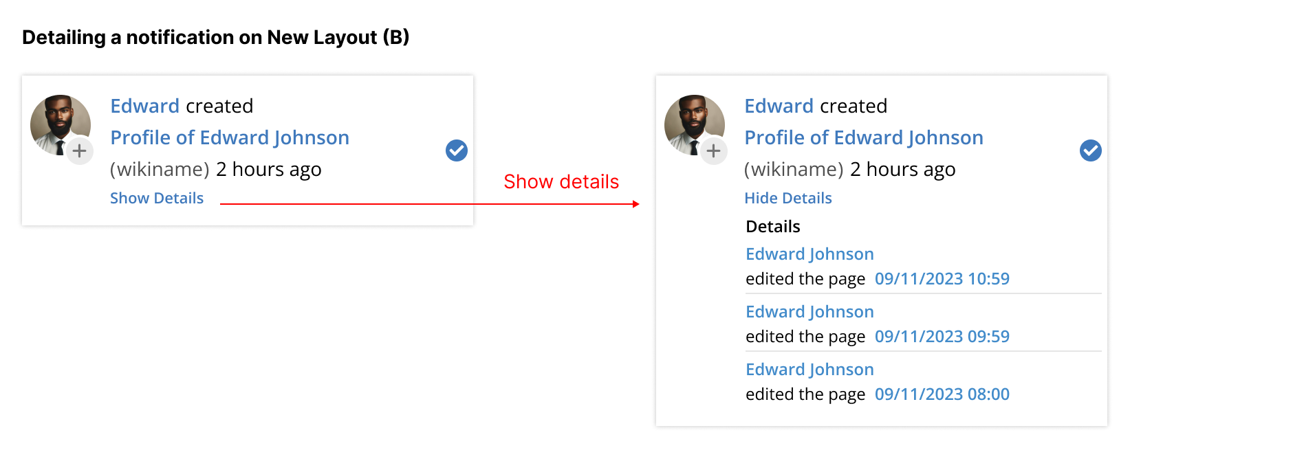
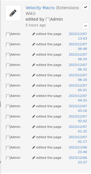
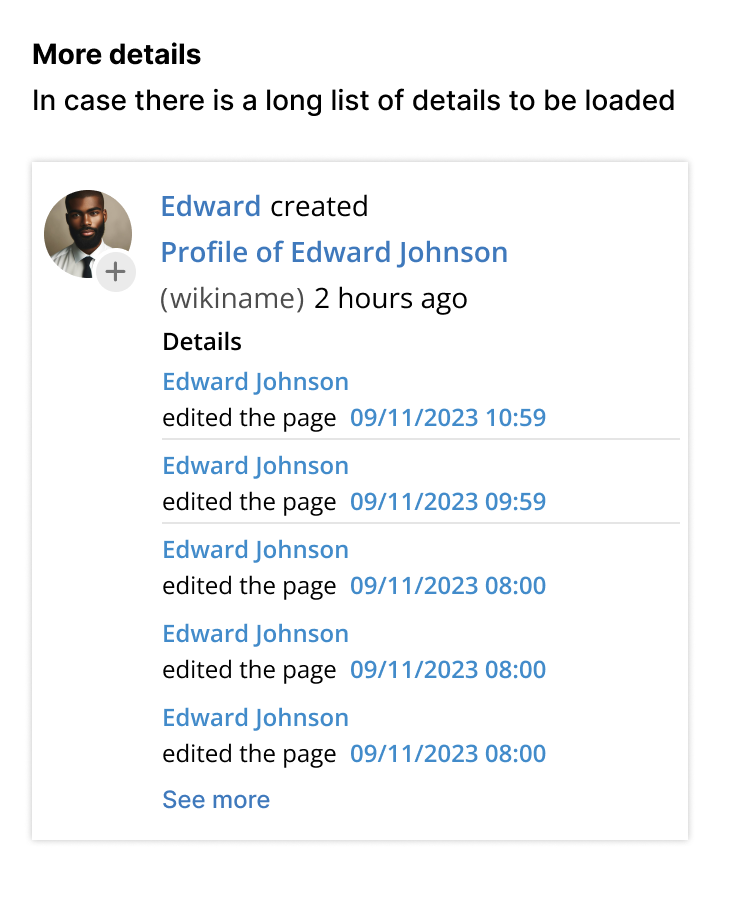
Clickable areas

Showing details

On layout B I opted to show the “Show Details” button in text, and in a smaller font. Its a very niche option and I would not like it to take much space.

Also, in this version there’s no “Hide details”, my reasoning for this is that the Notification Central is a transitioning place, users will click it, see what are the changes, maybe go to a page, maybe mark some as read, but will rarely keep interacting here for long. On page reload the details pane will be hidden again, as is the current published version.

Edit: I changed this behavior after @surli 's feedback below
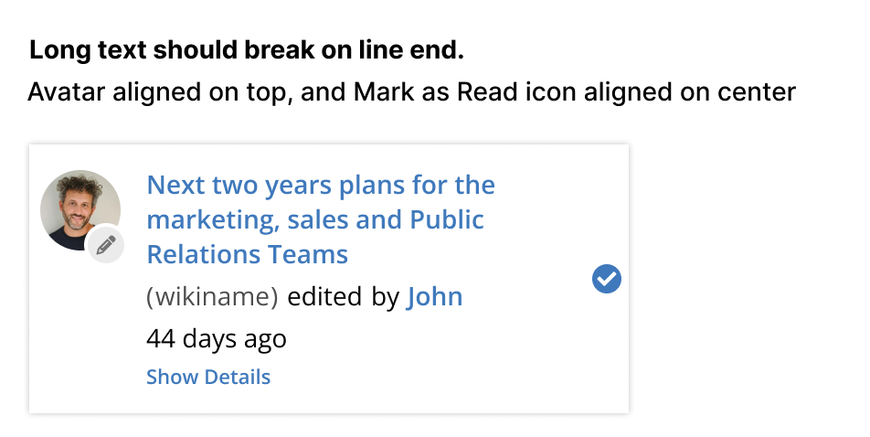
Notification details

Long text

Here we have a notification with long text applied to the page name. Probably this is a common scenario across organizations and based on @surli 's comment I think it’s nice to have it specified. The idea here is to simply keep the text breaking at the end of each line, so we would not truncate text anywhere here.

Long text

Change in voice

For the change in voice, I can see benefits in both, but I don’t want to stall this proposal because maybe it is a longer and separate discussion.

I don’t see a problem in notifications having both voices on the notification central in case we decide to go Active Voice while some extensions still rely on Passive Voice. But the layout of the notification should always be the same (A or B).

Adjusted layouts and my opinion

Personally, I would go with B2, a change in layout and in voice. As a second option, B1, keeping the passive voice but changing the layout to give more focus to the avatar.

Below you can see all changes in context and side by side with the same information between them (the image itself is big, try to open in a new tab to check details).

complete central

2 Likes

Right now it’s just that we use Unknown User as the actor of the action, so using passive voice it’s something like “XX page has been edited by Unknown User”. We could keep it like that with active voice, but IMO it would be nicer to use a more passive voice for those like “XX page has been edited by the system”.
I’m not sure we should use same mechanism than for What’s new: those are now very visible on top of the notifications, and for me here the need is not the same.

I’m not yet fully convinced about that: seeing a blue marker next to a div gives me the feeling that in the contrary I already checked / read those.
Now maybe it’s only a feeling with the screenshots.

I like that, now just a little detail: right now you can have an icon for the application and an icon for the event type. You end up with this kind of UI:
Capture d’écran du 2023-12-07 18-05-51

Big icon is the application, and small icon the event type AFAIR.
Here I used shields for both the application icon and the event icon, but some extensions might use different icons. We might want to deprecate the event icon, to only keep the application icon for the activity icon, we should probably check I doubt those are different in many cases.

I’m really not convinced with that argument for 2 reasons:

  1. details can be pretty big if you have lots of events, e.g.:
    Capture d’écran du 2023-12-07 18-09-28
  2. you can load more notifications in the area, in which case opening details forces you to scroll a lot more: if you can hide details, then it’s easier to have a global view when loading more notifications

Maybe I missed something but I don’t really understand the “Group Name” in your screenshots? What’s supposed to be used there?

Hey @surli thanks for the feedback!

Indeed, I was also thinking that perhaps it was not the best of ideas. I created a mockup below with a proposition of using the same layout as user notifications, but for apps/extensions.
Here “AutoNews” is a made up extension and “Newsletter” is a wiki page.

Long text

I will wait for further feedback but also keep researching for other ways of doing this. Maybe the yellowish background makes a comeback =)

It’s a nice idea, in my mockup above I still maintained two icons but in case the second one gets deprecated the layout would work the same way.

Interesting, in this case my layout would not work indeed. But I would like to ask, it is really necessary to show so many details here? I know there is a proposal for making a new page with detailed notifications as an individual page, if that’s indeed the case we could show only an arbitrary number of details here (let’s take 5 for example) and show the rest as a single link for the page. Something like “More details”.

more details (1)

But of course, this depends on a new implementation and maybe outside the scope here. Anyway, if this idea does not get support we can use today’s implementation, with Show and Hide details.

When we have notifications grouping in the future, that’s what I am proposing for them to look. Currently, that text would not be shown.

Edit: Disregard, misunderstanding on my part.

The problem is that those “details” are actually the real events that are then combined to form the composite event we display. And this grouping algorithm is not entirely in our hand anymore since we allow new grouping strategy. So we could even imagine a strategy where all the events would be grouped in a single composite event: just to emphasize that you just cannot guess in advance how many events will be there in the “details”.

Ok, that clears things up. I will update my proposal.

Proposal B2 looks very good! :star_struck:

Point 1: I’m still having trouble with the check button. :thinking: - 
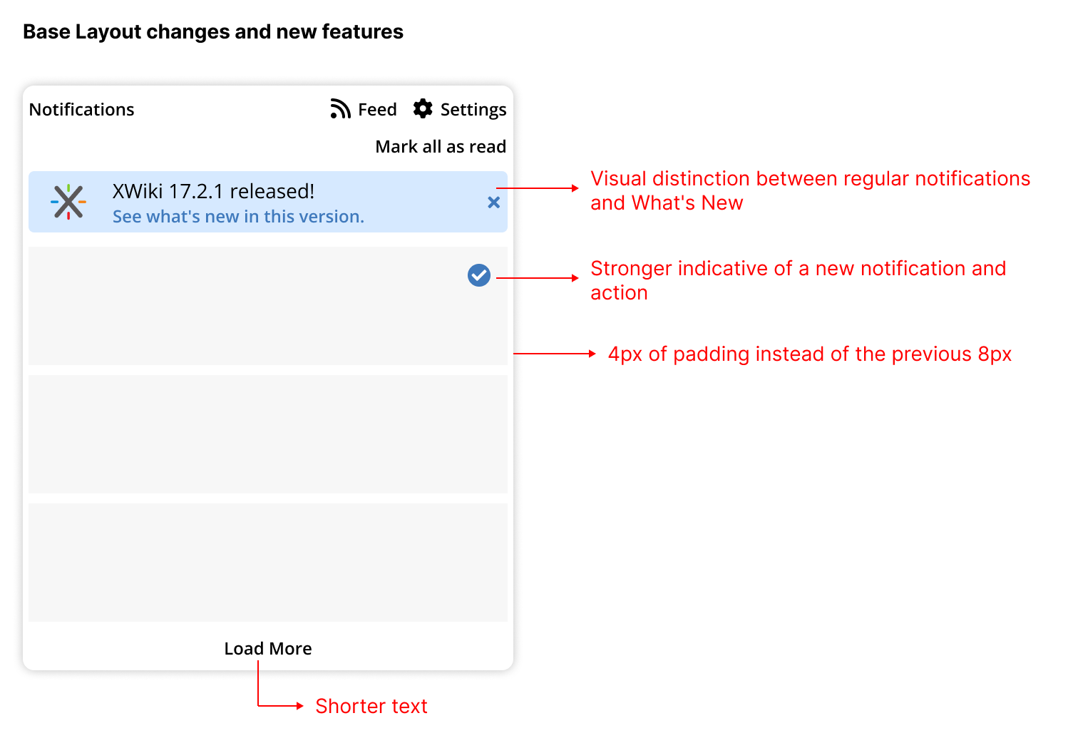
It still feels like a status and not a button. I think its problem is not the color, but the shape:

We are so used to a circled check to signify Seen status, that it could’ve been only a circle without any icon in it and I would’ve thought the same. I think the way to go would be a square icon.

Point 2: I’m not a big fan of changing the location of the check from the top right to the middle of the notification. I get why you moved it from an UX pov (I suspect that you wanted the icon to be reached by the eye immediately after the title is read? sorry if you’ve explained already, didn’t see it), but from an UI pov it looks a bit unintentional to a non-designer user. I feel like it looked much cleaner when it was in the top right corner.

Point 3: Would love a little chevron in front of Show details. It would act as a delimiter and also as a toggle icon (extends or collapses). It’d also be nice a bit more vertical space between the title and Show details (exactly how much space is between Details and the title).

Tried very quickly these changes, hope it it helps my explanation. The check button can be gray too, not necessarily blue, if we go with the square button:
74aff5b4cf72ddfe17be90f5406ba73e23819d14revamp

Hi @amilica indeed the check button is taking a little while to get right.

Point 1: My worry with using a square button with a check is to give it too much of a checkbox look. Checkboxes you can select and deselect, in our case the check would disappear. I did a quick research and lots of apps use just a circle, background color and/or bold text to emphasize an unread element, so maybe we can follow this pattern. Usually the read/unread status is changed with the click on the element, maybe we can do it as well (WDYT?). In my mockup below, I didn’t bold all the text because we already have bolder text in the links to the page and profile. The blue dot is not so clear in its intention in my opinion, but it seems like an established pattern, and we can always reinforce it with a hint text.

Point 2: Agreed, we can maintain the current position.

Point 3: That’s a good point, I like it =) . But I would still keep the Show/Hide label to reinforce the action (the whole line could be activated)

Mark as read (2)

1 Like