We have a jira ticket (XWIKI-19217) about creating an inbox view for our notifications. I would like to present here a version of this inbox for discussion.
Notes:
This ticked impact directly on the discussion we are having on the notification central, so I took that proposal and made some changes here. In case we choose to do not go through this one, then that version should be used as implementation reference.
As always I would like to reiterate that these images are mockups only.
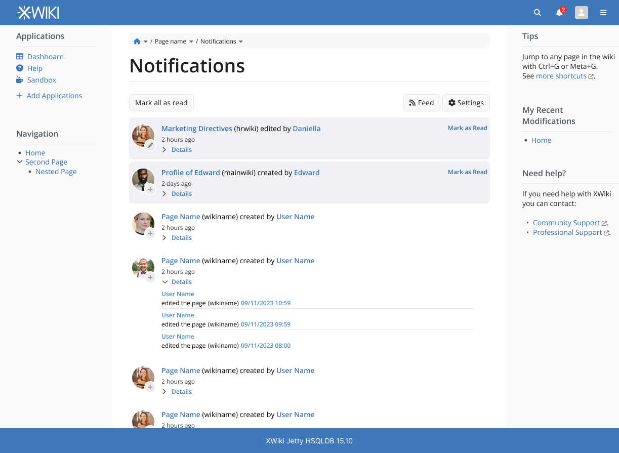
One of the problems pointed in the ticket is the use of space on the notification center (bell icon) so a separate page would help us to alleviate the problem and organize the features better with additional screen space.
This of course would change the proposal of the notification central to be more light, with fewer features but quicker to navigate. Also, only new notifications would be shown here
Features moved to the inbox that were here originally:
Note that navigation to the object of the notification is still available, doing so would automatically mark the object as “read”
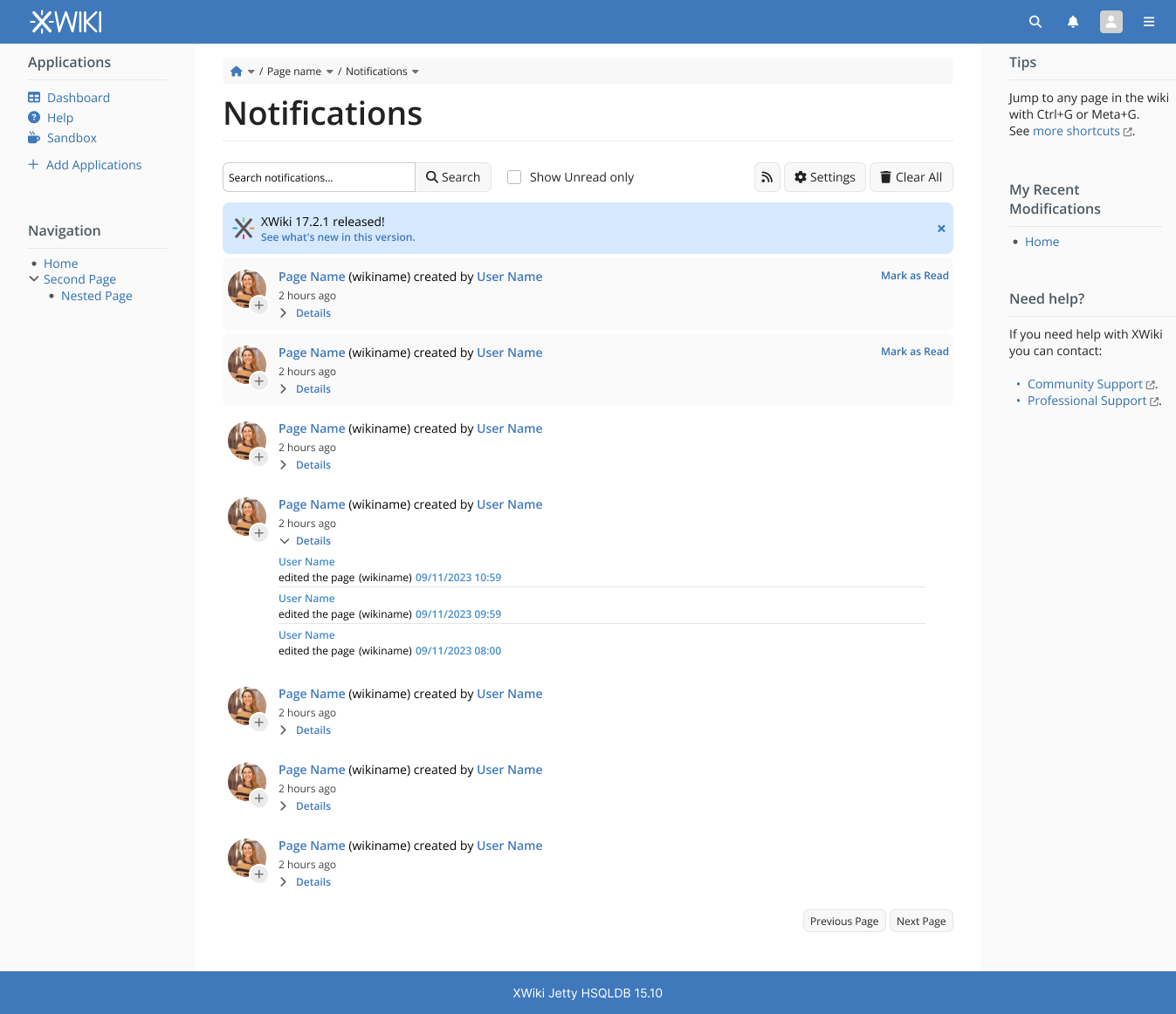
The flow of these screens would be the notification central being a gate to the complete list of notifications in the inbox, allowing the user to quickly glance at new notifications without being overwhelmed with a lot of options and features right away.
thanks for this proposal. I have a few questions / remarks.
First of all, the screenshot of the inbox is not clear how you’re proposing to handle thousands of notifications: do you plan to have pagination or an infinite scroll? filtering options of notifications? Also would that be possible to have capability to unmark a notif as read? In which case would it appear back in the notif area under the bell?
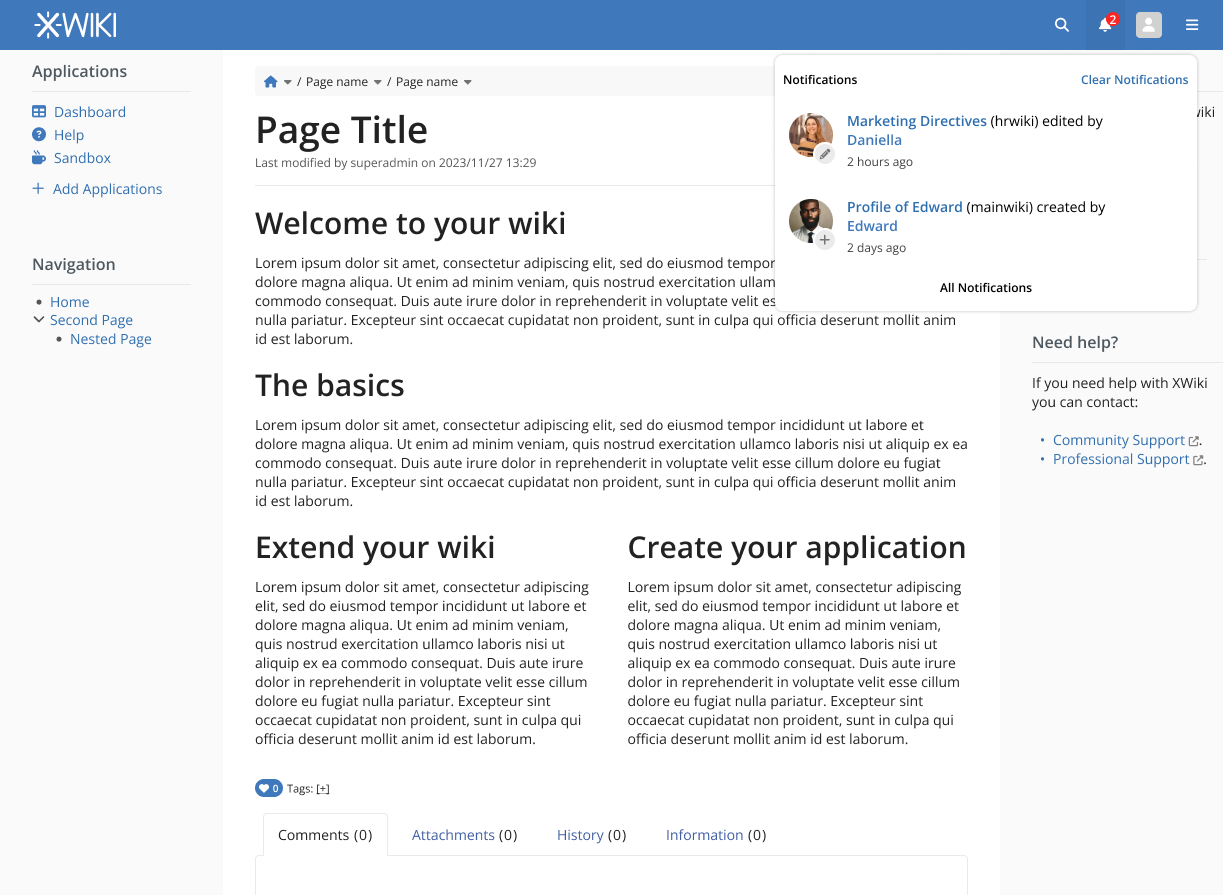
Speaking about the notif area under the bell: I’m not yet fully convinced that it’s a good idea to completely remove the settings links there: I’m still wondering if we shouldn’t keep at least a gear icon to access settings from there. Also it feels a bit odd to me that the notif immediately disappear when you access it and it’s marked as read. Finally: what should the area displays when everything’s has been read? And what’s the behaviour of this area when you have says 30 unread notifications: do you display a subset and invite to consult the notification inbox?
Good catch on the pagination and filtering, I will update the proposal.
Undoing the read status is not something I was thinking of. If necessary, we could provide this feature in the inbox page, without showing the “unmarked” notification again on the pop-up. My reasoning is the user already “saw” the notification but marked it as unread, so it is something that the user wants to come back to later but not being reminded again and again with a red mark on the header. Think of the pop-up being a quick glance into new notifications, while the inbox view is the main page for all notifications.
Sure, we could do that.
Maybe because the current implementation in Xwiki is different. But this proposal is not so different from an e-mail client that marks new email as read as soon as you access it.
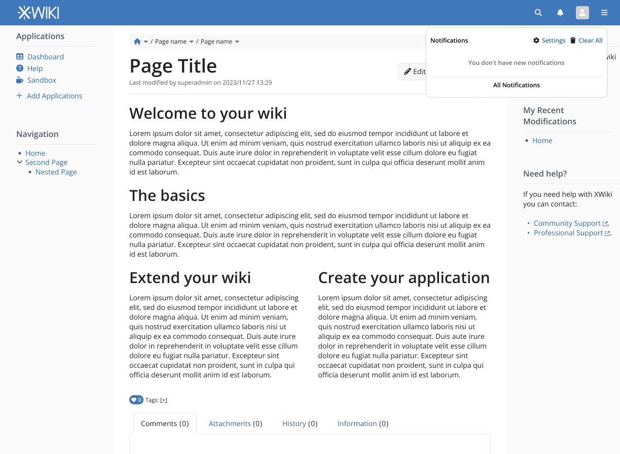
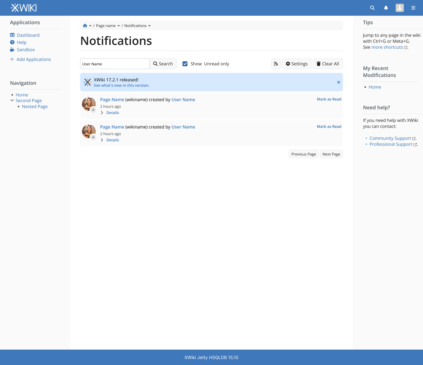
On the pop-up, the same message we have today. “No notifications available”. Personally, I would change it to “No new notifications available.” On the inbox view, all notifications would be available but visually differentiated between old and new.
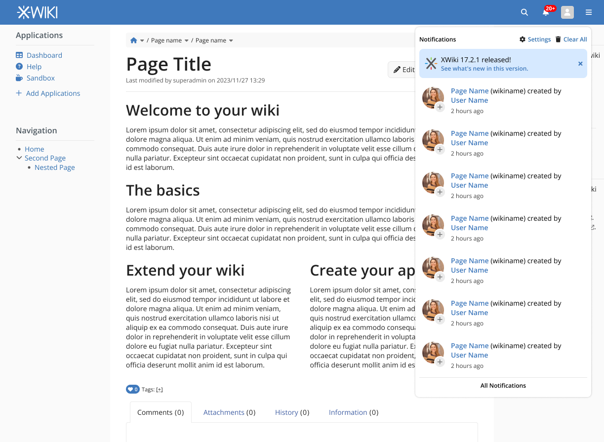
We could have a “Load More” past a certain number of new notifications and a “See All Notifications” button that lead to the inbox.
Let’s put that aside for now: it’s probably a minor feature. Now for info from a strict implementation point of view, right now there’s currently no way to distinguish from the storage an event that has been once read and an event that was never read.
I think that I would only always put a fix number of notifications in the area, but each time an event is read (and then removed) I’d load another one which wasn’t displayed. And I’d keep only the link to see all notif so that you can mark the notif as read one by one, or you can just go to the inbox to see them all.
Also it means we might need a way to “Mark all as read” in the inbox, or to select them to mark them as read there at once.
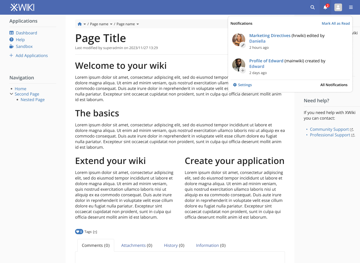
Hey @surli thank you for the feedback. I did some changes based on it, as you can see below.
For the filtering, I put a search box that would look into the text content of the notification and filter based on that (so it could be Page Name, or user or time). I don’t really know what is possible or practical from the programming side, so maybe it is something we should discuss further. Of course, we could always provide more sophisticated searches in this box, like GitHub does with tokens and all, but I don’t know the validity of that based of the time it would be needed to program.
For the navigation aspect I did some buttons just to jump pages but without links going to any specific pages (01, 02, 03, etc). The way I see it, notifications paging are not something the user will need a great amount of granularity in the interactions. But of course, maybe we have some edge cases that I don’t know about.
Without new notifications
New Notifications with counter
Inbox with filtering options and buttons for navigation
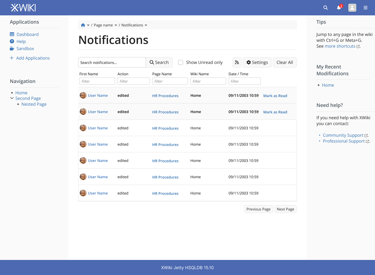
Technically, I think we should try to use the LiveData UI component to display the notifications in the inbox page, since that component already implements several features (filtering, sorting, pagination, etc).
If we want a different UI than the table view of LD, it’s possible to implement a custom view.
I think that’s good even with LiveData: we have a ticket for allowing to support cursor-based pagination in LiveData, see: Loading.... I’m not sure we can properly compute a number of notifications so computing number of pages might be complicated (depending on rights etc).
Regarding using a LiveData that would provide consistency indeed but I’m wondering how to handle the granularity of notifications: do we keep grouping notifications or do we only display any single event without any grouping? I’m afraid it won’t be good if we group: e.g. in a group you can have multiple author of a change in a page so filtering wouldn’t work properly.
@tkrieck : the proposal looks very nice, with the reserve that we should try as much as possible to use livedata, which should allow us to have filters on all metadata of notifications, ideally (date, page, author, etc).
In order to decide what we show where, I think we may need to clarify the state of a notification:
unread
read
read and deleted (non-existent after having been displayed).
(I think these are the current states of the notifications now).
In the context of your proposal, the display in the popup is somewhat ambiguous:
afaiu, in your proposal, it displays unread notifications only
the ‘clear notifications’ button would delete notifications, not mark them as read
this will make the notifications disappear from the popup
in your proposal, clicking on a notification from the popup would mark it as read, so it will disappear from the popup
Thus, the disappearance from the popup is rather ambiguous. We either offer both “remove all” and “mark all as read” options in the popup, so that the user understands clearly what will happen, or we offer none and it will have the default behaviour of only showing unread notifications and the management of deleting notifications will be done in the inbox view.
I agree with @surli that we can keep an access to settings in the popup, but we can move it next to “all notifications”, I would say, at the bottom.
Hey everyone, sorry for taking so long to get back into this.
I think the trash icon on my proposal was sending the wrong message, my intention was the Clear All button to mark them as read. I did some changes below to clarify this behavior.
Ok no problem, I did a new mockup below.
Here’s a version with the livedata component. I’m in doubt if a search field is needed when we have the individual Filter fields at each table header. I kept it for now, but probably it should be removed, WDYT?
Note that using the livedata component doesn’t mean we have to use a table layout (we can, but we don’t have to). We could very well use a layout similar to the ones in your screenshots above (it’s more work though). This is what I meant with:
If we like the table layout, it’s clearly less work since it already exists
If the columns display all the data then yes it’s not needed IMO.
You’re right, I forgot to tackle this. In my opinion, not grouping them wouldn’t be a problem now since LD have the filters and the user can “group” them in a way, by filtering.
This could change if there’s a strong use case for the user to see different groups together in the UI. For example, see the edits by user A, B and C. Without grouping I would need to filter first by user A, check notifications, filter user B, check again and so on. Now, maybe a user in a management role would need more granularity and control.
IMO the problem of not grouping in that inbox is that it breaks the consistency and might lost the users. Let’s take an example: you have 4 events happening in this order: 1 edit on Foo by X, 1 creation of Page1, 1 edit on Foo by Y, 1 creation of Page2. Notifications under the bell will display 3 notifications in this order: Creation of Page 1, Editions on Foo (by X and Y) and Creation of Page 2.
As you can see, the notification for the editions is in the middle, because the group is displayed at the date of latest event. Displaying all events might help users to understand what really happened, but it might also be confusing: users might start looking for events that appeared to be grouped but happened before others so are hidden in the pagination. In a perfect world I guess we should let users chose if they want to see them grouped or not, but I don’t know what’s the default should be.
OK, I think I understand now. I was ignoring the fact that in the bell the notifications are always grouped and ungrouping them can lead to a torrent of individual notifications.
So, some options that we can explore:
A) Always show ungrouped (bell and inbox). In this case, the bell would still be messy with a lot of notifications, depending on the user and wiki. The advantage is that we would still have a component for quick checks. Showing them always grouped lead to the problems that you’ve listed.
B) The bell only show a count or badge, clicking it goes directly to inbox, without the popover. We would lose the quick check of notifications, but the user would be more in control of them with filtering and sorting provided by the LD table. Regarding the default of grouping, I would keep it ungrouped to show the user what happened in chronological order. We then keep the user in control by allowing the use of filters and grouping as necessary. This is the way that Github does its notifications.
I really don’t like that as I’m really not a big fan of Github way to handle notifications I do like having the quick check of notifications and being able to act on them without having to leave the current page.
IMO we still have a third way:
C. handle inbox with 2 views: by default we display inbox without LD, with grouped notifications by basically reusing what we have in the bell area, but there’s another tab with a LD view with all events ungrouped which can be filtered / sorted. That way we have both worlds and it shouldn’t be that much in terms of maintenance if we manage to really reuse what we have in notification area for the view.
I would really go toward that solution for starting, and maybe we’ll find that we can get rid of the default view to only keep the LD later on.