Hey everyone, just a quick proposal to make the app actions more streamlined on the XWiki interface. The current version is very wasteful on space and has some legibility and standardization problems with its icons and fonts.
Context
Proposal
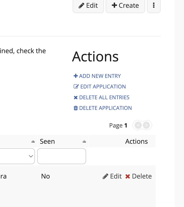
Remove the title “Actions” and make these actions a toolbar, this would ensure better vertical space and use a popover menu for actions that are not required for day-to-day use.
The buttons and menu options should follow the standard XWiki components.
This toolbar should have the following actions: “New Entry” and “More options”.
New entry:
Main action, styled as primary button
Aligned at the start of the toolbar
More options:
Secondary button
Aligned at the end of the toolbar
Not all actions would have an icon, only those that have a very clear meaning for the icon.
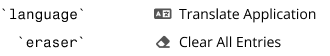
The action “Delete All Entries” to be labeled “Clear All Entries”. This is to differentiate this option more from “Delete Application”. Having two deletes so close to each other could induce an error on the user’s part when in a hurry.
The only comment I have, which is orthogonal with your proposal but related, is that there have been discussions in the past about trying to remove controls inside the page content so that the page content only contains content.
Some ideas going in this direction:
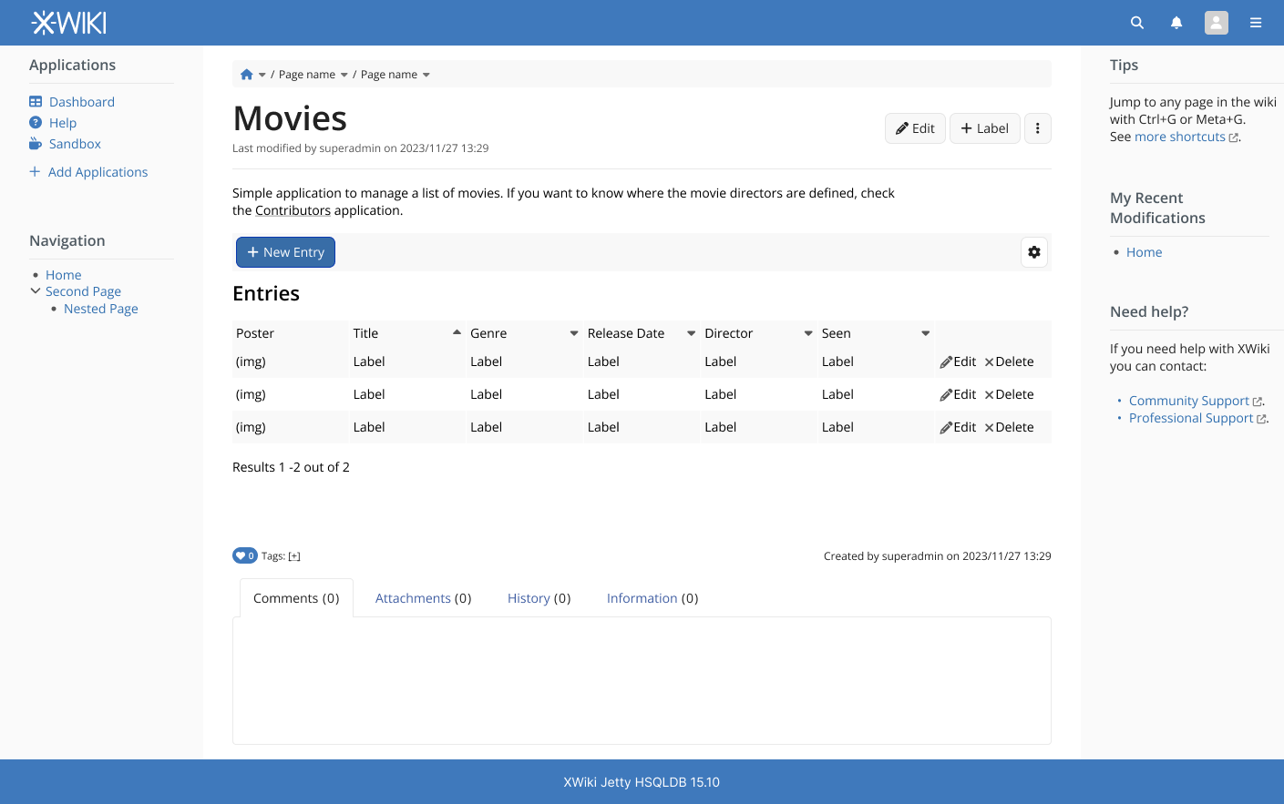
To create a new entry, use the existing “+Create” button available in the XS UI, and select the Provider Template for the app. AWM apps already create the template provider AFAIK so this already exists.
and/or Insert the AWM actions inside the page menu. For example, add the “New Entry” as a UIX left to the “Edit” button in your screenshot, and move the other actions inside the more menu (hamburger icon).
Interesting, it’s nice to see that these discussions took place in the past. I did not read the whole thing through yet as it is very technical towards the end. But I agree on the premise, having the standard content menu area to interact with the app would be ideal.
I think I would go towards this route and moving the secondary options (delete app, delete entries, etc) to the hamburguer menu.
Hey everyone, sorry it took so long, but I’ve updated this proposal a bit.
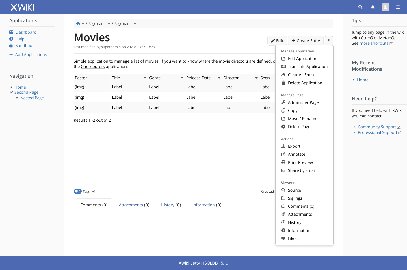
Integrating the default “Create” button to the app. I’ve renamed it to make it clear to the user a new app entry will be created and not a new page under the app.
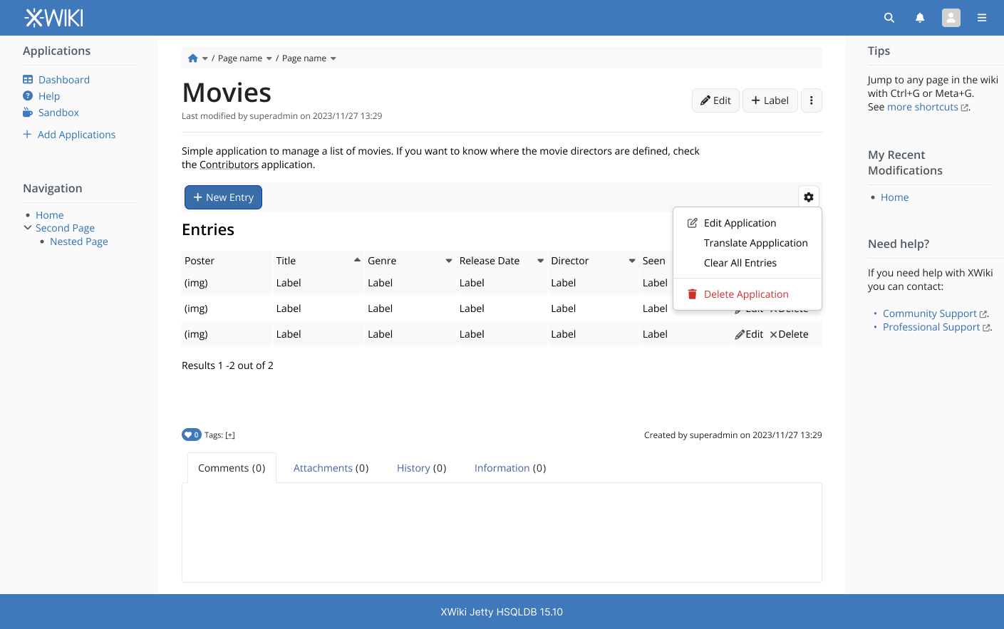
Integrating the app menu under the page burger menu. This also comes with a proposal to introduce new icons for the IconTheme. I’ve also renamed the sections a little bit to better separate “Manage App” from “Manage Page”, before the page one was just “Manage”
An issue arises with this updated proposal however:
With only a “Create Entry” button, it would not be possible to create a page under the app. We could fix this by choosing one of a few options:
Making the “Create” button a menu button with two options,
Create Entry (default one) and Create Page (secondary one). Personally, I like this one.
Keep the “Create” as a simple button but show a selection menu after clicking it. Not ideal since it would make the creation of a lot of entries quite a burden.
Create a new entry on the burger menu as “Create page”. This introduces a discrepancy when creating pages, sometimes it is a button, sometimes is an option in the burger menu. Not ideal.
Don’t allow the creating of pages under apps. Quite a nuclear option, could be too disruptive.
However, the idea there was to have a more general “Create” button to create anything in XWiki (page, applications (ie AWM), etc).
Right now the “Create” button is in the content menu, ie related to the current page. I don’t know if a generic “Create” button should remain there or be moved elsewhere.
Also, I think that your “Create Entry” is actually the same as “Create Page” with the App Template pre-selected. The idea would be that you no longer create entries at all but that users only create pages.
I don’t think I like this too much for 2 reasons:
Inconsistency with other admin actions
Make the menu too heavy with actions that are not needed that frequently
I’d prefer to consider that those actions are admin actions and available under the Admin UI, which is already meant to accomodate custom admin entries from extensions.
Ah, I think I get it now. However, this can be very far on the dev pipeline, right? For now, just a restyling of the app actions would be enough? At least, to save a bit of vertical space.
WDYM by “Admin UI”? The Page Administration that is loaded when you click on “Administer Page”? If so, then:
it’s far from obvious that you need to use the Page Administration of the application home page to manage the application
edit, translate, clear, delete are actions, not configuration sections, that currently take you to a separate page (location); you seem to suggest having an AWM page administration section that has 4 buttons to trigger those 4 actions; moving the UI of these actions inside the administration is not trivial (easier for clear and delete, but way more complex for edit and translate)
What would be the behavior of this “Create Entry” button? The Create button that we currently have is already supposed to preselect the right template to create an application entry, so I’m not sure what more we get from the Create Entry button. As long as you keep asking the location of the application entry to create (before going to edit mode), then it’s the same as the Create button, so I wouldn’t rename the button.
Also, I think that your “Create Entry” is actually the same as “Create Page” with the App Template pre-selected. The idea would be that you no longer create entries at all but that users only create pages.
I don’t think you even need to ask the user for any location since the location of the create UI could be automatically set by the application (actually, in most cases, it’s probably a nested page under the current page, which is the default for the create UI anyway).
What would help I think, is to modify a bit the create UI template to accept some query string parameter to provide a more lightweight UI:
Hide the template selection if a template is passed in the query string
Hide the location if a location is passed in the query string
Yes ok. Indeed, we had a discussion in the past about what should go in the Admin UI (page, space or wiki level) and what should not. I’m not sure that we concluded but indeed, I think I made the point that we should separate configs from apps/actions (AFAIR, Caty was proposing to move everything in the Admin UI back then). One main argument for not moving apps/actions in the Admin UI was that the rights could be reconfigured by an Admin to allow some non-Admins to use these apps/actions.
Now in parallel we also had some quick discussions about changing the Admin UI to be named differently and not requiring admin rights, and that the rights required to make changes to some sections would be based on the elements inside the section instead.
I agree that for now, it’s the simplest to keep the AWM actions outside of the “Administer Page” page.
Note that this will create a precedent that Apps which provide actions would have their actions listed under this “Manage Application” menu section (ie not just AWM apps but any app). For example, the “Extension Repository” app currently has “Contribute Extension” and “Import Extension” actions and we should refactor it to have those actions under that menu too.
There’s also this discussion about deprecating Silk (more specifically this comment). So I think it’s ok if we don’t have a fallback for Silk. In case someone is still using it, the icon space will be empty, but the action is still usable and well communicated via its label.
Hey everyone, I need to update the main proposal for this, so from what I can gather these are the main points:
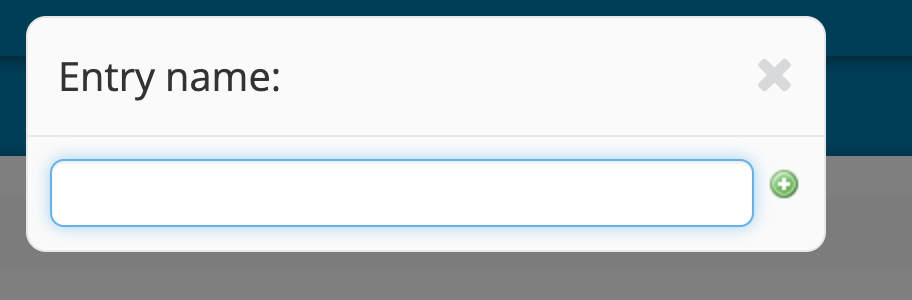
The button “New Entry” is removed, and its function is added to the main “Create” button, meaning only the “Entry Name” field will be available (not the traditional “Create page” page)
Hey everybody, just to let you know, I’ve updated the main design page with the latest discussions here and it should be good to go. Thanks everyone for your inputs, this proposal improved quite a lot from the original one.
I’m keeping my original proposal in the design page only for archival purposes and it’s clearly labeled as that.