Tags look revamp

Hello everyone! Hope you are having a nice day :grin:

As started in this xdocFooter revamp discussion, tags could be improved because of these reasons.
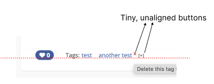
Current look

1694610982887-135

Right now, they are not very visible and if they weren’t in a context which clearly specifies they are tags, you wouldn’t think they are tags.

Wanting to make the whole initial proposal easier to tackle, I decided to split it in multiple parts, this being the second one (see proposals 1, 3).

This proposal only concerns the general/normal/added-by-the-user tags (not the default/colored ones that I proposed in the initial proposal, those will be separately discussed).
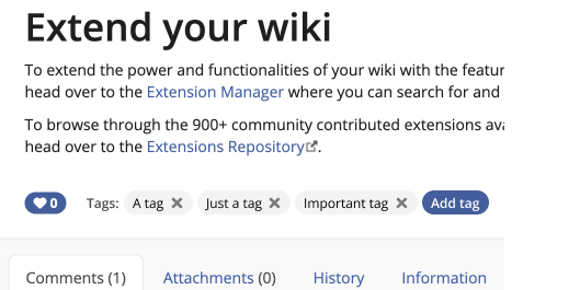
New look :star2:

Description

The set of tags will stop being introduced by the label “Tags:”. This will be replaced by a button that directly opens a UI for suggesting and adding tags. The old “+” button should disappear.

The new button is composed of a “+” icon and the label “Add tag”.
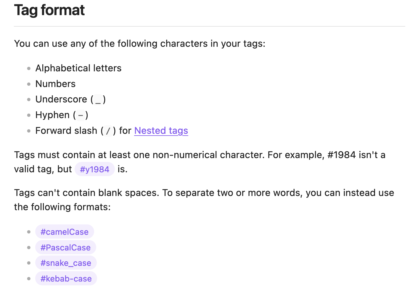
The new tag will:

  • have a light gray container, fully-rounded
  • a “#” character before its text to clearly identify it as a tag
  • continue to keep the text colored as a link, with a contrast respecting WCAG AA
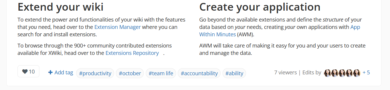
Looks (contextual)

Note:

  • The following images contain other revamped elements, but, in this proposal, we should focus on the tags and add tags button.
  • Default/colored tags explored in this linked proposal will be affected by the look decided in this proposal

1. White background, border same color with the boxes’ border

1697798424113-546.png

2. Box styling

1697798404672-802.png

3. full version

This version is with background-color: @dropdown-link-hover-bg

1697799356149-304.png

HTML

Changes in the HTML:

  • new structure and classes related to the add tags button
  • new tooltip message for adding tags
  • new tooltip message for any tag
  • the “#” should be separate from the tag itself (you don’t search by “#winter”, you search by “winter”)

Note: I still have to change hardcoded icons to icons got by scripting

<div class="doc-tags" id="xdocTags">

<div id="add-tag-button">
<a href="/xwiki/bin/view/Main/?showTagAddForm=true#xdocTags" rel="nofollow" title="Click to add new tags. Tags help in categorizing pages.">
<span class="fa fa-plus"></span>
<span class="add-tag">Add tag</span>
</a>
</div>

<span class="tag-wrapper">

<span class="tag" title="Click this tag to search all pages that have it.">
<a href="/xwiki/bin/view/Main/Tags?do=viewTag&amp;tag=productivity">
#productivity
</a>
</span>

</span>

</div>

CSS / LESS

Modified or added.

.doc-tags {
flex: 1 300px;
/* padding: 3px 2em 3px 0 */ /* got rid of this*/

}

.tag-wrapper {
padding: 2px 1px;
line-height: 225%; /* increased the line height */
}

.tag{
border-radius:999px;
background-color:@dropdown-link-hover-bg;
padding:3px 7px;
vertical-align: middle;
margin-right:2px;
font-size:@font-size-base;
}

#add-tag-button{
display: inline;
font-size:@font-size-base;
}

.add-tag{
margin-left:2px;
margin-right:4px;
}

Any feedback on HTML structure, class names, css/less would be greatly appreciated! I’d also be happy to hear which version of the tags you prefer and if we should move forward with the rounded container idea on each tag. :blush:

1 Like

So even users who cannot edit the page and thus cannot add tags will see this button? This doesn’t seem good. To me, the new look makes it much less obvious that these are tags.

Also, please use semantic HTML. Buttons need to be buttons, not divs. Also, titles on span elements are useless, the title needs to be on the link and should then include the tag (translations support parameters).

I’m not sure I understand your proposal, do you suggest that we should add a # in front of each tag? What if a user already has some tags with # in front of them, will there be two #s? Will this # be everywhere or just in the page footer? I personally don’t like these # but maybe that’s just me.

This is a good point. I’m so used to having full rights on a page that I didn’t take this into consideration, sorry.

In the case of users that cannot add tags, we can argue if tags that have the # before them is enough to make them clearly identifiable as tags. If we think it doesn’t, then we should keep, just for this case, the “Tags:” label. We would essentially have 2 cases.

I’ve tried to stay as close as possible to the structure of the current HTML, but yes, you’re right, I’ll update this to be semantic.

The proposal is a bit more than just the added #, but it does concern that too, sure. It also concerns the look of the tags themselves and how visually important they feel in comparison to the current version.

If some user has the # character before a tag, then they probably felt the need to have it. We should predict the needs of the users.

Ideally, tags would always be introduced by an #, even in inline content (apart from code snippets). The creation of a tag should be maybe dependent on typing a # character. This may be a different topic, worth exploring it when talking about the addition process of each tag.

This # character would be anywhere a tag exists.

Same comment as @MichaelHamann, this is not good for users that don’t have edit right.

I’m not convinced by this. # may be popular in the social media due to hashtags, but I’m not sure if it fits that well in the knowledge base context. Can you give us some examples where # is used to mark tags added to wiki pages / articles / documents in other applications?

The “Add tag” button should be aligned with the tags.

In the end, I think I’d be fine with:

  • Adding a rounded thin border around the tags and some more spacing (without any # and without a background color)
  • Having the “Add tag” button or the “Tags:” text before the tags, depending on whether the user can add tags or not

Thanks,
Marius

1 Like

I don’t think the link URL is the one that was intended to be :slight_smile:

:+1:

About <span class="tag" title="Click this tag to search all pages that have it.">
=> Usually, a title with ‘click’ is not recommended. If it’s not a button or interactive element, make it one; if it’s a button or interactive element, the user already knows that they can interact with it by clicking. Best titles and text alternatives are those that are short and go to the point, e.g. 'Search all pages with the tag #productivity'.

I’d use “View” or “See” rather than “Search” (because the search is implicit, done by the system), but otherwise +1 for your remark.

You are right that it’s not very common. Confluence, Notion, Evernote are only a few of those who do NOT use the # character in front of tags.

I believe that in a new interface, # characters do simplify the understanding of the tags’ function for a user not very used to knoweldge organization techniques because of their popularity in social media.

I believe the reasons for NOT using them are:

  • they slightly clutter the region in which they appear
  • they may impose certain rules about the spacing between words
  • because some tags work more like dropdowns from a certain bigger category

One knowledge organization that does utilize hashatags is Obsidian, but they are a minority:

image

yep, yep, I haven’t gotten around to update this (I know you’ve pointed this out in the like buton proposal too, thanks a lot!)

Okay, cool! Thank you for your feedback!

1 Like

Yep, thanks, changed it!

Oki, this helps, I’ll change it to: “View all pages with the the tag: productivity”, based also on @mflorea 's addition

1 Like

After reworking the HTML and CSS:

Tags look isolated

image

Tags look in the context of whole footer revamp

Disclaimers:

  • The like button has its own seperate proposal here, I’ll update the status there too.
  • The colored tags will have their own seperate proposal (will come back with a link)
  • The info in the right will have its own seperate proposal (will come back with a link)

Case 1: Viewer has no rights regarding adding tags
image

Case 2: Viewer had rights to add tags
image

Case 3: Mobile
image

Changes on the tags look from last update

  • alligned the like button with the tags
  • made the background of the normal/non-colored tags white
  • no hashtag on tags
  • the HTML is more semantic (hopefully fully)
  • added states to everything clickable (disclaimer:the way i did them works best only on light themes. I need to find a way to make them good for dark themes too)
  • increased horizontal spacing between tags
  • took into consideration the idea of having the “Add tag” button or the “Tags:” label depending on the rights of the viewer

HTML

The icons are not added in the way they are supposed to, this is just to confirm the structure and class usages.

                <div id="xdocFooter">
 
                  <!-- Like button -->
                  <button class="btn btn-default like-button"
                    title="Like this page to show your appreciation. Number of likes: 10">
                    <span class="fa fa-heart"></span>
                    <span class="like-number">10</span>
                  </button>

                  <div class="doc-tags">

                   <!-- Case 1 -->
                    <div class="tags-label">Tags:</div>

                   <!-- Case 2 -->
                    <button id="add-tag-button">
                      <span class="fa fa-plus"></span>
                      <span class="add-tag">Add tag</span>
                    </button>

                    <!-- All tags -->
                    <div class="tag-wrapper">

                      <!-- Each tag has the tag class and another class (simple-tag,success-tag, warning-tag, etc.) that color it i some way -->
                      <button class="tag success-tag"><a title="View all pages with the tag: done"
                          href="/xwiki/bin/view/Main/Tags?do=viewTag&amp;tag=done">done</a></button>
                      <button class="tag simple-tag"><a title="View all pages with the tag: proctivity"
                          href="/xwiki/bin/view/Main/Tags?do=viewTag&amp;tag=productivity">productivity</a></button>
                      <button class="tag simple-tag"><a title="View all pages with the tag: november"
                          href="/xwiki/bin/view/Main/Tags?do=viewTag&amp;tag=november">november</a></button>

                    </div>

                  </div>

<!-- Here will be HTML code for the info in the right side -->

</div>

CSS/LESS

/* additional spacing for the like button*/

.like-button {
    margin-right: 24px;
    align-self: start;
}

/* styling the add tag button */

#add-tag-button {
    display: inline;
    font-size: @font-size-base;
    vertical-align: middle;
    white-space: nowrap;
    background-color: @xwiki-page-content-bg;
    border: 0;
    color: @link-color;
    border-radius: @border-radius-base;
    padding: 4px 10px;
}

/* add tag button states */

#add-tag-button:hover {
    filter:brightness(95%);
}

#add-tag-button:focus {
    filter:brightness(90%);
}

#add-tag-button:active{
    filter: brightness(95%);
    padding:3px 10px;
    border:1px solid @link-color;
}

/* label spacing relative to the icon in the add tag button */
.add-tag {
    margin-left: 2px;
}

/* making all buttons in the footer consistent by having the same padding*/

#xdocFooter>button,
#xdocFooter>.doc-tags>.tag-wrapper>button,
#xdocFooter>.doc-tags1>.tag-wrapper1>button {
    padding: 3px 10px;

}


/* styling the general behaviour and dimensions of a tag
- css based on btn-default */

.tag {
    border-radius: 999px;
    overflow-wrap:break-word;
    word-wrap: break-word;
    margin-bottom: 0;
    font-weight: normal;
    text-align: center;
    
    vertical-align: middle;
    touch-action: manipulation;
    cursor: pointer;
    background-image: none;
    border: 1px solid transparent;
    font-size: @font-size-base;
    line-height: 1.428571429;
    -webkit-user-select: none;
    -moz-user-select: none;
    -ms-user-select: none;
    user-select: none;

    margin-right: 6px;

}

/* tag states */

.tag:hover {
    filter: brightness(95%);
}

.tag:focus {
    filter: brightness(90%);
}

.tag:active {
    border: 3px solid transparent;
}

/* colouring the tags - normal tags */

.simple-tag {
    background-color: @xwiki-page-content-bg;
    border-color: #e8e8e8; /* box border color variable - which is it? */
}

.simple-tag a {
    color: @text-color;
}


/* example of a colored tag: succes case (status:done) 
This will be further explained in a separate proposal */

.success-tag {
    background-color: @alert-success-bg;
    border-color: @alert-success-border;
}

.success-tag a {
    color: @alert-success-text;
}


/* the wrapper that contains every tag */

.tag-wrapper{
    padding:0;
    display:inline;
    line-height:250%;
    
}

/* the container that contains the tags, add tag button or "Tags:" label*/

.doc-tags{
    flex:1;
}

/*styling the "Tags:" label*/
 .tags-label{
    display: inline;
    font-size: @font-size-base;
    vertical-align: middle;
    white-space: nowrap;
    margin-right: 4px;
 }

/*mobile*/

@media only screen and (max-width: 600px) {
    .tag-wrapper1 {
      display:flex;
      line-height: 275%;
    }

    .doc-tags1{
        margin-top:10px;
        margin-bottom:10px;
  }

  #add-tag-button{
    margin-left:-5px;
  }
}


Let me know what you think about the changes :grin:

1 Like

Hey @amilica I am landing on this discussion just now after we talked. Sorry for the delay.

I really liked your proposal, especially your visualization of tags as they very, very subtle in the current iteration. Also, there are some problems with usability currently as the “add” and “delete” buttons are really tiny, and not very clear in my opinion.

tags

Following previous discussion, maybe we could compromise a visual revamp with fewer changes in the code and conceptually. That way, we could achieve the most usability and aesthetic gains without changing too much of the core functionality on this feature.

  • Change the background to a light color, to separate each tags visually;
  • Change the size and color of the delete button;
  • Keep the current structure of title and add tag;
    • But change the “Add tag” to have some text. Could be “New tag” or “Add Tag”
  • Keep the tag without # as we can have users that included that in the name of the tag itself. Personally, I agree that # would be nice, but forcing it could have a negative impact in our users.

All in all, something like this:

context (2)

In this case, the button X would always be visible to clearly indicate the possibility of deletion. The icon from font-awesome is really thick, but I don’t have a better alternative if we are required to use the IconTheme

We replied at almost the same time, lol. Well, I think we are pretty much aligned, just the delete button is missing here.

1 Like

Yep, the x button looks great in the container of the tag (+1 for having it there). Big thanks for the suggestion! :star_struck: I’ll come back with an update on my previous reply with the icon included in the tag

I think the Add tag button should still be at the beginning of the list of tags (not after it), because the tags can wrap on the next line (unless we do something like a gallery of tags). If they wrap on the next line, the button will be at the end of them. It might create a weird look and also get lost. Let me know if you’ve had something else in mind, I really appreciate the feedback! :grin:

Completely agree, it was an oversight on my part.

I don’t have anything to add on a design/style point of view :slight_smile:

I found a couple places where you could add semantics to your HTML to make it easier to understand / read:

  • .tag-label, you can just use a <label> or heading node instead of a div. I think I’d use a h2 and change its font-size / font-weight to match my needs.
  • .tag-wrapper is a list of tags, so I’d use <ul> instead of a div, then wrap all the buttons in <li>. Note that lists come with extra default styles that you might need to reset to avoid breaking your current style.

Thank you for your work on this topic!
Lucas C.

1 Like

The delete tag action is missing. If you integrate @tkrieck 's suggestion to have the cross icon inside the tag border, I suggest using a lighter color or make the cross thinner, if possible (without affecting accessibility) because I find it too emphasized compared to the tag text (it kind of invites you to delete the tag).

The spacing between the “Add tag” button and the list of tags is not perfect IMO. I would either increase it a bit or simply keep the button on the same line as the tags (the tags wrap on the next line anyway, so I don’t see the problem).

WDYM by “colored tags”? Have I missed some proposal? :slight_smile:

Thanks,
Marius

true, I’ll increase it to be equal to maybe the spacing between each tag or something. Wouldn’t want to have too much spacing because they’ll be considered elements from different categories even though they both are related to tags

You didn’t miss it, I’ve just gotten the chance to post it yesterday: Colored tags (or default tags) - xDocFooter Revamp

Thanks a lot, Lucas! This is very helpful, I’ll change these!

For anyone interested in the colored tags proposal, I came back with updates: Colored tags (or default tags) - xDocFooter Revamp - #6 by amilica