Hello everyone,
Recently I have been reviewing how XWiki is presented to new users, both before account creation or download, and after they start using it. The objective here is to consolidate different proposals to improve the onboarding experience, making it clearer, more consistent, and better adapted to different types of users, not only administrators, first-time users but also for frequent users.
We already had discussions about this topic a few times and I’ll link them here for easy access (I’m also linking this topic on those discussions).
Below you will find a set of proposals, organized into two sections: Out-of-app (website experience before download) and In-app (experience after account creation or installation). Each proposal was numbered to make it easier to vote on, comment, or provide feedback.
Note that the content below is a short version of the complete proposal design page, where we have a more complete analysis including competitors benchmark. https://design.xwiki.org/xwiki/bin/view/Proposal/OnboardingAnalysis
Out-of-app (before account creation / download)
Proposal 01: Make the “Try XWiki” button more visible
Why?
- Right now XWiki.org has three buttons that all look the same.
- This splits attention and makes “Try XWiki” less appealing.

Proposal:
- Highlight “Try XWiki” as the main/primary button.
- Keep “Download” and “Donate” as secondary options.
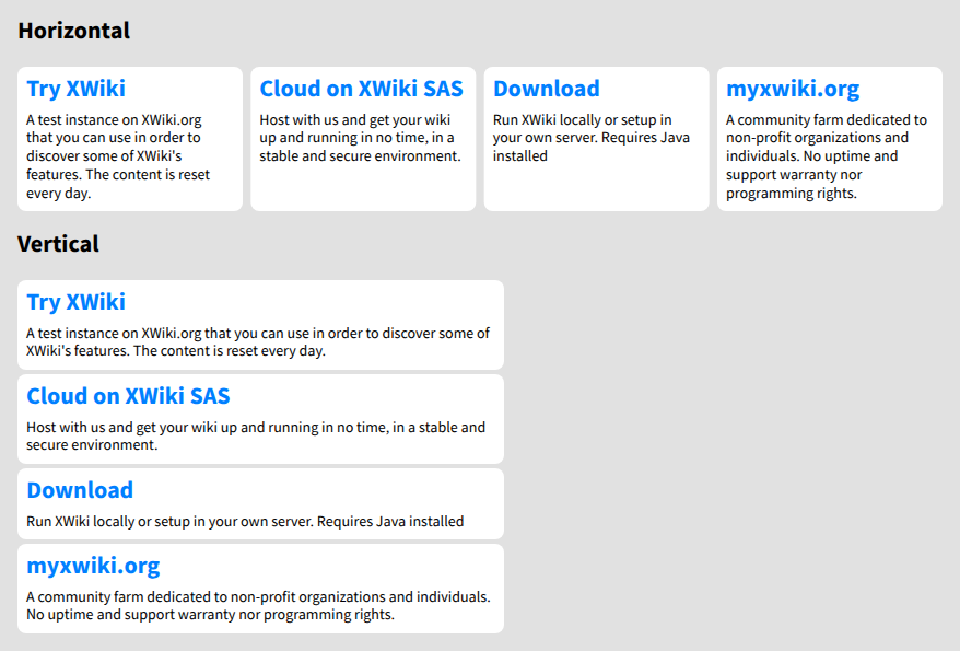
Proposal 02: Improve the layout of the Hosted page
Why?
- The page takes too much reading to understand the options.
- Action buttons are far away from their section titles.
- The “Download” option feels hidden.
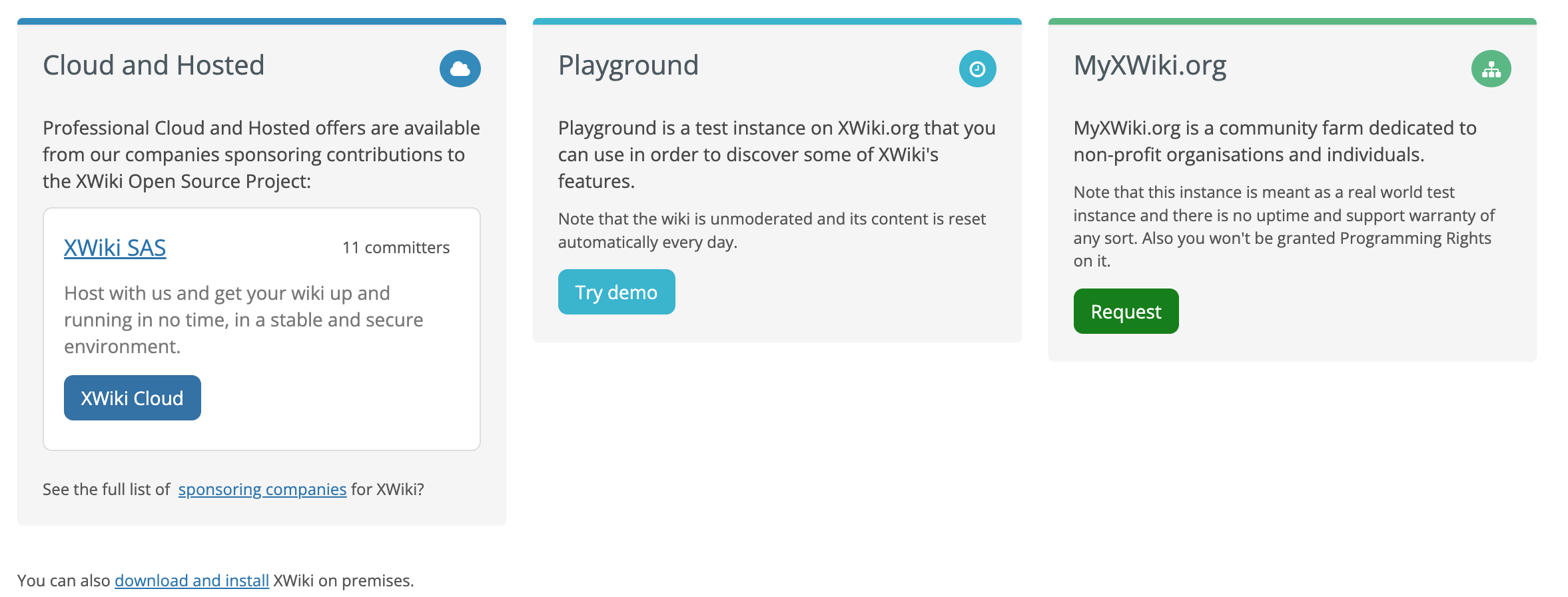
Proposal:
- Standardize each section into a title and short description.
- Give “Download” the same weight as the other options.
- Suggested order:
- Playground – Test instance on XWiki.org, resets daily.
- XWiki Cloud – Hosted by XWiki SAS, quick start, stable and secure.
- Download – Run it locally or on your own server (requires Java).
- MyXWiki.org – Community farm for nonprofits and individuals (no support or uptime guarantee).
Proposal 03: Keep the Playground on the latest version
Why?
- The Playground is the first experience for many users.
- It should always reflect the latest features.
Proposal:
- Update the Playground each month with the newest release.
In-app (after account creation / download)
Proposal 04: Use slides as the main onboarding method
Also proposed by @amilica here: XWiki onboarding tour - #12 by amilica
Why?
- Slides are familiar, predictable, and less visually complex.
- Keeps everything centered on the screen.
- Easier to follow compared to the Tour app.
Proposal:
- Build an Onboarding App with flows for different user types.
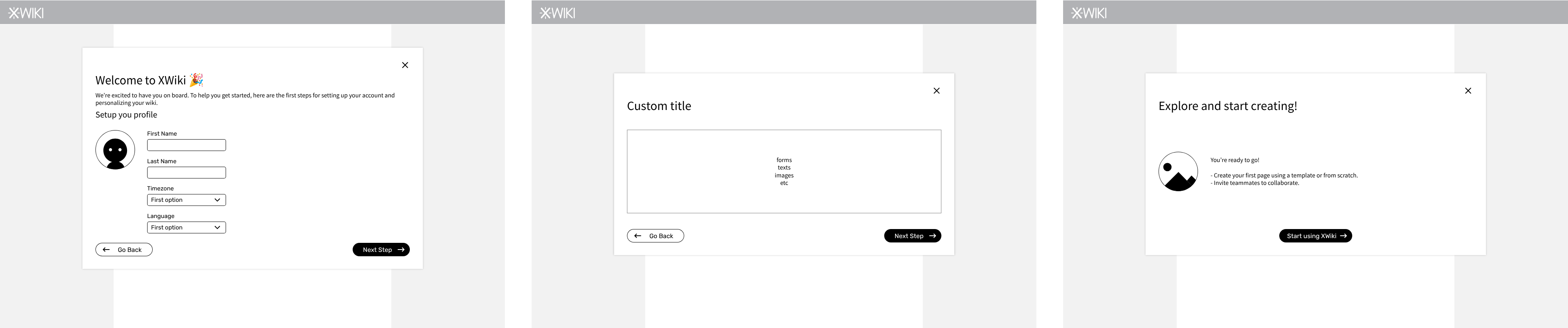
- Each flow is a set of slides with: title, description, optional image, and working area (text, forms, etc).
- Replace the current default Tour app aplication with this new Onboarding app, while keeping the Tour app for other purposes.
Risks:
- Too many slides across flows, particularly for administrators.
- Must allow skipping, but also returning
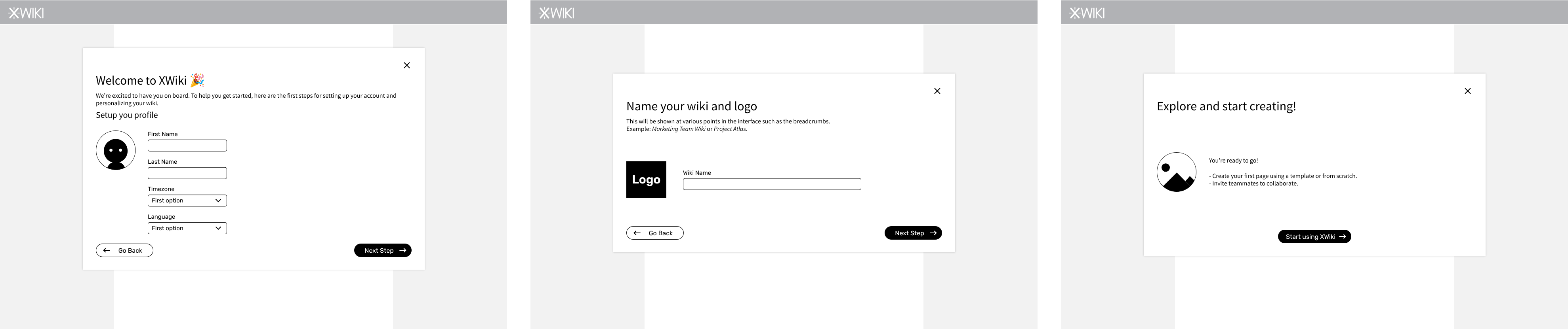
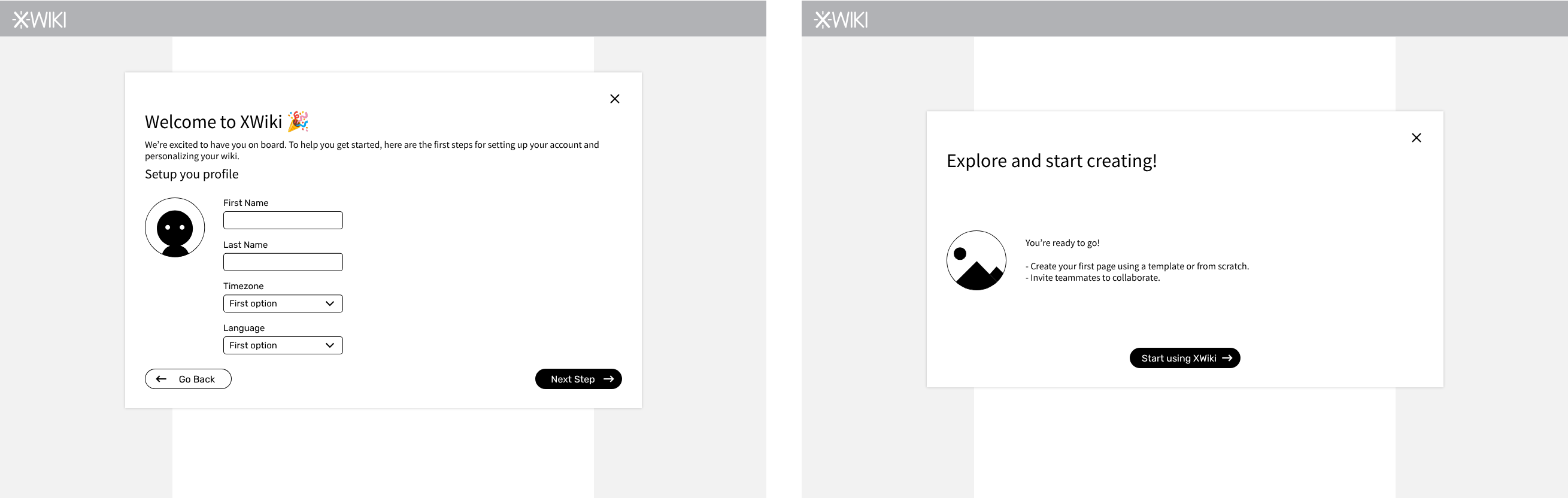
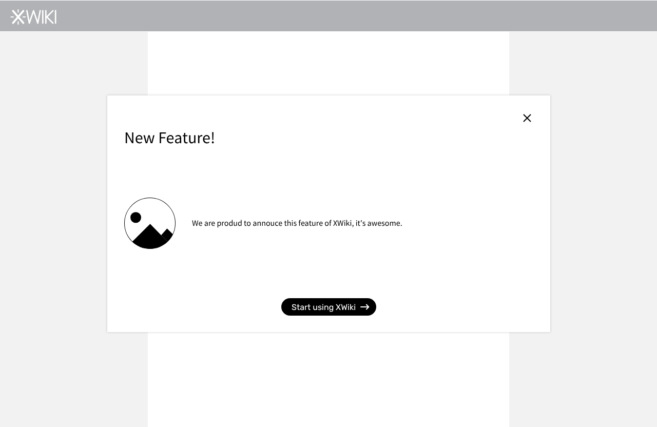
Proposal 05: Create different onboarding flows (Admins, General users, Returning users)
Why?
- Different users have different needs.
- Administrators need to configure the instance.
- New users need an introduction to the tool.
- Returning users should learn about new features.
Proposal (examples):
- Administrators: Setup basic instance (name, logo, description, visibility, invite users).
- General users: Setup profile (name, photo) and view an introduction with pre-configured pages.
- Returning users: Overview of new features.
- System administrators: Ability to create custom slides.
Example flow for Admins:
Example flow for new users:
Example slide for a new feature
Example flow for a customized onboarding
Open questions:
- How can users switch between flows later?
- Should there be a central onboarding dashboard?
Proposal 06: Make the onboarding app customizable
Why?
- Companies may need to show internal rules, important news, or legal notices.
- Administrators need a way to define this content.
Proposal:
- Each onboarding flow is an XWiki page.
- Each step is a sub-page of the flow.
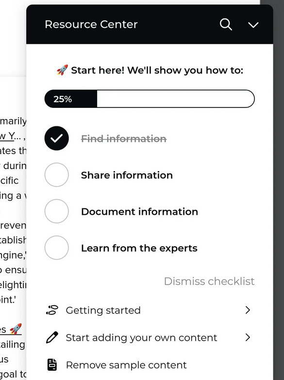
Proposal 07: Reduce the Tour App steps
Why?
- The Onboarding App should cover general onboarding.
- The Tour app can then be simplified to focus on key actions.
Proposal:
- Use the Tour app to:
- Show how to restart onboarding.
- Highlight the Sandbox for safe experimentation.
- On first edit, point to the “Done” button so users know how to exit edit mode.
To conclude
In summary, the overall intent is to simplify the entry points to XWiki, make it easier for people to get started quickly, and adapt the onboarding process to the needs of different users. At the same time, we want to streamline the Tour app so it remains focused on a smaller number of key actions.
As always, I would very much appreciate your feedback on this. Thanks!