Rounder corners everywhere - Minimalist Skin 3

Hello everyone! :blush:

I’m back on the discussion about the minimalist skin design proposal. Today, I wanted to discuss round corners on buttons and on all the other components that we have in XS (issue 3 of the proposal).

Current XS vs Bootstrap 5

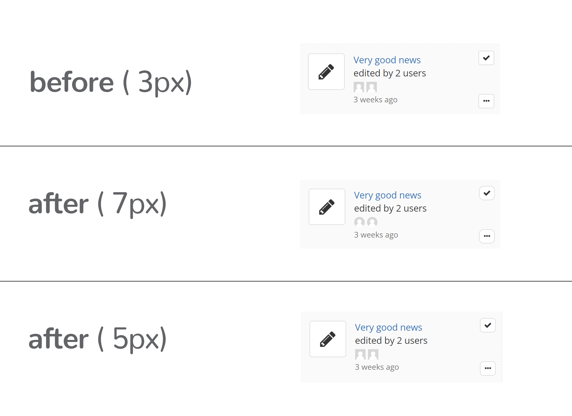
Current size of border-radius on buttons, info-boxes, tabs, text fields and others is 4px.

In comparison to Bootstrap 5, the current border-radius is the same, actually.

Changes & Motivation

While this size works ok, I believe that from an esthetic point of view, rounder corners on elements will give a more modern feel to the interface in a subtle way, at the same time making it slightly more friendly.

The size of the radius will impact how much friendliness we “pour” into the whole feel of the XS. I propose a radius of 7px, which is pretty tame, but still making the rounded corners more obvious and intentional.

Moreover, the interface will be feel less cluttered or daunting even when full of information if we have rounder corners. This is because round corners are easier on our eyes, thus helping us scan content easier.

Quote about this (sources: link, link):

According to some experts a rectangle with rounded corners is easier on the eyes than a rectangle with sharp edges because it takes less cognitive effort to visually process. The part of your eye which is responsible for sharp central vision (also called foveal vision), which is needed for reading, watching television or movies, driving, and any activity where visual detail is of primary importance is fastest at processing circles. This is because processing edges requires your brain to have to work harder as it involves more “neuronal image tools” being used.

Barrow Neurological Institute conducted Scientific research on corners and found that the sharper that a corner was, the brighter it began to appear. And the brighter a corner appears, the longer it will take to process visually.

Rounder corners adopted everywhere

The tendency of choosing rounder corners in web design is clear in the last few years. Some very quick examples that come to mind are Google, YouTube, Pinterest.
image

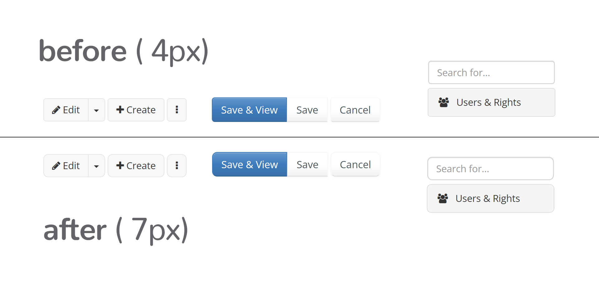
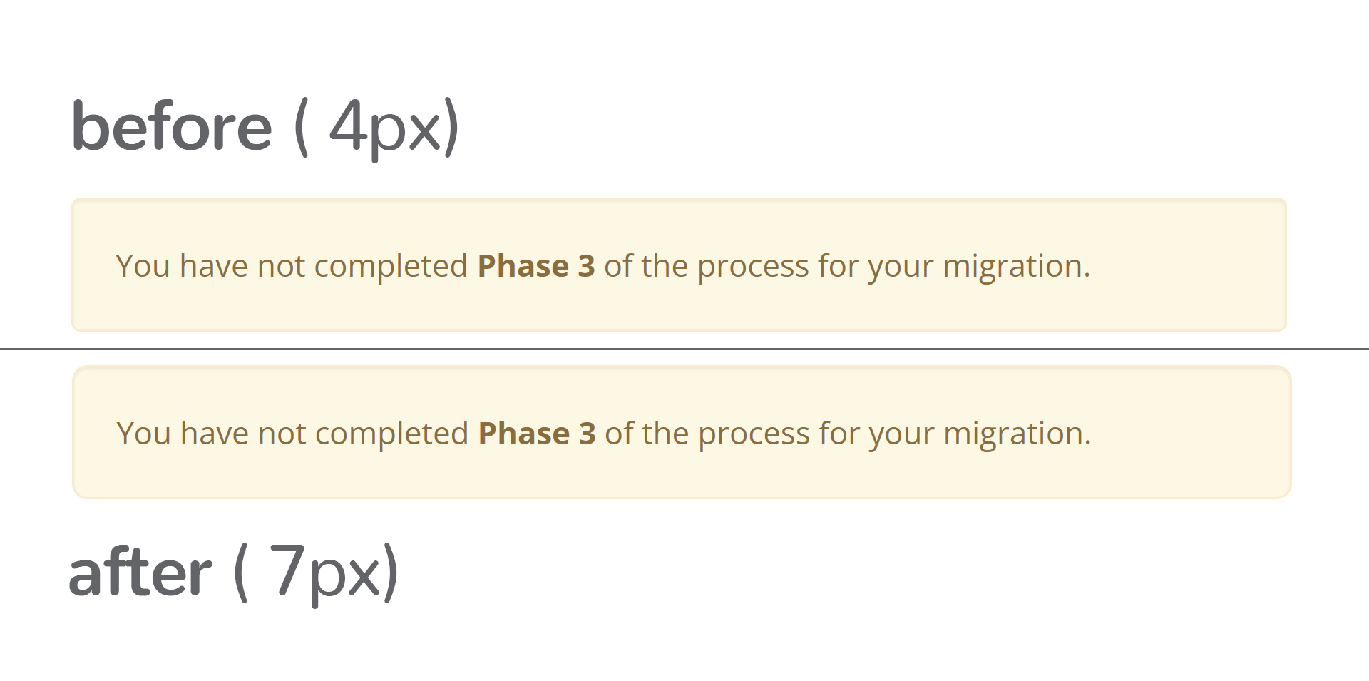
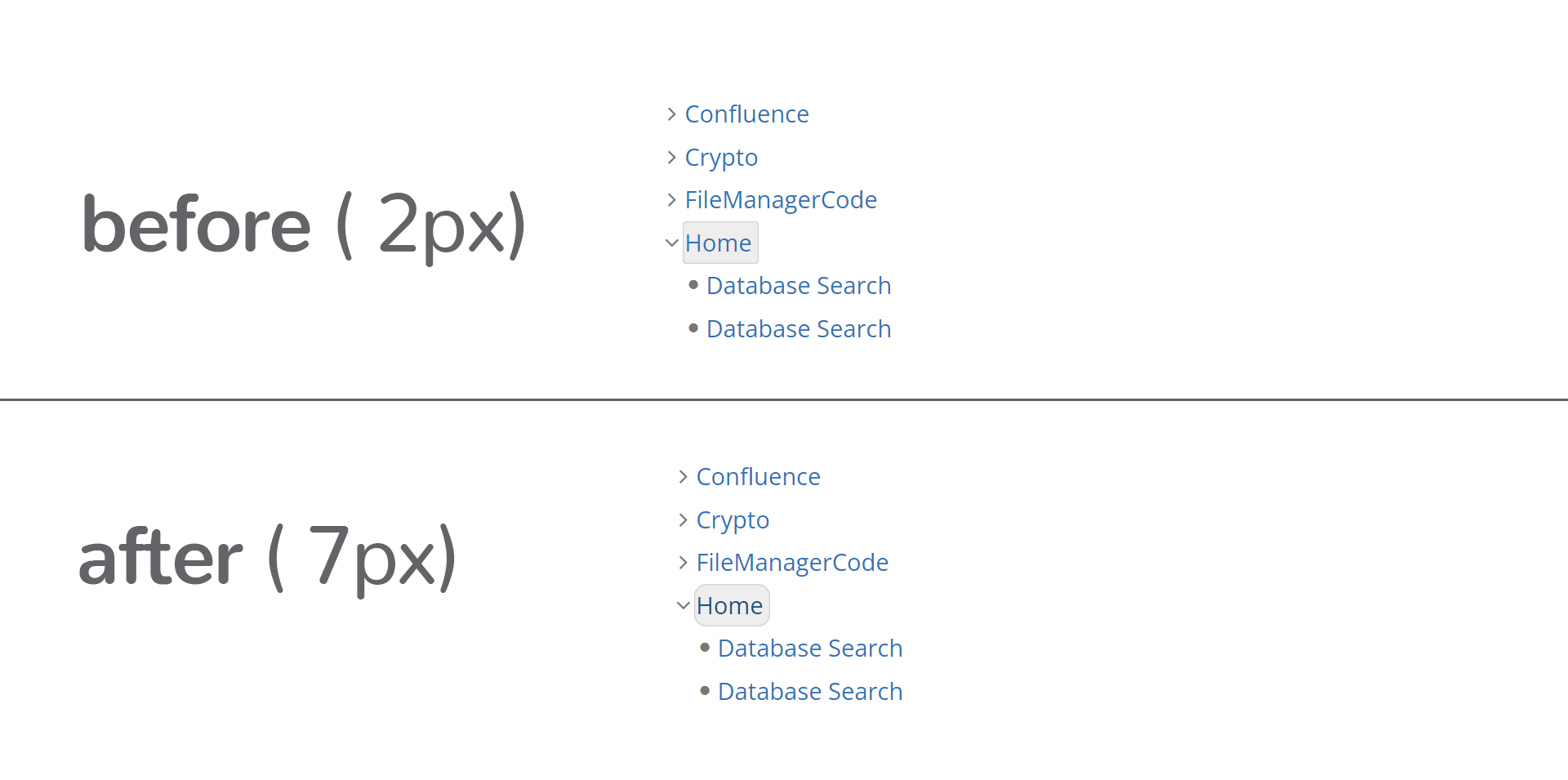
How would the change look

This is how smaller elements look with 4px and 7px border radius:
border radius 1

This is how wider elements would look like with a border-radius of 7px
border radius 2

What do you think? :thinking:

If you missed them, here is the post on gradients on buttons and here is the post on borders on buttons from the same proposal.

3 Likes

I have no doubts about rounded corners. The question is more what value to use for border radius: the one from Bootstrap or a different value. The 7px you propose looks good to me and I don’t see a problem with using a different value than Bootstrap (in this specific case) because this is the kind of small customizations you always do on top of a UI framework in order to distinguish yourself from the rest using the same framework.

So +1 on my side.

Thanks.
Marius

1 Like

Thanks a lot, Marius!

+1, sounds good.

We have some elements that have a smaller border radius like the current (or hovered) item in the navigation tree which has 2px and the btn-xs buttons like the tour button that have 3px. Do you plan to change the border radius there, too?

Thanks for your vote, Michael!

Regarding the 2px and 3px border-radius, I think a 7px border-radius would work on those elements quite well too.

This is how the navigation tree item looks with the change:
border radius 3

I can’t seem to open my Tour application in my instance, but I’m sure that if the change looked good on the navigation item, it will look okay in the Tour case too.

You can also check the options button on a notification, this is also a btn-xs, here in the screenshot the button in the lower right corner:

image

So it seems that for small size buttons, 7px might seem a bit too round and, thus, unpolished (the roundness doesn’t seem intentional). I feel like 3px is a bit low for this kind of button and a 5px border-radius would work best.

From my own observation this kind of small button is an exception so we can make a special case for it.
border radius 5

Looks good. I’m fine with 7px for large UI elements and 5px for smaller ones, but better have a rule, i.e. define more precisely what means small.

Thanks,
Marius

Agreed, we need a precise rule.

Otherwise, the proposal sounds good to me.

Thanks

Yep, a rule would help. I’ll make an “audit” of general elements that we have in our UI and then based on that decide which takes which values and what size category do they go in to make a general rule for future usecases

1 Like

+1 LGTM

Note that this button is slightly too small to achieve the WCAG 2.2 criterion SC 2.5.8:Target Size (Minimum) without using an exception (22 * 24 instead of minimum 24 * 24 ). Reported the issue: XWIKI-21204

For the small category, you might want to consider the elements in the lightbox (appears on image hover) and the document tags. :slight_smile:

We already have a couple sizes that could be used as thresholds for this rule, see CSS recommendation: pointer targets are large enough .


Thank you for your work on the proposal! It’s really nice to see all the different variations at a glance.

Lucas C.

Thanks a lot for this! I’ll take this into consideration when making the audit

Hello @amilica , all,

The first question I have that we probably should look at when looking at corner rounding is:
should the radius be a fixed size or a proportion of the size of the element whose borders are round?

My view on it:

  • if the objective is to obtain circles like google search input, then it needs to be a proportion
  • if the objective is to soften a sharp edge, then it can be a fixed size.

Design system’s view on it:
Bootstrap 3 (the one we use) actually has 3 radius sizes:

  • a base
  • a small one
  • a large one

and I imagine it may use a different radius size depending on the element.

See Customize and download · Bootstrap (these are awfully hardcoded in pixels in bootstrap 3 but well, then again, everything is hardcoded in bootstrap 3 :grin: ).

From my point of view, the choice we make here should be implementable uniquely by adjusting the defaults of these variables of bootstrap, which has the great benefit of allowing whoever customizes a color theme for XWiki to set them all to other values to obtain a different look (e.g. I set them often all to 0 these days :grin: ).

Thus, in order to see how an adjustment of corners would look on the various elements of XWiki, I think we’d need to check which elements use which size of radius from bootstrap, as their look may adjust differently (and not be 7px everywhere). For example, I can expect that a well (the warning) has a large radius while a button has a base radius (but I don’t know exactly, it needs to be checked).

Thanks,
Anca

Also, I haven’t mentioned it explicitly here:

I don’t find very rounded corners very appealing personally today, but it’s a matter of aesthetic and fashion (I cannot explain it).

Also, I see / know that there are lots of applications that are now using perfectly sharp corners (0 rounding) - for example the forum we’re on right now - I was wondering how does this trend / principle play with the idea that “round corners are easier on our eyes, thus helping us scan content easier” that you mentioned? All these people that make sharp corners just don’t care? Is there literature on the topic that so many people decide to ignore this?

Thanks,
Anca

For a pill shape like the google search input, it’s actually a fixed size too, bigger than the smallest dimension of the element :slight_smile:
See https://codepen.io/sereza7/pen/wvQZVwy for an example
Proportional border-radius just look ‘special’ on anything that’s not square shaped.

image
Here, the border radius is 24px, which is higher than half the height of the div (46px / 2), so it’s a perfectly round pill end :slight_smile:

:slight_smile: 
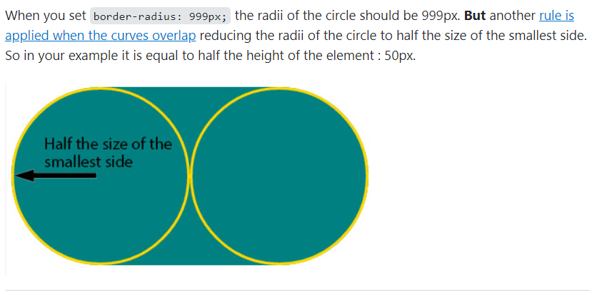
fixed to a size that needs to be more than half of the size of the actual element is proportional to me, regardless of how the rule is actually written. Since you cannot write a universal rule that would apply to all elements regardless of their size (or can you max it?), it’s still proportional, as a principle…

1 Like

If we are reffering to pill-like shapes, this can be achieved with setting the border-radius to 999px or 3vmin, like discussed here:

image

image

Thing is, apart from tags / badges, we might not need this kind of thing. At a quick glance, another place where I could see pill-shapes useful would be text fields, but this would be better to talk if we ever decide to revamp live tables.

this would mostly be the case

Yep, I’ve said in an earlier reply that I’ll make an audit of elements and see which elements would get what size. It’s a good idea to see which sizes Bootstrap 5 implements for border-radius of all of their elements

As mentioned twice here, yep, there definetly is scientific literature on this. One of the papers is available online, but is pretty stuffy.

Some more details on the quote I provided in the start of the discussion:

2 scientific papers which clearly explain the relationship between the roundness of objects and the way humans perceive them. The first one was published in 2008 by the Barrow Neurological Institute in Phoenix, Arizona [1] which has scientifically proven that the perceived brightness of corners is linearly related to the sharpness of corner angle, so basically the sharper an angle is, the brighter it appears to the human eye.

Now, at this point maybe we could connect the dots ourselves and assume that brighter objects are probably less comfortable on the eyes, after all, dark mode has probably gained a lot of popularity recently for the same reason. However, some scientists at the Barrow Neurological Institute have luckily published another paper in 2019 [2] measuring the exact amount of neural response when the eye sees an object based on the corner angle of this object, and the results as the graph below shows that the smaller the corner angle of an object (the shaper, more pointy), the more neural spikes it elicits in the neurons of the visual system. Hence, rounder shapes are more comfortable for the brain and consume less energy to grasp.
image

Now, people may choose sharp corners in an attempt to make certain elements feel more obvious/ more important. Thing is, when everything has sharp corners this effect is lost.

Moreover, because of the visual comfort they add, rounded corners are also making the interface friendlier to the user. As we make software for people that are working everyday with our software, it’s important that XWiki doesn’t feel like a boring day of work, but, at the very least, like a decently pleasant experience

As the forum is an utilitarian tool, it was probably thought that sharp corners would go better with the idea of being objective, neutral, straight to the point.

Also, as is the the case with many open-source projects, UI/UX falls on the second place, functionality having the spotlight (as it should, of course).