Related to the minimalist skin design detailed here, I want to discuss with you the borders aspect of buttons.
In the current XS many buttons have borders that are intended to visually separate the button from the page. I believe this separation can be done without borders on buttons.
Borders create the visual effect of too many little rectangles, thus cluttering the overall UI. Removing them from buttons, still making sure that every button is visible enough in the context of the page, will add a modern feel to the UI and make the design more minimal.
As written in the proposal:
If the button has the background-color property a different color than the background of the whole page, the button shouldn’t have borders.
If the button has the same color with the background of the page, its color should be changed to be a bit darker (for light pages) or a bit lighter (for dark pages) color, keeping the idea of no borders on the button. This would imply a small refresh of the main colors in the standard themes or thinking of a formula/script that dynamically changes buttons’ colors based on the page container color
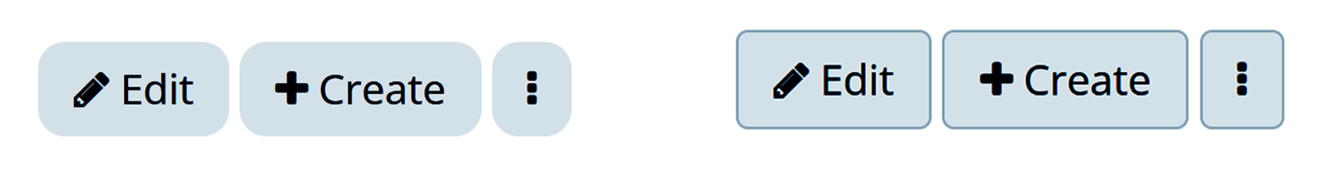
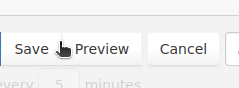
Quick example of borderless buttons (this example has changed the border-radius too, but ignore that for now ).
I’m willing to believe you but it would be great to have some proof to this by providing some URLs showing that the current web design trend is to not have borders around buttons.
I don’t think that’s enough. For WCAG we need a minimum of contrast.
The easiest and, I think, most reliable proof, is the design of all the main websites/apps that many people use on a day-to-day basis (Twitter, Facebook, LinkedIn, Reddit, Discord, Notion, Obsidian, ClickUp, Stack Overfllow, etc.). In each of them, there are only two types of buttons:
contained buttons - the button has a background color different than the page background. Can be used as main or secondary buttons.
ghost buttons / outlined buttons - the button has the same background with the page and its border is what makes the buttons pop. Used mainly as secondary buttons.
My problem with the current outlined buttons is that they are not fully like most ghost buttons in the modern web design. They have borders AND background color (different from the page background).
My proposal was just eliminating border because it seems the easiest. In most cases just eliminating the border will make the interface look cleaner and the button is still observable.
Of course, I understand that without borders, the button with the current colors may not be as visible for all people. We could make that the color picker in the Look & Feel section only lets the user choose colors above a certain level of color contrast based on the page background (but this is not the focus of the current discussion, I know).
The other idea, would be to preserve ghost buttons, but let their background be the same with the page background ( or transparent background) and their border thicker by 1-2 px and by default white for dark themes and dark gray/black for light themes. This would imply making the text of the button match the border color.
To me the first idea seems quicker to implement, but maybe I’m wrong.
For reference, WCAG’s success criterion (SC) 1.4.11 is the one describing this: Understanding Success Criterion 1.4.11: Non-text Contrast | WAI | W3C
^^^ Lots of examples of interactive controls, todos and todon’t
The part about boundaries is especially relevant to our topic:
This success criterion does not require that controls have a visual boundary indicating the hit area, but if the visual indicator of the control is the only way to identify the control, then that indicator must have sufficient contrast. If text (or an icon) within a button or placeholder text inside a text input is visible and there is no visual indication of the hit area then the Success Criterion is passed. If a button with text also has a colored border, since the border does not provide the only indication there is no contrast requirement beyond the text contrast (1.4.3 Contrast (Minimum)). Note that for people with cognitive disabilities it is recommended to delineate the boundary of controls to aid in the recognition of controls and therefore the completion of activities.
In short, the border can be nice for usability/accessibility if the other contrast requirements in 1.4.3 are not met, but we should be alright without them (since AFAIK we fulfill them for button styles since this other topic).
So I don’t think it’d become an issue regarding WCAG.
A lot of WCAG Success Criterion address this problem and give some leeway for user generated content/parameters. For example in the SC 1.4.11:
User Interface Components: Visual information required to identify user interface components and states, except […] where the appearance of the component is determined by the user agent and not modified by the author;
It’d be a possible feature to limit color choices but I don’t think it should be activated by default since a user choosing a wrong color wouldn’t bring WCAG violation in XWiki. It would bring accessibility issues, but it’s not our responsibility by this point. The same way, nothing prevented a user from setting all the colors in the color theme to white, the wiki would become unusable, but it’s not our responsibility.
Considering we wouldn’t need to change any background/text color on buttons with the first solution, I agree .
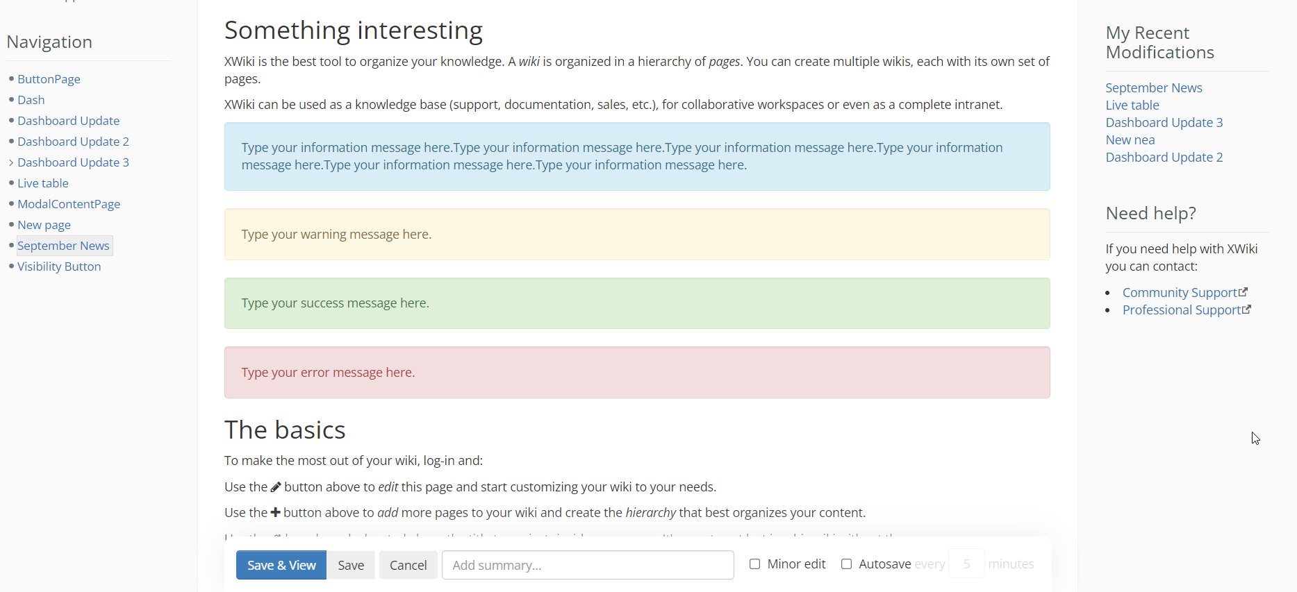
Thanks Adina. Do you have a screenshot of the XWiki home page (using the default theme) using the new button styles you’re proposing (ie no gradient and no border)? I think that would help see visually how it looks. Thanks
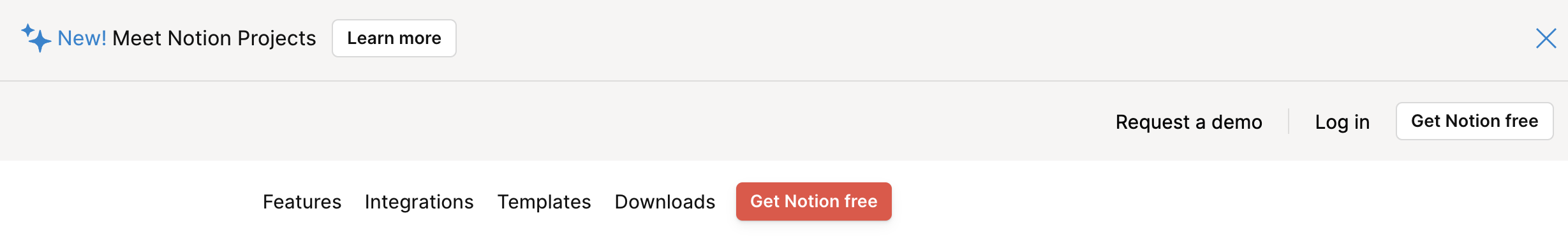
Note that the Notion web site has some buttons with a white background and a dark grey border, on a light gray background. This also seems true inside Notion (blue buttons with a blue border), see:
It seems there’s a 3rd rule : if the contrast between the button background color and the page background color is not contrasted enough, then the button also has a border.
Do you also suggest to remove the darker border that is currently displayed when moving the mouse over a button? Will there be any visible difference between the background color of the buttons and the background we use, e.g., in the panels? If not, I fear there is absolutely no way to tell a button apart from regular text when a button is used in a panel. Please provide some examples for our regular, gray buttons on different backgrounds and how they can be differentiated from regular text.
Found this site which shows an evolution of buttons (unfortunately only until 2017). Interesting to see that gradients came back in 2016 (according to the author) but was dropped in 2017: Button Design over the Years – The Dribbble Timeline | Toptal®
Just saw this regarding buttons in the panels. However, I’m not sure I like this idea. We don’t control the code of the panels so we also cannot assume that we can just change all buttons in panels so I think we would need to automatic script. This assumes that there is an easy way to automatically calculate such a color. This might not be possible without violating the contrast requirement for the text color. Further, this still makes text with a gray background visually indistinguishable from text on a button.
XWiki is different from many websites as in XWiki you can have extensions or also regular pages contributing new buttons and UI elements that we don’t control so we need to take extra care that we don’t break the design of them.
All are providing border-less buttons and outline buttons. Of course, we need to be careful with the contrast between the page background and the button background / outline, but otherwise +1 for the proposal.
+1 for removing borders on buttons if we take care of the contrast. I’m thinking in particular of the default buttons which are currently lacking contract IMO:
Let me know if some additional screenshots are required.
Also, note that the screenshots are also including the change of button gradients discussed in another discussion.
I don’t like how the white buttons now look like on non-white backgrounds. Having no border and a super low contrast against the background looks to me as if either the button was broken or disabled. Also, when the border almost matches the background color, the white buttons look smaller than the blue button which also creates a broken impression for me, see, e.g. the following screenshot from the distribution wizard:
Similarly, here a screenshot from conflict resolution in the distribution wizard where in my opinion the button looks very odd compared to the select elements that have the same color as the button but a very visible border:
I don’t know how to fix this but to me this doesn’t look good. I think buttons should have either a) a clearly visible border or b) no contrast against the background (but might look odd if other form elements have a contrast) or c) a clearly visible contrast against the background.
Yep, for sure a problem, thanks for pointing it out, Michael!
I’ve never really been a fan of the light gray bars, to be honest. It’d be great if there was an audit of all the situations this is happening, to tackle most of them and turn them white wherever we can. I’m working on a UI elements audit, but it’s still in the beginning phase.
For some cases, like the Edit Page situation, the light- gray bar could be a bit revamped and the default button’s background color changed to another light gray instead of white, with darker text.
For example:
default button bg: #eeeeee
default button text color: #333333
I can imagine that the idea of changing all occurrences of the light gray bar wouldn’t be an ideal thing.
The alternative would just be adding soft shadows to all buttons (also not ideal) or adding the old border back at least for the default button…
I don’t think the grey background on default buttons would work as they can be defined on a background of the same color on many pages, making them “invisible”.
What I had in mind was to had a slightly darker border by default (e.g., 5%), and and every darker border (e.g., 10%) on hower, with no background color change on hover.
I’m going for this option because otherwise we would be potentially breaking a lot of existing pages.
 ).
).
 .
.

